
Note:
This post is a companion piece to my article The origins of DEL (0x7F) and its Legacy in Amiga ASCII art. That article is all about the character DEL, what it is, how it was used, and why it even has a visual representation, but with a focus on Commodore's Amiga computers. Whereas AmigaOS's Topaz font renders DEL with diagonal lines, IBM's PC renders it... as a house. This bonus article is about that.
This article wouldn't have happened without the great help and insights of Michael Walden and VileR, thank you!
If you want to comment on something (minor or major), please send me an email at hlotvonen@gmail.com. I would greatly appreciate it, and if something needs fixing I would gladly update the article with proper credit.
a-b-c-d-x-y-z...HOUSE?
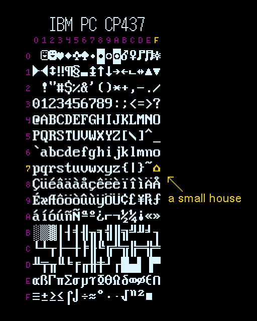
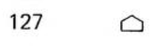
There's a small house ( ⌂ ) in the middle of IBM's infamous character set Code Page 437. "Small house"—that's the official IBM name given to the glyph at code position 0x7F, where a control character for "Delete" (DEL) should logically exist. It's cute, but a little strange. I wonder, how did it get there? Why did IBM represent DEL as a house, of all things?
The rise of Code Page 437
Released in 1981, the IBM Personal Computer (PC) launched IBM's first microcomputer model line. Alongside it, they introduced an 8-bit character set, which later became known as Code Page 437 (CP437). Unlike earlier IBM machines, the PC was built using off-the-shelf components instead of proprietary IBM technology. This spawned a wave of third-party clones marketed as "IBM-compatible" systems, which lead to IBM PC architecture quickly becoming the dominant global computing standard. By the end of the 1980s, 84% of all sold microcomputers were either IBM PC's or its clones.[1]
The rise of PC also meant the widespread adoption of CP437, making it one of the most copied and recognizable character sets ever. VileR's Ultimate Oldschool PC Font Pack lists over 200 fonts based on CP437 from various IBM PC models and their clones.
CP437 was based on American Standard Code for Information Interchange (ASCII), which defines the first 127 characters. This was a big change for IBM who had previously used the fundamentally different EBCDIC standard. But as ASCII covers only 96 printable characters of the total 256 available in 8-bit code, IBM had to figure out what to do with the rest of them. Instead of basing their choices on any predefined standards extending ASCII, or copying others, they decided (yet again) to do their own thing.
A set of "not serious" characters
The extended bits (characters 128–255) of CP437 contain mainly a mishmash of international text characters, box drawing shapes and mathematical symbols. But for the undefined control characters they did something wildly different. Dr. David J. Bradley, one of the creators of the IBM PC, recounts the origins of the ASCII smiley character in an email conversation with Benj Edwards of vintagecomputing.com:
"Now, what to do about the first 32 characters (x00-x1F)? ASCII defines them as control codes, carriage return, line feed, tab… These characters originated with teletype transmission. But we could display them on the character based screens. So we added a set of “not serious” characters. They were intended as display only characters, not for transmission or storage. Their most probable use would be in [text] character based games."[2]
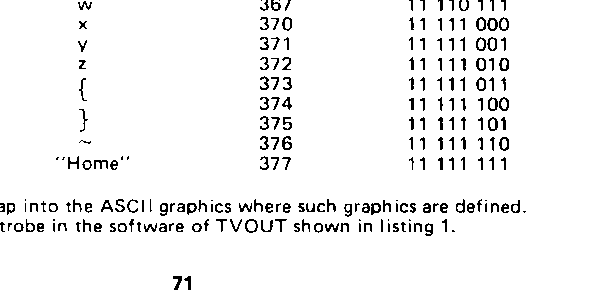
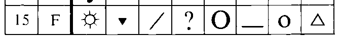
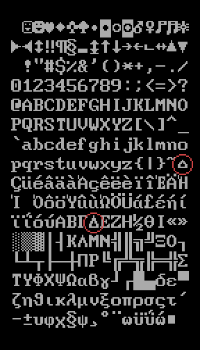
The first 32 characters (x00-x1F) of CP437 mentioned by Bradley include smileys, playing card suits, musical notes, a solar symbol, gender symbols and arrows. What Bradley doesn't explicitly mention is the character at 0x7F, which is also a (sort-of) control character used in teletype transmission. It's assigned to the Delete character, which was used to obliterate undesirable characters on paper tape by punching it full of holes. The all-holes pattern in ASCII is at the 127th code point, represented by 0x7F in hexadecimal. This character is like all the other 32 control characters in that it doesn't have a defined visual representation, nor any particular use in digital computers like the IBM PC. So, even though Bradley doesn't explicitly mention 0x7F, it's represented in CP437 as a tiny pixel-house (⌂), suggesting it might also belong to the "not serious" group of characters.
According to Bradley, the "not serious" characters were developed during a 4-hour plane travel. He's of course exaggerating, but gave it as an "indication of the rapidity in which many significant decisions were undertaken". But even though they developed them relatively quickly, they must have based them on something.
What is this something? IBM could have followed an existing standard and taken the graphics for control characters from ANSI X3.32-1973—but they are ambiguous and hard-to-use (see part 2 of The origins of DEL (0x7F) and its Legacy in Amiga ASCII art). Instead, going with these "not serious" characters was arguably a better choice, especially as a business decision. Characters like the smiley face at 0x01 became iconic, precisely because they offered a simple way to represent player characters in text-based games like Rogue and ZZT.
IBM was by no means the first to include "not serious" characters. For example, Commodore's PETSCII character set from 1977 is known for its graphical shapes which also include card suites.[3]
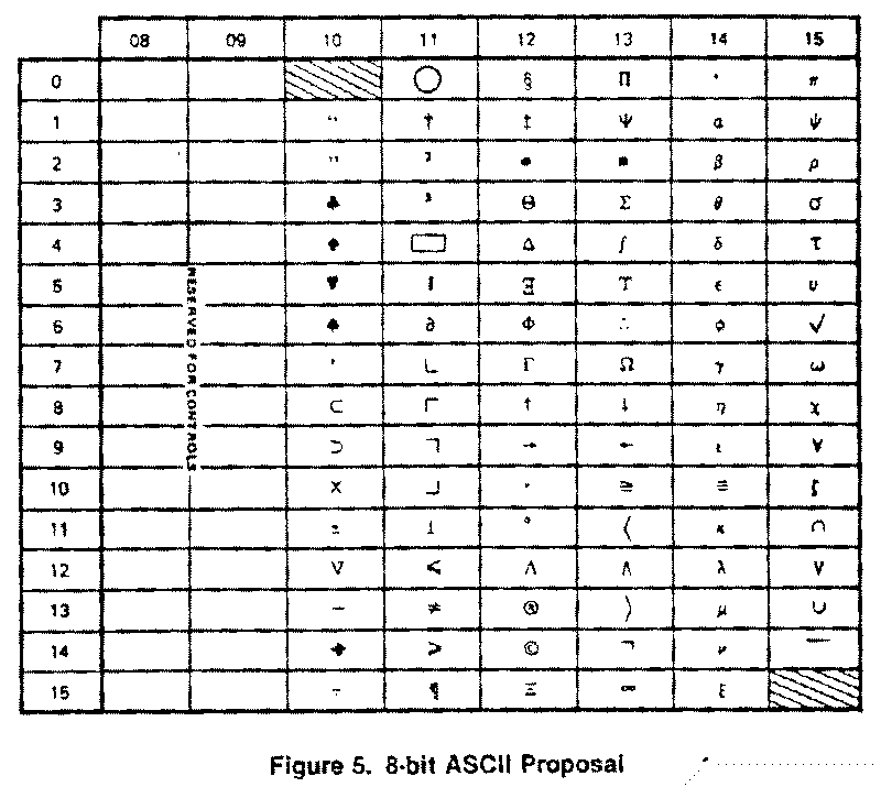
Even the American National Standards Institute's (ANSI) X3.2 committee considered including some "not serious" symbols for an official 8-bit ASCII extension.
But, why add these quirky characters, when arguably more useful characters, like extending support for additional languages or writing systems, could be added? Bob Bemer ("The Father of ASCII") defends their inclusion in an article for the Interface Age in July 1978:
"Presumably the card suits will strike your eye, and you will wonder why so many other useful symbols were ignored in favor of these. Don't worry, they will always come in handy; it's sometimes useful to have symbols whose meaning you can reassign without harm to programming languages, etc."[4]
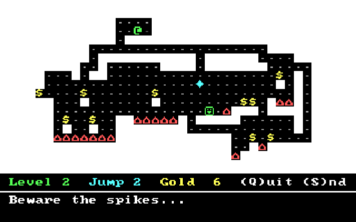
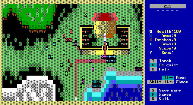
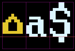
This is definitely the case with Code Page 437's house symbol (⌂). It is ambiguous enough that it can resemble many different things, not just a house. For example, in the DOS games By Fire & Sword (1985) it's a town, in ZZT (1991) it stands for "energizers", in Bugs! (1982) it's the player's gun, in Target (1982) it represents player's ammo, and in Numjump (2017) they're deadly spikes.
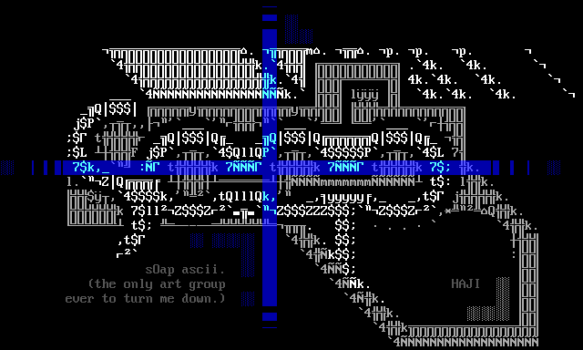
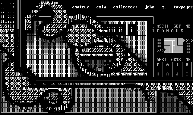
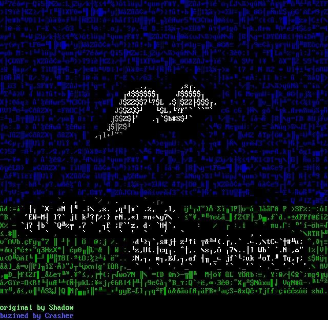
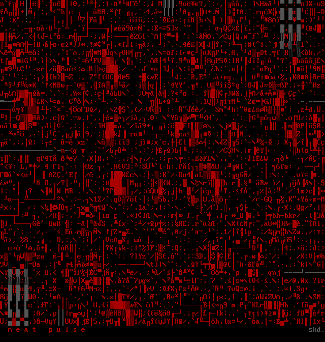
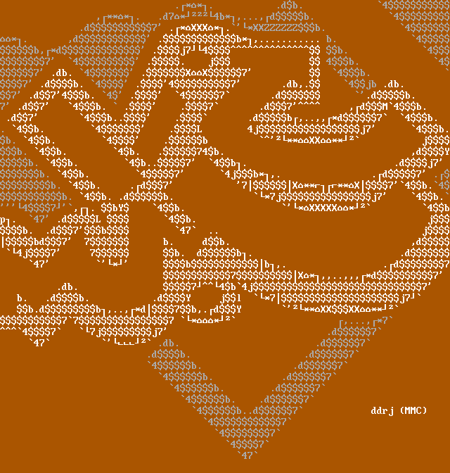
PC ASCII artists have used the house symbol, not as a specific thing with meaning, but purely for its shape and size, to create what is called "newskool", or filled ASCII art. In the classic 8×16 pixels-per-character IBM VGA font, it's one of the few characters that sit one pixel higher from the baseline.
When combined with other characters that are just slightly larger or smaller creates an illusion of a continuous shape: ·∙•↔*⌂S§¼╣$♫b%⌂≈←·.
It's also fairly wide and "dark" in its typographic color, so it fills the space it occupies, without leaving any considerable gaps of negative space. In other words, it doesn't stand out when used carefully.
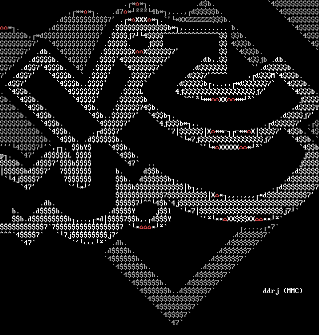
Its angled top makes it useful for creating curves, as seen in ddrj's drj-mmc.ans from 2004 (house characters are highlighted in red):
Theories on the origins of CP437's house
But what about IBM? Why did IBM decide to include a symbol representing a house in their character set? It's a strange glyph; adding a smiley is readily arguable, and playing card suits have existed in prior character sets, but a house—as far as I can tell—didn't exist as a glyph anywhere before IBM's Code Page 437. It seems to have come out of thin air. To my knowledge, there are no (surviving) documents on the design process of the character set. The little bit we know comes from a few interviews, like the one with David J. Bradley, and from meticulous research done by people like VileR. So, the only thing I can do is speculate. Here are my thoughts:
Acknowledgements
Most of these theories are based on my conversations with VileR and Michael Walden, credit goes to them!
Theory #1: House as a symbol for home computers
My first thought was that maybe the house was included as a symbol for IBM's new line of personal home computers? Before IBM PC's launch in 1981, IBM had largely been known for their business computers. So, it makes sense that, as IBM was entering the growing market of personal computers, they wanted to signal to the home users that their PC had something fun to offer—hence the "not serious" glyphs, like the smiley, which were added with text-based games in mind. So maybe they added the house glyph for the same reason? Surely the smileys must have a house to live in! It's compelling to think this might be true, but to be clear, this is pure speculation, and there's nothing to support this claim.
Theory #2: It's related to backspace
Another "hunch" was suggested by VileR. He entertained the idea that the house character itself was associated with the action of deleting text, or related to the backspace symbol ⌫ (U+232B). If you rotate ⌫ 90˚ clockwise, you do get a house ⌂ (with an × in it). It's an interesting idea, but there doesn't seem to be anything to support this claim either.
Theory #3: House as a symbol for "home reset"
Or maybe it is related to "Home" key, which resets the cursor to the beginning of the text? In 1976, Robert Suding (who worked for IBM from 1967 to 1975)[5] writes in BYTE magazine about how to build a television display interface, using the Motorola MCM6571L 7×9 dot matrix character generator. In this computer chip, DEL is rendered as a full block (■), but Suding repurposes it as "home reset". He describes it as a routine that writes 512 spaces (effectively clearing the screen), and then resets the cursor to the home position (top-left of the screen).[6]
Could it be that IBM PCs developers wanted to symbolize this "home reset" with a house graphic in their product? This seems almost too good to be a coincidence—yet there's nothing substantial to support this theory either.
Theory #4: It's borrowed from System/23 Datamaster
In the Benj Edwards' email interview, David Bradley also mentions that the choice of "serious characters" was based on the immediate ancestor of PC at IBM, the System/23 Datamaster.[7] VileR analyzed the Datamaster character ROM image recently shared online by Jaume López, which confirms that some character sequences were copied to CP437 unchanged (üéâäàåçêëèïî). But, there is no house symbol, or anything resembling it.
Theory #5: It's borrowed from Wang word processing machines
In a blog post Weird Tales, Michal Necasek of OS/2 Museum examines claims made by Bill Gates that Microsoft wanted IBM to copy some Wang word processing characters ("smiley faces and boxes and triangles and stuff") into the IBM PC's character set because they were considering creating their own Wang clone. Necasek half-debunks and half-confirms these claims, as none of the Wang character sets have smileys, yet they do share some strikingly similiar characters with CP437 that are unlikely to be a coincidence. These include left/right triangles, a box, a diamond, double exclamation mark, and several arrows.[8] But again, none of the Wang character sets include a house symbol, so IBM couldn't have copied it from there.
Theory #6: It comes from Blissymbolics
So, IBM didn't get the house glyph by copying it from other character sets. But it's unlikely that IBM's team designed the house symbol in a vacuum. If it's not from another computer system, then maybe they found it by looking at books for existing symbol systems and iconography?
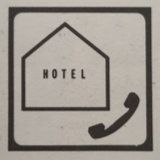
For example, a hotel icon used by the ICAO in the 1970s is quite similar in shape to CP437's house.[9]
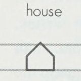
Another possibile influence is Blissymbolics. It was originally developed in 1949, but gained some renewed popularity in the 1970s and 1980s.[10] The Blissymbolics house glyph is striking similar to IBM's character at 0x7F.[11] If IBM was looking at symbol books, searching for inspiration for their new character set, it's possible they would have come upon Blissymbolics. The timeline fits: a book Teaching and Using Blissymbolics was published in 1980, at the time when IBM was developing CP437.
Sidenote
There's a recent proposal to add Blissymbolics to Unicode!
Theory #7: Botched copy of a dot-stretched Wang delta
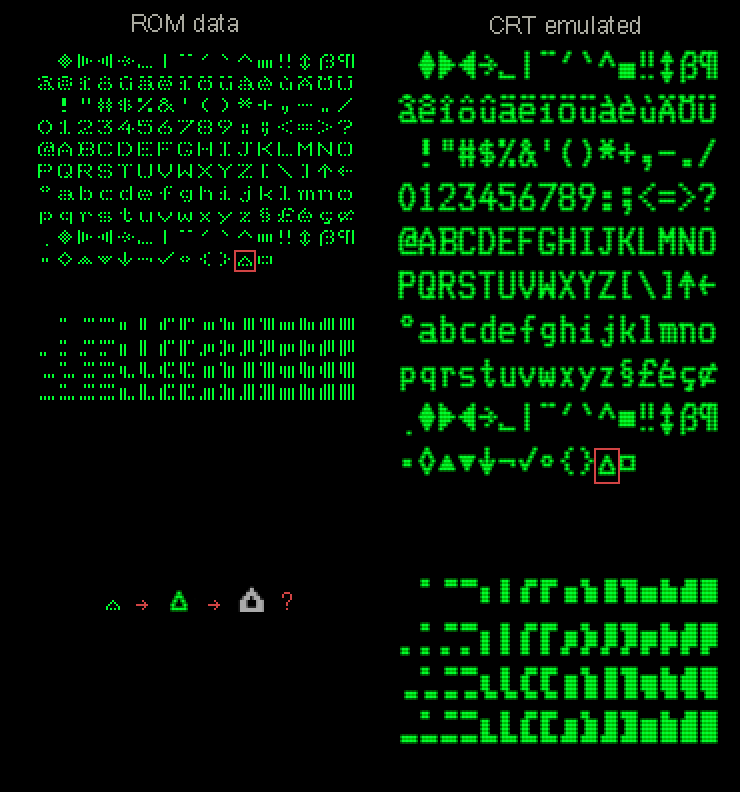
Or maybe it does come from Wang? VileR makes an interesting observation: a 1979 Wang character set for the 2236DE terminal includes a delta symbol ( Δ ) at position 0x9A. At first glance this seemed unrelated to IBM's house symbol at 0x7F. But after viewing the ROM data as a bitmap, VileR discovered two interesting things. First, Wang's delta wasn't a clean equilateral triangle (angles at 60°, 60°, 60°); to avoid uneven displacements between scanlines, which could produce very obvious "jaggies" on low-res CRTs, the delta was instead rendered as a right triangle (angles 45°, 90°, 45°). However, because of this, the triangle's side-corners had to be chopped off, to fit it into its 7×7 pixels-per-character space. Secondly, VileR discovered that the bitmap's pixels were spaced-out, implying that the glyphs relied on some sort of dot-stretching effect in the display circuitry. After these realizations, rendering the bitmap with his CRT emulator revealed that Wang's delta actually resembles IBM's blocky house symbol.
So, if Bill Gates was correct about IBM copying characters from Wang, it's entirely possible that the people at IBM, who were copying glyphs directly from a Wang terminal screen, misinterpreted the delta as a house, especially considering, as Bradley notes, that the whole process was rushed. This is not a definitive proof, but a compelling theory nonetheless!
Theory #8: Is it delta?
But, in an email conversation, Michael Walden speculates that it might not even be a coincidence that the DELete character has DELta as its printable character glyph.
Delta as a symbol ( Δ ) originates from the Greek alphabet. CP437 already includes some Greek characters in the 0xEO–0xEB range, notably 0xEB being the symbol for Greek small delta ( δ ). These characters were not included to support Greek language, but as math symbols. In mathematics and other sciences, the uppercase delta is often used to denote a "change of any changeable quantity", which might have provided a good reason to include it in the character set.
Delta doesn't only appear in Wang's character set, but in many character sets before it. For example, the APL programming language, which originated at IBM in the 1960s, includes delta ( Δ ), and inverted delta ( ∇ ) in its syntax. As a curious but unrelated coincidence, the IBM name for the inverted delta is DEL—the same as the control character DEL (Delete) at 0x7F.[12]
The APL symbols appeared on some early IBM APL keyboards, like in the 1971 IBM 3270. VileR also notes that IBM's first desktop machines from the mid 1970s, the 5100/5110/5120, were intended for APL from the get go, but there's no evidence that they ever influenced the development of IBM PC in any way, even if they are in the same model numbering system (IBM PC is 5150). It's also worth noting that IBM's APL character sets, like the Code Page 909, sometimes include both delta and the house symbol. As such, it doesn't seem like there's a strong connection between the house and APL's delta.
Theory #9: It IS delta?!
Hold on... let's examine our basic assumptions. How can we be absolutely certain that IBM even intended for the glyph ⌂ at 0x7F to represent a house? What if the whole premise is wrong?
When I browsed through the original 1981 Technical Reference manual for IBM PC, I realized that there's no mention of a "house" anywhere. In fact, the character explicitly listed at position 0x7F isn't a house at all—it's a delta ( Δ )!

Was it intended to be delta all along?
But of course it's not so simple. The 1982 edition of IBM BASIC Manual displays the code point 0x7F quite unambiguously as a house!
What is going on? Was the 1981 Technical Reference printed in error, and corrected later? It doesn't seem like it: the 1984 revised edition of the IBM PC Technical Reference still display 0x7F as delta.
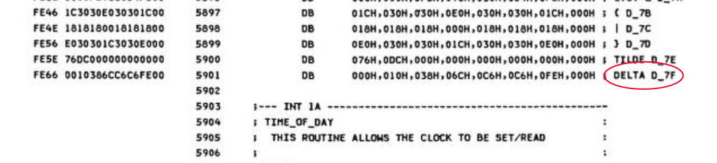
And it's not a mistake: 0x7F is even labeled as delta in the IBM PCs source code (in the System BIOS character generator routines).
Still, the original 1981 IBM PC System BIOS font clearly renders it as a house: ⌂. It seems very unlikely that anybody would actually associate the shape of it with the delta character—let alone use the house character as delta in any scientific syntax.
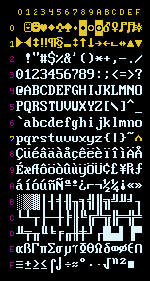
Maybe it's just some careless disparity between printed material and the actual font rendering? It isn't so either: 0x7F isn't consistently rendered as a house in every CP437 font, as can be seen from the following chart, which display the 0x7F character from various CP437-compatible VGA fonts:
While most of the fonts render 0x7F as a house, some of them are quite undeniably deltas (listed near the bottom of the chart).
To make matters more confusing (or maybe in an attempt to prevent further confusion?), in 1984, IBM's own authoritative registry of glyph names (GCGID) officially names 0x7F in CP437 as "small house". In fact, as Michael Walden pointed out to me, originally the whole character set had no name, until this registration. Code Page 437 was not born as a real code page at all—it was merely a bunch of graphical glyphs, stored in the Read-Only Memory (ROM) of the System BIOS, available for the computer to use immediately on booting. Because the characters were implemented in the hardware, the font, and its derivatives, were often just called "OEM fonts", where OEM stands for "Original Equipment Manufacturer". All "official" IBM names, for the character set and its glyphs, were given retroactively in 1984.
But even officially naming the Code Page 437, and its glyphs, was not enough to correct their rendering. In 1986, the IBM PC Convertible system font renders 0x7F as delta, and the 1986 IBM PC/AT Technical Reference still lists and labels 0x7F as delta. Even in 1989, the Olivetti MS-DOS Software Installation Guide renders the 0x7F as delta.
Theory #10: It MUST be a delta because even the GREEK delta looks like a house!
As I was taking another look at VileR's oldschool PC fonts page on the original IBM BIOS font, something caught my eye. Because the IBM PC was sold in many non-English speaking countries, the character set had language specific variants. The Greek versions included the actual Greek uppercase delta. And—this came to me as a complete surprise—its glyph looks like a house too!
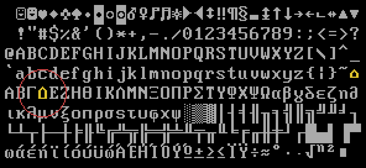
If even the actual Greek uppercase delta is, quite unmistakenly, rendered as a house, then the theory that DEL is just a badly formed uppercase Greek delta character with the bottom corners cut off (due to a lack of horizontal pixels) starts to seem more and more convincing.
But yet again, it's not so simple. VileR pointed out to me that we don't actually know what the official IBM PC Greek font looked like! The original pixel data of the IBM Greek CP851 character set could be (presumably) found in IBM's Greek video card ROMs, or on IBM's National Language Supplement diskettes. But, neither the ROMs, nor the language diskettes, have ever been made available anywhere. The only Greek fonts that have survived are sourced from software and video cards made by third party vendors, not by IBM. But while most of the third party Greek fonts I found are styled like IBM's, and render 0x7F as a house, they aren't necessarily based on actual IBM sources. And, the one Greek font VileR has found, an unknown MS-DOS CP851 font, which might be a direct copy of an actual IBM PC font, renders the Greek delta as a delta, not a house!
Delta theory doubt
There is just one thing I cant't quite comprehend. Let's assume for a second that DEL was supposed to be delta. Did IBM seriously not try different ways of drawing a delta, before settling on the house glyph? With a little bit of effort, it is completely possible to draw a convincing delta, even in 8×8 pixel space. Here's a chart to compare. The first three are IBM's renditions of the "delta", the rest are my own attempts I threw together in 10 minutes. I think that any of the versions I drew could have been more clearly understood as deltas. So, if IBM did go through some versions of the delta, they would have likely landed on the same, or very similar shapes to mine—yet they still chose the house-looking glyph to represent it. Why would they do that?
Click on the patterns to change the view. You can also edit/draw on the canvas, see if you can come up with something better:
Theory #11: It's no mistake
A comment on hackernews pointed out that every character in CP437, not just the delta/house, which would typically have diagonal lines at steeper angles than 45˚ are forced to 45˚ by extending them first with straight lines. This can be seen most clearly in letters A, V, N, 7 and Æ. Because the same design feature appears throughout the character set, delta's transformation into a house starts to look less like a mistake, and more like a deliberate decision. Perhaps VileR's suggestion, that designers of early bitmap fonts were reluctant to use angles other than 45˚ and 90˚ to avoid uneven displacements between scanlines, is the reason for this choice.
So, if IBM copied characters from Wang character sets, maybe the delta character wasn't misinterpreted, or mistakenly drawn, as a house by IBM's designers after all, as theorised earlier. Instead, maybe the designers intended it to be a delta, but in their stubborness to avoid "jaggies" rendered it illegible, without realizing that, while A and V can still be clearly read as A and V, a more uncommon symbol like delta, rendered as ⌂, wouldn't be as easily understood as ∆. As a consequence, nobody associated CP437's "delta" shape with the actual delta symbol, but percieved it as a funny little house. Because the character set already had "not serious" characters like the smiley, a house glyph wouldn't have been unexpected.
Sidenote
There's a few extra reader suggested theories at the end of this post (after the ASCII images) claiming it comes from tab or margin stops, or some other physical typewriter part.
What DO we know?
But even after all these theories, the only thing we know for certain is that even IBM was confused, or just didn't care, whether 0x7F should be a delta, or a house. The fact is, that while the character at code point 0x7F in the 1981 IBM PC's System BIOS font might look like a house, we can't definitely claim that it was intended to look like a house. The only thing we can say for sure, is that 0x7F has been labeled as "delta" in the IBM PC's System BIOS since 1981, and that the IBM's official registry named it "small house" in 1984. That's it.
What does this tell us? The consistent inconsistencies in IBM's technical documentations, fonts, and registries, sounds like a classic case of miscommunication between the different departments of IBM. Did the font's designers intend 0x7F to be a house, but the engineers interpreted it as a delta, mislabeling it in the System BIOS? Or did the designers intend it to be delta, but the botched rendering made it look like a house, and publications like the IBM BASIC Manual perpetuated the wrong interpretation until IBM decided to make it official in the registry? Or what? There is no clear answer.
Sidenote
The house symbol ( ⌂ ) was added to Unicode in version 1.1.0 in 1993. It was given the Unicode value U+2302.
Whether IBM meant 0x7F to be a delta, or a house, remains a mystery. But it doesn't really matter. What the house character looks like, is, after all, just a matter of interpretation. The legacy of CP437 is not defined by IBM's intentions, but by all the different ways designers, programmers, ASCII artists and other users adopted it. It is delta and house, but also rocket, players ammo, gun, spike, energizer, or whatever else we want it to be. As IBM engineer Charles E. Mackenzie observes in Coded Character Sets, History and Development:
"There is an aspect of human nature which surfaces in data processing. Experience has shown that if graphics are provided on a computing system, they will be used in one way or another by customers, even if they have no intrinsic meaning."[13]
This is probably best exemplified by how the house character is used in PC ASCII art. In the hands of ASCII artists, the character goes beyond meaning and returns to pure form, demonstrating that there is no shape that has an "intrinsic" meaning, until we give them meaning.
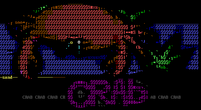
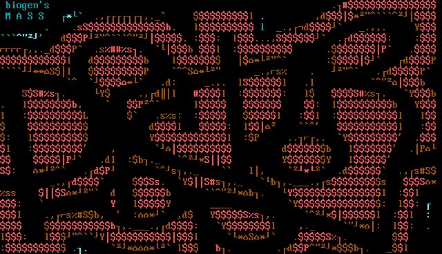
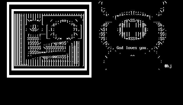
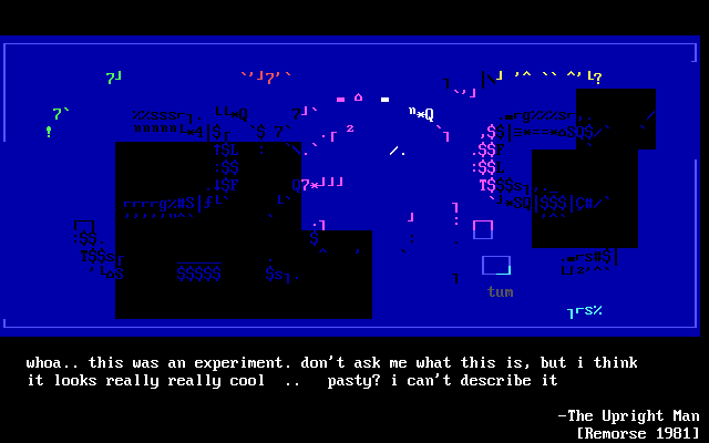
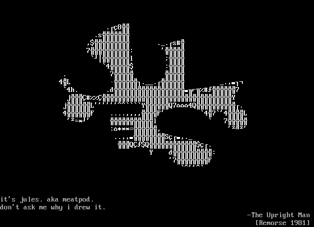
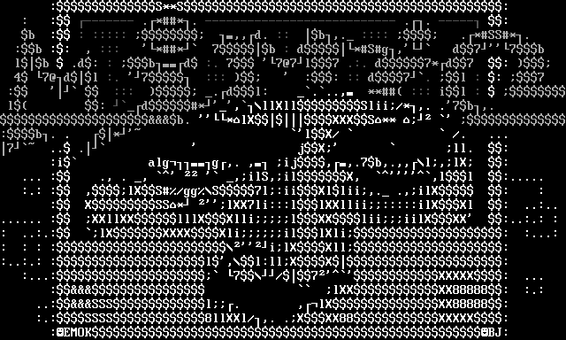
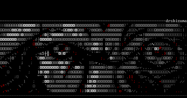
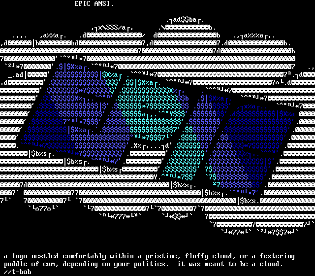
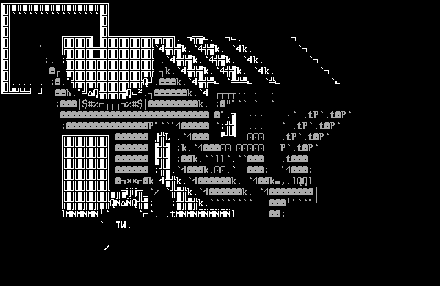
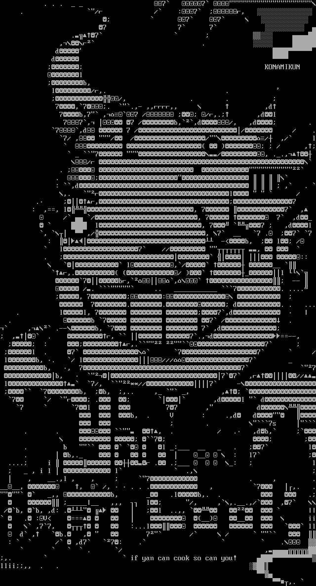
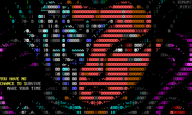
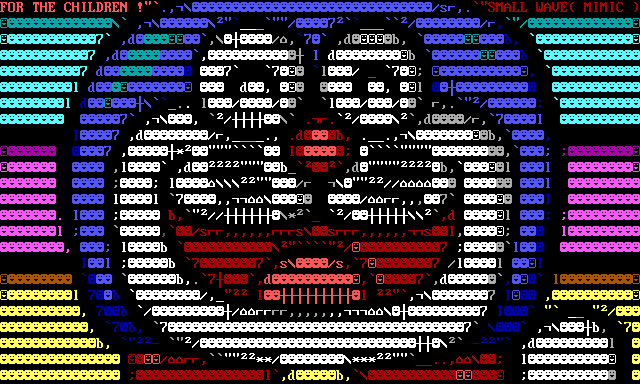
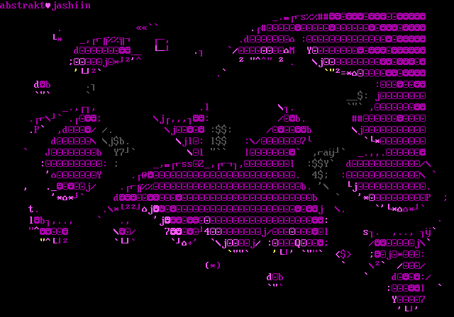
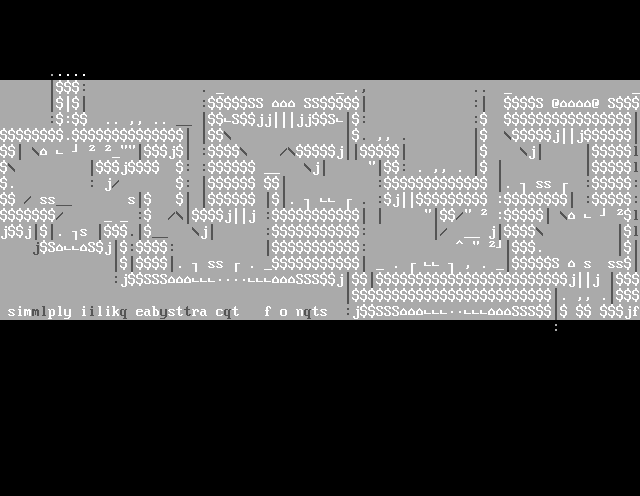
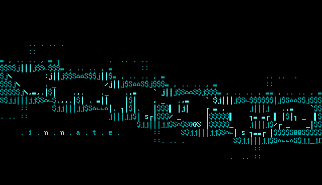
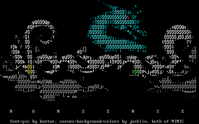
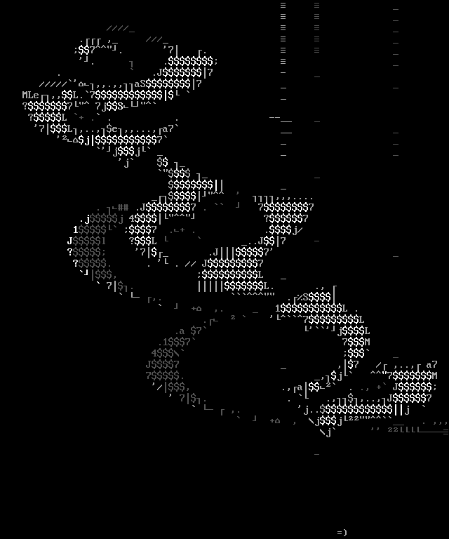
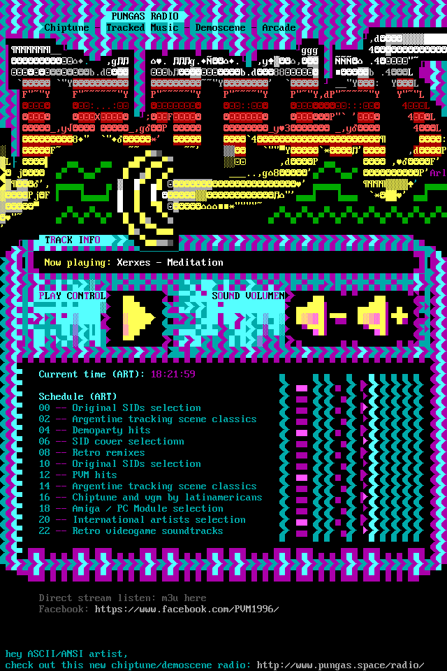
To see how ⌂ was used in PC ASCII art, I wrote a script that scanned the 16colo.rs archive for any artwork containing 0x7F. Here are some of my favourites:
Reader's theories: It represents a tab stop, or a similar part
After I published the article, many people commented that the house reminded them of some physical part of earlier typewriters and word processors.
Dru Nelson suggested it's related to the cursor indicator from the original IBM selectric typewriter.
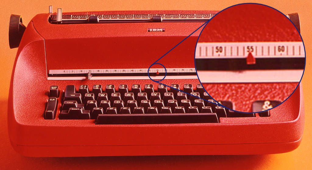
Indeed, it does look like it! But, firstly, if the house glyph was intended to be used as a cursor (shown underneath the character position), then why wasn't it positioned touching the top edge of the character cell? The house character is almost always positioned near the baseline of the character cell instead. Secondly, the character was named "delta" in the System BIOS, so if it was meant to be a cursor, wouldn't they have named it so? Thirdly, the CP437 character set already includes an upwards triangle ▲ and ^, both of which could work as cursor indicators already. Fourthly, IBM PC indicates its cursor position with a blinking underline—the same as Wang terminals—so there was no need for a separate "cursor" symbol anyway.
Robert Kersbergen also suggested to me in an email that the house resembles the "scope" of some typewriters (used to position the typeball or type hammer), but this theory is also on shaky ground for the same reasons as above.
Many people also commented that it looks like a tab or margin stop, but so far I haven't managed to find any pictures of such use before IBM PCs launch in 1981. When I've asked the commenters to provide some sources, or name the devices, they've come empty handed. Maybe people remember them from word processors that came after 1981?
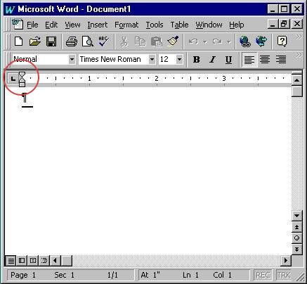
Sure enough, the margin stops in MS Word do resemble the house character quite a bit. But, this is a relatively recent development: the house-resembling-markers were added to Word in 1993 for version 6. Before that, MS Word indicated tab and margin stops with simple triangles, numbers, and square brackets.
What about other word processors? WordPerfect, indicated tab stops with ▲, and WordStar used the exclamation point (!). There is, however, IBM's own DisplayWrite program for DOS, which did use the house symbol to indicate the center line, but it came out in 1984, three years after the launch of IBM PC. It seems unlikely that IBM would have anticipated its use for this minor purpose, especially considering that IBM's earlier computer, the DisplayWriteR from 1980, indicated the center line, not with a house, but with a triangle.
Also, if the house was indeed intended to represent a margin or tab stop, then why didn't they add its glyph to code point 0x09, which is already standardized in ASCII as "horizontal tabulation"? And, ECMA-17 from 1968 already has a standardised graphical representation for horizontal tabs, which is a right arrow. All in all, while people might nowadays associate the house symbol with a tab marker, this association is quite likely based on their memories of MS Word or other modern word processors. There doesn't seem to be any concrete evidence of its use for this purpose before 1981. But I would gladly be proven wrong. If you know something more, send me an email: hlotvonen@gmail.com
Further reading
If you enjoyed this read, you might also want to check out the "main" article which digs deeper into the history of DEL character, and how it was represented and used in the Amiga computers. It's not quite as "juicy" of a story as this one, but interesting nonetheless: The origins of DEL (0x7F) and its Legacy in Amiga ASCII art
Footnotes
Reimer, Jeremy (2005): Total Share: 30 Years of Computer Market Share Figures, Ars Technica. 20.3.2025 ↩︎
Edwards, Benj (2015): Origins of the ASCII Smiley Character: An Email Exchange With Dr. David Bradley (2011), vintagecomputing.com. 19.3.2025 ↩︎
Reunanen, Markku; Heikkinen, Tero; Carlsson, Anders (2019): PETSCII – A Character Set and a Creative Platform ↩︎
R.W. Bemer (1978): Inside ASCII, part 3 of 3 parts. Included in the "Source documents on the history of character codes, 1977-1981", compiled by Eric Fischer, on Internet Archive ↩︎
Computer Timeline: Robert Suding. 5.5.2025 ↩︎
Robert Suding (1976): Build a TV Readout Device for Your Microprocessor. Byte magazine, vol 0, issue 12. ↩︎
Edwards, Benj (2015): Origins of the ASCII Smiley Character: An Email Exchange With Dr. David Bradley (2011), vintagecomputing.com. 19.3.2025 ↩︎
Necasek, Michal (2021): Weird Tales, OS/2 Museum. 19.3.2025 ↩︎
Dreyfuss, Henry (1972): Symbol sourcebook : an authoritative guide to international graphic symbols ↩︎
Blissymbolics Communication Institute (1980): Teaching and Using Blissymbolics ↩︎
Wikipedia article Digital encoding of APL symbols 3.4.2025 ↩︎
Mackenzie, Charles E. (1980): Coded Character Sets, History and Development ↩︎