<?xml version="1.0" encoding="utf-8"?>
<feed xmlns="http://www.w3.org/2005/Atom">
    <title>GlyphDrawing.Club -blog</title>
    <subtitle>Blog dedicated to things about Glyph Drawing Club, modular design, type pictures and textmode art.</subtitle>
    <link href="https://blog.glyphdrawing.club/feed.xml" rel="self" type="application/atom+xml" />
    <link href="https://blog.glyphdrawing.club" rel="alternate" type="text/html"/>
    <author>
        <name>GlyphDrawing.Club -blog</name>
    </author>
    
    <updated>2025-08-27T00:00:00Z</updated>
    
    <id>https://blog.glyphdrawing.club/</id>
        <entry>
            <title>Semi-Justified Text</title>
            <link href="https://blog.glyphdrawing.club/semi-justified-text/"/>
            <updated>2025-08-27T00:00:00Z</updated>
            <id>https://blog.glyphdrawing.club/semi-justified-text/</id>
            <content type="html"><![CDATA[
                <h2>An obscure text justification method</h2>
<p>I thrifted a book <a href="https://ilovetypography.com/2012/05/02/type-matters-book-review/"><em>Type Matters!</em></a> by Jim Williams. It's not a <a href="https://tosche.net/blog/book-review-type-matters">great book</a>, but it had one interesting tidbit in it, describing an obscure text justification setting. It says:</p>
<blockquote>
<p>Range left, range right, centered or justified: there is also a fifth way of setting type within a given measure, called <em>cogent</em>. In the 1980s [...] an advertising agency called Cogent Elliott would send out type mark-ups requesting the type to be set as 'semi-justified', whereby the setting was range left but lines that were close to the measure were pulled out to the full width, to give a more defined edge to the right-hand side.</p>
</blockquote>
<p>I had never heard of &quot;cogent&quot; or &quot;semi-justified&quot; text alignment, and searching for it online brings up almost no relevant results.</p>
<p>I found this idea interesting, so I had to try it out. Here's an interactive demo. Adjust the line width slider to see the effect:</p>
<p><!-- Custom element 'semi-justify' removed for RSS compatibility --></p>
<p>It's a bit jarring at first — probably because this style of justification is so uncommon — but it's surprisingly readable after getting used to it.</p>
<p>Here it is implemented it in my (WIP) stroke font editor:</p>
<figure class="u-image-small">
    <img class="" alt="" loading="lazy" decoding="async" src="https://blog.glyphdrawing.club/assets/R5DmfQRVOL-1000.jpeg" width="1000" height="2117" />
    <figcaption>Excerpt from Robert Bringhurst's <em>The Tree of Meaning</em>. The font looks kinda quirky because I made it as a test in a stroke font editor I'm making, but overall the semi-justified text looks pretty good and readable in my opinion!</figcaption>
</figure>
<h2>How does it work?</h2>
<p><em>Type Matters</em> describes semi-justification as ragged, where lines that are almost to the full width are justified. But then the question is: what does it mean &quot;almost&quot;? How do we decide which lines should be justified?</p>
<p>The basic justification algorithm (called <em>greedy</em>) puts words on a line with normal spaces between them, until the next word doesn't fit in the element's boundaries, and <em>then</em> distributes the remaining space evenly between the inter-word gaps of that line. The left-over word starts a new line, and the process is repeated.</p>
<p>The problem is that if the remaining space is large, it can produce horrible gaps in-between words. This happens usually if the line width is short, or if the text has long words (which languages like Finnish or German have plenty), rendering the text nigh unreadable. This is what we have on the web, and it sucks.</p>
<p>As I was trying to figure out the semi-justification logic, I realized that the problem <em>is</em> actually about word-spaces: what we <em>really</em> want to avoid is holes.</p>
<p>We can do that with <strong>bounding word-spaces</strong>. By bounding word-spaces, we don't need to decide which lines should be justified, because lines automatically self-select: if a line can reach the target width within acceptable spacing bounds, it gets justified, and if not, it stays ragged. This is achieved by restricting how much word-spaces are allowed to expand during space distribution. In addition, we can also allow the word-spaces to <em>shrink</em> for more flexibility. Here's how it works:</p>
<ol>
<li>Puts words on a line one at a time, but with word-spaces shrunk by a <em>minimum word-space</em> value. When a word would exceed the target line width, move it to the next line.</li>
<li>Distribute the remaining space evenly among the word-spaces to reach the target line width. But, if the word-spaces would exceed <em>maximum word-space</em> value to fill the line, leave the line ragged (using normal word-spacing).</li>
<li>Repeat for each line, <em>including</em> the last.</li>
</ol>
<p>That's it.</p>
<p>With moderate min and max word-space values (e.g. -25% and 25% of the normal space), most of the lines get justified, while some lines get ragged. In the &quot;worst case&quot; scenario, if the textbox is narrow, most lines just get ragged, whereas basic greedy justification would produce holes. But, if the textbox is wide enough, the result is a well justified paragraph, with occasional ragged lines. It never produces <em>unacceptable</em> results, but has the potential of producing great results.</p>
<p>Here's a (non-optimised) implementation in JavaScript:</p>
<pre><code>class SemiJustify {
  // measureText should return the pixel width of a text string
  #measure
  constructor(measureText) {
    this.#measure = measureText;
  }

  justify(text, { maxWidth, minSpace, maxSpace, normalSpace }) {
    const words = text.trim().split(/\s+/);
    const lines = this.#breakLines(words, maxWidth, minSpace);

    return lines.map((words, i) =&gt; {
      const canJustify = words.length &gt; 1 &amp;&amp;
        this.#totalWidth(words) + (words.length - 1) * maxSpace &gt;= maxWidth;

      return {
        words,
        spacing: canJustify
          ? this.#calcSpacing(words, maxWidth, minSpace, maxSpace)
          : normalSpace
      };
    });
  }

  #breakLines(words, maxWidth, minSpace) {
    const lines = [];
    let line = [];

    for (const word of words) {
      if (line.length &amp;&amp; !this.#fits(line, word, maxWidth, minSpace)) {
        lines.push(line);
        line = [];
      }
      line.push(word);
    }

    if (line.length) lines.push(line);
    return lines;
  }

  #fits(line, word, maxWidth, minSpace) {
    return this.#totalWidth(line) + this.#measure(word) + line.length * minSpace &lt;= maxWidth;
  }

  #calcSpacing(words, maxWidth, minSpace, maxSpace) {
    const gaps = words.length - 1;
    if (!gaps) return minSpace;

    const spacing = (maxWidth - this.#totalWidth(words)) / gaps;
    return Math.min(Math.max(spacing, minSpace), maxSpace);
  }

  #totalWidth(words) {
    return words.reduce((sum, word) =&gt; sum + this.#measure(word), 0);
  }
}
</code></pre>
<p>and here's a crude example use for canvas:</p>
<pre><code>const canvas = document.getElementById('canvas');
const ctx = canvas.getContext('2d');
ctx.font = '9px Arial';

const measureText = (text) =&gt; ctx.measureText(text).width;
const justifier = new SemiJustify(measureText);

const text = &quot;Justifying text usually means that all lines except (usually) the last are set to equal measure. Text justification is very common in books and other printed matter, and is regarded by many as an essential property of high quality typography. On the web, it's the opposite.&quot;;

const normalSpaceWidth = ctx.measureText(' ').width;
const result = justifier.justify(text, {
    maxWidth: 150,
    minSpace: normalSpaceWidth * 0.75,
    maxSpace: normalSpaceWidth * 1.5,
    normalSpace: normalSpaceWidth
});

// Render each line
let y = 9; // Starting Y position
const lineHeight = 12;
result.forEach(line =&gt; {
    let x = 0; // Starting X position
    line.words.forEach((word, i) =&gt; {
        ctx.fillText(word, x, y); // Draw the word
        x += ctx.measureText(word).width;
        // Add spacing (except after the last word)
        if (i &lt; line.words.length - 1) {
            x += line.spacing;
        }
    });
    y += lineHeight;
});
</code></pre>
<p>The algorithm could be further improved with hyphenation, and even further with bounded glyph scaling and letter spacing adjustments. The SVG web component included above can be found <a href="https://blog.glyphdrawing.club/assets/webcomponents/semi-justify.js">here</a>. I also tested mixing this with hyphenation in this <a href="https://codepen.io/heikkilotvonen/pen/EaVeZBP">codepen demo</a>.</p>
<h2>Fix justification for the web</h2>
<p>The <em>best</em> justification systems are based on the <a href="https://en.wikipedia.org/wiki/Knuth%E2%80%93Plass_line-breaking_algorithm">Knuth–Plass line-breaking algorithm</a>. It's what professional typesetting programs use. But it's also really complex, and requires a lot of tricky optimisations to be fast and reliable. That, and the fact that Knuth-Plass requires knowing the contents of the text upfront to make its calculations, is the reason the web (for example) only implements a simple greedy algorithm for text justification.</p>
<p>But anyone who has ever set type with <code>text-align:justify;</code> knows that the greedy justification can produce horrible holes if the line width is short or if the text has long words, rendering the text unreadable. As a consequence, the <em>one</em> rule for web typography has been to <em>not</em> justify text under any circumstances.</p>
<div class="u-medium-width" style="font-size:16px;line-height:1.2;width:min(180px, 50%);text-align:justify; color:var(--color-7); border: 1px solid var(--color-2);resize: horizontal;overflow:hidden;">
    Justifying text usually means that all lines except (usually) the last are set to equal measure. Text justification is very common in books and other printed matter, and is regarded by many as an essential property of high quality typography. On the web, it's the opposite.
</div>
<p>We can't have Knuth-Plass on the web — sad, but understandable. The proposed <a href="https://webkit.org/blog/16547/better-typography-with-text-wrap-pretty/"><code>text-wrap:pretty;</code></a> might bring it, or something like it, to web at some point, but the current implementations found in Safari and Chrome don't fix the issues with justification.</p>
<p>So, <code>text-align:left;</code> (or right) remains the only viable text alignment option for the web.</p>
<p>In my opinion, the semi-justified system could offer a real alternative. As I see it, it has no downsides:</p>
<ol>
<li>
<p>It has essentially the same computational cost as regular greedy justification since it's still, in essence, a greedy algorithm.</p>
</li>
<li>
<p>It's simple to implement.</p>
</li>
<li>
<p>It's a progressive enhancement. My proposed syntax would be to use the already existing <a href="https://developer.mozilla.org/en-US/docs/Web/CSS/Reference/Properties/word-spacing">word-spacing</a> property to accept a clamp function:</p>
<pre><code> p {
   text-align: justify;
   word-spacing: clamp(-25%, 0%, 25%);
 }
</code></pre>
</li>
<li>
<p>It's inherently responsive. The most common use case is clear: as the containing box resizes, the text inside gets automatically justified on desktop (wide screen), and ragged on mobile (narrow screen).</p>
</li>
</ol>
<h2>Related examples</h2>
<p>In a <a href="https://www.briarpress.org/20536">briarpress</a> discussion the same method is called &quot;half justification&quot;:</p>
<blockquote>
<p>I have a design book somewhere I believed mentioned a technique for justifying type that was called something like half justification. [...] The idea was that if the length of the text was within some predetermined distance of the maximum possible width the line would be justified. If it fell short of that it would remain ragged right.</p>
</blockquote>
<figure class="u-image-full-width">
    <img class="" alt="" loading="lazy" decoding="async" src="https://blog.glyphdrawing.club/assets/Ory60cTvWq-730.png" width="730" height="357" />
    <figcaption>Semi-justified and ragged comparison. Images from the briarpress discussion.</figcaption>
</figure>
<p><a href="https://typo.social/@jo/115105914791813359">Johannes Lang</a> pointed out that Fraser Muggeridge gave a talk recently about this exact method: <a href="https://vimeo.com/1059643515"><em>Justified and unjustified setting (at the same time)</em></a>! The talk includes many examples, it's worth a watch.</p>
<p><a href="https://typo.social/@kst@post.lurk.org/115407852588945613">kst</a> pointed me to Johannes Ammon's talk/article <a href="https://finaltype.de/en/topics/better-justification-for-the-web">Better Justification for the Web</a>, in which he gives a great overview and history of the problem, and suggests using variable fonts for additional parameters for better justification (he calls his method &quot;soft justification&quot;, here's a <a href="https://ammonj.github.io/better-justification-demo/">demo</a>). The &quot;further reading&quot; section also has some great resources, like Bram Stein's <a href="https://github.com/bramstein/typeset/">TeX line breaking algorithm in JavaScript</a> and Simon Cozens' <a href="https://github.com/simoncozens/newbreak">line breaking algo for variable fonts</a> for which there's also a <a href="https://simoncozens.github.io/newbreak/">demo</a>.</p>
<h4>End note</h4>
<p>If you found this idea interesting and want to discuss it, or if you know of any examples of this method used, please contact me at <a href="mailto:hlotvonen@gmail.com">hlotvonen@gmail.com</a> or post a comment on <a href="https://typo.social/@gdc/115105847736031051">mastodon</a>.</p>

            ]]></content>
        </entry>
        <entry>
            <title>MoebiusXBIN ASCII &amp; text-mode Art editor with Custom font support!</title>
            <link href="https://blog.glyphdrawing.club/moebiusxbin-ascii-and-text-mode-art-editor-with-custom-font-support/"/>
            <updated>2025-07-30T00:00:00Z</updated>
            <id>https://blog.glyphdrawing.club/moebiusxbin-ascii-and-text-mode-art-editor-with-custom-font-support/</id>
            <content type="html"><![CDATA[
                <div class="note">
<p>UPDATE Summer 2025: I've released a <a href="https://github.com/hlotvonen/moebiusXBIN">new version</a> of Moebius XBIN! This guide is completely rewritten for it.</p>
</div>
<h2>MoebiusXBIN</h2>
<p>MoebiusXBIN is an ASCII &amp; text-mode art editor for MacOS, Linux and Windows, with support for custom fonts and colors.</p>
<figure class="u-image-medium">
    <img class="crisp" alt="" loading="lazy" decoding="async" src="https://blog.glyphdrawing.club/assets/cLXvmOb_g6-2018.png" width="2018" height="1326" />
    <figcaption></figcaption>
</figure>
<h2>Download</h2>
<p>To download, click the link below and choose the package suitable for your OS.</p>
<p><a href="https://github.com/hlotvonen/moebiusXBIN/releases/">Download the latest packages from Github</a></p>
<p>If you have suggestions or find any bugs let me know! You can email me at <a href="mailto:hlotvonen@gmail.com">hlotvonen@gmail.com</a> or make an issue at the Github page.</p>
<h2>Introduction</h2>
<p>Traditionally ASCII art<sup class="footnote-ref"><a href="https://blog.glyphdrawing.club/moebiusxbin-ascii-and-text-mode-art-editor-with-custom-font-support/#fn1" id="fnref1">[1]</a></sup> is made in <em>plain text</em>, and displayed in text-mode using character sets stored in the ROM of computer graphics adapters. This has carried on to modern text-mode art editors, which are designed to produce files compatible with real retro hardware, even if they're rarely viewed with them.</p>
<p>The editor for making PC-ASCII, ANSI art<sup class="footnote-ref"><a href="https://blog.glyphdrawing.club/moebiusxbin-ascii-and-text-mode-art-editor-with-custom-font-support/#fn2" id="fnref2">[2]</a></sup>, and <a href="https://blog.glyphdrawing.club/amiga-ascii-art/">Amiga ASCII art</a> is nowadays <a href="https://github.com/cwensley/pablodraw">PabloDraw</a>, and more recently <a href="https://github.com/blocktronics/moebius">Moebius</a>. Those editors come with a few standard IBM PC and Amiga fonts, but which font is used to <em>view</em> them is wholly dependent on the viewer's system. There is no way to specify which font should be used to view the artwork (other than maybe writing something like &quot;please view with font X&quot; at the top of the artwork).</p>
<figure class="u-image-full-width">
    <img class="crisp" alt="" loading="lazy" decoding="async" src="https://blog.glyphdrawing.club/assets/HN7duq-EuK-592.png" width="592" height="640" />
    <figcaption></figcaption>
</figure>
<p>But as someone with no strong nostalgic relationship to retro computers, the magic of ASCII art is not necessarily in the aesthetic produced by these two fonts, but in the act of creating it: to me ASCII art is about trying to uncover the latent visual potentials of a small set of letterforms, by weaving them into imagery idiosyncratic to their textu(r)al properties.</p>
<p>The latent potential of both <a href="https://www.asciiarena.se/">Amiga ASCII art</a> and <a href="https://blog.glyphdrawing.club/moebiusxbin-ascii-and-text-mode-art-editor-with-custom-font-support/(https://16colo.rs/)">PC ASCII &amp; ANSI art</a> art is pretty well explored over the past 30–40 years, which made me think: <em>what if you could change the font?</em> What kind of possibilities would other character sets unlock? What is possible with ASCII art if you could change the look of the characters?</p>
<p>These same question were also asked back in the heydays of ASCII art, and in 1996 the art group ACiD created the <a href="http://www.acid.org/images/0896/XBIN.TXT">XBIN</a> (eXtended BINary) file format to overcome the limits of plain text ASCII and ANSI files. Instead of saving the ASCII art files as text, XBIN saves them as a raw image of the video memory, <em>and</em> also includes the font and color palette data. With XBIN, artists can make text-mode graphics with customized fonts and color palettes.</p>
<p>XBIN was released &quot;ready to take the Art scene by storm&quot;, but it never gained any widespread adoption or support. However, both PabloDraw and Moebius <em>do</em> support (to some extent) viewing and saving XBIN files. The problem? You can't change the font!</p>
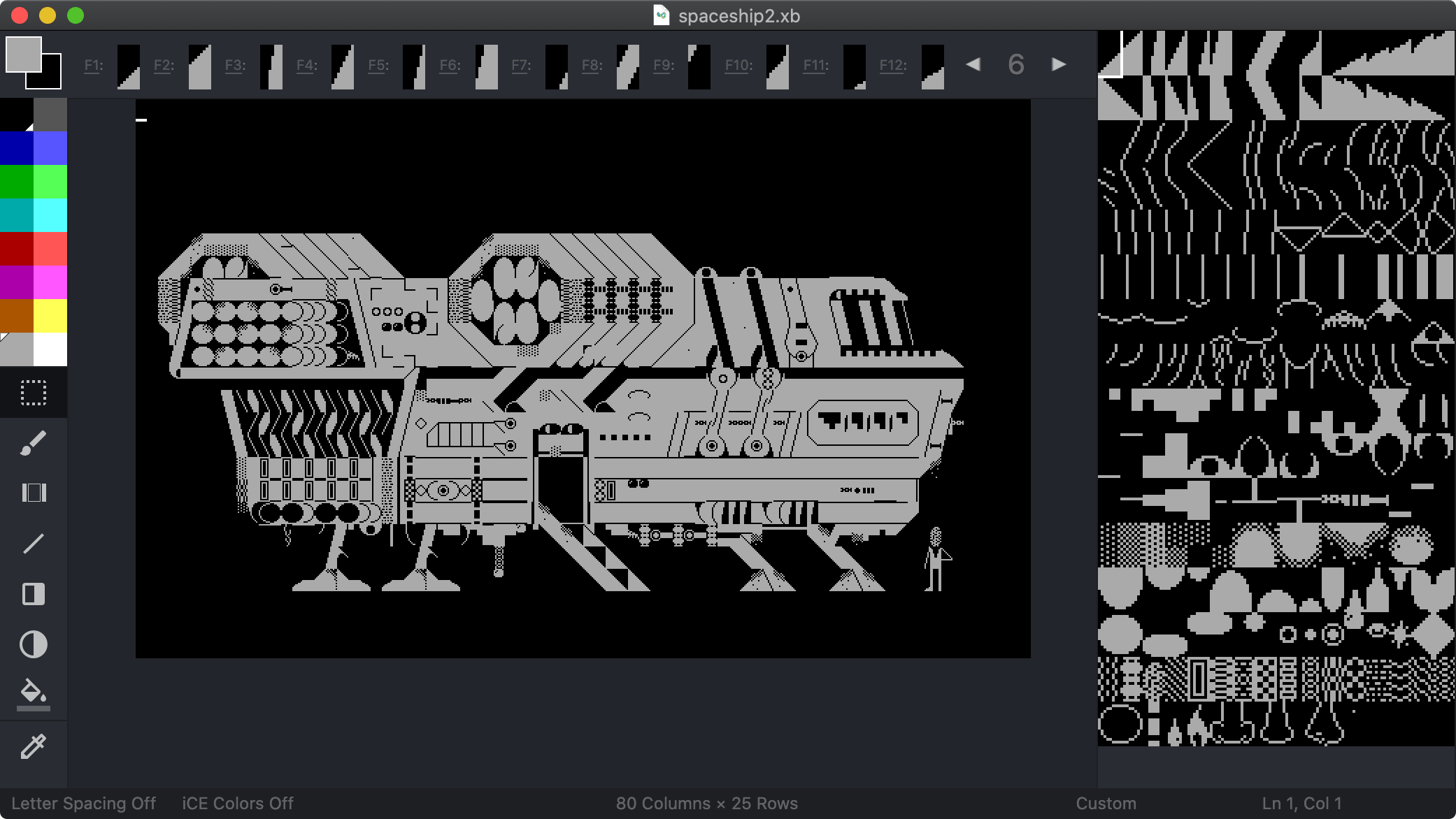
<p>But Moebius, made by Andy Herbert in 2019, is <a href="https://github.com/blocktronics/moebius">open source</a>. So, in 2020 I forked it into <strong>MoebiusXBIN</strong> with the intention of adding a full support for the XBIN format and the ability to change the font. That was in 2020, and at the time of writing (2025), the editor has received multiple additional features, and has been used to explore the potentials of custom fonts by <a href="https://16colo.rs/tags/content/xbin">many</a> <a href="https://16colo.rs/tags/content/custom%20font">artists</a>.</p>
<figure class="u-image-full-width">
    <img class="crisp" alt="User interface of MoebiusXBIN, monochrome ASCII drawing of a spaceship." loading="lazy" decoding="async" src="https://blog.glyphdrawing.club/assets/eBocvryUQi-2082.png" width="2082" height="1172" />
    <figcaption>Spaceship drawn using TES-SYMB5 custom font in MoebiusXBIN.</figcaption>
</figure>
<h2>Features in MoebiusXBIN</h2>
<p>Quick summary of features:</p>
<ol>
<li><strong>Custom fonts</strong>. Choose and favorite from almost 2400 different fonts using the dedicated Font browser. Import and export fonts as PNG files.</li>
<li><strong>Custom colors</strong>. Choose from around 200 hand-made color palettes made by the <a href="https://lospec.com/">Lospec</a> community. Use the dedicated Palette browser to choose and favorite them.</li>
<li><strong>Multi-lingual ASCII art</strong>. Support for hundreds of encodings to match your input source and chosen font. Support for right-to-left and top-to-bottom writing directions. Basic Arabic text shaper for the CP864 encoding.</li>
<li><strong>Beginner-friendly tutorial</strong>. The step-by-step MoebiusXBIN tutorial will teach you the workflow, shortcuts and features of the editor. <details>
     <summary>
     ▶ (Click to open) View the tutorial as an image
     </summary>
     <figure class="u-image-full-width">
         <img class="" alt="" loading="lazy" decoding="async" src="https://blog.glyphdrawing.club/assets/i770qZdW1g-640.png" width="640" height="9248" />
         <figcaption></figcaption>
     </figure>
 </details>
</li>
<li>...and so much more! Check the full list on the <a href="https://github.com/hlotvonen/moebiusXBIN">Github page</a></li>
</ol>
<h3>How to use custom fonts</h3>
<p>The main feature of MoebiusXBIN is using custom fonts. MoebiusXBIN comes with all the classic fonts, but also includes a few special text-mode art fonts, the complete list of VGA fonts compiled by VileR and hundreds of fonts found from various Amiga discs.</p>
<p>However, the easiest way to use or make your own font is finding a font you like using the Font browser (<em>Font -&gt; Font browser</em>), exporting it as a PNG (<em>Font -&gt; Export Font as PNG</em>), modifying it in a pixel art editor, and then importing it again (<em>Font -&gt; Import Font from Image (GIF/PNG)</em>).</p>
<p>I can also recommend making custom fonts with VileR's amazing VGA font editor <a href="https://int10h.org/blog/2019/05/fontraption-vga-text-mode-font-editor/">Fontraption</a>. Watch a video tutorial for it on <a href="https://www.youtube.com/watch?v=aEGT7A5RVRU">Youtube</a>.</p>
<h2>Examples</h2>
<figure class="u-image-medium">
    <img class="crisp" alt="" loading="lazy" decoding="async" src="https://blog.glyphdrawing.club/assets/vs2m5JjCbM-2752.png" width="2752" height="672" />
    <figcaption>
        By <a href="https://16colo.rs/pack/impure86/xz-dvinestylers3.xb">Hellbeard</a>
    </figcaption>
</figure>
<figure class="u-image-medium">
    <img class="crisp" alt="" loading="lazy" decoding="async" src="https://blog.glyphdrawing.club/assets/fzPj6SyHw6-2240.png" width="2240" height="1632" />
    <figcaption>
        By <a href="https://16colo.rs/pack/impure84/xz-belindra12.xb">Hellbeard</a>
    </figcaption>
</figure>
<figure class="u-image-full-width">
    <img class="crisp" alt="" loading="lazy" decoding="async" src="https://blog.glyphdrawing.club/assets/TcygSu3bFq-2720.png" width="2720" height="1824" />
    <figcaption>
        By <a href="https://16colo.rs/pack/impure88/xz-neuromancer.xb">Hellbeard</a>
    </figcaption>
</figure>
<figure class="u-image-medium">
    <img class="crisp" alt="" loading="lazy" decoding="async" src="https://blog.glyphdrawing.club/assets/JzRwD2R7Gq-3056.png" width="3056" height="1856" />
    <figcaption>
        By <a href="https://16colo.rs/pack/impure87/xz-devotion.xb">Hellbeard</a>
    </figcaption>
</figure>
<figure class="u-image-small">
    <img class="crisp" alt="" loading="lazy" decoding="async" src="https://blog.glyphdrawing.club/assets/BzZ_j0Tk5h-1280.png" width="1280" height="832" />
    <figcaption>
        By <a href="https://16colo.rs/pack/newschool-01/tkb-heated.xb">tkb</a>
    </figcaption>
</figure>
<figure class="u-image-small">
    <img class="crisp" alt="" loading="lazy" decoding="async" src="https://blog.glyphdrawing.club/assets/_iMgP9d0TN-1280.png" width="1280" height="800" />
    <figcaption>
        By <a href="https://16colo.rs/pack/newschool-01/ntby-bwoi-esc08.xb">ntby bwoi</a>
    </figcaption>
</figure>
<figure class="u-image-small">
    <img class="crisp" alt="" loading="lazy" decoding="async" src="https://blog.glyphdrawing.club/assets/Mw5gegBKl5-1280.png" width="1280" height="800" />
    <figcaption>
        By <a href="https://16colo.rs/pack/newschool-01/ntby-bwoi-esc02.xb">ntby bwoi</a>
    </figcaption>
</figure>
<figure class="u-image-small">
    <img class="crisp" alt="" loading="lazy" decoding="async" src="https://blog.glyphdrawing.club/assets/AW8I3naaxp-1280.png" width="1280" height="800" />
    <figcaption>
        By <a href="https://16colo.rs/pack/newschool-01/ntby-bwoi-esc05.xb">ntby bwoi</a>
    </figcaption>
</figure>
<figure class="u-image-small">
    <img class="crisp" alt="" loading="lazy" decoding="async" src="https://blog.glyphdrawing.club/assets/PrMJ7UaLsW-1280.png" width="1280" height="800" />
    <figcaption>
        By <a href="https://16colo.rs/pack/newschool-01/kp-ctrl.xb">kp</a>
    </figcaption>
</figure>
<figure class="u-image-full-width">
    <img class="crisp" alt="" loading="lazy" decoding="async" src="https://blog.glyphdrawing.club/assets/sERqKCk50f-1280.png" width="1280" height="816" />
    <figcaption>
        By <a href="https://16colo.rs/pack/impure83/lmn-meanwhile.xb">lmn</a>
    </figcaption>
</figure>
<figure class="u-image-full-width">
    <img class="crisp" alt="Shattered logo of the text 'Core' filled with purple to light blue to pink gradient." loading="lazy" decoding="async" src="https://blog.glyphdrawing.club/assets/txhTJdld5D-640.png" width="640" height="410" />
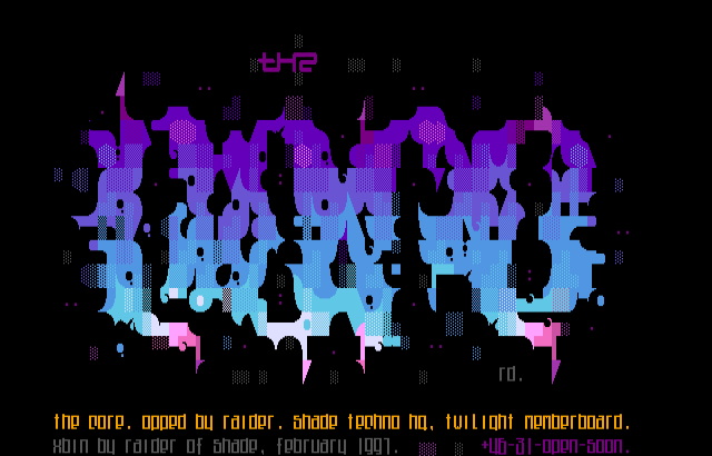
    <figcaption>ANSI with modified font: The Core by Raider (Shade) https://16colo.rs/pack/shade5/RD-CORE1.XB</figcaption>
</figure>
<figure class="u-image-full-width">
    <img class="crisp" alt="Monochrome ASCII drawing of a house" loading="lazy" decoding="async" src="https://blog.glyphdrawing.club/assets/8Zq0ExThpr-640.png" width="640" height="400" />
    <figcaption>House drawn with TES-SYMB5 font</figcaption>
</figure>
<figure class="u-image-full-width">
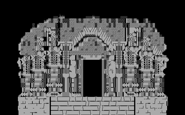
    <img class="crisp" alt="ASCII drawing of a temple" loading="lazy" decoding="async" src="https://blog.glyphdrawing.club/assets/P3SUhwDEfF-640.png" width="640" height="400" />
    <figcaption>Temple at Lonar Lake drawn with TES-SYMB5 font</figcaption>
</figure>
<figure class="u-image-full-width">
    <img class="crisp" alt="ASCII art animation of a fox jumping into snow" loading="lazy" decoding="async" src="https://blog.glyphdrawing.club/assets/yH71cpwsDf-640.gif" width="640" height="640" />
    <figcaption>ASCII animation created by the students at KADK VisCom. Each frame is drawn by a different student using the TES-SYMB5 font</figcaption>
</figure>
<figure class="u-image-small">
    <img class="crisp" alt="" loading="lazy" decoding="async" src="https://blog.glyphdrawing.club/assets/cFhH9y86qF-1280.png" width="1280" height="800" />
    <figcaption>
      By [grx](https://16colo.rs/pack/impure80/grx-isleofman.xb)
    </figcaption>
</figure>
<figure class="u-image-small">
    <img class="crisp" alt="" loading="lazy" decoding="async" src="https://blog.glyphdrawing.club/assets/x9dacG75Ph-1280.png" width="1280" height="2560" />
    <figcaption>
        By <a href="https://16colo.rs/pack/impure80/grx-topazcp437.xb">grx</a>
    </figcaption>
</figure>
<figure class="u-image-small">
    <img class="crisp" alt="" loading="lazy" decoding="async" src="https://blog.glyphdrawing.club/assets/B99bQ1bnAs-1280.png" width="1280" height="800" />
    <figcaption>
        By <a href="https://16colo.rs/pack/impure80/grx-touchofgod.xb">grx</a>
    </figcaption>
</figure>
<figure class="u-image-small">
    <img class="crisp" alt="" loading="lazy" decoding="async" src="https://blog.glyphdrawing.club/assets/yTHssWgwK5-800.png" width="800" height="800" />
    <figcaption>
        By <a href="https://16colo.rs/pack/impure80/grx-suitman.xb">grx</a>
    </figcaption>
</figure>
<figure class="u-image-full-width">
    <img class="crisp" alt="Light blue logotype 'angelgirl' with small wings on the sides" loading="lazy" decoding="async" src="https://blog.glyphdrawing.club/assets/_Ki0WtQKc6-480.png" width="480" height="480" />
    <figcaption>Drawn with TES-GIGR font</figcaption>
</figure>
<figure class="u-image-full-width">
    <img class="crisp" alt="Moltres pokemon spreading its wings and looking menacing." loading="lazy" decoding="async" src="https://blog.glyphdrawing.club/assets/xbSbyS7fnp-320.png" width="320" height="320" />
    <figcaption>Moltres drawn with 8x8px font CHUNKY by Batfeula (https://batfeula.itch.io/chunky) and custom colors</figcaption>
</figure>
<figure class="u-image-full-width">
    <img class="crisp" alt="ASCII drawing of Magmar pokemon" loading="lazy" decoding="async" src="https://blog.glyphdrawing.club/assets/8t5oDXtDQv-416.png" width="416" height="416" />
    <figcaption>Magmar drawn with TES-SYMB5 font and custom colors</figcaption>
</figure>
<figure class="u-image-full-width">
    <img class="crisp" alt="ASCII drawing of Ponyta pokemon" loading="lazy" decoding="async" src="https://blog.glyphdrawing.club/assets/_uYKqnWYBU-416.png" width="416" height="416" />
    <figcaption>Ponyta drawn with TES-SYMB5 font and custom colors</figcaption>
</figure>
<h2>Acknowledgements &amp; Thanks</h2>
<p>• All credits go to Andy Herbert who made the original Moebius.<br />
• Huge thanks for major contributions to grymmjack (who maintains <a href="https://github.com/grymmjack/moebius">his own fork</a> of my fork, but I have now merged it), jejacks0n, michael-lazar and bart-d.<br />
• Uses modified Google's Material Icons. <a href="https://material.io/icons/">https://material.io/icons/</a></p>
<h4>Included fonts:</h4>
<p>• GJSCI-3, GJSCI-4 and GJSCI-X appears courtesy of <a href="https://www.youtube.com/channel/UCrp_r9aomBi4mryxSxLq24Q">GrymmJack</a><br />
• <a href="https://polyducks.itch.io/frogblock">FROGBLOCK</a> appears courtesy of <a href="http://polyducks.co.uk/">PolyDucks</a><br />
• Newschool fonts collected and modified from the <a href="https://16colo.rs/pack/newschool-01">NewSchool pack</a>, courtesy of XBIN workshop participants at the Estonian Academy of Arts in 2021.<br />
• structures font by <a href="https://gladyscamilo.com/">Gladys Camilo</a><br />
• TES-* fonts by me.<br />
• Topaz originally appeared in Amiga Workbench, courtesy of Commodore Int.<br />
• Topaz Kickstart versions uncovered by <a href="https://heckmeck.de/blog/amiga-topaz-1.4/">heckmeck</a>, courtesy of Commodore Int.<br />
• P0t-NOoDLE appears courtesy of Leo 'Nudel' Davidson<br />
• mO'sOul appears courtesy of Desoto/Mo'Soul<br />
• <a href="https://github.com/viler-int10h/vga-text-mode-fonts">Viler's VGA font collection</a>, with additional info on sources in the <a href="https://github.com/viler-int10h/vga-text-mode-fonts/blob/master/FONTS.TXT">FONTS.TXT</a><br />
• Discmaster fonts collected from <a href="https://discmaster.textfiles.com/search?family=font&amp;format=amigaBitmapFont&amp;widthMin=312&amp;heightMin=76&amp;widthMax=312&amp;heightMax=85&amp;limit=500&amp;showItemName=showItemName">discmaster.textfiles.com</a></p>
<hr /><h2>Footnotes</h2>
<section class="footnotes">
<ol class="footnotes-list">
<li id="fn1" class="footnote-item"><p>To purists &quot;ASCII art&quot; refers to art made with the 128 ASCII characters, but it has become a catch-all term for any text-based computer art, and that's how I use it. <a href="https://blog.glyphdrawing.club/moebiusxbin-ascii-and-text-mode-art-editor-with-custom-font-support/#fnref1" class="footnote-backref">↩︎</a></p>
</li>
<li id="fn2" class="footnote-item"><p>While ANSI codes are not unique to IBM PC, &quot;ANSI art&quot; usually refers to this specific style popular on bulletin board systems (BBS's) in the 80s and 90s. <a href="https://blog.glyphdrawing.club/moebiusxbin-ascii-and-text-mode-art-editor-with-custom-font-support/#fnref2" class="footnote-backref">↩︎</a></p>
</li>
</ol>
</section>

            ]]></content>
        </entry>
        <entry>
            <title>Why is there a &quot;small house&quot; in IBM&#39;s Code page 437?</title>
            <link href="https://blog.glyphdrawing.club/why-is-there-a-small-house-in-ibm-s-code-page-437/"/>
            <updated>2025-01-06T00:00:00Z</updated>
            <id>https://blog.glyphdrawing.club/why-is-there-a-small-house-in-ibm-s-code-page-437/</id>
            <content type="html"><![CDATA[
                <div class="note">
<h4>Note:</h4>
<p>This post is a companion piece to my article <a href="https://blog.glyphdrawing.club/the-origins-of-del-0x7f-and-its-legacy-in-amiga-ascii-art/">The origins of DEL (0x7F) and its Legacy in Amiga ASCII art</a>. That article is all about the character DEL, what it is, how it was used, and why it even has a visual representation, but with a focus on Commodore's Amiga computers. Whereas AmigaOS's Topaz font renders DEL with diagonal lines, IBM's PC renders it... as a house. This bonus article is about that.</p>
<p>This article wouldn't have happened without the great help and insights of <a href="https://mw.rat.bz/">Michael Walden</a> and <a href="https://int10h.org/blog/">VileR</a>, thank you!</p>
<p>If you want to comment on something (minor or major), please send me an email at <strong><a href="mailto:hlotvonen@gmail.com">hlotvonen@gmail.com</a></strong>. I would greatly appreciate it, and if something needs fixing I would gladly update the article with proper credit.</p>
</div>
<hr />
<div class="initial">
<h1>a-b-c-d-x-y-z...HOUSE?</h1>
<p>There's a small house ( <span class="ibmpcbios-inline">⌂</span> ) in the middle of IBM's infamous character set Code Page 437. <strong>&quot;Small house&quot;</strong>—that's the official IBM name given to the glyph at code position 0x7F, where a control character for &quot;Delete&quot; (DEL) should logically exist. It's cute, but a little strange. I wonder, how did it get there? Why did IBM represent DEL as a <em>house</em>, of all things?</p>
</div>
<figure class="u-image-full-width">
    <img class="crisp" alt="Code Page 437 table, highlighting the character 'small house' at 0x7F" loading="lazy" decoding="async" src="https://blog.glyphdrawing.club/assets/WtGwIoZIJW-512.png" width="512" height="640" />
    <figcaption>IBM PC's Code Page 437 (VGA)</figcaption>
</figure>
<h2>The rise of Code Page 437</h2>
<p>Released in 1981, the <em>IBM Personal Computer</em> (PC) launched IBM's first microcomputer model line. Alongside it, they introduced an 8-bit character set, which later became known as <em>Code Page 437</em> (CP437). Unlike earlier IBM machines, the PC was built using off-the-shelf components instead of proprietary IBM technology. This spawned a wave of third-party clones marketed as &quot;IBM-compatible&quot; systems, which lead to IBM PC architecture quickly becoming the dominant global computing standard. By the end of the 1980s, 84% of all sold microcomputers were either IBM PC's or its clones.<sup class="footnote-ref"><a href="https://blog.glyphdrawing.club/why-is-there-a-small-house-in-ibm-s-code-page-437/#fn1" id="fnref1">[1]</a></sup></p>
<p>The rise of PC also meant the widespread adoption of CP437, making it one of the most copied and recognizable character sets ever. VileR's <a href="https://int10h.org/oldschool-pc-fonts/">Ultimate Oldschool PC Font Pack</a> lists over 200 fonts based on CP437 from various IBM PC models and their clones.</p>
<p>CP437 was based on <em>American Standard Code for Information Interchange</em> (ASCII), which defines the first 127 characters. This was a big change for IBM who had previously used the fundamentally different EBCDIC standard. But as ASCII covers only 96 <em>printable</em> characters of the total 256 available in 8-bit code, IBM had to figure out what to do with the rest of them. Instead of basing their choices on any predefined standards extending ASCII, or copying others, they decided (yet again) to do their own thing.</p>
<h2>A set of &quot;not serious&quot; characters</h2>
<p>The extended bits (characters 128–255) of CP437 contain mainly a mishmash of international text characters, box drawing shapes and mathematical symbols. But for the undefined control characters they did something wildly different. Dr. David J. Bradley, one of the creators of the IBM PC, recounts the <a href="https://www.vintagecomputing.com/index.php/archives/790/the-ibm-smiley-character-turns-30"><em>origins of the ASCII smiley character</em></a> in an email conversation with Benj Edwards of <a href="http://vintagecomputing.com/">vintagecomputing.com</a>:</p>
<blockquote>
<p>&quot;Now, what to do about the first 32 characters (x00-x1F)? ASCII defines them as control codes, carriage return, line feed, tab… These characters originated with teletype transmission. But we could display them on the character based screens. So we added a set of “not serious” characters. They were intended as display only characters, not for transmission or storage. Their most probable use would be in [text] character based games.&quot;<sup class="footnote-ref"><a href="https://blog.glyphdrawing.club/why-is-there-a-small-house-in-ibm-s-code-page-437/#fn2" id="fnref2">[2]</a></sup></p>
</blockquote>
<p>The first 32 characters (x00-x1F) of CP437 mentioned by Bradley include smileys, playing card suits, musical notes, a solar symbol, gender symbols and arrows. What Bradley doesn't explicitly mention is the character at 0x7F, which is also a (sort-of) control character used in teletype transmission. It's assigned to the Delete character, which was used to obliterate undesirable characters on paper tape by punching it full of holes. The all-holes pattern in ASCII is at the 127th code point, represented by 0x7F in hexadecimal. This character is like all the other 32 control characters in that it doesn't have a defined visual representation, nor any particular use in digital computers like the IBM PC. So, even though Bradley doesn't explicitly mention 0x7F, it's represented in CP437 as a tiny pixel-house (<span class="ibmpcbios-inline">⌂</span>), suggesting it might also belong to the &quot;not serious&quot; group of characters.</p>
<figure class="u-image-full-width">
    <img class="crisp" alt="Code Page 437 table, highlighting the 'not serious' characters" loading="lazy" decoding="async" src="https://blog.glyphdrawing.club/assets/td-XacaseR-304.png" width="304" height="568" />
    <figcaption>The "not serious" characters</figcaption>
</figure>
<p>According to Bradley, the &quot;not serious&quot; characters were developed during a 4-hour plane travel. He's of course exaggerating, but gave it as an &quot;indication of the rapidity in which many significant decisions were undertaken&quot;. But even though they developed them relatively quickly, they must have based them on <em>something</em>.</p>
<p>What is this something? IBM could have followed an existing standard and taken the graphics for control characters from ANSI X3.32-1973—but they are ambiguous and hard-to-use (see part 2 of <a href="https://blog.glyphdrawing.club/the-origins-of-del-0x7f-and-its-legacy-in-amiga-ascii-art/#part-2">The origins of DEL (0x7F) and its Legacy in Amiga ASCII art</a>). Instead, going with these &quot;not serious&quot; characters was arguably a better choice, especially as a business decision. Characters like the smiley face at 0x01 became iconic, precisely because they offered a simple way to represent player characters in text-based games like <a href="https://en.wikipedia.org/wiki/Rogue_(video_game)">Rogue</a> and <a href="https://en.wikipedia.org/wiki/ZZT">ZZT</a>.</p>
<p>IBM was by no means the first to include &quot;not serious&quot; characters. For example, Commodore's PETSCII character set from 1977 is known for its graphical shapes which also include card suites.<sup class="footnote-ref"><a href="https://blog.glyphdrawing.club/why-is-there-a-small-house-in-ibm-s-code-page-437/#fn3" id="fnref3">[3]</a></sup></p>
<figure class="u-image-full-width">
    <img class="crisp" alt="" loading="lazy" decoding="async" src="https://blog.glyphdrawing.club/assets/P91gLYO8_N-259.png" width="259" height="293" />
    <figcaption>PETSCII (manually ordered)</figcaption>
</figure>
<p>Even the American National Standards Institute's (ANSI) X3.2 committee considered including some &quot;not serious&quot; symbols for an official 8-bit ASCII extension.</p>
<figure class="u-image-full-width">
    <img class="crisp" alt="" loading="lazy" decoding="async" src="https://blog.glyphdrawing.club/assets/IKput0bqT4-800.png" width="800" height="715" />
    <figcaption>Proposal for an 8-bit extension for ASCII. It didn't get standardized. The closest to an "official" 8-bit extension to ASCII is ISO 8859-1 (also called ISO Latin-1), which extended support for additional Latin based languages, standardized by the International Organization for Standardization (ISO) in 1987.</figcaption>
</figure>
<p>But, why add these quirky characters, when arguably more useful characters, like extending support for additional languages or writing systems, could be added? Bob Bemer (&quot;The Father of ASCII&quot;) defends their inclusion in an article for the <em>Interface Age</em> in July 1978:</p>
<blockquote>
<p>&quot;Presumably the card suits will strike your eye, and you will wonder why so many other useful symbols were ignored in favor of these. Don't worry, they will always come in handy; it's sometimes useful to have symbols whose meaning you can reassign without harm to programming languages, etc.&quot;<sup class="footnote-ref"><a href="https://blog.glyphdrawing.club/why-is-there-a-small-house-in-ibm-s-code-page-437/#fn4" id="fnref4">[4]</a></sup></p>
</blockquote>
<p>This is definitely the case with Code Page 437's house symbol (<span class="ibmpcbios-inline">⌂</span>). It is ambiguous enough that it can resemble many different things, not just a house. For example, in the DOS games <a href="https://www.mobygames.com/game/16049/by-fire-sword/"><em>By Fire &amp; Sword</em></a> (1985) it's a <strong>town</strong>, in <a href="https://cheerfulghost.com/jdodson/posts/1179/zzt-an-epic-dos-ansi-adventure"><em>ZZT</em></a> (1991) it stands for <strong>&quot;energizers&quot;</strong>, in <a href="https://www.mobygames.com/game/67110/bugs/"><em>Bugs!</em></a> (1982) it's the <strong>player's gun</strong>, in <a href="https://www.mobygames.com/game/72491/ibm-personal-computer-basic-compiler-included-game/"><em>Target</em></a> (1982) it represents <strong>player's ammo</strong>, and in <a href="https://sparcie.wordpress.com/2018/03/28/numjump-for-dos/"><em>Numjump</em></a> (2017) they're deadly <strong>spikes</strong>.</p>
<figure class="u-image-full-width">
    <img class="crisp" alt="Screenshot from Numjump. In this game, the house symbols represent spikes." loading="lazy" decoding="async" src="https://blog.glyphdrawing.club/assets/eiKv43OuWf-711.png" width="711" height="444" />
    <figcaption>In the 2017 homebrew DOS game <em>Numjump</em> by Daniel Remar, the house symbols represent spikes.</figcaption>
</figure>
<figure class="u-image-full-width">
    <img class="crisp" alt="Screenshot from ZZT. In this game, the house symbols represent energizers." loading="lazy" decoding="async" src="https://blog.glyphdrawing.club/assets/hjr_rWbs7m-640.gif" width="640" height="350" />
    <figcaption>Screenshot from ZZT, made by Tim Sweeney (the CEO of Epic Games!) in 1991. In this game, the house symbols represent energizers (on the right edge of the game view).</figcaption>
</figure>
<p>PC ASCII artists have used the house symbol, not as a specific thing with meaning, but purely for its shape and size, to create what is called &quot;newskool&quot;, or filled ASCII art. In the classic 8×16 pixels-per-character IBM VGA font, it's one of the few characters that sit one pixel <em>higher</em> from the baseline.</p>
<figure class="u-image-full-width">
    <img class="crisp" alt="The house, compared to a and $" loading="lazy" decoding="async" src="https://blog.glyphdrawing.club/assets/Qimy5q8QQv-260.png" width="260" height="178" />
</figure>
<p>When combined with other characters that are just slightly larger or smaller creates an illusion of a continuous shape: <span class="cp437-inline">·∙•↔*⌂S§¼╣$♫b%⌂≈←·</span>.</p>
<p>It's also fairly wide and &quot;dark&quot; in its typographic color, so it fills the space it occupies, without leaving any considerable gaps of negative space. In other words, it doesn't stand out when used carefully.</p>
<p>Its angled top makes it useful for creating curves, as seen in ddrj's <a href="https://16colo.rs/pack/mimic73/drj-mmc.ans">drj-mmc.ans</a> from 2004 (house characters are highlighted in red):</p>
<figure class="u-image-full-width">
    <img class="crisp" alt="Screenshot from Numjump. In this game, the house symbols represent spikes." loading="lazy" decoding="async" src="https://blog.glyphdrawing.club/assets/UuUNxQ4W3c-640.png" width="640" height="672" />
    <figcaption>drj-mmc.ans. Colors have been changed from original to highlight the use of 0x7F.</figcaption>
</figure>
<h2>Theories on the origins of CP437's house</h2>
<p>But what about IBM? Why did IBM decide to include a symbol representing a house in their character set? It's a strange glyph; adding a smiley is readily arguable, and playing card suits have existed in prior character sets, but a house—as far as I can tell—didn't exist as a glyph anywhere before IBM's Code Page 437. It seems to have come out of thin air. To my knowledge, there are no (surviving) documents on the design process of the character set. The little bit we know comes from a few interviews, like the one with David J. Bradley, and from meticulous research done by people like <a href="https://int10h.org/blog/2024/10/missing-ibm-pc-localization-disks-roms/">VileR</a>. So, the only thing I can do is speculate. Here are my thoughts:</p>
<div class="note">
<h4>Acknowledgements</h4>
<p>Most of these theories are based on my conversations with VileR and Michael Walden, credit goes to them!</p>
</div>
<h4>Theory #1: House as a symbol for home computers</h4>
<p>My first thought was that maybe the house was included as a symbol for IBM's new line of personal <strong>home</strong> computers? Before IBM PC's launch in 1981, IBM had largely been known for their business computers. So, it makes sense that, as IBM was entering the growing market of personal computers, they wanted to signal to the home users that their PC had something <em>fun</em> to offer—hence the &quot;not serious&quot; glyphs, like the smiley, which were added with text-based games in mind. So maybe they added the house glyph for the same reason? Surely the smileys must have a house to live in! It's compelling to think this might be true, but to be clear, this is pure speculation, and there's nothing to support this claim.</p>
<h4>Theory #2: It's related to backspace</h4>
<p>Another &quot;hunch&quot; was suggested by VileR. He entertained the idea that the house character itself was associated with the action of deleting text, or related to the backspace symbol ⌫ (U+232B). If you rotate ⌫ 90˚ clockwise, you do get a house ⌂ (with an × in it). It's an interesting idea, but there doesn't seem to be anything to support this claim either.</p>
<h4>Theory #3: House as a symbol for &quot;home reset&quot;</h4>
<p>Or maybe it is related to &quot;Home&quot; key, which resets the cursor to the beginning of the text? In 1976, Robert Suding (who worked for IBM from 1967 to 1975)<sup class="footnote-ref"><a href="https://blog.glyphdrawing.club/why-is-there-a-small-house-in-ibm-s-code-page-437/#fn5" id="fnref5">[5]</a></sup> writes in <em>BYTE</em> magazine about how to build a television display interface, using the Motorola <a href="http://bitsavers.informatik.uni-stuttgart.de/components/motorola/_dataSheets/MCM6571/MCM6571.pdf"><em>MCM6571L</em></a> 7×9 dot matrix character generator. In this computer chip, DEL is rendered as a full block (■), but Suding repurposes it as &quot;home reset&quot;. He describes it as a routine that writes 512 spaces (effectively clearing the screen), and then resets the cursor to the home position (top-left of the screen).<sup class="footnote-ref"><a href="https://blog.glyphdrawing.club/why-is-there-a-small-house-in-ibm-s-code-page-437/#fn6" id="fnref6">[6]</a></sup></p>
<figure class="u-image-full-width">
    <img class="crisp" alt="The character set of Robert Suding's experimental television display interface repurposes 0x7F as a Home reset" loading="lazy" decoding="async" src="https://blog.glyphdrawing.club/assets/xEyr_tBgLU-600.png" width="600" height="303" />
    <figcaption>The character set of Robert Suding's experimental television display interface repurposes 0x7F as a Home reset. BYTE magazine, issue 12, 1976.</figcaption>
</figure>
<p>Could it be that IBM PCs developers wanted to symbolize this &quot;home reset&quot; with a house graphic in their product? This seems almost too good to be a coincidence—yet there's nothing substantial to support this theory either.</p>
<h4>Theory #4: It's borrowed from System/23 Datamaster</h4>
<p>In the Benj Edwards' email interview, David Bradley also mentions that the choice of &quot;serious characters&quot; was based on the immediate ancestor of PC at IBM, the System/23 Datamaster.<sup class="footnote-ref"><a href="https://blog.glyphdrawing.club/why-is-there-a-small-house-in-ibm-s-code-page-437/#fn7" id="fnref7">[7]</a></sup> VileR <a href="https://forum.vcfed.org/index.php?threads/ibm-system-23-datamaster-display-and-character-generation.1247762/">analyzed</a> the Datamaster character ROM image recently shared online by <a href="https://bitspassats.com/index.php/Main_Page">Jaume López</a>, which confirms that some character sequences <em>were</em> copied to CP437 unchanged (üéâäàåçêëèïî). But, there is no house symbol, or anything resembling it.</p>
<h4>Theory #5: It's borrowed from Wang word processing machines</h4>
<p>In a blog post <a href="https://www.os2museum.com/wp/weird-tales/">Weird Tales</a>, Michal Necasek of OS/2 Museum examines claims made by Bill Gates that Microsoft wanted IBM to copy some Wang word processing characters (&quot;smiley faces and boxes and triangles and stuff&quot;) into the IBM PC's character set because they were considering creating their own Wang clone. Necasek half-debunks and half-confirms these claims, as none of the Wang character sets have smileys, yet they do share some strikingly similiar characters with CP437 that are unlikely to be a coincidence. These include left/right triangles, a box, a diamond, double exclamation mark, and several arrows.<sup class="footnote-ref"><a href="https://blog.glyphdrawing.club/why-is-there-a-small-house-in-ibm-s-code-page-437/#fn8" id="fnref8">[8]</a></sup> But again, none of the Wang character sets include a house symbol, so IBM couldn't have copied it from there.</p>
<h4>Theory #6: It comes from Blissymbolics</h4>
<p>So, IBM didn't get the house glyph by copying it from other character sets. But it's unlikely that IBM's team designed the house symbol in a vacuum. If it's not from another computer system, then maybe they found it by looking at books for existing symbol systems and iconography?</p>
<figure class="u-image-float-right-inline">
    <img class="" alt="An icon for a hotel resembles CP437's house glyph" loading="lazy" decoding="async" src="https://blog.glyphdrawing.club/assets/C9a5Pmlz33-160.jpeg" width="160" height="160" />
</figure>
<p>For example, a hotel icon used by the <abbr title="International Civil Aviation Organization">ICAO</abbr> in the 1970s is quite similar in shape to CP437's house.<sup class="footnote-ref"><a href="https://blog.glyphdrawing.club/why-is-there-a-small-house-in-ibm-s-code-page-437/#fn9" id="fnref9">[9]</a></sup></p>
<figure class="u-image-float-right-inline">
    <img class="" alt="A house symbol from blissymbolics" loading="lazy" decoding="async" src="https://blog.glyphdrawing.club/assets/eH3vupWSkh-160.jpeg" width="160" height="160" />
</figure>
<p>Another possibile influence is Blissymbolics. It was originally developed in 1949, but gained some renewed popularity in the 1970s and 1980s.<sup class="footnote-ref"><a href="https://blog.glyphdrawing.club/why-is-there-a-small-house-in-ibm-s-code-page-437/#fn10" id="fnref10">[10]</a></sup> The Blissymbolics house glyph is striking similar to IBM's character at 0x7F.<sup class="footnote-ref"><a href="https://blog.glyphdrawing.club/why-is-there-a-small-house-in-ibm-s-code-page-437/#fn11" id="fnref11">[11]</a></sup> If IBM was looking at symbol books, searching for inspiration for their new character set, it's possible they would have come upon Blissymbolics. The timeline fits: a book <em>Teaching and Using Blissymbolics</em> was published in 1980, at the time when IBM was developing CP437.</p>
<div class="note">
<h5>Sidenote</h5>
<p>There's a <a href="https://www.unicode.org/L2/L2020/20271-n5149-blissymbols-kbd.pdf">recent proposal</a> to add Blissymbolics to Unicode!</p>
</div>
<h4>Theory #7: Botched copy of a dot-stretched Wang delta</h4>
<p>Or maybe it <em>does</em> come from Wang? VileR makes an interesting observation: a 1979 Wang character set for the <em>2236DE terminal</em> includes a delta symbol ( Δ ) at position 0x9A. At first glance this seemed unrelated to IBM's house symbol at 0x7F. But after viewing the ROM data as a bitmap, VileR discovered two interesting things. First, Wang's delta wasn't a clean equilateral triangle (angles at 60°, 60°, 60°); to avoid uneven displacements between scanlines, which could produce very obvious &quot;jaggies&quot; on low-res CRTs, the delta was instead rendered as a right triangle (angles 45°, 90°, 45°). However, because of this, the triangle's side-corners had to be chopped off, to fit it into its 7×7 pixels-per-character space. Secondly, VileR discovered that the bitmap's pixels were spaced-out, implying that the glyphs relied on some sort of dot-stretching effect in the display circuitry. After these realizations, rendering the bitmap with his <a href="https://int10h.org/blog/2021/01/simulating-crt-monitors-ffmpeg-pt-1-color/">CRT emulator</a> revealed that Wang's delta actually resembles IBM's blocky house symbol.</p>
<figure class="u-image-full-width">
    <img class="crisp" alt="Comparison between Wang's character set as raw ROM data and CRT emulated" loading="lazy" decoding="async" src="https://blog.glyphdrawing.club/assets/dwF5gRHI4L-740.png" width="740" height="792" />
    <figcaption>Comparison between Wang's character set as raw ROM data and CRT emulated. Is this the origin of IBM PC's house? Compiled from images by VileR.</figcaption>
</figure>
<p>So, if Bill Gates was correct about IBM copying characters from Wang, it's entirely possible that the people at IBM, who were copying glyphs directly from a Wang terminal screen, misinterpreted the delta as a house, especially considering, as Bradley notes, that the whole process was rushed. This is not a definitive proof, but a compelling theory nonetheless!</p>
<h4>Theory #8: Is it delta?</h4>
<p>But, in an email conversation, Michael Walden speculates that it might not even be a coincidence that the DELete character has DELta as its printable character glyph.</p>
<p>Delta as a symbol ( Δ ) originates from the Greek alphabet. CP437 already includes some Greek characters in the 0xEO–0xEB range, notably 0xEB being the symbol for Greek <em>small</em> delta ( δ ). These characters were not included to support Greek language, but as math symbols. In mathematics and other sciences, the uppercase delta is often used to denote a &quot;change of any changeable quantity&quot;, which might have provided a good reason to include it in the character set.</p>
<p>Delta doesn't only appear in Wang's character set, but in many character sets before it. For example, the APL programming language, which originated at IBM in the 1960s, includes delta ( Δ ), and inverted delta ( ∇ ) in its syntax. As a curious but unrelated coincidence, the IBM name for the inverted delta is DEL—the same as the control character DEL (Delete) at 0x7F.<sup class="footnote-ref"><a href="https://blog.glyphdrawing.club/why-is-there-a-small-house-in-ibm-s-code-page-437/#fn12" id="fnref12">[12]</a></sup></p>
<p>The APL symbols appeared on some early IBM APL keyboards, like in the 1971 <a href="https://geekhack.org/index.php?topic=104046.0">IBM 3270</a>. VileR also notes that IBM's first desktop machines from the mid 1970s, the <a href="https://voidstar.blog/the-ibm-5100-5110-mame-emulators-how-to/">5100/5110/5120</a>, were intended for APL from the get go, but there's no evidence that they ever influenced the development of IBM PC in any way, even if they are in the same model numbering system (IBM PC is 5150). It's also worth noting that IBM's APL character sets, like the <a href="https://web.archive.org/web/20130121103608/http://www-03.ibm.com/systems/resources/systems_i_software_globalization_pdf_cp00909z.pdf">Code Page 909</a>, sometimes include both delta <em>and</em> the house symbol. As such, it doesn't seem like there's a strong connection between the house and APL's delta.</p>
<h4>Theory #9: It IS delta?!</h4>
<p>Hold on... let's examine our basic assumptions. How can we be <em>absolutely certain</em> that IBM even intended for the glyph <span class="ibmpcbios-inline">⌂</span> at 0x7F to represent a house? What if the whole premise is wrong?</p>
<p>When I browsed through the original 1981 <a href="https://www.minuszerodegrees.net/manuals/IBM_5150_Technical_Reference_6025005_AUG81.pdf"><em>Technical Reference</em></a> manual for IBM PC, I realized that there's no mention of a &quot;house&quot; anywhere. In fact, the character explicitly listed at position 0x7F isn't a house at all—it's a delta ( Δ )!</p>
<figure class="u-image-full-width">
    <img class="crisp" alt="0x7F is displayed as delta" loading="lazy" decoding="async" src="https://blog.glyphdrawing.club/assets/yQrMFrOoOU-800.png" width="800" height="67" />
    <figcaption>1981 IBM PC Technical Reference</figcaption>
</figure>
<p>Was it intended to be delta all along?</p>
<p>But of course it's not so simple. The 1982 edition of <a href="https://archive.org/details/IBMBASICAV1.10Manual/page/n483/mode/2up"><em>IBM BASIC Manual</em></a> displays the code point 0x7F quite unambiguously as a <strong>house</strong>!</p>
<figure class="u-image-full-width">
    <img class="crisp" alt="IBM BASIC Manual displays 0x7F as house" loading="lazy" decoding="async" src="https://blog.glyphdrawing.club/assets/WCK0PI0uHp-218.png" width="218" height="66" />
    <figcaption>1982 IBM BASIC Manual</figcaption>
</figure>
<p>What is going on? Was the 1981 Technical Reference printed in error, and corrected later? It doesn't seem like it: the 1984 revised edition of the <a href="https://archive.org/details/IBMPCIBM5150TechnicalReference6322507APR84/page/n246/mode/1up">IBM PC <em>Technical Reference</em></a> still display 0x7F as <strong>delta</strong>.</p>
<figure class="u-image-full-width">
    <img class="crisp" alt="0x7F is displayed as delta" loading="lazy" decoding="async" src="https://blog.glyphdrawing.club/assets/Jg6U9BLOAT-673.png" width="673" height="92" />
    <figcaption>1984 IBM PC Technical Reference</figcaption>
</figure>
<p>And it's not a mistake: 0x7F is even labeled as <strong>delta</strong> in the IBM PCs source code (in the System BIOS character generator routines).</p>
<figure class="u-image-full-width">
    <img class="crisp" alt="0x7F is labeled as delta" loading="lazy" decoding="async" src="https://blog.glyphdrawing.club/assets/AY4vI6wII3-1024.png" width="1024" height="234" />
    <figcaption>All IBM PC Technical References since 1981 label 0x7F as delta in the system BIOS character generator routines.</figcaption>
</figure>
<p>Still, the original 1981 <a href="https://int10h.org/oldschool-pc-fonts/fontlist/font?ibm_bios">IBM PC System BIOS</a> font clearly renders it as a <strong>house</strong>: <span class="ibmpcbios-inline">⌂</span>. It seems very unlikely that anybody would actually associate the shape of it with the delta character—let alone use the house character <em>as</em> delta in any scientific syntax.</p>
<p>Maybe it's just some careless disparity between printed material and the actual font rendering? It isn't so either: 0x7F isn't consistently rendered as a house in every CP437 font, as can be seen from the following chart, which display the 0x7F character from various <a href="https://github.com/viler-int10h/vga-text-mode-fonts/releases/tag/2020-11-25">CP437-compatible VGA fonts</a>:</p>
<div class="u-image-full-width">
  <character-viewer-cp437></character-viewer-cp437>
</div>
<p>While most of the fonts render 0x7F as a house, some of them are quite undeniably deltas (listed near the bottom of the chart).</p>
<p>To make matters more confusing (or maybe in an attempt to prevent further confusion?), in 1984, IBM's own authoritative registry of glyph names (<a href="https://public.dhe.ibm.com/software/globalization/gcoc/attachments/CP00437.txt">GCGID</a>) officially names 0x7F in CP437 as <strong>&quot;small house&quot;</strong>. In fact, as Michael Walden pointed out to me, originally <em>the whole character set had no name</em>, until this registration. Code Page 437 was not born as a real code page at all—it was merely a bunch of graphical glyphs, stored in the Read-Only Memory (ROM) of the System BIOS, available for the computer to use immediately on booting. Because the characters were implemented in the hardware, the font, and its derivatives, were often just called &quot;OEM fonts&quot;, where OEM stands for &quot;Original Equipment Manufacturer&quot;. All &quot;official&quot; IBM names, for the character set and its glyphs, were given retroactively in 1984.</p>
<p>But even officially naming the Code Page 437, and its glyphs, was not enough to correct their rendering. In 1986, the <a href="https://int10h.org/oldschool-pc-fonts/fontlist/font?ibm_conv"><em>IBM PC Convertible</em></a> system font renders 0x7F as delta, and the 1986 <a href="https://bitsavers.org/pdf/ibm/pc/at/6183355_PC_AT_Technical_Reference_Mar86.pdf">IBM PC/AT <em>Technical Reference</em></a> still lists and labels 0x7F as delta. Even in 1989, the Olivetti <a href="https://www.minuszerodegrees.net/manuals/Olivetti/Olivetti%20-%20MS-DOS%203.30%20-%20Software%20Installation%20Guide.pdf"><em>MS-DOS Software Installation Guide</em></a> renders the 0x7F as delta.</p>
<h4>Theory #10: It MUST be a delta because even the GREEK delta looks like a house!</h4>
<p>As I was taking another look at VileR's oldschool PC fonts page on the original <a href="https://int10h.org/oldschool-pc-fonts/fontlist/font?ibm_bios">IBM BIOS font</a>, something caught my eye. Because the IBM PC was sold in many non-English speaking countries, the character set had language specific variants. The Greek versions included the actual Greek uppercase delta. And—this came to me as a complete surprise—its glyph looks like a house too!</p>
<figure class="u-image-full-width">
    <img class="crisp" alt="The greek delta is displayed as a house!" loading="lazy" decoding="async" src="https://blog.glyphdrawing.club/assets/3x0gTnaSLk-1184.png" width="1184" height="544" />
    <figcaption>IBM PC-like Greek .psf font from a console-tools linux package, renders the greek delta as a house.</figcaption>
</figure>
<p>If even the actual Greek uppercase delta is, quite unmistakenly, rendered as a house, then the theory that DEL is just a badly formed uppercase Greek delta character with the bottom corners cut off (due to a lack of horizontal pixels) starts to seem more and more convincing.</p>
<p>But yet again, it's not so simple. VileR pointed out to me that we don't <em>actually</em> know what the official IBM PC Greek font looked like! The original pixel data of the IBM Greek CP851 character set could be (presumably) found in IBM's Greek video card ROMs, or on IBM's <em>National Language Supplement</em> diskettes. But, neither the ROMs, nor the language diskettes, have ever been made available anywhere. The <em>only</em> Greek fonts that have survived are sourced from software and video cards made by third party vendors, not by IBM. But while most of the third party Greek fonts I found are styled like IBM's, and render 0x7F as a house, they aren't necessarily based on actual IBM sources. And, the one Greek font VileR has found, an unknown <a href="https://github.com/viler-int10h/vga-text-mode-fonts/blob/master/PREVIEWS/SYSTEM/DOSMIXED/CP851.F14.png">MS-DOS CP851 font</a>, which <em>might</em> be a direct copy of an actual IBM PC font, renders the Greek delta as a delta, not a house!</p>
<figure class="u-image-full-width">
    <img class="crisp" alt="The CP851 greek delta is displayed as a delta!" loading="lazy" decoding="async" src="https://blog.glyphdrawing.club/assets/SEl250iGE3-288.png" width="288" height="504" />
    <figcaption>According to VileR, PC-DOS and MS-DOS fonts prior to DOS 5.0 (when IBM and MS were still cooperating on development), were usually identical. But this CP851 font is from an unkown version of MS-DOS, so we don't know for sure.</figcaption>
</figure>
<h4>Delta theory doubt</h4>
<p>There is just one thing I cant't quite comprehend. Let's assume for a second that DEL was supposed to be delta. Did IBM seriously <em>not</em> try different ways of drawing a delta, before settling on the house glyph? With a little bit of effort, it is completely possible to draw a convincing delta, even in 8×8 pixel space. Here's a chart to compare. The first three are IBM's renditions of the &quot;delta&quot;, the rest are my own attempts I threw together in 10 minutes. I think that any of the versions I drew could have been more clearly understood as deltas. So, if IBM <em>did</em> go through some versions of the delta, they would have likely landed on the same, or very similar shapes to mine—yet they <em>still</em> chose the house-looking glyph to represent it. Why would they do that?</p>
<p>Click on the patterns to change the view. You can also edit/draw on the canvas, see if you can come up with something better:</p>
<p><!-- Custom element 'character-editor' removed for RSS compatibility --></p>
<h4>Theory #11: It's no mistake</h4>
<p>A <a href="https://news.ycombinator.com/item?id=43669273">comment on hackernews</a> pointed out that <em>every</em> character in CP437, not just the delta/house, which would typically have diagonal lines at steeper angles than 45˚ are <em>forced</em> to 45˚ by extending them first with straight lines. This can be seen most clearly in letters <span class="ibmpcbios-inline">A</span>, <span class="ibmpcbios-inline">V</span>, <span class="ibmpcbios-inline"> N</span>, <span class="ibmpcbios-inline"> 7</span> and <span class="ibmpcbios-inline">Æ</span>. Because the same design feature appears throughout the character set, delta's transformation into a house starts to look less like a mistake, and more like a deliberate decision. Perhaps VileR's suggestion, that designers of early bitmap fonts were reluctant to use angles other than 45˚ and 90˚ to avoid uneven displacements between scanlines, is the reason for this choice.</p>
<p>So, if IBM copied characters from Wang character sets, maybe the delta character <em>wasn't</em> misinterpreted, or mistakenly drawn, as a house by IBM's designers after all, as theorised earlier. Instead, maybe the designers intended it to be a delta, but in their stubborness to avoid &quot;jaggies&quot; rendered it illegible, without realizing that, while <span class="ibmpcbios-inline">A</span> and <span class="ibmpcbios-inline">V</span> can still be clearly read as A and V, a more uncommon symbol like delta, rendered as <span class="ibmpcbios-inline">⌂</span>, wouldn't be as easily understood as ∆. As a consequence, nobody associated CP437's &quot;delta&quot; shape with the actual delta symbol, but percieved it as a funny little house. Because the character set already had &quot;not serious&quot; characters like the smiley, a house glyph wouldn't have been unexpected.</p>
<div class="note">
<h5>Sidenote</h5>
<p>There's a few extra reader suggested theories <a href="https://blog.glyphdrawing.club/why-is-there-a-small-house-in-ibm-s-code-page-437/#readers-theories-it-represents-a-tab-stop-or-a-similar-part">at the end of this post</a> (after the ASCII images) claiming it comes from tab or margin stops, or some other physical typewriter part.</p>
</div>
<h3>What DO we know?</h3>
<p>But even after all these theories, the only thing we know for certain is that even IBM was confused, or just didn't care, whether 0x7F should be a delta, or a house. The fact is, that while the character at code point 0x7F in the 1981 IBM PC's System BIOS font might look like a house, we can't definitely claim that it was <em>intended</em> to look like a house. The <em>only</em> thing we can say for sure, is that 0x7F has been labeled as &quot;delta&quot; in the IBM PC's System BIOS since 1981, and that the IBM's official registry named it &quot;small house&quot; in 1984. That's it.</p>
<p>What does this tell us? The consistent <em>inconsistencies</em> in IBM's technical documentations, fonts, and registries, sounds like a classic case of miscommunication between the different departments of IBM. Did the font's designers intend 0x7F to be a house, but the engineers interpreted it as a delta, mislabeling it in the System BIOS? Or did the designers intend it to be delta, but the botched rendering made it look like a house, and publications like the <em>IBM BASIC Manual</em> perpetuated the wrong interpretation until IBM decided to make it official in the registry? Or what? There is no clear answer.</p>
<div class="note">
<h5>Sidenote</h5>
<p>The house symbol ( ⌂ ) was added to Unicode in <a href="https://www.unicode.org/versions/Unicode1.1.0/appI.pdf">version 1.1.0</a> in 1993. It was given the Unicode value <a href="https://graphemica.com/%E2%8C%82">U+2302</a>.</p>
</div>
<p>Whether IBM meant 0x7F to be a delta, or a house, remains a mystery. But it doesn't really matter. <em>What</em> the house character looks like, is, after all, just a matter of interpretation. The legacy of CP437 is not defined by IBM's intentions, but by all the different ways designers, programmers, ASCII artists and other users adopted it. It is delta <em>and</em> house, but <em>also</em> rocket, players ammo, gun, spike, energizer, or whatever else we want it to be. As IBM engineer Charles E. Mackenzie observes in <em>Coded Character Sets, History and Development</em>:</p>
<blockquote>
<p>&quot;There is an aspect of human nature which surfaces in data processing. Experience has shown that if graphics are provided on a computing system, they will be used in one way or another by customers, even if they have no intrinsic meaning.&quot;<sup class="footnote-ref"><a href="https://blog.glyphdrawing.club/why-is-there-a-small-house-in-ibm-s-code-page-437/#fn13" id="fnref13">[13]</a></sup></p>
</blockquote>
<p>This is probably best exemplified by how the house character is used in PC ASCII art. In the hands of ASCII artists, the character goes <em>beyond</em> meaning and returns to pure form, demonstrating that there is no shape that has an &quot;intrinsic&quot; meaning, until we give them meaning.</p>
<p>To see how <span class="cp437-inline">⌂</span> was used in PC ASCII art, I wrote a script that scanned the <a href="https://16colo.rs/">16colo.rs</a> archive for any artwork containing 0x7F. Here are some of my favourites:</p>
<figure class="u-image-full-width">
    <img class="crisp" alt="" loading="lazy" decoding="async" src="https://blog.glyphdrawing.club/assets/SvDOE2Nk7y-640.png" width="640" height="352" />
    <figcaption>1997_clit-63.zip_dy1-pen.ans</figcaption>
</figure>
<hr />
<figure class="u-image-full-width">
    <img class="crisp" alt="" loading="lazy" decoding="async" src="https://blog.glyphdrawing.club/assets/dhNbpa5Z6m-640.png" width="640" height="368" />
    <figcaption>1997_labia314.zip_dy1-bed.ans</figcaption>
</figure>
<hr />
<figure class="u-image-full-width">
    <img class="crisp" alt="" loading="lazy" decoding="async" src="https://blog.glyphdrawing.club/assets/NCQKct_K5z-640.png" width="640" height="368" />
    <figcaption>1999_bj-creep.zip_bjasc147.ans</figcaption>
</figure>
<hr />
<figure class="u-image-full-width">
    <img class="crisp" alt="" loading="lazy" decoding="async" src="https://blog.glyphdrawing.club/assets/-91OA6w5tc-640.png" width="640" height="464" />
    <figcaption>1999_mimic11.zip_ess#0002.ans</figcaption>
</figure>
<hr />
<figure class="u-image-full-width">
    <img class="crisp" alt="" loading="lazy" decoding="async" src="https://blog.glyphdrawing.club/assets/0bwGdF8TaT-640.png" width="640" height="432" />
    <figcaption>1999_mimic15.zip_dy-blue.ans</figcaption>
</figure>
<hr />
<figure class="u-image-full-width">
    <img class="crisp" alt="" loading="lazy" decoding="async" src="https://blog.glyphdrawing.club/assets/9wYWhNRG4j-640.png" width="640" height="976" />
    <figcaption>1999_mimic16.zip_bjasc159.ans</figcaption>
</figure>
<hr />
<figure class="u-image-full-width">
    <img class="crisp" alt="" loading="lazy" decoding="async" src="https://blog.glyphdrawing.club/assets/8kZO9PXsO5-640.png" width="640" height="560" />
    <figcaption>1999_mimic17.zip_bjasc168.ans</figcaption>
</figure>
<hr />
<figure class="u-image-full-width">
    <img class="crisp" alt="" loading="lazy" decoding="async" src="https://blog.glyphdrawing.club/assets/XtHGRIXvcg-640.png" width="640" height="400" />
    <figcaption>1999_rmrs-29.zip_tum-egun.ans</figcaption>
</figure>
<hr />
<figure class="u-image-full-width">
    <img class="crisp" alt="" loading="lazy" decoding="async" src="https://blog.glyphdrawing.club/assets/3dyyxCviuh-640.png" width="640" height="464" />
    <figcaption>1999_rmrs-29.zip_tum-jule.ans</figcaption>
</figure>
<hr />
<figure class="u-image-full-width">
    <img class="crisp" alt="" loading="lazy" decoding="async" src="https://blog.glyphdrawing.club/assets/SFNAJP7TZM-640.png" width="640" height="384" />
    <figcaption>2000_mimic25.zip_us-bj189.ans</figcaption>
</figure>
<hr />
<figure class="u-image-full-width">
    <img class="crisp" alt="" loading="lazy" decoding="async" src="https://blog.glyphdrawing.club/assets/B4eDwlQUgz-640.png" width="640" height="336" />
    <figcaption>2000_mimic27.zip_dr-mmc27.ans</figcaption>
</figure>
<hr />
<figure class="u-image-full-width">
    <img class="crisp" alt="" loading="lazy" decoding="async" src="https://blog.glyphdrawing.club/assets/H2dvsbMk3d-640.png" width="640" height="560" />
    <figcaption>2000_mimic30.zip_tb-epic.ans</figcaption>
</figure>
<hr />
<figure class="u-image-full-width">
    <img class="crisp" alt="" loading="lazy" decoding="async" src="https://blog.glyphdrawing.club/assets/n_2YzSt_gv-640.png" width="640" height="416" />
    <figcaption>2000_mimic30.zip_us-tw.ans</figcaption>
</figure>
<hr />
<figure class="u-image-full-width">
    <img class="crisp" alt="" loading="lazy" decoding="async" src="https://blog.glyphdrawing.club/assets/RqS99D4ZR0-640.png" width="640" height="1184" />
    <figcaption>2001_bommc01.zip_mmc10-12.ans</figcaption>
</figure>
<hr />
<figure class="u-image-full-width">
    <img class="crisp" alt="" loading="lazy" decoding="async" src="https://blog.glyphdrawing.club/assets/9Bpo8RXOSm-640.png" width="640" height="384" />
    <figcaption>2001_mimic33.zip_ko-cats.ans</figcaption>
</figure>
<hr />
<figure class="u-image-full-width">
    <img class="crisp" alt="" loading="lazy" decoding="async" src="https://blog.glyphdrawing.club/assets/5gkIL2ajV--640.png" width="640" height="384" />
    <figcaption>2001_mimic34.zip_h4-soap.ans</figcaption>
</figure>
<hr />
<figure class="u-image-full-width">
    <img class="crisp" alt="" loading="lazy" decoding="async" src="https://blog.glyphdrawing.club/assets/BRK8idGZLx-640.png" width="640" height="384" />
    <figcaption>2002_mimic44.zip_h4-tune.ans</figcaption>
</figure>
<hr />
<figure class="u-image-full-width">
    <img class="crisp" alt="" loading="lazy" decoding="async" src="https://blog.glyphdrawing.club/assets/CTVHQJ086u-640.png" width="640" height="624" />
    <figcaption>2003_buzina6.zip_crs-hmes.ans</figcaption>
</figure>
<hr />
<figure class="u-image-full-width">
    <img class="crisp" alt="" loading="lazy" decoding="async" src="https://blog.glyphdrawing.club/assets/k4BtR32V6I-640.png" width="640" height="672" />
    <figcaption>2003_galza-18.zip_shd-sx09.ans</figcaption>
</figure>
<hr />
<figure class="u-image-full-width">
    <img class="crisp" alt="" loading="lazy" decoding="async" src="https://blog.glyphdrawing.club/assets/yDDh8oNUd6-640.png" width="640" height="384" />
    <figcaption>2003_mimic57.zip_ko-taima.ans</figcaption>
</figure>
<hr />
<figure class="u-image-full-width">
    <img class="crisp" alt="" loading="lazy" decoding="async" src="https://blog.glyphdrawing.club/assets/12Nv_Ymr4R-640.png" width="640" height="448" />
    <figcaption>2003_mimic61.zip_us-m.ans</figcaption>
</figure>
<hr />
<figure class="u-image-full-width">
    <img class="crisp" alt="" loading="lazy" decoding="async" src="https://blog.glyphdrawing.club/assets/H0Cj4pM1nR-640.png" width="640" height="496" />
    <figcaption>2003_mimic66.zip_jf-fukk.ans</figcaption>
</figure>
<hr />
<figure class="u-image-full-width">
    <img class="crisp" alt="" loading="lazy" decoding="async" src="https://blog.glyphdrawing.club/assets/FiXixDOiiT-640.png" width="640" height="368" />
    <figcaption>2003_mimic66.zip_jf-inn2.ans</figcaption>
</figure>
<hr />
<figure class="u-image-full-width">
    <img class="crisp" alt="" loading="lazy" decoding="async" src="https://blog.glyphdrawing.club/assets/F8dAk4q-3M-640.png" width="640" height="400" />
    <figcaption>2004_mimic69.zip_us-nons.ans</figcaption>
</figure>
<hr />
<figure class="u-image-full-width">
    <img class="crisp" alt="" loading="lazy" decoding="async" src="https://blog.glyphdrawing.club/assets/G2pfyFY8rk-640.png" width="640" height="672" />
    <figcaption>2004_mimic73.zip_drj-mmc.ans</figcaption>
</figure>
<hr />
<figure class="u-image-full-width">
    <img class="crisp" alt="" loading="lazy" decoding="async" src="https://blog.glyphdrawing.club/assets/Mi4fZ8WGUi-640.png" width="640" height="768" />
    <figcaption>2004_mimic77.zip_je-eul.ans</figcaption>
</figure>
<hr />
<figure class="u-image-full-width">
    <img class="crisp" alt="" loading="lazy" decoding="async" src="https://blog.glyphdrawing.club/assets/N3857PVjXi-640.png" width="640" height="960" />
    <figcaption>2018_impure69.zip_arl-radio_final.ans</figcaption>
</figure>
<hr />
<div class="note">
<h5>Reader's theories: It represents a tab stop, or a similar part</h5>
<p>After I published the article, many people commented that the house reminded them of some <em>physical</em> part of earlier typewriters and word processors.</p>
<p>Dru Nelson suggested it's related to the cursor indicator from the original IBM selectric typewriter.</p>
<figure class="u-image-full-width">
    <img class="" alt="IBM Selectric typewriter has a cursor which looks like the house symbol." loading="lazy" decoding="async" src="https://blog.glyphdrawing.club/assets/cz_lW3MnQo-1024.jpeg" width="1024" height="559" />
    <figcaption>IBM selectric typewriter from 1961 (Image ©: <a href="https://www.pressebox.com/pressrelease/ibm-deutschland-gmbh-bblingen/IBM-Celebrates-50th-Anniversary-of-Selectric-Typewriter/boxid/437871" target="_blank">IBM Deutschland GmbH</a>)</figcaption>
</figure>
<p>Indeed, it does look like it! But, firstly, if the house glyph was intended to be used as a cursor (shown underneath the character position), then why wasn't it positioned touching the top edge of the character cell? The house character is almost always positioned near the baseline of the character cell instead. Secondly, the character was named &quot;delta&quot; in the System BIOS, so if it was meant to be a cursor, wouldn't they have named it so? Thirdly, the CP437 character set already includes an upwards triangle <span class="ibmpcbios-inline">▲</span> and <span class="ibmpcbios-inline">^</span>, both of which could work as cursor indicators already. Fourthly, IBM PC indicates its cursor position with a blinking underline—the same as Wang terminals—so there was no need for a separate &quot;cursor&quot; symbol anyway.</p>
<p>Robert Kersbergen also suggested to me in an email that the house resembles the &quot;scope&quot; of some typewriters (used to position the typeball or type hammer), but this theory is also on shaky ground for the same reasons as above.</p>
<p>Many people also commented that it looks like a tab or margin stop, but so far I haven't managed to find any pictures of such use <em>before</em> IBM PCs launch in 1981. When I've asked the commenters to provide some sources, or name the devices, they've come empty handed. Maybe people remember them from word processors that came <em>after</em> 1981?</p>
<figure class="u-image-full-width">
    <img class="" alt="Margin stops in MS Word." loading="lazy" decoding="async" src="https://blog.glyphdrawing.club/assets/vv0kZQh8Ju-437.jpeg" width="437" height="404" />
    <figcaption>The margin stops in MS Word after version 6.x</figcaption>
</figure>
<p>Sure enough, the margin stops in MS Word do resemble the house character quite a bit. But, this is a relatively recent development: the house-resembling-markers were added to Word in 1993 for version 6. Before that, MS Word indicated tab and margin stops with simple triangles, numbers, and square brackets.</p>
<p>What about other word processors? <a href="https://youtu.be/ML_GoEUhs4A?t=358">WordPerfect</a>, indicated tab stops with <span class="ibmpcbios-inline">▲</span>, and <a href="https://youtu.be/5kYfsP_WKLY?t=365">WordStar</a> used the exclamation point (<span class="ibmpcbios-inline">!</span>). There is, however, IBM's own <a href="https://www.dosdays.co.uk/topics/Software/ibm_displaywrite.php">DisplayWrite</a> program for DOS, which <em>did</em> use the house symbol to indicate the <em>center line</em>, but it came out in 1984, three years after the launch of IBM PC. It seems unlikely that IBM would have anticipated its use for this minor purpose, especially considering that IBM's earlier computer, the DisplayWrite<strong>R</strong> from 1980, indicated the center line, not with a house, but <a href="https://www.youtube.com/watch?v=YnU_woucebE&amp;t=169s">with a triangle</a>.</p>
<figure class="u-image-full-width">
    <img class="" alt="Tab markers in MS Word." loading="lazy" decoding="async" src="https://blog.glyphdrawing.club/assets/Jc6YgAEoXQ-720.png" width="720" height="400" />
    <figcaption>IBM's DisplayWrite for DOS from 1984 uses the house symbol to indicate the center line.</figcaption>
</figure>
<p>Also, if the house was indeed intended to represent a margin or tab stop, then why didn't they add its glyph to code point 0x09, which is already standardized in ASCII as &quot;horizontal tabulation&quot;? And, ECMA-17 from 1968 already has a standardised graphical representation for horizontal tabs, which is a right arrow. All in all, while people might nowadays associate the house symbol with a tab marker, this association is quite likely based on their memories of MS Word or other modern word processors. There doesn't seem to be any concrete evidence of its use for this purpose before 1981. But I would gladly be proven wrong. If you know something more, send me an email: <a href="mailto:hlotvonen@gmail.com">hlotvonen@gmail.com</a></p>
</div>
<h3>Further reading</h3>
<p>If you enjoyed this read, you might also want to check out the &quot;main&quot; article which digs deeper into the history of DEL character, and how it was represented and used in the Amiga computers. It's not quite as &quot;juicy&quot; of a story as this one, but interesting nonetheless: <a href="https://blog.glyphdrawing.club/the-origins-of-del-0x7f-and-its-legacy-in-amiga-ascii-art/">The origins of DEL (0x7F) and its Legacy in Amiga ASCII art</a></p>
<hr /><h2>Footnotes</h2>
<section class="footnotes">
<ol class="footnotes-list">
<li id="fn1" class="footnote-item"><p>Reimer, Jeremy (2005): <a href="http://arstechnica.com/old/content/2005/12/total-share.ars/">Total Share: 30 Years of Computer Market Share Figures</a>, <em>Ars Technica</em>. 20.3.2025 <a href="https://blog.glyphdrawing.club/why-is-there-a-small-house-in-ibm-s-code-page-437/#fnref1" class="footnote-backref">↩︎</a></p>
</li>
<li id="fn2" class="footnote-item"><p>Edwards, Benj (2015): <a href="https://www.vintagecomputing.com/index.php/archives/790/the-ibm-smiley-character-turns-30#more-790">Origins of the ASCII Smiley Character: An Email Exchange With Dr. David Bradley (2011)</a>, <em><a href="http://vintagecomputing.com/">vintagecomputing.com</a></em>. 19.3.2025 <a href="https://blog.glyphdrawing.club/why-is-there-a-small-house-in-ibm-s-code-page-437/#fnref2" class="footnote-backref">↩︎</a></p>
</li>
<li id="fn3" class="footnote-item"><p>Reunanen, Markku; Heikkinen, Tero; Carlsson, Anders (2019): <a href="https://acris.aalto.fi/ws/portalfiles/portal/39040680/PETSCII_A_Character_Set_and_a_Creative_Platform.pdf"><em>PETSCII – A Character Set and a Creative Platform</em></a> <a href="https://blog.glyphdrawing.club/why-is-there-a-small-house-in-ibm-s-code-page-437/#fnref3" class="footnote-backref">↩︎</a></p>
</li>
<li id="fn4" class="footnote-item"><p>R.W. Bemer (1978): Inside ASCII, part 3 of 3 parts. Included in the &quot;Source documents on the history of character codes, 1977-1981&quot;, compiled by Eric Fischer, <a href="https://archive.org/details/enf-ascii-1977-1981/page/n40/mode/1up">on Internet Archive</a> <a href="https://blog.glyphdrawing.club/why-is-there-a-small-house-in-ibm-s-code-page-437/#fnref4" class="footnote-backref">↩︎</a></p>
</li>
<li id="fn5" class="footnote-item"><p>Computer Timeline: <a href="http://www.computer-timeline.com/timeline/robert-suding/">Robert Suding</a>. 5.5.2025 <a href="https://blog.glyphdrawing.club/why-is-there-a-small-house-in-ibm-s-code-page-437/#fnref5" class="footnote-backref">↩︎</a></p>
</li>
<li id="fn6" class="footnote-item"><p>Robert Suding (1976): <a href="https://archive.org/details/byte-magazine-1976-08/page/n66/mode/1up">Build a TV Readout Device for Your Microprocessor</a>. <em>Byte</em> magazine, vol 0, issue 12. <a href="https://blog.glyphdrawing.club/why-is-there-a-small-house-in-ibm-s-code-page-437/#fnref6" class="footnote-backref">↩︎</a></p>
</li>
<li id="fn7" class="footnote-item"><p>Edwards, Benj (2015): <a href="https://www.vintagecomputing.com/index.php/archives/790/the-ibm-smiley-character-turns-30#more-790">Origins of the ASCII Smiley Character: An Email Exchange With Dr. David Bradley (2011)</a>, <em><a href="http://vintagecomputing.com/">vintagecomputing.com</a></em>. 19.3.2025 <a href="https://blog.glyphdrawing.club/why-is-there-a-small-house-in-ibm-s-code-page-437/#fnref7" class="footnote-backref">↩︎</a></p>
</li>
<li id="fn8" class="footnote-item"><p>Necasek, Michal (2021): <a href="https://www.os2museum.com/wp/weird-tales/">Weird Tales</a>, <em>OS/2 Museum</em>. 19.3.2025 <a href="https://blog.glyphdrawing.club/why-is-there-a-small-house-in-ibm-s-code-page-437/#fnref8" class="footnote-backref">↩︎</a></p>
</li>
<li id="fn9" class="footnote-item"><p>Dreyfuss, Henry (1972): <a href="https://archive.org/details/symbolsourcebook0000henr/page/n9/mode/2up"><em>Symbol sourcebook : an authoritative guide to international graphic symbols</em></a> <a href="https://blog.glyphdrawing.club/why-is-there-a-small-house-in-ibm-s-code-page-437/#fnref9" class="footnote-backref">↩︎</a></p>
</li>
<li id="fn10" class="footnote-item"><p>Radiolab (2012): <a href="https://radiolab.org/podcast/257194-man-became-bliss">Mr.Bliss</a> <a href="https://blog.glyphdrawing.club/why-is-there-a-small-house-in-ibm-s-code-page-437/#fnref10" class="footnote-backref">↩︎</a></p>
</li>
<li id="fn11" class="footnote-item"><p>Blissymbolics Communication Institute (1980): <a href="https://archive.org/details/OTUED_8-2-3-3/page/21/mode/1up"><em>Teaching and Using Blissymbolics</em></a> <a href="https://blog.glyphdrawing.club/why-is-there-a-small-house-in-ibm-s-code-page-437/#fnref11" class="footnote-backref">↩︎</a></p>
</li>
<li id="fn12" class="footnote-item"><p>Wikipedia article <a href="https://en.wikipedia.org/wiki/Digital_encoding_of_APL_symbols#Character_repertoire">Digital encoding of APL symbols</a> 3.4.2025 <a href="https://blog.glyphdrawing.club/why-is-there-a-small-house-in-ibm-s-code-page-437/#fnref12" class="footnote-backref">↩︎</a></p>
</li>
<li id="fn13" class="footnote-item"><p>Mackenzie, Charles E. (1980): <a href="https://archive.org/details/mackenzie-coded-char-sets/page/99/mode/1up"><em>Coded Character Sets, History and Development</em></a> <a href="https://blog.glyphdrawing.club/why-is-there-a-small-house-in-ibm-s-code-page-437/#fnref13" class="footnote-backref">↩︎</a></p>
</li>
</ol>
</section>

            ]]></content>
        </entry>
        <entry>
            <title>The origins of DEL (0x7F) and its Legacy in Amiga ASCII art</title>
            <link href="https://blog.glyphdrawing.club/the-origins-of-del-0x7f-and-its-legacy-in-amiga-ascii-art/"/>
            <updated>2025-01-06T00:00:00Z</updated>
            <id>https://blog.glyphdrawing.club/the-origins-of-del-0x7f-and-its-legacy-in-amiga-ascii-art/</id>
            <content type="html"><![CDATA[
                <h2>Brief Summary</h2>
<p>tl;dr: This article is a detailed (but not exhaustive) micro-history on the character DEL (0x7F) as it appears in Amiga's Topaz font (<span class="amiga-inline"> ⌂ </span>), and how it was used in Amiga ASCII art between 1993–2005.</p>
<p>In <a href="https://blog.glyphdrawing.club/the-origins-of-del-0x7f-and-its-legacy-in-amiga-ascii-art/#part-1">part 1</a>, <strong>&quot;What is DEL&quot;</strong>, I try to form a comprehensive understanding of how DEL(ETE) originated as a way to obliterate errors on punched tape, and how it found use as a timing control for mechanical printers.</p>
<p>In <a href="https://blog.glyphdrawing.club/the-origins-of-del-0x7f-and-its-legacy-in-amiga-ascii-art/#part-2">part 2</a>, <strong>&quot;The graphics of DEL&quot;</strong>, I take a closer look at how normally non-printing characters, like DEL, were given a standardized graphical representation through ECMA-17 in 1968, and how DEL was <em>actually</em> represented in various early bitmap fonts between 1970s–1990s.</p>
<p><a href="https://blog.glyphdrawing.club/the-origins-of-del-0x7f-and-its-legacy-in-amiga-ascii-art/#part-3">Part 3</a>, <strong>&quot;DEL in Amiga ASCII art&quot;</strong>, is about the particular shape and design of Topaz's <span class="amiga-inline">⌂</span>. I analyze over 3000 Amiga ASCII artworks made between 1993–2005 to see how DEL was used, and showcase some of them.</p>
<p>I also wrote an bonus article focusing specifically on IBM PC's DEL: <a href="https://blog.glyphdrawing.club/why-is-there-a-small-house-in-ibm-s-code-page-437/">Why is there a &quot;small house&quot; in IBM's Code page 437?</a>.</p>
<p><strong>Keywords</strong>: DELETE character, Amiga ASCII art, textmode, bitmap fonts, character sets, control characters, ASCII, ECMA-17, punched tape, telegraph, ITA2</p>
<div class="note">
<p>If you find any errors, incorrect understandings, or if you think I've simplified some things too much, or if you have some information that you think would be valuable to add, or have any comments or thoughts at all, please send me an email at <strong><a href="mailto:hlotvonen@gmail.com">hlotvonen@gmail.com</a></strong>. I greatly appreciate all contacts, and if something needs fixing I would gladly update the article with proper credit.</p>
<p>I would like to sincerely thank <a href="https://mw.rat.bz/">Michael Walden</a>, who made me aware of the weirdness of DEL and <strong>greatly</strong> helped me with this research, and <a href="https://int10h.org/blog/">VileR</a>, whose insights on bitmap fonts and DEL were invaluable.</p>
</div>
<hr />
<h1>PART 1</h1>
<h1>What is DEL (0x7F)?</h1>
<p><!-- ANSI content removed for RSS compatibility --></p>
<h2>Introduction</h2>
<p>One day I received an unexpected email from Michael Walden.</p>
<p>He had read my BA thesis on <a href="https://blog.glyphdrawing.club/amiga-ascii-art/">Amiga ASCII art</a> and wanted to point out something curious that I had missed. The character set used in AmigaOS is identical to the  <abbr title="Latin alphabet No. 1">ISO/IEC 8859-1</abbr> character encoding standard<sup class="footnote-ref"><a href="https://blog.glyphdrawing.club/the-origins-of-del-0x7f-and-its-legacy-in-amiga-ascii-art/#fn1" id="fnref1">[1]</a></sup>, <em>except</em> for one character: the character at code point 0x7F.</p>
<p>This observation might seem trivial, but I was intrigued. This character has always been somewhat of a mystery to me. Let me explain…</p>
<h3>Diagonals in Amiga ASCII Art</h3>
<p>The default font of Amiga, Topaz, is really good for making ASCII art in &quot;outline&quot; style because many of its characters &quot;touch&quot; the edges of the 8×16 pixels-per-character cell. Slashes placed diagonally form a continuous slanting line, and rows of underscores form straight horizontal lines. Combined in a textmode grid, these characters can be assembled into an endless variety of shapes, forming the basis for the majority of Amiga ASCII art. The seamless connectivity of the glyphs, as a result of their systematic familiarity, is what makes the unique aesthetic of Amiga ASCII art:</p>
<!-- Content with class 'amiga' removed for RSS compatibility -->
<p>Besides the slashes and underscores, there's a total of 256 characters to play with. Every diagonal in every character of Topaz follows the same basic rule: two pixels up, <strong>one</strong> to either side (e.g <span class="amiga-inline">&lt; &gt; / \ % X Y Z K ^ 2 4</span>)<sup class="footnote-ref"><a href="https://blog.glyphdrawing.club/the-origins-of-del-0x7f-and-its-legacy-in-amiga-ascii-art/#fn2" id="fnref2">[2]</a></sup>. All, <em>except</em> for one character: the character at code point 0x7F.</p>
<figure class="u-image-float-right-inline">
    <img class="crisp" alt="Angle comparison between DEL and slash characters" loading="lazy" decoding="async" src="https://blog.glyphdrawing.club/assets/F1b77rGFV2-162.png" width="162" height="156" />
</figure>
<p>Topaz represents 0x7F as two diagonal lines ( <span class="amiga-inline">⌂</span> )<sup class="footnote-ref"><a href="https://blog.glyphdrawing.club/the-origins-of-del-0x7f-and-its-legacy-in-amiga-ascii-art/#fn3" id="fnref3">[3]</a></sup>, which makes it very distinct compared to all the other characters because of its unusual angle: <span class="amiga-inline">⌂</span> is the only glyph where the diagonals go two pixels up and <strong>two</strong> pixels to the right. Because 0x7F doesn't follow Topaz's inherent geometric &quot;rules&quot;, it doesn't tile well, which makes it tricky to use in Amiga ASCII art. It's like a puzzle piece that belongs to a different set, yet finding uses for it is an interesting challenge (I'll come back to this in <a href="https://blog.glyphdrawing.club/the-origins-of-del-0x7f-and-its-legacy-in-amiga-ascii-art/#part-3">part-3</a>).</p>
<!-- Content with class 'amiga' removed for RSS compatibility -->
<p>Is it a coincidence that the <em>same</em> character that deviates from the standards, is also the character that deviates visually from all the other characters? Or is there something more to it?</p>
<h3>The Contradiction of a Non-Printable Glyph</h3>
<p>As I was taking a closer look at the <abbr title="Latin alphabet No. 1">ISO/IEC 8859-1</abbr> standard, I realized that 0x7F is the code point for the control character DELETE (DEL), which is a <strong>non-printable</strong> character! To quote directly from Wikipedia, the Delete character &quot;is supposed to do nothing&quot;<sup class="footnote-ref"><a href="https://blog.glyphdrawing.club/the-origins-of-del-0x7f-and-its-legacy-in-amiga-ascii-art/#fn4" id="fnref4">[4]</a></sup>, thus its graphical representation is <em>supposed</em> to be empty and undefined.</p>
<p>But... if DEL is supposed to do nothing, and look like nothing, then <strong>why does Topaz have a glyph for it?</strong> I would assume that if a character has a graphical representation, then it must have <em>some</em> meaning or function, right? But if so: what is it? What reasons did Topaz's designers have that justified diverging from the standards, and give DEL a distinct graphical representation? Why not follow the standards and just leave it empty?</p>
<p>Even though I had used <span class="amiga-inline">⌂</span> quite a bit in ASCII art, I had never realized that <em>everything</em> about this strange glyph—from its design to its mere existence—seemed to be in contradiction. Maybe Walden is onto something.</p>
<figure class="u-image-full-width">
    <img class="crisp" alt="Comparison between ASCII and Amiga TOPAZ" loading="lazy" decoding="async" src="https://blog.glyphdrawing.club/assets/vNoIsIyii0-592.png" width="592" height="640" />
    <figcaption>Comparison between ASCII (standard) and Amiga TOPAZ (font) </figcaption>
</figure>
<p>These questions kept bugging me, so I wanted to get to the bottom of understanding the reasons for <span class="amiga-inline">⌂</span> existence in Amiga's Topaz at the code point 0x7F. I wanted to know: <strong>what is 0x7F, and why does it look like it does?</strong> Because I'm mainly interested in the typographic and artistic application of Topaz in making Amiga ASCII art, I also wanted to know: <strong>what is the creative potential of <span class="amiga-inline">⌂</span> in Amiga ASCII art</strong>?</p>
<h2>What is DEL?</h2>
<p>What even is DEL? Why does it exist? What is its purpose?</p>
<p>Aivosto's comprehensive article on <a href="https://www.aivosto.com/articles/control-characters.html#DEL">Control characters in ASCII and Unicode</a> defines it as follows:</p>
<blockquote>
<p>&quot;Outdated. An ignorable character originally intended for erasing an erroneous or unwanted character in punched tape. In this standard use, DEL wouldn't affect the information content of data, even though it may have affected the information layout and the control of equipment. Standards also allowed DEL to be used as media-fill or time-fill (even though a NUL may be more appropriate).&quot;</p>
</blockquote>
<p>I roughly know what punched tape is, but I was born too late to truly understand how it was used, so this definition raises more questions than it answers. What does it mean it's outdated? What does it mean that it's ignorable? What does it mean that it &quot;doesn't affect content, but may affect layout&quot;? What is &quot;control of equipment&quot;? What are media-fill and time-fill? What is NUL and why would it be more appropriate? Wikipedia doesn't help much. The entry on <a href="https://en.wikipedia.org/wiki/Delete_character">Delete character</a> states that &quot;it is supposed to do nothing&quot;, while the 1987 <em>C programmer's guide to serial communications</em><sup class="footnote-ref"><a href="https://blog.glyphdrawing.club/the-origins-of-del-0x7f-and-its-legacy-in-amiga-ascii-art/#fn5" id="fnref5">[5]</a></sup> says that DEL is like NUL in almost everything, but NUL is <strong>not</strong> interchangeable with the word &quot;null&quot;, which <strong>is</strong> a synonym for &quot;nothing&quot;. There's a lot of very confusing terms and concepts here.</p>
<p>To understand all this, and work my way up to answering the question of &quot;why is DEL represented as <span class="amiga-inline">⌂</span> in AmigaOS&quot;, I needed to ask more basic questions: How did early telecommunication systems develop, and what effect did they have on the design of modern digital communications?</p>
<h3>The Evolution of Character Encodings</h3>
<p>It all starts in the early 1800s when scientists discovered that electric current could transmit signals nearly instantaneously over long distances, which lead to the idea of using it for sending messages. There was a problem though: how do you <em>encode</em> the alphabet into a format that could be sent over a wire, and reliably <em>decoded</em> and reconstructed on the other end?</p>
<p>There were multiple experiments, Morse code being the most successful at first. But, a more lasting and practical solution came in the form of character encoding systems developed during the mid 1800s. The grand idea was simple but ingenious: each character (a letter, number, or other typographic symbol) could be represented as a <strong>fixed-length sequence of binary digits (bits)</strong>.</p>
<div class="note">
<h5>What's a bit?</h5>
<p>Bits can be represented with any mechanism capable of being in two mutually exclusive states. In written format, they are most often represented with numbers 0 and 1. Transmitted, it could be implemented as electric current switching between on-and-off states, or as distinct frequency shifts in telephone or radio transmission. On paper tape, a bit sequence can be represented as a combination of holes and spaces. In this article I will use ⓪-bit to represent an unpunched space (0), and a ❶ to represent a hole punched through paper (1).</p>
</div>
<h4>The 5-bit Code of ITA2</h4>
<p>In the 1870s a French telegraph engineer, Émile Baudot, develops the Baudot code, and in 1901 Donald Murray refines it into what became known as <em>ITA2</em> (International Telegraph Alphabet No. 2). ITA2 is a 5-bit code, which means that each character is assigned to a specific sequence of five bits.</p>
<p>On its own, five bits can represent only 32 elements (2<sup>5</sup> = 32 code points), which is not quite enough to handle all letters, numerals and punctuation needed for basic communication in English. To alleviate the limited space available in five bits, ITA2 employs a &quot;locking shift scheme&quot; to switch between two modes: in <strong>letter</strong> mode bit sequences represent letters from the Roman alphabet, and in <strong>figure</strong> mode the same bit sequences represent numerals and various punctuation marks. This effectively doubles the amount of printable characters to 56 (some are reserved for special characters). The two shifts resemble the modern day use of the SHIFT key to access lowercase and uppercase characters.</p>
<figure class="u-image-full-width">
    <img class="crisp" alt="ITA2 Code" loading="lazy" decoding="async" src="https://blog.glyphdrawing.club/assets/7TJ_HiJQAN-552.png" width="552" height="320" />
    <figcaption>ITA2 character encoding table. The binary sequences (the red dots) represent letters in letter mode (shown in cyan), and numbers, punctuation and other miscellaneous characters in figure mode (shown in yellow).</figcaption>
</figure>
<p>ITA2 code was mostly used in special telegraph machines equipped with keyboards that were connected to tape perforators, typewriter-like printers, or both. A blank tape can be considered to contain only NUL characters, which are represented by five unpunched spaces (⓪⓪⓪⓪⓪). When an operator strikes a key, the tape perforator punches holes corresponding to the character, into the tape, <em>overpunching</em> the NUL characters. The pattern of five punched holes (❶❶❶❶❶) activates the letter mode and ❶❶⓪❶❶ activates the figure mode. Any binary sequence following a mode shift prints the character in that mode. For example, ⓪⓪⓪❶❶ prints <em>A</em> if letter mode is activated, or <em>-</em> (dash) if figure mode is activated instead.</p>
<figure class="u-image-full-width">
    <img class="crisp" alt="A paper reperforator would also print the characters on the tape, which was quite useful!" loading="lazy" decoding="async" src="https://blog.glyphdrawing.club/assets/y0ZY8ohHNy-1000.jpeg" width="1000" height="425" />
    <figcaption>A paper reperforator would also print the characters on the tape, which must have been quite useful! From the 1947 <a href="https://archive.org/details/nrf_Model_14_Typing_and_Nontyping_Reperforators_TM_11-2223_1947/page/14/mode/1up" target="_blank">Model 14 Typing and Nontyping Reperforators</a> technical manual.</figcaption>
</figure>
<h4>Correction of Errors on Punched Tape</h4>
<p>Writing messages like this is slow and error-prone. There is no &quot;undo&quot; on punching a hole through paper. A teleprinter manual from 1958 estimates that &quot;in manually-prepared unchecked tape one error may be expected to occur in every 300 to 2000 characters.&quot;<sup class="footnote-ref"><a href="https://blog.glyphdrawing.club/the-origins-of-del-0x7f-and-its-legacy-in-amiga-ascii-art/#fn6" id="fnref6">[6]</a></sup>, which seems like a lot, but is likely far fewer than what a typical person would make today.</p>
<p>Write the previous paragraph in the textbox below to see how few you errors make while typing (I've disabled the <kbd>Backspace</kbd> key):</p>
<p><!-- Custom element 'textarea-nobs' removed for RSS compatibility --></p>
<p>If you made no mistake, congratulations! But more likely, you made at least one typo. Not being able to simply erase errors feels <em>weird</em>. Nowadays, with ubiquitous spell-checking and auto-correct, we take text deletion and editing for granted.</p>
<p>Obviously, even back in the day, operators needed <em>some</em> way to correct typing errors. With the original Baudot code, errors had to be literally cut out of the tape, and corrections pasted back<sup class="footnote-ref"><a href="https://blog.glyphdrawing.club/the-origins-of-del-0x7f-and-its-legacy-in-amiga-ascii-art/#fn7" id="fnref7">[7]</a></sup>. A simpler, and more common, practice was to follow an error with a recognizable character sequence e.g. EEE or XXX, although it caused uncertainty on &quot;how far back&quot; should be ignored<sup class="footnote-ref"><a href="https://blog.glyphdrawing.club/the-origins-of-del-0x7f-and-its-legacy-in-amiga-ascii-art/#fn8" id="fnref8">[8]</a></sup>.</p>
<div class="note">
<h5>Sidenote</h5>
<p>The manual tape-cutting process was also known as &quot;rub-out&quot; (a skeumorphic word that stems from rubbing out pencil marks with an eraser), and is the reason why the physical delete key was sometimes labeled as &quot;rub-out&quot;.</p>
</div>
<p>The improved ITA2 solved the problem with a clever trick: precisely <em>because</em> there is no &quot;undo&quot; on punching holes, all the operator has to do, is punch any erroneous part <em>full</em> of holes. This is done by reeling back the tape by pressing a lever, backtracking to the typo, and striking the letter-shift key (❶❶❶❶❶) over it. Conveniently, this action works on <strong>any</strong> character as they're all the same length in bits, and each includes at least one unpunched ⓪-bit.</p>
<p>What makes this solution so clever is how it exploits the fundamental way the telegraph system works. In normal operation, telegraph machines are kept idle in a &quot;marking&quot; state, with electrical current flowing continuously, producing a steady stream of ones (❶❶❶❶❶❶❶❶❶❶...). In this state, the machine doesn't advance the paper tape or cause any printing action; it does <em>nothing</em>. Only when the machine receives a zero bit (❶❶❶❶❶❶❶❶❶❶<strong>⓪</strong>...), it knows that a message is incoming.</p>
<p>So when the receiving machine encounters an all-ones pattern (❶❶❶❶❶) within a message, it either idles (just like in marking state) or, if it was in figure mode, shifts to letter mode. But if the machine is <em>already</em> in letter mode, shifting to letter mode again does nothing; the machine simply ignores those bits and continues from the next character. As a result, no trace of the deleted typo, not even a blank space, appears in the final printed message.<sup class="footnote-ref"><a href="https://blog.glyphdrawing.club/the-origins-of-del-0x7f-and-its-legacy-in-amiga-ascii-art/#fn9" id="fnref9">[9]</a></sup></p>
<p>Here's a simplified ITA2 tape perforator simulator to demonstrate this. Try writing something. Press <em>Reset</em> to start a new message. <strong>⨂</strong> shifts to figure mode, and <strong>⨀</strong> shifts to letter mode. To correct a typo, <em>Reel</em> to the unwanted character, and press the letter mode symbol <strong>⨀</strong> on it.</p>
<p><!-- Custom element 'paper-tape' removed for RSS compatibility --></p>
<h4>The Usefulness of Wasting Time</h4>
<p>Besides removing typing errors and shifting to letter mode, DEL is used as a &quot;time-waster&quot; character. Telegraph machines and teletypewriters typically process data at fixed timing intervals (like a metronome), rather than waiting for each operation to finish before starting the next one. This creates a timing problem: different operations take different amounts of time to complete. The DEL character solves this with its ability to tell the receiving machine to idle.</p>
<p>An operation that often needs such timing accommodations is when the printer carriage (= the mechanism that holds the paper) moves back to the left margin to start a new line, triggered by a combination of CR (carriage return) and LF (line feed). Because the <strong>horizontal movement</strong> of the carriage takes <strong>longer</strong> than the time it takes to process subsequent characters, the following character could be printed mid-movement, resulting in misaligned text (e.g., overlapping characters or text appearing at the wrong horizontal position). By inserting a DEL character right after CR and LF, the machine is instructed to idle for a brief moment, as the carriage completes its movement, before continuing printing. The processing delay caused by DEL characters, used to &quot;synchronize&quot; the data stream with the printer's physical capabilities, is why DEL is referred to as a &quot;time-waster&quot; or &quot;time-fill&quot; character.<sup class="footnote-ref"><a href="https://blog.glyphdrawing.club/the-origins-of-del-0x7f-and-its-legacy-in-amiga-ascii-art/#fn10" id="fnref10">[10]</a></sup></p>
<p>For this reason, the ASCII standards also state that the &quot;addition or removal of [DEL] characters may affect the information layout or the control of equipment, or both&quot;<sup class="footnote-ref"><a href="https://blog.glyphdrawing.club/the-origins-of-del-0x7f-and-its-legacy-in-amiga-ascii-art/#fn11" id="fnref11">[11]</a></sup>, meaning that DEL characters could have a very important role in determining <em>where and when</em> text is printed, and should not be removed from the data.</p>
<p>Understanding how DEL actually functions in telegraphy clears up the confusion I had about statements that DEL is &quot;ignorable&quot; and &quot;supposed to do nothing&quot;. Because initially I was interpreting these terms through everyday language, I thought that &quot;nothing&quot; meant &quot;unimportant&quot;, and &quot;ignorable&quot; to mean it could be deliberately disregarded. But in the context of paper tape, mechanical devices, and character encodings, these terms just describe how DEL should be processed. When DEL is called &quot;ignorable&quot;, it's not worthless—it's a specific instruction for the machine to &quot;skip the character without action&quot;. When it &quot;does nothing&quot;, it's not useless—it's actively preventing other operations from occurring. DEL's usefulness comes precisely from its ability to exist in a data stream <em>while</em> causing no processing action—making it not an absence of function, but a function <em>in itself</em>.</p>
<div class="note">
<h5>Sidenote #1: DEL as line-fill</h5>
<p>The practice of using DEL to instruct the machine to idle is sometimes referred to as &quot;line-fill&quot;, because it fills the line (circuit), indicating that the line is active, but not sending information.<sup class="footnote-ref"><a href="https://blog.glyphdrawing.club/the-origins-of-del-0x7f-and-its-legacy-in-amiga-ascii-art/#fn12" id="fnref12">[12]</a></sup></p>
<h5>Sidenote #2: DEL as media-fill</h5>
<p>DEL as &quot;media-fill&quot; refers to punching a series of DELs to create an easily noticeable visual mark on paper tape. This practice is commonly used to mark the end of a message to make it easy to tell which way the tape should be inserted into a tape-reader.<sup class="footnote-ref"><a href="https://blog.glyphdrawing.club/the-origins-of-del-0x7f-and-its-legacy-in-amiga-ascii-art/#fn13" id="fnref13">[13]</a></sup> It is also used as a &quot;padding&quot; to extend the tape.</p>
<h5>Sidenote #3: Is DEL a control character?</h5>
<p>The status of DEL as a control character is debatable. Some sources label DEL as a control character, others explicitly reject this categorization, and some just give up and call it a &quot;special&quot; character, or simply refer to it as &quot;DEL&quot; without taking a stance one way or another. According to the ASCII-1968 standard, &quot;in the strict sense, DEL is not a control character&quot;, probably referring to the fact that it is not part of the control characters group (code points 0–31, also known as the C0 set) in the ASCII table, and doesn't directly control any device operations. But it's not a printable character either, so it's not to be put into a category with the rest of the graphic characters. The SPACE character is also not a graphic character, but it does have an important function in written language, unlike DEL. NUL, which is quite similar to DEL, is part of the control characters group, but it's similarly debatable if NUL is an <em>actual</em> control character or not. But, NUL and DEL do have a significant and practical influence on the <em>timing</em> of operations. The processing of NUL and DEL characters takes time, which is <strong>not</strong> nothing.<sup class="footnote-ref"><a href="https://blog.glyphdrawing.club/the-origins-of-del-0x7f-and-its-legacy-in-amiga-ascii-art/#fn14" id="fnref14">[14]</a></sup> For this reason, the way I see it, DEL <em>is</em> a control character—it controls time. For practical reasons it is not part of the C0 set, but that shouldn't affect its status as a control character.</p>
</div>
<h3>ASCII immortalizes DEL</h3>
<p>While ITA2 remained in use in telegraphy, the limited range of characters possible with 5-bit encoding was insufficient for the needs of emerging data processing technologies. By 1960, over 25 different character codes were used in computers and other systems in the US alone—most of them incompatible with each other. This created two pressing problems: individuals struggled to learn multiple, slightly different codes, while large organizations faced inefficiencies from maintaining incompatible systems that couldn't directly exchange data.<sup class="footnote-ref"><a href="https://blog.glyphdrawing.club/the-origins-of-del-0x7f-and-its-legacy-in-amiga-ascii-art/#fn15" id="fnref15">[15]</a></sup> A new unifying character set was urgently needed: one that would establish a standard for mapping bit combinations to characters. And so, in August 1960, this task was taken on by the American Standards Association (ASA), forming the <em>X3.2 subcommittee on Coded Character Sets and Data Format</em>.</p>
<p>The result was the <em>American Standard Code for Information Interchange</em>, a 7-bit (2<sup>7</sup> = 128 code points) character encoding system better known by its acronym ASCII. In the 1960s, computers relied primarily on physical media like punch cards, paper tape, and teletypewriters, so ASCII dedicated 33 of the 128 code points for managing these devices. ASCII preserved the earlier convention from ITA2 in assigning the final code point (127, where all seven bits are ❶) to <em>DEL</em>, maintaining its function as a physical obliteration of an undesirable punching on paper tape.</p>
<p>Although ASCII only requires 7 bits, its values are commonly represented using two hexadecimal digits (equivalent to 8 bits). DEL's all-holes-punched pattern ❶❶❶❶❶❶❶ is thus padded with an extra ⓪-bit to become ⓪❶❶❶❶❶❶❶. In hexadecimal notation this pattern is written as <strong>0x7F</strong>, where <em>7</em> represents the first four bits (⓪❶❶❶) and <em>F</em> the last four bits (❶❶❶❶). The prefix <em>0x</em> is a convention from programming languages to denote hexadecimal numbers—without it, a value like 10 could be interpreted either as 10 (decimals) or 16 (hexadecimals).</p>
<figure class="u-medium-width">
    <ascii-viewer-127></ascii-viewer-127>
    <figcaption>ASCII table laid out in four 32-character rows, combined with "paper tape" representation of the binary sequences, makes its system more understandable—even <a href="https://danq.me/2024/07/21/ascii/" target="_blank">elegant</a>. The first two bits (first two rows) vary, and the last five bits are static. This means that all control characters (except for DEL) can be identified by two leading ⓪-bits, and that all uppercase and lowercase characters are identical, except uppercase characters start with ❶⓪ and lowercase characters with ❶❶. It's also the reason why in <a href="https://en.wikipedia.org/wiki/Caret_notation" target="_blank">caret notation</a> ESC is ^[, and DEL is ^?</figcaption>
</figure>
<p>ASCII became immensely popular in facilitating the transfer of textual information across various systems and devices. Almost all of computer and character encoding systems developed after 1960s are based on ASCII (or are mostly ASCII compatible, IBM's <a href="https://en.wikipedia.org/wiki/EBCDIC">EBCDIC</a> being a notable exception) for the first 127 code positions.<sup class="footnote-ref"><a href="https://blog.glyphdrawing.club/the-origins-of-del-0x7f-and-its-legacy-in-amiga-ascii-art/#fn16" id="fnref16">[16]</a></sup> ASCII remained the most commonly used character set on the Internet until 2007 when it was overtaken by UTF-8<sup class="footnote-ref"><a href="https://blog.glyphdrawing.club/the-origins-of-del-0x7f-and-its-legacy-in-amiga-ascii-art/#fn17" id="fnref17">[17]</a></sup>. Even though ASCII itself is not widely used anymore, Unicode inherits the ASCII code points, thus cementing DEL to the 0x7F position in perpetuity.</p>
<p>But, neither ASCII nor Unicode defines the graphical representation of DEL, because it's a <em>non-printable</em> character. So the question remains: why does Amiga represent DEL with a diagonally striped glyph?</p>
<hr />
<h1>PART 2</h1>
<h1>The Graphics of DEL</h1>
<p><!-- ANSI content removed for RSS compatibility --></p>
<h2>DEL gets a printing symbol</h2>
<p>With the rise of digital data processing and computer programming in the 1960s, managing errors became essential. While typos in everyday documents are inconvenient, in programming, even a single mistake could lead to system crashes, mission-critical failures, or incorrect outputs. Most typing errors are noticed and corrected immediately. But what if the error is caused by an invisible control character like the DEL?</p>
<p>In a letter to the director of production development at the Teletype Corporation in 1962, British computer pioneer Hugh McGregor Ross suggests a solution to the problem: the normally non-printing DEL should have graphic representation, as a way to highlight errors in print:</p>
<blockquote>
<p>&quot;Experience shows that when these errors are being corrected it is all too easy to make further mistakes. It is considered most important that at all stages the occurence [sic] of any error, together with its correction, should be <strong>highlighted</strong> in some way to permit a third overall scrutiny and check. [...] To accord with the computer principle that all errors be highlighted, <strong>a printing symbol needs to be associated with the Delete character</strong>.&quot;<sup class="footnote-ref"><a href="https://blog.glyphdrawing.club/the-origins-of-del-0x7f-and-its-legacy-in-amiga-ascii-art/#fn18" id="fnref18">[18]</a></sup></p>
</blockquote>
<p>But which symbol? A 1960 <em>Survey of Coded Character Representation</em> by Bob Bemer (&quot;the father of ASCII&quot;), reveals that almost none of the roughly 70 machines at the time had a clearly defined printing symbol for DEL.<sup class="footnote-ref"><a href="https://blog.glyphdrawing.club/the-origins-of-del-0x7f-and-its-legacy-in-amiga-ascii-art/#fn19" id="fnref19">[19]</a></sup> An exception was the 1958 Ferranti Pegasus computer, which used a heavy asterisk (🞷) to represent obliteration.<sup class="footnote-ref"><a href="https://blog.glyphdrawing.club/the-origins-of-del-0x7f-and-its-legacy-in-amiga-ascii-art/#fn20" id="fnref20">[20]</a></sup> However, Ross, who worked at Ferranti, opposed this choice. Though he doesn't explicitly state his reasons, he may have worried that the asterisk could be misinterpreted, as it already had multiple different meanings and uses, but none that were strongly associated with deleting.</p>
<h3>The symbol of shading</h3>
<p>To replace the heavy asterisk, Ross proposed a &quot;symbol of shading&quot; to visually represent ERASE (aka DELETE). While working at Ferranti in 1961, he implemented this symbol for their 7-track flexowriters (= devices that combined a typewriter, printer, and paper tape puncher) used with the Orion and Atlas computer systems.<sup class="footnote-ref"><a href="https://blog.glyphdrawing.club/the-origins-of-del-0x7f-and-its-legacy-in-amiga-ascii-art/#fn21" id="fnref21">[21]</a></sup> The symbol also appears in his 1961 document <em>Punched tape codes</em>, where he proposed standardized encodings for paper tape. In his hand drawn designs, the symbol of shading for ERASE is represented by evenly spaced 45˚ diagonal lines—twenty three years before a strikingly similar design would appear to represent DEL  at the same all-holes-punched position in Amiga's Topaz font.<sup class="footnote-ref"><a href="https://blog.glyphdrawing.club/the-origins-of-del-0x7f-and-its-legacy-in-amiga-ascii-art/#fn22" id="fnref22">[22]</a></sup></p>
<figure class="u-image-full-width">
    <img class="" alt="" loading="lazy" decoding="async" src="https://blog.glyphdrawing.club/assets/p0ZR1gr5AE-1200.jpeg" width="1200" height="704" />
    <figcaption>Proposal for the 7-track tape code standard by Hugh McGregor Ross in 1961 includes the "symbol of shading" for ERASE, i.e. DELETE (bottom right corner).</figcaption>
</figure>
<h3>The standardisation of DEL's representation in ECMA-17</h3>
<p>Ross was active in promoting his ideas for character codes, so he joined the <em>Technical Committee 1</em> (TC-1) committee at <em>The European Computer Manufacturers Association</em> (ECMA). TC-1's task was to define common character sets and their coded representations for input/output media and data transmission. In 1963, the committee officially decided that DEL should have a a printed representation<sup class="footnote-ref"><a href="https://blog.glyphdrawing.club/the-origins-of-del-0x7f-and-its-legacy-in-amiga-ascii-art/#fn23" id="fnref23">[23]</a></sup>, and started working on assigning graphical symbols for all non-printing control characters. This allowed control characters to be analyzed, troubleshot and documented visually. Their work culminated in 1968 with the <strong>ECMA-17</strong> standard, which introduced graphical symbols for control characters—including DEL and space. With this standard, Ross' design of evenly spaced 45˚ diagonal lines became the official representation for DEL. <sup class="footnote-ref"><a href="https://blog.glyphdrawing.club/the-origins-of-del-0x7f-and-its-legacy-in-amiga-ascii-art/#fn24" id="fnref24">[24]</a></sup> The ECMA-17 standard was adopted into both US and international standards with minimal changes, becoming <strong>ANSI X3.32-1973</strong> in the United States in 1973, and <strong>ISO 2047</strong> internationally in 1975.<sup class="footnote-ref"><a href="https://blog.glyphdrawing.club/the-origins-of-del-0x7f-and-its-legacy-in-amiga-ascii-art/#fn25" id="fnref25">[25]</a></sup></p>
<figure class="u-image-full-width">
    <img class="" alt="" loading="lazy" decoding="async" src="https://blog.glyphdrawing.club/assets/OA_5g3HNi9-800.jpeg" width="800" height="408" />
    <figcaption>Excerpt from the ECMA-17 document. As a little sidenote, the triangle shape for space is also curious. One of the first digital computers from 1951, <a href="http://www.bitsavers.org/pdf/univac/univac1/UNIVAC1_Programming_1959.pdf" target="_blank">the UNIVAC I</a> represented SPACE like that, probably to differentiate it from NUL. However, UNIVAC I didn't define a symbol for DEL.</figcaption>
</figure>
<figure class="u-image-full-width">
    <img class="" alt="" loading="lazy" decoding="async" src="https://blog.glyphdrawing.club/assets/vC-7_Mn7Bx-794.png" width="794" height="1024" />
    <figcaption>Symbols assigned to the 32 control characters, space and delete characters. <a href="https://www.google.de/books/edition/Military_Standard/um2cRERx4S4C?gbpv=0" target="_blank">(ISO 2047, MIL-STD-188-100, 1972)</a></figcaption>
</figure>
<div class="note">
<p>Side note: Bizarrely, in 1969, the US Department of Defense suggested the heart ( ♡ ) as a general symbol to indicate all control characters in print<sup class="footnote-ref"><a href="https://blog.glyphdrawing.club/the-origins-of-del-0x7f-and-its-legacy-in-amiga-ascii-art/#fn26" id="fnref26">[26]</a></sup>.</p>
</div>
<h2>The adoption of the &quot;symbol of shading&quot; and ECMA-17</h2>
<p>After Ross' proposal to represent DEL as a &quot;symbol of shading&quot; in 1961, it started to appear in other systems too, especially on ones based on &quot;new&quot; experimental technology.</p>
<p>Because electro-mechanical printers were extremely slow, with &quot;print rates of perhaps 6 characters per second&quot;, and a typical calculation output being up to 100,000 characters long, printing would take an exessively long time. This frustration of having to wait for printouts lead to some eccentric inventions in search for speedier printing.<sup class="footnote-ref"><a href="https://blog.glyphdrawing.club/the-origins-of-del-0x7f-and-its-legacy-in-amiga-ascii-art/#fn27" id="fnref27">[27]</a></sup> The 1963 informational film produced by General Dynamics, <a href="https://www.youtube.com/watch?v=tb-IaGFLz0w"><em>The Mark of Man</em></a>, demonstrates one such invention. Their high speed <em>S-C 4020</em> plotter/printer works by using an obscure cathode ray tube (CRT) technology, called the <em>Charactron</em>. Unlike conventional CRTs, the Charactron displayed characters by shooting electron beams through stencilled characters etched on a tiny metal plate. And, in a scene emphasizing how these character matrices could be customized, Ross's distinctive diagonal-lined &quot;symbol of shading&quot; appears.<sup class="footnote-ref"><a href="https://blog.glyphdrawing.club/the-origins-of-del-0x7f-and-its-legacy-in-amiga-ascii-art/#fn28" id="fnref28">[28]</a></sup></p>
<figure class="u-image-full-width">
    <img class="" alt="" loading="lazy" decoding="async" src="https://blog.glyphdrawing.club/assets/4Ux8ifT5Dk-1170.jpeg" width="1170" height="550" />
    <figcaption>Screencaptures from the film <em>The Mark of Man</em>. The electron beam is shot trough a character stencil, taking its shape. A reversed "symbol of shading" can be found (bottom right) in one of the featured stencils.</figcaption>
</figure>
<p>And then it appears again, in the Stromberg-Carlson S-C 5000 printer (<a href="https://en.wikipedia.org/wiki/Lp0_on_fire">&quot;the first printer to start a fire&quot;</a>) <sup class="footnote-ref"><a href="https://blog.glyphdrawing.club/the-origins-of-del-0x7f-and-its-legacy-in-amiga-ascii-art/#fn29" id="fnref29">[29]</a></sup>, produced somewhere between 1957 to late 1960s.</p>
<figure class="u-image-full-width">
    <img class="" alt="" loading="lazy" decoding="async" src="https://blog.glyphdrawing.club/assets/msjzGGwo4r-755.jpeg" width="755" height="753" />
    <figcaption>Character set for the S-C 5000 high speed printer. The printer was produced as early as 1957, but it's not clear if this particular character set was introduced then, or later—this image is from the book <a href="https://archive.org/details/rechnenmitmaschidebe/page/283/mode/1up?q=%22SC%205000%22" target="_blank"><em>Rechnen mit Maschinen</em></a>, published in 1968.</figcaption>
</figure>
<p>Charactron inspired other similarly weird tech, like Raytheon's Symbolray monoscopes, which were used to display graphics in their DIDS-400 computer terminals in 1967. Instead of drawing text directly on screen, it shot electron beams at a metal plate stencilled with tiny characters. The beams were &quot;collected&quot;, and converted into an analog video signal corresponding to the stencil characters. Yet again, we can find Ross' symbol of shading in some of the Symbolray character sets.<sup class="footnote-ref"><a href="https://blog.glyphdrawing.club/the-origins-of-del-0x7f-and-its-legacy-in-amiga-ascii-art/#fn30" id="fnref30">[30]</a></sup></p>
<figure class="u-image-full-width">
    <img class="" alt="" loading="lazy" decoding="async" src="https://blog.glyphdrawing.club/assets/nA6SiqXImC-1280.jpeg" width="1280" height="550" />
    <figcaption>On the left: image of the Raytheon CK1414F10C Symbolray character generating CRT monoscope (from <a href="https://lampes-et-tubes.info/ct/ct003.php" target="_blank">lamps-et-tubes.info</a>). On the righ: the image it produces (from <a href="https://tubetime.us/index.php/2018/06/04/a-vacuum-tube-rom/" target="_blank">tubetime.us</a>)</figcaption>
</figure>
<h3>DEL represented by a checkerboard symbol</h3>
<p>Even though the Charactron and monoscope methods could display almost any kind of shape on screen (as long as there was a stencil made for it), they had a few fundamental problems. First, it was extremely difficult to accurately align the beams to hit the correct character stencils, and then to display it on the intended position on the screen. Even the smallest drift in the beam would degrade the clarity of the displayed text. Second, beam movement caused an annoying flicker and blurring.</p>
<p>To overcome these problems, a student at MIT in 1969 developed one of the first dot-matrix character generators for CRTs. Instead of using a character set stencil, the characters were generated as dots in a grid (typically 5 × 7) and stored in a solid state Read-Only Memory (ROM). With this approach, the electron beam was simply turned on or off based on the stored patterns during the raster scanning process, and could be used with any standard low-cost CRT (like TVs), while producing a much sharper text.<sup class="footnote-ref"><a href="https://blog.glyphdrawing.club/the-origins-of-del-0x7f-and-its-legacy-in-amiga-ascii-art/#fn31" id="fnref31">[31]</a></sup> Ross' symbol of shading is included in the scientific symbols set of this early dot-matrix character generator.</p>
<figure class="u-image-full-width">
    <img class="crisp" alt="" loading="lazy" decoding="async" src="https://blog.glyphdrawing.club/assets/gdjOpSAdAo-800.png" width="800" height="481" />
    <figcaption>The raw ROM capture of King's dot-matrix character generator shows the "symbol of shading" in the scientific symbols set.</figcaption>
</figure>
<p>The trade-off for clarity and simplicity was a loss of fidelity in what kind of shapes could be drawn. Because the designs of these early bitmap fonts were constrained by their small cell sizes, often 5 × 7 pixels-per-character, the diagonal lines of the symbol of shading could not be rendered clearly anymore. If the diagonal lines were placed too close to each other, the character would end up looking more like a checkerboard symbol ( ▒ ) rather than clearly separate diagonal lines. But, while the checkerboard pattern didn't accurately resemble Ross' symbol of shading anymore, it still fulfilled its purpose as a symbol of <em>shading</em>.</p>
<figure class="u-image-full-width">
    <img class="crisp" alt="" loading="lazy" decoding="async" src="https://blog.glyphdrawing.club/assets/rhBSLAjbqJ-360.png" width="360" height="273" />
</figure>
<h3>The mass manufacture of character generator chips</h3>
<p>During the 1970s computer components got smaller in size, their production costs reduced, and manufacturing volumes increased. This development lead to the mass production of desktop-sized computers. One such manufacturer of computer components was Motorola, who started producing cheap dot-matrix character generator ROM chips. Their 1975 <em>MCM6570</em> character generator chip was based on the ECMA-17 standard, which included graphic symbols for all control characters and DEL, rendered again as a checkerboard pattern.<sup class="footnote-ref"><a href="https://blog.glyphdrawing.club/the-origins-of-del-0x7f-and-its-legacy-in-amiga-ascii-art/#fn32" id="fnref32">[32]</a></sup> In 1977, its successor, the <em>MCM6674</em>, was used in the <em>TRS-80 Model I</em>, one of the earliest mass-produced retail home computers.<sup class="footnote-ref"><a href="https://blog.glyphdrawing.club/the-origins-of-del-0x7f-and-its-legacy-in-amiga-ascii-art/#fn33" id="fnref33">[33]</a></sup></p>
<figure class="u-image-full-width">
    <img class="" alt="" loading="lazy" decoding="async" src="https://blog.glyphdrawing.club/assets/_0_31jqgkX-1200.jpeg" width="1200" height="911" />
    <figcaption>The character patterns generated by Motorola's MCM6674 chip. This shipped with many TRS-80 Model I computers.</figcaption>
</figure>
<p>Despite TRS-80's decent commercial success, it failed to make the symbol of shading, or any other ECMA-17 symbol, known to a wider audience. Even though the ECMA-17 symbols were present inside the MM6674 character generator chip, the TRS-80 wasn't capable of displaying them (or lowercase letters) without hardware modifications.<sup class="footnote-ref"><a href="https://blog.glyphdrawing.club/the-origins-of-del-0x7f-and-its-legacy-in-amiga-ascii-art/#fn34" id="fnref34">[34]</a></sup>. But even when modified (usually to enable those lowercase letters), the purpose of the ECMA-17 symbols were not understood very well. Even Motorola itself mistakenly advertised them as &quot;math symbols&quot;<sup class="footnote-ref"><a href="https://blog.glyphdrawing.club/the-origins-of-del-0x7f-and-its-legacy-in-amiga-ascii-art/#fn35" id="fnref35">[35]</a></sup>. This lack of awareness of the ECMA-17 symbols continues to this day: a recent <a href="https://www.glensstuff.com/trs80/docco/trs80model1clone.pdf">TRS-80 cloning project</a> calls them &quot;hieroglyph-like&quot;; the TRS-80 expert RetroStack calls them <a href="https://github.com/RetroStack/chargen/blob/main/src/chargen/TRS80/Model1.ts">&quot;odd symbols&quot;</a>; and <a href="https://www.kreativekorp.com/software/fonts/trs80/">&quot;the most complete TRS-80 text font&quot;</a> by KreativeKorp misclassifies them as mathematical, technical or geometric shapes.</p>
<p>This confusion is understandable. The ECMA-17 symbols, including Ross' symbol of shading, were designed for paper tape and electromechanical systems (e.g. ⍾ symbolizing an electric bell), not digital displays. As TRS-80 was squarely a digital computer, the ECMA-17 symbols seemed like some cryptic artifacts, locked inside the TRS-80's character generator chip.</p>
<h3>The legacy of DEL</h3>
<p>Beyond appearing in the 1984 Amstrad CPC<sup class="footnote-ref"><a href="https://blog.glyphdrawing.club/the-origins-of-del-0x7f-and-its-legacy-in-amiga-ascii-art/#fn36" id="fnref36">[36]</a></sup>, the ECMA-17 standard largely faded into obscurity. However, one of its 34 characters managed to endure: DEL. Even though graphical symbols for control characters 0–31 were not widely adopted, many systems and software continued to include the diagonal lines symbol (or a similar representation) at the 0x7F position.</p>
<p>This checkerboard pattern can be found in character sets for <em>Apple II</em> (1977)<sup class="footnote-ref"><a href="https://blog.glyphdrawing.club/the-origins-of-del-0x7f-and-its-legacy-in-amiga-ascii-art/#fn37" id="fnref37">[37]</a></sup>, the dot-matrix printer based <em>DECwriter III</em> (1977)<sup class="footnote-ref"><a href="https://blog.glyphdrawing.club/the-origins-of-del-0x7f-and-its-legacy-in-amiga-ascii-art/#fn38" id="fnref38">[38]</a></sup>, <em>Exidy Sorcerer</em> (1978), various systems that used the <em>TMS9918</em> video display controller by Texas Instruments (1979)<sup class="footnote-ref"><a href="https://blog.glyphdrawing.club/the-origins-of-del-0x7f-and-its-legacy-in-amiga-ascii-art/#fn39" id="fnref39">[39]</a></sup>, <em>Elektuur Junior</em> (1980), <em>Kaypro II</em> (1982), in many &quot;RAMfonts&quot; bundled with the <em>Hercules Plus</em> graphics card (1986), and in some software, like SEI Soft's <em>FontEdit II</em> (1994). Hewlett-Packard also had specifically designed &quot;symbol sets&quot; for printers, many of which included the checkerboard pattern at 0x7F, first appearing in 1978 in the <em>HP Roman</em> encoding.<sup class="footnote-ref"><a href="https://blog.glyphdrawing.club/the-origins-of-del-0x7f-and-its-legacy-in-amiga-ascii-art/#fn40" id="fnref40">[40]</a></sup></p>
<figure class="u-image-full-width">
    <img class="crisp" alt="Screenshot displaying the character DEL as seen in EasyWriter from Apple II." loading="lazy" decoding="async" src="https://blog.glyphdrawing.club/assets/CTSgPulLw5-560.png" width="560" height="384" />
    <figcaption>Screenshot from <a href="https://archive.org/details/EasyWriter_Capn_Software_John_Draper_1979_Formatted_Disk" target="_blank">Apple II emulator running EasyWriter</a>. In EasyWriter, released in 1979 as the first word processor for the Apple II, pressing <kbd>Delete</kbd> inserts a checkerboard pattern ( ▒ ). To actually delete a character, I need to move the cursor over a character and then hit <kbd>Control</kbd>+<kbd>D</kbd>.</figcaption>
</figure>
<figure class="u-image-full-width">
    <img class="crisp" alt="Decwriter III printout showing the checkerboard pattern" loading="lazy" decoding="async" src="https://blog.glyphdrawing.club/assets/wKOsKXlJZE-1280.jpeg" width="1280" height="402" />
    <figcaption>Screenshots from w2hx's youtube video <a href="https://www.youtube.com/watch?v=Z0DmeANmv0I&t=121s" target="_blank">LA-120 Decwriter III - Self Test Problem and Fix!</a>. The DECwriter III was a 1977 computer terminal, which didn't use a screen, but printed everything on paper. Its dot-matrix character generator includes the checkerboard DEL symbol. (Thanks to Michael Walden for sharing this video.)</figcaption>
</figure>
<p>An interesting example showing the utility of graphically representing control characters can be found from the 1983 remote display terminal system UNIVAC <em>UTS 20</em>. It included a line monitoring function, which displayed all characters graphically for &quot;troubleshooting communications problems&quot;.<sup class="footnote-ref"><a href="https://blog.glyphdrawing.club/the-origins-of-del-0x7f-and-its-legacy-in-amiga-ascii-art/#fn41" id="fnref41">[41]</a></sup></p>
<figure class="u-image-full-width">
    <img class="crisp" alt="Line monitor display for the UNIVAC UTS 20" loading="lazy" decoding="async" src="https://blog.glyphdrawing.club/assets/rn-De6K8sZ-1280.png" width="1280" height="984" />
    <figcaption>Line monitor display for the UNIVAC UTS 20. The user manual says "the user may convey the line monitor information over the telephone to a customer services representative to aid in failure analysis." Imagine having to verbally explain to someone what happens in this screen!</figcaption>
</figure>
<p>However, the graphic representation for DEL wasn't necessarily always a glyph of diagonal lines, or a checkerboard pattern. Some are close enough that the glyph's function remains roughly the same. For example, many Teletext character sets<sup class="footnote-ref"><a href="https://blog.glyphdrawing.club/the-origins-of-del-0x7f-and-its-legacy-in-amiga-ascii-art/#fn42" id="fnref42">[42]</a></sup>, <em>Mattel Aquarius</em><sup class="footnote-ref"><a href="https://blog.glyphdrawing.club/the-origins-of-del-0x7f-and-its-legacy-in-amiga-ascii-art/#fn43" id="fnref43">[43]</a></sup>, <em>Robotron Z9001</em>, <em>Otrona Attaché</em>, the morse set of <em>RM Nimbus PC-186</em> and <em>Canon AS-100 (CP/M)</em> among many display DEL as a full block ( █ ) instead. <em>FM-Towns</em> and the <em>DEC VT220</em> terminal displays DEL as a glyph containing the letters &quot;DL&quot;.</p>
<p>And then there's the 1981 <em>IBM PC</em>: its infamous <em>Code Page 437</em> represents DEL as a &quot;small house&quot; ( ⌂ ). This is such a weird deviation from all other character sets that I had to write a separate article on it: <a href="https://blog.glyphdrawing.club/why-is-there-a-small-house-in-ibm-s-code-page-437/">Why is there a &quot;small house&quot; in IBM's Code page 437?</a></p>
<p>To get a more complete picture on how DEL appears in all the various microcomputer systems, I put together the following chart. It displays the graphical representation of 0x7F from 1259 character sets, compiled from Rob Hagemans' <a href="https://github.com/robhagemans/hoard-of-bitfonts"><em>hoard of bitfonts</em></a> and from VileR's <a href="https://github.com/viler-int10h/vga-text-mode-fonts/releases/tag/2020-11-25"><em>VGA textmode fonts</em></a>. It's ordered purely based on the visual properties of the characters. Click on the glyps to display more information about them. (Note that some characters might have extra whitespace around them which might not appear in real hardware.)</p>
<div class="u-image-full-width">
  <!-- Custom element 'character-viewer' removed for RSS compatibility -->
</div>
<p>The overwhelming amount of ⌂ characters skews the chart, but if we disregard those and compare the remaining sets, it seems clear that the standard choice for visually representing DEL was either as a symbol of shading in the form of diagonal lines <span class="amiga-inline">( ⌂ )</span>, checkerboard ( ▒ ), full block ( █ ), or as a symbol combining the letters <em>DT</em>, <em>DL</em> or <em>7F</em>.</p>
<h3>The graphical representation of DEL in Amiga's Topaz fonts</h3>
<p>Amiga computers were produced in a few different models by Commodore from 1985 until the company's bankruptcy in 1994. When the Amiga first starts up, the only fonts available to use are <em>Topaz-8</em> and <em>Topaz-9</em>, both of which are stored in the &quot;Kickstart&quot; Read-Only Memory (ROM).</p>
<figure class="u-image-float-right-inline">
    <img class="crisp" alt="Angle comparison between DEL and slash characters" loading="lazy" decoding="async" src="https://blog.glyphdrawing.club/assets/BofmHUY9hI-162.png" width="162" height="111" />
</figure>
<p>The number, Topaz-<em>8</em>, refers to the font's height, which means that the font is <em>actually</em> 8×8 pixels-per-character in size, and not 8×16 as I claimed in the introduction. But, because Amiga's default video mode was 640×200 (NTSC) or 640×256 (PAL), each pixel was &quot;stretched&quot; vertically to fill the screen. This meant that, in effect, each pixel had an aspect ratio closer to 2:1, resulting in the font <em>looking</em> like it was 16 pixels tall. This is the reason for it's modern appearance as a 8×16 px font, and for its consistent look and two-pixel line thickness. So, the raw ROM version of the characters like the slash ( <span class="amiga-inline">/</span> ) have diagonals at 45˚ angle, while DEL doesn't. But when stretched to 2:1, the DEL gets transformed into its more familiar 45˚ diagonal lines form <span class="amiga-inline">⌂</span>.</p>
<p>The Kickstart firmware has seen several updates since its release. Alongside those updates, Amiga's Topaz fonts have also gone through an evolution. The original serif versions of Topaz (Kickstart versions up to 1.4) were designed by Bob Burns and the original sans-serif versions (Kickstart versions from 1.4 onwards) were designed by Peter J Cherna.<sup class="footnote-ref"><a href="https://blog.glyphdrawing.club/the-origins-of-del-0x7f-and-its-legacy-in-amiga-ascii-art/#fn44" id="fnref44">[44]</a></sup></p>
<p>When comparing the differences between each Kickstart version, I was surprised to find out that Topaz-8 initially rendered DEL as a checkerboard, from Kickstart 0.7 (released in 1985) until Kickstart 1.4 (released in 1990).<sup class="footnote-ref"><a href="https://blog.glyphdrawing.club/the-origins-of-del-0x7f-and-its-legacy-in-amiga-ascii-art/#fn45" id="fnref45">[45]</a></sup></p>
<figure class="u-image-full-width">
    <img class="crisp" alt="" loading="lazy" decoding="async" src="https://blog.glyphdrawing.club/assets/qVsuc6Di_e-1376.png" width="1376" height="512" />
    <figcaption>Topaz-8 font's evolution between the different Kickstart versions.</figcaption>
</figure>
<p>On the other hand, the Topaz-9 font has always included the same diagonal lines symbol for DEL.</p>
<figure class="u-image-full-width">
    <img class="crisp" alt="" loading="lazy" decoding="async" src="https://blog.glyphdrawing.club/assets/J0ZAbf0kch-1720.png" width="1720" height="576" />
    <figcaption>Topaz-9 font's evolution between the different Kickstart versions.</figcaption>
</figure>
<h2>Conclusion on the graphics of DEL</h2>
<p>This research originated from <a href="https://mw.rat.bz/ascii/#AmigaOS">Michael Walden's claim</a> that the AmigaOS character set is identical to the <abbr title="Latin alphabet No. 1">ISO/IEC 8859-1</abbr> standard, except for the DEL character. This lead to the follow-up questions, <strong>why does Topaz have a glyph for DEL</strong>, and <strong>why represent it as diagonal lines</strong>. I didn't expect I'd be writing nearly 14,000 words to answer these questions, but I think I've finally come to a conclusion.</p>
<p>As the evolution of the diagonal lines glyph <span class="amiga-inline">⌂</span> is traced throughout the history, from Hugh McGregor Ross's proposal for DEL to be represented as a &quot;symbol of shading&quot; in 1961, to its standardisation in ECMA-17 in 1968, and to its adoption in so many different character sets, AmigaOS's choice for representing DEL as diagonal lines doesn't seem like an outlier after all. Instead, it's clear they were just following a decades long convention. On the other hand, nearly every bitmap font since the first dot-matrix character generator in 1969 (that represented DEL with some kind of &quot;symbol of shading), rendered DEL as a checkerboard. To my knowledge, Amiga is the first to actually represent DEL as Ross had intended it, with <em>diagonal lines</em>. Was Topaz's designer, Bob Burns, aware of ECMA-17, or was it just coincidental attempt to represent &quot;shading&quot; somewhat differently? This question remains open.</p>
<p>Then, coming back to Walden's claim: does AmigaOS follow the <abbr title="Latin alphabet No. 1">ISO/IEC 8859-1</abbr> standard or not? Or perhaps a more accurate question is: if a character code standard like ISO/IEC 8859-1 doesn't explicitly define a graphical representation for a character (like DEL), but a system like Amiga implements its own graphical representation (based on another standard, like ECMA-17), is it compliant with the standard or not? <strong>The answer might simply be a matter of perspective.</strong> Keeping in mind that character encoding standards are primarily concerned with the binary values attached to characters and their semantic meaning or function and not their exact rendering, and that by definition DEL's graphical representation is <em>undefined</em>, and that DEL was also largely obsolete by 1980s, yet still an inseparable piece of the ASCII standard, then representing DEL visually might not be <em>strictly</em> compliant with ISO/IEC 8859-1, but <em>also</em> not contradicting it. Therefore, I think that AmigaOS <strong>does</strong> follow the ISO/IEC 8859-1 standard, just <em>extends</em> it in a standards-compatible and useful way, by visually representing DEL with the checkerboard/diagonal lines glyph.</p>
<h2>What does the Delete key do?</h2>
<p>At this point I had still one lingering question in mind regarding the DEL character. I know what DEL is. I know why it can have a graphical reprsentation. But, <strong>how do I actually input or use the DEL character?</strong></p>
<p>My Windows keyboard has a key for <kbd>Delete</kbd>, <kbd>Del</kbd> and <kbd>Backspace</kbd>, and my Mac keyboard has a <kbd>Delete</kbd> key where <kbd>Backspace</kbd> usually is. On the Windows keyboard, when I press the <kbd>Backspace</kbd> key, the character to the left of the cursor is deleted, and when I press <kbd>Delete</kbd>, the character to the right of the cursor is deleted. On Mac it's the opposite, pressing <kbd>Delete</kbd> removes the character to the left, but I can do <kbd>Fn</kbd>+<kbd>Delete</kbd> to forward delete. I can also press <kbd>Ctrl</kbd>+<kbd>H</kbd> to delete backwards, or <kbd>Ctrl</kbd>+<kbd>D</kbd> to delete forwards. On Windows, the Numpad <kbd>Del</kbd> does a forward delete if <kbd>Numlock</kbd> is off. But how are they related to the DEL character? If I have a font with a graphical representation for DEL, how can I type it?</p>
<h4>BS and DEL</h4>
<p>The answer is rather complicated and confusing, and starts with understanding how DEL was used in conjunction with backspace. To recap, a common way to backwards delete on paper tape was to move the tape back by pressing a backspacing lever and then overpunch with the all-holes Delete. Initially the backspacing lever itself didn't punch anything, it would just move the tape, but later on it became its own character (BS at 0x08). This was necessary to achieve overprinting on initial punchout and any subsequent print-outs. Overpunching was useful feature for multiple reasons, most commonly to achieve diacritics. As an example, <em>u BS ^</em> would produce <em>û</em>, and <em>u BS _</em> underlined <u>u</u>.</p>
<p>BS was also combined with DEL to produce backwards delete. But this posed a difficulty on how computers should interpret DEL during tape editing and subsequent print-outs. When the tape is first created, the simultaneous print shows the original erroneous character, then the DEL character <strong>on top</strong> of that. But any subsequent print-out shows <strong>only</strong> the DEL character, because the original incorrect character didn't exist anymore—it was physically and permanently transformed into a DEL character. A technique called &quot;line reconstruction&quot; was developed to overcome this, based on a few simple rules: never manually move the carriage, and all print-outs should match what's on the tape. With these rules in mind, the computer could be programmed to read the data to a buffer (without immediately printing them), then processing it sequentially, so that BS moves backwards in the buffer, and DEL overwrites the position. After the buffer process is completed, the line is printed, ignoring any DEL characters.<sup class="footnote-ref"><a href="https://blog.glyphdrawing.club/the-origins-of-del-0x7f-and-its-legacy-in-amiga-ascii-art/#fn46" id="fnref46">[46]</a></sup></p>
<!-- Content with class 'amiga' removed for RSS compatibility -->
<h4>DEL vs Backspace</h4>
<p>The differing interpretations on how to deal with DEL in various media had lasting effects. What worked on paper-based media proved problematic for the digital screen-based text input and output. Ultimately, the question on <em>how</em> exactly to use and interpret DEL was (and still is) context dependent, lacking a clear consensus.</p>
<div class="note">
<h5>Examples</h5>
<p>This ambiguity has lead to much confusion, as illustrated by the following examples. The 1978 video terminal VT100 worked similarly to the &quot;line reconstruction&quot; example, but many UNIX systems behaved differently. In UNIX, by default the <kbd>Backspace</kbd> key would send the actual DEL character (0x7F), but many terminal drivers and applications were configured to interpret it as &quot;move the cursor back one position <em>and</em> delete the character at the cursor position&quot;. On the other hand, the <kbd>Delete</kbd> key would behave <em>like</em> DEL (forward delete), but actually generate an escape code ESC[3~, which is a command to the terminal to perform a &quot;forward delete&quot;. Confusingly, there were also terminal emulators (like xterm) based on the completely different VT100 behavior: <kbd>Backspace</kbd> key would send the BS character and <kbd>Delete</kbd> key would send DEL (0x7F). This discrepancy caused problems on how these characters should be interpreted. Should <kbd>Backspace</kbd> be interpreted as forward or as backward delete? What about DEL then? These confusions lead to situations where the sender's screen might show deletions correctly while the receiver's might not, or vice versa. On top of that, some Unix-like systems, like HP-UX interpreted DEL as a &quot;interrupt process&quot; (similar to modern CTRL+C)<sup class="footnote-ref"><a href="https://blog.glyphdrawing.club/the-origins-of-del-0x7f-and-its-legacy-in-amiga-ascii-art/#fn47" id="fnref47">[47]</a></sup>. Many guides have been written on how to deal with the issue of Backspace and Delete keys doing unexpected things.<sup class="footnote-ref"><a href="https://blog.glyphdrawing.club/the-origins-of-del-0x7f-and-its-legacy-in-amiga-ascii-art/#fn48" id="fnref48">[48]</a></sup>.</p>
</div>
<p>The many varied and contradicting functions, interpretations and implementations of DEL is a total mess. So, when I press the <kbd>Delete</kbd> key on my keyboard, the keyboard sends a scan code for the <kbd>Delete</kbd> key, the operating system translates this to virtual key code based on the currently active keyboard layout, and this virtual key code is interpreted differently based on the application—and this could be literally anything from printing the DEL character to deleting a file. The physical key has nothing to do with the ASCII DEL character, other than having a shared history and name.</p>
<h4>DEL in AmigaOS</h4>
<p>But what about Amiga then? When the <kbd>Delete</kbd> key is pressed on an Amiga system, the raw keycode is translated by the system into the <span class="amiga-inline">⌂</span> character OR action based on the current keymap and console device handling. To my knowledge, by default it invokes a CSI escape sequence that deletes the character to the right of the cursor.</p>
<p>The raw keycode can be captured though, as noted in the Amiga 500 user manual: &quot;Keys can be program-controlled-that is, their use can be defined by the software being used&quot;.<sup class="footnote-ref"><a href="https://blog.glyphdrawing.club/the-origins-of-del-0x7f-and-its-legacy-in-amiga-ascii-art/#fn49" id="fnref49">[49]</a></sup> One could program a software to find any non-printable character and return 0x7F, displaying the <span class="amiga-inline">⌂</span> character. This is the case for example in the <em>RAWKEY keymapping example</em> on AmigaOS wiki<sup class="footnote-ref"><a href="https://blog.glyphdrawing.club/the-origins-of-del-0x7f-and-its-legacy-in-amiga-ascii-art/#fn50" id="fnref50">[50]</a></sup> which is a program that converts raw keycodes to ASCII, and replaces any unprintable or control characters with <span class="amiga-inline">⌂</span>. In this program, printing the DEL key as a visually highly distinct character is more informative than printing nothing, a space, or a string of escape sequences from directly outputting control characters.</p>
<p>To help with inputting characters, the Amiga Workbench 3.1 has a menu option to &quot;Insert ASCII&quot; by providing the index (0-255) of the character's code point. If I wanted to insert 0x7F, I would write 127 in the prompt.</p>
<p>But when I draw Amiga ASCII art on macOS using contemporary specialized ASCII editors (like Moebius), all the characters are simply listed in a table which can be mapped to function keys F1–F12.</p>
<h2>Displaying Amiga ASCII art on the web</h2>
<p>Nowadays to <em>actually</em> type the character at code point 0x7F requires the use of &quot;alt codes&quot;. On Windows, this can be done by holding down the <kbd>Alt</kbd> key, then typing the decimal number of DEL <kbd>1</kbd><kbd>2</kbd><kbd>7</kbd> using the keyboard's numeric keypad, and then releasing <kbd>Alt</kbd>. On Mac this is not possible by default, but can be done by enabling <em>Unicode Hex Input</em> as text input source (<a href="https://poynton.ca/notes/misc/mac-unicode-hex-input.html">instructions</a>), then holding down the <kbd>Option</kbd> key, then typing the Unicode hexadecimal of DEL <kbd>0</kbd><kbd>0</kbd><kbd>7</kbd><kbd>f</kbd>, and then releasing <kbd>Option</kbd>. These will produce the code 0x7F.</p>
<p>However, displaying the glyph at 0x7F is not always possible—it's wholly dependent on the application. For example, here's DEL (0x7F) using the Topaz font: <span class="amiga-inline"></span>. If you view this on Chrome, you will see the glyph. However, if you view this on Firefox, it will not display, because it's blocked at the browser level (for what reason I don't exactly know). On the web, it's more common to display Unicode characters using HTML entities like <code>&amp;#x7F;</code> or <code>&amp;#127;</code>, but these methods produce the generic symbol for &quot;unrepresentable character&quot;, even on Chrome: <span class="amiga-inline">� �</span>. Using a Javascript snippet <code>document.write(String.fromCharCode(0x7F));</code> displays the glyph correctly on Chrome, but not on Firefox: <span class="amiga-inline"><script>document.write(String.fromCharCode(0x7F));</script></span>.</p>
<p>This is of course a big problem for displaying Amiga ASCII art containing DEL characters on the web. Even <a href="http://asciiarena.se/">asciiarena.se</a>, THE website dedicated to archiving, sharing and displaying Amiga ASCII art, haven't been able (or aren't bothered) to solve this issue. Artworks containing DEL characters simply don't display them. For example, the rendering for <a href="https://www.asciiarena.se/release/SNAFUALV.TXT">SNAFUALV.TXT</a> by sNAFu from 1995 is completely broken on the site. (However, the artworks on <a href="http://asciiarena.se/">asciiarena.se</a> <em>could</em> be shown correctly at least on Chrome, but the DEL glyph is not even assigned to <em>any</em> code point in the Topaz font they use.)</p>
<figure class="u-image-full-width">
    <img class="" alt="" loading="lazy" decoding="async" src="https://blog.glyphdrawing.club/assets/heMXVRhwew-2363.png" width="2363" height="817" />
    <figcaption>Displaying the same ASCII art on asciiarena.se website (left), and in a dedicated ASCII art tool Moebius (right) shows the effect missing DEL characters can have.</figcaption>
</figure>
<p>The other option, as employed by the site <a href="http://16colo.rs/">16colo.rs</a>, is to render ASCII art as images (see for example <a href="https://16colo.rs/pack/impure80/h7-impure.txt">h7-impure.txt</a> by h7 from 2021). This preserves all formatting and special characters like DELs, but it's slightly disappointing that ASCII art, which is supposed to be just text, is displayed as images.</p>
<h3>ASCII to Unicode</h3>
<p>Is there really no way to display ASCII art, including DEL characters, reliably as text on the web?</p>
<p>The answer is no, if we want to use the original code points. But a way to preserve ASCII art as text, while being able to display DEL and other control characters, is to convert the troublesome characters to their Unicode equivalents or best-fit approximations. A similar glyph to <span class="amiga-inline">⌂</span> could be ▨ (U+25A8), 🮙 (U+1FB99), ␥ (U+2425), ▒ (U+2592), 🮕 (U+1FB95) or maybe it could even be mapped to ␡ (U+2421). In 2022 the Terminals Working Group at Unicode made a <em>Proposal to add further characters from legacy computers and teletext to the UCS</em><sup class="footnote-ref"><a href="https://blog.glyphdrawing.club/the-origins-of-del-0x7f-and-its-legacy-in-amiga-ascii-art/#fn51" id="fnref51">[51]</a></sup>, adding hundreds of new graphic characters to provide compatibility with a wide range of home computers manufactured from the mid-1970s to the mid-1980s. Even though Amiga was not among them, three new specific symbols for delete were added: symbol for delete in the Apple II character set ␧ (U+2427), in the TRS-80 character set ␨ (U+2428), and in the Amstrad CPC character set ␩ (U+2429). These were accepted to Unicode version 16.0 which was officially released just last year in 2024. In my opinion, the closest graphic approximation for Topaz's DEL would be 🮙 (U+1FB99), but its name is a generic &quot;upper right to lower left fill&quot;, while semantically better fit would be the new ␩ (U+2429), which is a &quot;symbol for delete medium shade form&quot;.</p>
<p>Converting ASCII to Unicode is not trivial though. There needs to be some program or process to do it, and the font needs to map the right Unicode values to the corresponding glyphs.</p>
<p>For this site I ended up using a much simpler, although improper, method. My preferred ASCII art tool Moebius, which is predominantly programmed for creating PC ANSI art, already has an ASCII to Unicode conversion feature. I can either save the file as &quot;Unicode ANSI&quot;, or simply copy-paste from the program to another text editor, and it will convert any control characters to Unicode. However, PC ASCII uses IBM's code page 437, so the conversion is specific to it. For example, 0x7F gets automatically converted to the Unicode equivalent of code page 437's symbol for DEL ( ⌂ ) at <a href="https://graphemica.com/%E2%8C%82">U+2302</a>, rather than to any of the aforementioned symbols that would better fit Amiga's DEL symbol. The ease of use is too great for me to care though, especially because semantic correctness for control characters is not a priority (for me) in Amiga ASCII art.</p>
<p>To then display ASCII art on the site, I made a font of Topaz glyphs, and mapped the <span class="amiga-inline">⌂</span> glyph to U+2302. This way I can make Amiga ASCII art with Moebius, then simply copy paste it to my code editor, wrap it with a <code>&lt;pre class=&quot;amiga&quot;&gt;</code> element, give it two lines of CSS, and it just works:</p>
<pre><code>.amiga {
  font-family: 'Topaz_Plus_a1200_CP437';
  line-height: 1;
}
</code></pre>
<p>(Additionally, I made a web component that uses regular expressions to find escape sequences and transforms them to <code>&lt;span class=&quot;fgX bgX&quot;&gt;</code> elements to display ANSI colored Amiga ASCII.)</p>
<hr />
<h1>PART 3</h1>
<h1>DEL in Amiga ASCII art</h1>
<!-- Content with class 'amiga' removed for RSS compatibility -->
<h2>Scanning the archive for DEL</h2>
<p>Inspired by this whole research, I downloaded an <a href="https://github.com/textmodes/archive-amiga">archive of Amiga ASCII art</a> containing 3153 works made between 1992 to 2015, and wrote a script scanning them for the DEL character. The script found DEL used on 15617 lines of text in 410 different files, which is a lot more than I expected. But on a closer look, the actual number of files with <em>unique</em> uses is probably closer to a few hundred because many files contained repeated uses of the same few ASCII logos, adverts or images. (The complete results can be found <a href="https://docs.google.com/spreadsheets/d/1LbEUB24ZohpAKdr9TIegIRDufR8BETMtLWj-N53G7MA/edit?gid=0#gid=0">here</a>)</p>
<p>The earliest file containing DEL is from 93, although the character is actually used in a BBS advert added in 1995. Therefore, the earliest deliberate use as part of ASCII art seems to be from 1994. The files are not properly dated, so it's impossible to say who used it first, but an ASCII artist called &quot;xClUZiWe&quot; or &quot;xcz&quot; was among the first to use it frequently and with purpose. The use of DEL in Amiga ASCII art properly took off in 1995, continuing strong all the way to 1999. From 2000 onwards, it's seen less and less as the whole ASCII scene started fading. Since around 2015 Amiga ASCII art has experienced a slight resurgence, as has the use of DEL, but I wanted to focus on the historic use of DEL, so I didn't include art made after 2010s in my search.</p>
<p>Below I have curated a selection of artworks that incorporate DEL in one way or another. The files are grouped by year. The individual artworks are usually part of larger collections (&quot;collys&quot;), some of which have a unified layout or theme. Crudely copy-pasting them here inevitably removes them from their original contexts, so I recommend viewing them in full using a dedicated ASCII software. For this the Windows only ASCII art editor / viewer <a href="https://picoe.ca/products/pablodraw/">PabloDraw</a> is best, as it includes a browsable folder view.</p>
<p>If trying to spot the <span class="amiga-inline">⌂</span> characters is too time consuming, <strong>clicking on the ASCII art highlights the DEL characters!</strong> Other than that, I will let the art speak for itself. Enjoy!</p>
<h2>1994</h2>
<h4>1994/dss_xcz!.txt</h4>
<!-- Content with class 'amiga' removed for RSS compatibility -->
<h4>1994/pss_rw.txt</h4>
<!-- Content with class 'amiga' removed for RSS compatibility -->
<h4>1994/xcz-phq.txt</h4>
<!-- Content with class 'amiga' removed for RSS compatibility -->
<h2>1995</h2>
<h4>1995/cor-vns.txt</h4>
<!-- Content with class 'amiga' removed for RSS compatibility -->
<h4>1995/ds!-hopp.txt</h4>
<!-- Content with class 'amiga' removed for RSS compatibility -->
<h4>1995/ds!-bob4.txt</h4>
<!-- Content with class 'amiga' removed for RSS compatibility -->
<h4>1995/cnb-sch.txt</h4>
<!-- Content with class 'amiga' removed for RSS compatibility -->
<h4>1995/snafualv.txt</h4>
<p>First colly in which the 0x7F is used extensively as the &quot;main&quot; character. It's completely broken on (<a href="http://asciiarena.se/">asciiarena.se</a>)[<a href="https://www.asciiarena.se/release/SNAFUALV.TXT">https://www.asciiarena.se/release/SNAFUALV.TXT</a>]</p>
<!-- Content with class 'amiga' removed for RSS compatibility -->
<h4>1995/-t-satc3.txt</h4>
<!-- Content with class 'amiga' removed for RSS compatibility -->
<h4>1995/e^d-name.txt</h4>
<!-- Content with class 'amiga' removed for RSS compatibility -->
<h4>1995/e^d-blc.txt</h4>
<!-- Content with class 'amiga' removed for RSS compatibility -->
<h4>1995/os!-isbm.txt</h4>
<p>The colly includes <em>&quot;Ping Pong&quot;</em> and <em>Pac-Man</em> in a similar style.</p>
<!-- Content with class 'amiga' removed for RSS compatibility -->
<h4>1995/m's-sign.txt</h4>
<!-- Content with class 'amiga' removed for RSS compatibility -->
<h2>1996</h2>
<h4>1996/os!-eotw.txt</h4>
<!-- Content with class 'amiga' removed for RSS compatibility -->
<h4>1996/ed_fc.txt</h4>
<!-- Content with class 'amiga' removed for RSS compatibility -->
<h4>1996/-t-ap3e.txt</h4>
<!-- Content with class 'amiga' removed for RSS compatibility -->
<h4>1996/beuty.txt</h4>
<!-- Content with class 'amiga' removed for RSS compatibility -->
<h4>1996/hos-dts!.txt</h4>
<!-- Content with class 'amiga' removed for RSS compatibility -->
<h4>1996/-t-loved.txt</h4>
<!-- Content with class 'amiga' removed for RSS compatibility -->
<h4>1996/-t-tatf2.txt</h4>
<!-- Content with class 'amiga' removed for RSS compatibility -->
<h4>1996/-t-tatf3.txt</h4>
<!-- Content with class 'amiga' removed for RSS compatibility -->
<h4>1996/e^d-t0!7.txt</h4>
<!-- Content with class 'amiga' removed for RSS compatibility -->
<h4>1996/e^d-barc.txt</h4>
<!-- Content with class 'amiga' removed for RSS compatibility -->
<h2>1997</h2>
<h4>1997/u'r-bomb.txt</h4>
<!-- Content with class 'amiga' removed for RSS compatibility -->
<h4>1997/se-atrip.txt</h4>
<!-- Content with class 'amiga' removed for RSS compatibility -->
<h4>1997/se-pain.txt</h4>
<!-- Content with class 'amiga' removed for RSS compatibility -->
<h4>1997/p^d-ambb.txt</h4>
<!-- Content with class 'amiga' removed for RSS compatibility -->
<h2>1998</h2>
<h4>1998/la!-mia.txt</h4>
<!-- Content with class 'amiga' removed for RSS compatibility -->
<h4>1998/l124-iso.txt</h4>
<!-- Content with class 'amiga' removed for RSS compatibility -->
<h4>1998/l124-m98.txt</h4>
<!-- Content with class 'amiga' removed for RSS compatibility -->
<h4>1998/la!-tdh.txt</h4>
<!-- Content with class 'amiga' removed for RSS compatibility -->
<h4>1998/dzn-pac.txt</h4>
<!-- Content with class 'amiga' removed for RSS compatibility -->
<h4>1998/blz-devs.txt</h4>
<!-- Content with class 'amiga' removed for RSS compatibility -->
<h4>1998/cp!-hom.txt</h4>
<!-- Content with class 'amiga' removed for RSS compatibility -->
<h2>1999</h2>
<h4>1999/k0-st8wa.txt</h4>
<!-- Content with class 'amiga' removed for RSS compatibility -->
<h4>1999/sea-erre.txt</h4>
<!-- Content with class 'amiga' removed for RSS compatibility -->
<h4>1999/la-cld.txt</h4>
<!-- Content with class 'amiga' removed for RSS compatibility -->
<h4>1999/c½w-purefeelings.txt</h4>
<!-- Content with class 'amiga' removed for RSS compatibility -->
<h4>1999/c½w-purefeelings.txt</h4>
<!-- Content with class 'amiga' removed for RSS compatibility -->
<h4>1999/c½w-klam.txt</h4>
<!-- Content with class 'amiga' removed for RSS compatibility -->
<h2>2000</h2>
<h4>2000/lot-rave.txt</h4>
<!-- Content with class 'amiga' removed for RSS compatibility -->
<h4>2000/lot-noco.txt</h4>
<!-- Content with class 'amiga' removed for RSS compatibility -->
<h2>2001</h2>
<h4>2001/1oo-apoc.txt</h4>
<!-- Content with class 'amiga' removed for RSS compatibility -->
<h2>Further readings</h2>
<p>There's a lot more to say about DEL, especially about the technical aspects of character codes. I left most of that out on purpose to center my attention on the <em>visual</em> aspects of the glyph. However, if you are interested, there are many well written and extremely detailed articles on the minute details of telegraph machines, character code standards, control characters, early computing history and so on.</p>
<p>On coded character sets and ASCII, there's the massive 535 page <a href="https://archive.org/details/mackenzie-coded-char-sets/page/n6/mode/1up?q=delete"><em>Coded Character Sets, History and Development</em></a> by Charles E. Mackenzie (1980), the slightly more approachable <a href="https://www.sensitiveresearch.com/Archive/CharCodeHist/index.html"><em>An annotated history of some character codes</em></a> by Tom Jennings (1999, last update 2023) and <a href="https://archive.org/details/enf-ascii/mode/2up"><em>The Evolution of Character Codes, 1874-1968</em></a> by Eric Fischer (2000). Aivosto's <a href="https://www.aivosto.com/articles/control-characters.html"><em>Control characters in ASCII and Unicode</em></a> (2011, last update 2022) is an excellent and in-depth look focused on control characters. David M. MacMillan's <a href="https://www.circuitousroot.com/artifice/telegraphy/tty/codes/"><em>Codes that Don't Count</em></a> is more about the telegraph codes with a particular attention on Teletypesetters. The most invaluable source of material has been <a href="https://archive.org/search?query=creator%3A%22Compiled+by+Eric+Fischer%22"><em>Source documents on the history of character codes</em></a> compiled by Eric Fischer and shared gratuitously on the Internet Archive. But if I were to recommend something more &quot;enjoyable&quot; and thought-provoking to read, it would be <a href="https://archive.org/details/machineinghostdi0000boas/"><em>The machine in the ghost: digitality and its consequences</em></a> by Robin Boast (2017), which takes a more social and human approach to the developments of digital communication.</p>
<p>For texts on ASCII, there's not much unfortunately. On text art, there's <a href="https://widerscreen.fi/widerscreen-1-2-2017-tekstitaide-text-art/">WiderScreen's</a> 2017 issue on text art as both an object of study and artistic work, and the book <a href="https://direct.mit.edu/books/oa-monograph/5649/From-ASCII-Art-to-Comic-SansTypography-and-Popular"><em>From ASCII Art to Comic Sans: Typography and Popular Culture in the Digital Age</em></a> by Karin Wagner (2023). VileR has a great article on <a href="https://int10h.org/blog/2024/02/game-font-forensics/"><em>Game Font Forensics</em></a> (2024) which has a somewhat similar theme investigating old bitmap fonts. On Amiga ASCII art specifically, there's my own BA thesis on <a href="https://blog.glyphdrawing.club/amiga-ascii-art/"><em>Amiga ASCII art</em></a> from 2015, which I translated to English and published here on my blog in 2023.</p>
<hr /><h2>Footnotes</h2>
<section class="footnotes">
<ol class="footnotes-list">
<li id="fn1" class="footnote-item"><p><a href="https://en.wikipedia.org/wiki/ISO/IEC_8859-1#History">ISO/IEC 8859-1</a> is probably better known nowadays as Latin Alphabet No.1 or just Latin-1, and when Commodore adopted it, it was known as ECMA-94. <a href="https://blog.glyphdrawing.club/the-origins-of-del-0x7f-and-its-legacy-in-amiga-ascii-art/#fnref1" class="footnote-backref">↩︎</a></p>
</li>
<li id="fn2" class="footnote-item"><p>There are a few Topaz versions that slightly differ from each other, but the 8×16 Topaz+ fonts, and its variants, are the de facto font for Amiga ASCII art <a href="https://blog.glyphdrawing.club/the-origins-of-del-0x7f-and-its-legacy-in-amiga-ascii-art/#fnref2" class="footnote-backref">↩︎</a></p>
</li>
<li id="fn3" class="footnote-item"><p>Different Kickstart ROM versions shipped with slightly different versions of the Topaz font, but all of them have checkerboard pattern or diagonal lines at 0x7F. Check the comparisons at <a href="https://heckmeck.de/blog/amiga-topaz-1.4/">Heckmeck's blog post on Amiga Topaz</a> <a href="https://blog.glyphdrawing.club/the-origins-of-del-0x7f-and-its-legacy-in-amiga-ascii-art/#fnref3" class="footnote-backref">↩︎</a></p>
</li>
<li id="fn4" class="footnote-item"><p>Wikipedia: <a href="https://en.wikipedia.org/wiki/Delete_character">Delete character</a> 07.04.2025 <a href="https://blog.glyphdrawing.club/the-origins-of-del-0x7f-and-its-legacy-in-amiga-ascii-art/#fnref4" class="footnote-backref">↩︎</a></p>
</li>
<li id="fn5" class="footnote-item"><p>Campbell, Joe (1987): <a href="https://archive.org/details/cprogrammersguid00camp/page/22/mode/2up">C programmer's guide to serial communications</a>, p.22 <a href="https://blog.glyphdrawing.club/the-origins-of-del-0x7f-and-its-legacy-in-amiga-ascii-art/#fnref5" class="footnote-backref">↩︎</a></p>
</li>
<li id="fn6" class="footnote-item"><p>Creed &amp; Company Limited (1958): <a href="http://www.samhallas.co.uk/repository/telegraph/introduction_teleprinters_1958.pdf"><em>An introduction to Creed teleprinters and punched tape equipment</em></a> p.42 <a href="https://blog.glyphdrawing.club/the-origins-of-del-0x7f-and-its-legacy-in-amiga-ascii-art/#fnref6" class="footnote-backref">↩︎</a></p>
</li>
<li id="fn7" class="footnote-item"><p>Herbert, Thomas Ernest (1920): <em>Telegraphy; a detailed exposition of the telegraph system of the British post office</em> Scan by <a href="https://archive.org/details/TelegraphyADetailedExposition/page/481/mode/2up">Internet Archive / Google</a> p.482 <a href="https://blog.glyphdrawing.club/the-origins-of-del-0x7f-and-its-legacy-in-amiga-ascii-art/#fnref7" class="footnote-backref">↩︎</a></p>
</li>
<li id="fn8" class="footnote-item"><p>Ross, Hugh McGregor (1962): Letter 441/HMcGR/DB. Included in the &quot;Source documents on the history of character codes, 1963-02&quot;, compiled by Eric Fischer, <a href="https://archive.org/details/enf-ascii-1963-02/page/n39/mode/2up">on Internet Archive</a> <a href="https://blog.glyphdrawing.club/the-origins-of-del-0x7f-and-its-legacy-in-amiga-ascii-art/#fnref8" class="footnote-backref">↩︎</a></p>
</li>
<li id="fn9" class="footnote-item"><p>Herbert, T. E. (1920). <a href="https://archive.org/details/TelegraphyADetailedExposition/page/481/mode/2up?q=%22rub%20out%22">Telegraphy: A detailed exposition of the telegraph system of the British Post Office</a> (p.482) <a href="https://blog.glyphdrawing.club/the-origins-of-del-0x7f-and-its-legacy-in-amiga-ascii-art/#fnref9" class="footnote-backref">↩︎</a></p>
</li>
<li id="fn10" class="footnote-item"><p>ANSI X3.4-1977: American National Standards Institute. ASCII Format for Information Interchange. <a href="https://nvlpubs.nist.gov/nistpubs/Legacy/FIPS/fipspub1-2-1977.pdf">Adopted in FIPS PUB 1-2 by NIST, 1977.</a> <a href="https://blog.glyphdrawing.club/the-origins-of-del-0x7f-and-its-legacy-in-amiga-ascii-art/#fnref10" class="footnote-backref">↩︎</a></p>
</li>
<li id="fn11" class="footnote-item"><p>ANSI X3.4-1977: American National Standards Institute. ASCII Format for Information Interchange. <a href="https://nvlpubs.nist.gov/nistpubs/Legacy/FIPS/fipspub1-2-1977.pdf">Adopted in FIPS PUB 1-2 by NIST, 1977.</a>, p.11 <a href="https://blog.glyphdrawing.club/the-origins-of-del-0x7f-and-its-legacy-in-amiga-ascii-art/#fnref11" class="footnote-backref">↩︎</a></p>
</li>
<li id="fn12" class="footnote-item"><p>Jennings, Tom (2023): <a href="https://www.sensitiveresearch.com/Archive/CharCodeHist/index.html#DEL">An annotated history of some character codes</a> 19.02.2025 <a href="https://blog.glyphdrawing.club/the-origins-of-del-0x7f-and-its-legacy-in-amiga-ascii-art/#fnref12" class="footnote-backref">↩︎</a></p>
</li>
<li id="fn13" class="footnote-item"><p><a href="https://archive.org/details/bitsavers_ferrantipemingMan1962_40324310/page/n135/mode/2up">https://archive.org/details/bitsavers_ferrantipemingMan1962_40324310/page/n135/mode/2up</a> <a href="https://blog.glyphdrawing.club/the-origins-of-del-0x7f-and-its-legacy-in-amiga-ascii-art/#fnref13" class="footnote-backref">↩︎</a></p>
</li>
<li id="fn14" class="footnote-item"><p>Campbell, J. (1987). C Programmer’s Guide to Serial Communications (p.21). <a href="https://archive.org/details/cprogrammersguid00camp/mode/1up">Internet Archive</a> <a href="https://blog.glyphdrawing.club/the-origins-of-del-0x7f-and-its-legacy-in-amiga-ascii-art/#fnref14" class="footnote-backref">↩︎</a></p>
</li>
<li id="fn15" class="footnote-item"><p>Ross, Hugh McGregor (1961): Considerations in Choosing a Character Code for Computers and Punched Tapes. Included in the &quot;Source documents on the history of character codes, 1960-1961&quot;, compiled by Eric Fischer, <a href="https://archive.org/details/enf-ascii-1960-1961/page/n5/mode/2up">on Internet Archive</a> <a href="https://blog.glyphdrawing.club/the-origins-of-del-0x7f-and-its-legacy-in-amiga-ascii-art/#fnref15" class="footnote-backref">↩︎</a></p>
</li>
<li id="fn16" class="footnote-item"><p><em>Control characters in ASCII and Unicode</em>, <a href="https://www.aivosto.com/articles/control-characters.html">Aivosto</a> 19.2.2025 <a href="https://blog.glyphdrawing.club/the-origins-of-del-0x7f-and-its-legacy-in-amiga-ascii-art/#fnref16" class="footnote-backref">↩︎</a></p>
</li>
<li id="fn17" class="footnote-item"><p>Dubost, Karl (2008): UTF-8 Growth On The Web. W3C Blog. World Wide Web Consortium. <a href="http://www.w3.org/blog/2008/05/utf8-web-growth/">http://www.w3.org/blog/2008/05/utf8-web-growth/</a> 19.2.2025. <a href="https://blog.glyphdrawing.club/the-origins-of-del-0x7f-and-its-legacy-in-amiga-ascii-art/#fnref17" class="footnote-backref">↩︎</a></p>
</li>
<li id="fn18" class="footnote-item"><p>Ross, Hugh McGregor (1962): Letter 441/HMcGR/DB. Included in the &quot;Source documents on the history of character codes, 1963-02&quot;, compiled by Eric Fischer, <a href="https://archive.org/details/enf-ascii-1963-02/page/n39/mode/2up">on Internet Archive</a> <a href="https://blog.glyphdrawing.club/the-origins-of-del-0x7f-and-its-legacy-in-amiga-ascii-art/#fnref18" class="footnote-backref">↩︎</a></p>
</li>
<li id="fn19" class="footnote-item"><p>Bemer, R. W. (1960): Survey of coded character representation. Communications of the ACM Volume 3, Issue 12 (Dec. 1960), 639–642. <a href="https://doi.org/10.1145/367487.367493">https://doi.org/10.1145/367487.367493</a> <a href="https://blog.glyphdrawing.club/the-origins-of-del-0x7f-and-its-legacy-in-amiga-ascii-art/#fnref19" class="footnote-backref">↩︎</a></p>
</li>
<li id="fn20" class="footnote-item"><p>Felton, G.E. (1962): <a href="https://archive.org/details/bitsavers_ferrantipemingMan1962_40324310/page/n127/mode/2up?q=erase"><em>The Pegasus Programming Manual</em></a> Ferranti Ltd <a href="https://blog.glyphdrawing.club/the-origins-of-del-0x7f-and-its-legacy-in-amiga-ascii-art/#fnref20" class="footnote-backref">↩︎</a></p>
</li>
<li id="fn21" class="footnote-item"><p>Ross, Hugh McGregor (1961): Considerations in Choosing a Character Code for Computers and Punched Tapes. Included in the &quot;Source documents on the history of character codes, 1960-1961&quot;, compiled by Eric Fischer, <a href="https://archive.org/details/enf-ascii-1960-1961/page/n5/mode/2up">on Internet Archive</a> <a href="https://blog.glyphdrawing.club/the-origins-of-del-0x7f-and-its-legacy-in-amiga-ascii-art/#fnref21" class="footnote-backref">↩︎</a></p>
</li>
<li id="fn22" class="footnote-item"><p>Ross, Hugh McGregor (1961): Punched tape codes. Available online at <a href="https://www.chilton-computing.org.uk/acl/literature/chapman/p015.htm">chilton-computing.org.uk</a> 06.03.2025 <a href="https://blog.glyphdrawing.club/the-origins-of-del-0x7f-and-its-legacy-in-amiga-ascii-art/#fnref22" class="footnote-backref">↩︎</a></p>
</li>
<li id="fn23" class="footnote-item"><p>ECMA (1963): Ecma philosophy on codes. Included in the &quot;Source documents on the history of character codes, 1963-02&quot;, compiled by Eric Fischer, <a href="https://archive.org/details/enf-ascii-1963-02/page/n21/mode/1up">on Internet Archive</a> <a href="https://blog.glyphdrawing.club/the-origins-of-del-0x7f-and-its-legacy-in-amiga-ascii-art/#fnref23" class="footnote-backref">↩︎</a></p>
</li>
<li id="fn24" class="footnote-item"><p>ECMA (1968): ECMA Standard for the Graphic Representation of Control Characters of the ECMA 7 bit Coded Character Set for Information Interchange. <a href="https://ecma-international.org/wp-content/uploads/ECMA-17_1st_edition_november_1968.pdf">Online scan</a> 07.03.2025 <a href="https://blog.glyphdrawing.club/the-origins-of-del-0x7f-and-its-legacy-in-amiga-ascii-art/#fnref24" class="footnote-backref">↩︎</a></p>
</li>
<li id="fn25" class="footnote-item"><p>Wikipedia: <a href="https://en.wikipedia.org/wiki/ISO_2047">ISO 2047</a> 07.03.2025 <a href="https://blog.glyphdrawing.club/the-origins-of-del-0x7f-and-its-legacy-in-amiga-ascii-art/#fnref25" class="footnote-backref">↩︎</a></p>
</li>
<li id="fn26" class="footnote-item"><p><a href="https://archive.org/details/enf-ascii-1969-1982/page/n49/mode/1up">MIL-STD-I88C</a> <a href="https://blog.glyphdrawing.club/the-origins-of-del-0x7f-and-its-legacy-in-amiga-ascii-art/#fnref26" class="footnote-backref">↩︎</a></p>
</li>
<li id="fn27" class="footnote-item"><p>Michael, George (2000): <a href="https://www.computer-history.info/Page4.dir/pages/Radiation.Printer.dir/index.html">&quot;The Radiation Printer&quot;</a> 8.4.2025 <a href="https://blog.glyphdrawing.club/the-origins-of-del-0x7f-and-its-legacy-in-amiga-ascii-art/#fnref27" class="footnote-backref">↩︎</a></p>
</li>
<li id="fn28" class="footnote-item"><p>Convair/General Dynamics (1963): <a href="https://www.youtube.com/watch?v=tb-IaGFLz0w"><em>The Mark of Man</em></a> [Film]. Uploaded by San Diego Air and Space Museum Archives on YouTube, April 17, 2012. <a href="https://blog.glyphdrawing.club/the-origins-of-del-0x7f-and-its-legacy-in-amiga-ascii-art/#fnref28" class="footnote-backref">↩︎</a></p>
</li>
<li id="fn29" class="footnote-item"><p>de Beauclair (1968): <a href="https://archive.org/details/rechnenmitmaschidebe/page/283/mode/1up?q=%22SC%205000%22"><em>Rechnen mit Maschinen</em></a> <a href="https://blog.glyphdrawing.club/the-origins-of-del-0x7f-and-its-legacy-in-amiga-ascii-art/#fnref29" class="footnote-backref">↩︎</a></p>
</li>
<li id="fn30" class="footnote-item"><p><a href="http://tubetime.us/">Tubetime.us</a> (2018): <a href="https://tubetime.us/index.php/2018/06/04/a-vacuum-tube-rom/">A Vacuum Tube ROM?</a> 8.4.2025 <a href="https://blog.glyphdrawing.club/the-origins-of-del-0x7f-and-its-legacy-in-amiga-ascii-art/#fnref30" class="footnote-backref">↩︎</a></p>
</li>
<li id="fn31" class="footnote-item"><p>Paul Allen King, Jr. (1969): <a href="https://archive.org/details/ERIC_ED031274/page/n102/mode/1up"><em>A Novel Solid State Character Generator.</em></a>. Massachusetts Institute of Technology. <a href="https://blog.glyphdrawing.club/the-origins-of-del-0x7f-and-its-legacy-in-amiga-ascii-art/#fnref31" class="footnote-backref">↩︎</a></p>
</li>
<li id="fn32" class="footnote-item"><p><a href="https://datasheetspdf.com/datasheet/MCM6570.html">MCM6570 Datasheet, ROM, Motorola</a> <a href="https://blog.glyphdrawing.club/the-origins-of-del-0x7f-and-its-legacy-in-amiga-ascii-art/#fnref32" class="footnote-backref">↩︎</a></p>
</li>
<li id="fn33" class="footnote-item"><p>Hoard of Bitmap fonts repository has <a href="https://github.com/robhagemans/hoard-of-bitfonts/tree/master/trs-80">bitmap dumps of the TRS-80 Model I, Model III, Model 4 character sets</a> <a href="https://blog.glyphdrawing.club/the-origins-of-del-0x7f-and-its-legacy-in-amiga-ascii-art/#fnref33" class="footnote-backref">↩︎</a></p>
</li>
<li id="fn34" class="footnote-item"><p>Matthew Reed's <a href="http://trs-80.org/">TRS-80.org</a>: <a href="http://www.trs-80.org/why-was-the-model-i-uppercase-only/">Why was the Model I uppercase only?</a> <a href="https://blog.glyphdrawing.club/the-origins-of-del-0x7f-and-its-legacy-in-amiga-ascii-art/#fnref34" class="footnote-backref">↩︎</a></p>
</li>
<li id="fn35" class="footnote-item"><p>Electronic Design V26 N10 (1978) <a href="https://archive.org/details/bitsavers_ElectronicignV26N1019780510_129741478/page/12/mode/1up?q=mcm6674">Scan on Internet Archive</a> p. 12. 07.03.2025 <a href="https://blog.glyphdrawing.club/the-origins-of-del-0x7f-and-its-legacy-in-amiga-ascii-art/#fnref35" class="footnote-backref">↩︎</a></p>
</li>
<li id="fn36" class="footnote-item"><p>CPC wiki on <a href="https://www.cpcwiki.eu/index.php?title=Keyboard_Versions#Character_Set_ROMs">Amstrad CPC Character Set ROMs</a> <a href="https://blog.glyphdrawing.club/the-origins-of-del-0x7f-and-its-legacy-in-amiga-ascii-art/#fnref36" class="footnote-backref">↩︎</a></p>
</li>
<li id="fn37" class="footnote-item"><p>DamienG (2011): <a href="https://damieng.com/blog/2011/02/20/typography-in-8-bits-system-fonts/#apple-1977">Typography in 8 bits: System fonts</a> 8.4.2025 <a href="https://blog.glyphdrawing.club/the-origins-of-del-0x7f-and-its-legacy-in-amiga-ascii-art/#fnref37" class="footnote-backref">↩︎</a></p>
</li>
<li id="fn38" class="footnote-item"><p>w2hx (2024): <a href="https://www.youtube.com/watch?v=Z0DmeANmv0I&amp;t=121s">LA-120 Decwriter III - Self Test Problem and Fix!</a>. Youtube video. 8.4.2025. <a href="https://blog.glyphdrawing.club/the-origins-of-del-0x7f-and-its-legacy-in-amiga-ascii-art/#fnref38" class="footnote-backref">↩︎</a></p>
</li>
<li id="fn39" class="footnote-item"><p><a href="https://web.archive.org/web/20180717212934/https://emu-docs.org/VDP%20TMS9918/Datasheets/TMS9918.pdf">TMS9918 datasheet</a> <a href="https://blog.glyphdrawing.club/the-origins-of-del-0x7f-and-its-legacy-in-amiga-ascii-art/#fnref39" class="footnote-backref">↩︎</a></p>
</li>
<li id="fn40" class="footnote-item"><p>HP Roman on <a href="https://en.wikipedia.org/wiki/HP_Roman">Wikipedia</a> <a href="https://blog.glyphdrawing.club/the-origins-of-del-0x7f-and-its-legacy-in-amiga-ascii-art/#fnref40" class="footnote-backref">↩︎</a></p>
</li>
<li id="fn41" class="footnote-item"><p>SPERRY UNIVAC (1983): <a href="https://bitsavers.org/pdf/univac/terminals/UTS_20/UP-9134r2_UTS_20_Single_Station_System_Description_Apr83.pdf"><em>Universal Terminal System 20 (UTS 20) Single Station System Description</em></a> <a href="https://blog.glyphdrawing.club/the-origins-of-del-0x7f-and-its-legacy-in-amiga-ascii-art/#fnref41" class="footnote-backref">↩︎</a></p>
</li>
<li id="fn42" class="footnote-item"><p>Wikipedia, <a href="https://en.wikipedia.org/wiki/Teletext_character_set">Teletext character sets</a> 07.03.2025 <a href="https://blog.glyphdrawing.club/the-origins-of-del-0x7f-and-its-legacy-in-amiga-ascii-art/#fnref42" class="footnote-backref">↩︎</a></p>
</li>
<li id="fn43" class="footnote-item"><p><a href="http://text-mode.org/">text-mode.org</a> (2025): <a href="https://text-mode.tumblr.com/post/776754751787433984/text-mode-mattel-aquarius-1983-character">Mattel Aquarius (1983) character graphics set.</a> 9.4.2025 <a href="https://blog.glyphdrawing.club/the-origins-of-del-0x7f-and-its-legacy-in-amiga-ascii-art/#fnref43" class="footnote-backref">↩︎</a></p>
</li>
<li id="fn44" class="footnote-item"><p>Limi, Alex (2023): <a href="https://github.com/amigavision/TopazDouble?tab=readme-ov-file">TopazDouble</a> <a href="https://blog.glyphdrawing.club/the-origins-of-del-0x7f-and-its-legacy-in-amiga-ascii-art/#fnref44" class="footnote-backref">↩︎</a></p>
</li>
<li id="fn45" class="footnote-item"><p><a href="http://heckmeck.de/">heckmeck.de</a> (2024): <a href="https://heckmeck.de/blog/amiga-topaz-1.4/">Amiga Topaz 1.4</a> 9.4.2025 <a href="https://blog.glyphdrawing.club/the-origins-of-del-0x7f-and-its-legacy-in-amiga-ascii-art/#fnref45" class="footnote-backref">↩︎</a></p>
</li>
<li id="fn46" class="footnote-item"><p>Ross, Hugh McGregor (1962): Letter 441/HMcGR/DB. Included in the &quot;Source documents on the history of character codes, 1963-02&quot;, compiled by Eric Fischer, <a href="https://archive.org/details/enf-ascii-1963-02/page/n39/mode/2up">on Internet Archive</a> <a href="https://blog.glyphdrawing.club/the-origins-of-del-0x7f-and-its-legacy-in-amiga-ascii-art/#fnref46" class="footnote-backref">↩︎</a></p>
</li>
<li id="fn47" class="footnote-item"><p>A relevant discussion on <a href="https://unicode.org/mail-arch/unicode-ml/Archives-Old/UML025/1090.html">&quot;What is DEL for?&quot;</a> <a href="https://blog.glyphdrawing.club/the-origins-of-del-0x7f-and-its-legacy-in-amiga-ascii-art/#fnref47" class="footnote-backref">↩︎</a></p>
</li>
<li id="fn48" class="footnote-item"><p>See Sebastiano Vigna's <a href="https://tldp.org/HOWTO/BackspaceDelete/index.html">Linux Backspace/Delete mini-HOWTO</a>, Anne Baretta's <a href="https://web.archive.org/web/20181022000151/http://ibb.net/%7Eanne/keyboard.html">Consistent BackSpace and Delete Configuration</a> and Kermit FAQ's <a href="http://www.columbia.edu/kermit/backspace.html">My Backspace Key doesn't work!</a> <a href="https://blog.glyphdrawing.club/the-origins-of-del-0x7f-and-its-legacy-in-amiga-ascii-art/#fnref48" class="footnote-backref">↩︎</a></p>
</li>
<li id="fn49" class="footnote-item"><p>Commodore Amiga 500 User Manual. <a href="https://www.manualslib.com/manual/932575/Commodore-Amiga-500.html?page=238#manual">Scan online</a> p.238 <a href="https://blog.glyphdrawing.club/the-origins-of-del-0x7f-and-its-legacy-in-amiga-ascii-art/#fnref49" class="footnote-backref">↩︎</a></p>
</li>
<li id="fn50" class="footnote-item"><p>AmigaOS Wiki: <a href="https://wiki.amigaos.net/wiki/Intuition_Keyboard">Intuition keyboard</a> <a href="https://blog.glyphdrawing.club/the-origins-of-del-0x7f-and-its-legacy-in-amiga-ascii-art/#fnref50" class="footnote-backref">↩︎</a></p>
</li>
<li id="fn51" class="footnote-item"><p>Bettencourt, Rebecca; Ewell, Doug; Bánffy, Ricardo; Everson, Michael; Hietaniemi, Jarkko; Silva, Eduardo Marín; Mårtenson, Elias; Shoulson, Mark; Steele, Shawn; Turner, Rebecca (2021-12-20): <a href="https://www.unicode.org/L2/L2021/21235-terminals-supplement.pdf">Proposal to add further characters from legacy computers and teletext to the UCS</a> <a href="https://blog.glyphdrawing.club/the-origins-of-del-0x7f-and-its-legacy-in-amiga-ascii-art/#fnref51" class="footnote-backref">↩︎</a></p>
</li>
</ol>
</section>

            ]]></content>
        </entry>
        <entry>
            <title>Font with Built-In Syntax Highlighting</title>
            <link href="https://blog.glyphdrawing.club/font-with-built-in-syntax-highlighting/"/>
            <updated>2024-01-01T00:00:00Z</updated>
            <id>https://blog.glyphdrawing.club/font-with-built-in-syntax-highlighting/</id>
            <content type="html"><![CDATA[
                <h2>Syntax Highlighting in Hand-Coded Websites</h2>
<h3>The problem</h3>
<p>I have been trying to identify practical reasons why hand-coding websites with HTML and CSS is so hard (<em>by hand-coding, I mean not relying on frameworks, generators or 3rd party scripts that modify the DOM</em>).</p>
<p>Let's say, I want to make a blog. What are the <strong>actual</strong> things that prevent me from making—and maintaining—it by hand? What would it take to clear these roadblocks?</p>
<p>There are many, of course, but for a hand-coded programming oriented blog one of these roadblocks is <strong>syntax highlighting</strong>.</p>
<p>When I display snippets of code, I want to make the code easy to read and understand by highlighting it with colors. To do that, I would normally need to use a complex syntax highlighter library, like <a href="https://prismjs.com/">Prism</a> or <a href="https://highlightjs.org/">highlight.js</a>. These scripts work by scanning and chopping up the code into small language-specific patterns, then wrapping each part in tags with special styling that creates the highlighted effect, and then injecting the resulting HTML back into the page.</p>
<p>But, I want to write code by hand. I don't want any external scripts to inject things I didn't write myself. Syntax highlighters also add to the overall complexity and bloat of each page, which I'm trying to avoid. I want to keep things as simple as possible.</p>
<h3>Leveraging OpenType features to build a simple syntax highlighter inside the font</h3>
<p>This lead me to think: <strong>could it be possible to build syntax highlighting directly into a font</strong>, skipping JavaScript altogether? Could I somehow leverage OpenType features, by creating colored glyphs with the COLR table, and identifying and substituting code syntax with contextual alternates?</p>
<pre><code>&lt;div class=&quot;spoilers&quot;&gt;
  &lt;strong&gt;Yes, it's possible!&lt;/strong&gt;
  &lt;small&gt;...to some extent =)&lt;/small&gt;
&lt;/div&gt;
</code></pre>
<p>The colors in the HTML snippet above <strong>comes from within the font itself</strong>, the code is <strong>plain text</strong>, and requires <strong>no JavaScript</strong>.</p>
<p>To achieve that, I modified an open source font Monaspace Krypton to include colored versions of each character, and then used OpenType contextual alternates to essentially find &amp; replace specific strings of text based on HTML, CSS and JS syntax. The result is a simple syntax highlighter, <strong>built-in</strong> to the font itself.</p>
<p>If you want to try it yourself, download the font: <a href="https://blog.glyphdrawing.club/assets/fonts/FontWithASyntaxHighlighter-Regular.woff2">FontWithASyntaxHighlighter-Regular.woff2</a></p>
<p>And include the following bits of CSS:</p>
<pre><code>@font-face {
  font-family: 'FontWithASyntaxHighlighter';
  src: 
    url('/FontWithASyntaxHighlighter-Regular.woff2') 
    format('woff2')
  ;
}
code {
  font-family: &quot;FontWithASyntaxHighlighter&quot;, monospace;
}
</code></pre>
<p>And that's it!</p>
<h2>What are the Pros and Cons of this method?</h2>
<p>This method opens up some interesting possibilities...</p>
<h3>Pros</h3>
<ol>
<li>Install is as easy as using any custom font.</li>
<li>Works without JavaScript.</li>
<li>Works without CSS themes.</li>
<li>...but can be themed with CSS.</li>
<li>It's fast.</li>
<li>Snippets of code can be put into <code>&lt;pre&gt;</code> and <code>&lt;code&gt;</code>, with no extra classes or <code>&lt;span&gt;</code>s.</li>
<li>Clean HTML source code.</li>
<li>Works everywhere that supports OpenType features, like InDesign.</li>
<li>Doesn't require maintenance or updating.</li>
<li>Works in <code>&lt;textarea&gt;</code> and <code>&lt;input&gt;</code>! Syntax highlighting inside <code>&lt;textarea&gt;</code> has been <a href="https://css-tricks.com/creating-an-editable-textarea-that-supports-syntax-highlighted-code/">previously impossible</a>, because textareas and inputs can only contain plain text. This is where the interesting possibilities lie. As a demo, I made this tiny HTML, CSS &amp; JS sandbox, with native undo and redo, in a single, <a href="https://blog.glyphdrawing.club/assets/webcomponents/tinybox.js">web component</a>.</li>
</ol>
<!-- Custom element 'tiny-box' removed for RSS compatibility -->
<h3>Cons</h3>
<p>There are, of course, some limitations to this method. It is not a direct replacement to the more robust syntax highligting libraries, but works well enough for simple needs.</p>
<ol>
<li>
<p>Making modifications to the syntax highligher, like adding more language supports or changing the look of the font, requires modifying the font file. This requires some knowledge of font production, which most people don't have.</p>
</li>
<li>
<p>It only works where OpenType is supported. Fortunately, that's all major browsers and most modern programs. However, something like PowerPoint doesn't support OpenType.</p>
</li>
<li>
<p>Finding patterns in text with OpenType contextual alternates is quite basic, and is no match for scripts that use regular expressions. For example, words within <code>&lt;p&gt;</code> tags that are JS keywords will be always highlighted: <code>&lt;p&gt;if I throw this Object through the window, catch it, for else it’ll continue to Infinity &amp; break&lt;/p&gt;</code>.</p>
</li>
<li>
<p>Multiline highlighting with manual line breaks will sadly not work.</p>
<p>This is common, for example, in comment blocks and template literals:</p>
<pre><code> &lt;!-- This line gets highlighted...
 but not this, because I made a manual line break...
 --&gt;
</code></pre>
</li>
</ol>
<h2>How does it actually work?</h2>
<p>Here's roughly how it works. There are two features in OpenType that make this possible: OpenType COLR table and contextual alternates.</p>
<h3>OpenType COLR table</h3>
<p>OpenType COLR table makes multi-colored fonts possible. <a href="https://glyphsapp.com/learn/creating-a-microsoft-color-font">There is a good guide on creating a color font using Glyphs</a>.</p>
<p>I made a palette with 8 colors.</p>
<p>I duplicated letters <code>A</code> <code>–</code> <code>Z</code>, numbers <code>0</code> <code>–</code> <code>9</code> and the characters <code>.</code> <code>#</code> <code>*</code> <code>-</code> and <code>_</code> four times. Each duplicated character is then suffixed with .alt, .alt2, .alt3 or .alt4, and then assigned a color from the palette. For example, all .alt1 glyphs are <code>this</code> color.</p>
<p>I also duplicated all characters twice, and gave them suffices .alt1 and .alt5 and assigned them colors used in <code>&lt;!-- comment blocks --&gt;</code> and <code>&quot;strings within quotes&quot;</code></p>
<figure class="u-image-small">
    <img class="" alt="" loading="lazy" decoding="async" src="https://blog.glyphdrawing.club/assets/kmFZTjkTcx-320.jpeg" width="1280" height="799" srcset="https://blog.glyphdrawing.club/assets/kmFZTjkTcx-320.jpeg 320w, https://blog.glyphdrawing.club/assets/kmFZTjkTcx-640.jpeg 640w, https://blog.glyphdrawing.club/assets/kmFZTjkTcx-1280.jpeg 1280w" sizes="(min-width: 30em) 50vw, 100vw" />
    <figcaption>View from Glyps app. Each alternate character has a different color.</figcaption>
</figure>
<p>The two other colors I used for symbols <code>&amp; | $ + − = ~ [] () {} / ; : &quot; @ %</code> and <code>'</code>, and they are always in one color. Numbers <code>0 1 2 3 4 5 6 7 8 9</code> are also always a certain color, unless overriden by other rules.</p>
<h3>OpenType contextual alternates</h3>
<p>The second required feature is OpenType contextual alternates. <a href="https://glyphsapp.com/learn/features-part-3-advanced-contextual-alternates">Here's a great introductory guide to advanced contextual alternates for Glyphs</a>.</p>
<p>Contextual alternates makes characters &quot;aware&quot; of their adjacent characters. An example would be fonts that emulate continuous hand writing, where <em>how</em> a letter connects depends on which letter it connects to. There is a <a href="https://ilovetypography.com/2011/04/01/engaging-contextuality/">nice article covering possible uses here</a>.</p>
<h4>JavaScript syntax rules</h4>
<p>The core feature of contextual alternates is substituting glyphs. Here is a simplified code for finding the JavaScript keyword <code>if</code> and substituting the letters i and f with their colored variant:</p>
<pre><code>sub i' f by i.alt2;
sub i.alt2 f' by f.alt2;
</code></pre>
<p>In English:</p>
<ol>
<li>When i is followed by f, substitute the default i with an alternate (i.alt2).</li>
<li>When i.alt2 is followed by f, substitute the default f with an alternate (f.alt2).</li>
<li>As a result, every &quot;if&quot; in text gets substituted with <code>if</code>.</li>
</ol>
<p>OpenType doesn't support many-to-many substitutions directly, but <a href="https://typo.social/@behdad/112967180363218632">@behdad</a> on Mastodon had a great suggestion: keywords could be elegantly colored by <em>chaining</em> contextual substitutions.</p>
<p>To do this, I made a lookup which substitutes each letter with its colored variant.</p>
<pre><code>lookup ALT_SUBS {
    sub a by a.alt; 
    sub b by b.alt; 
    sub c by c.alt; 
    [etc.]
    sub Y by Y.alt;
    sub Z by Z.alt;
} ALT_SUBS;
</code></pre>
<p>I moved this lookup rule to the <a href="https://handbook.glyphsapp.com/layout/standalone-lookups/">Prefix</a> section, which just means it doesn't get applied automatically unlike the other lookups.</p>
<p>Then, I made a lookup rule for each keyword in the contextual alternates section. Here's one for <code>console</code>:</p>
<pre><code>lookup console {
    ignore sub @AllLetters c' o' n' s' o' l' e';
    ignore sub c' o' n' s' o' l' e' @AllLetters;
    sub c' lookup ALT_SUBS
        o' lookup ALT_SUBS
        n' lookup ALT_SUBS
        s' lookup ALT_SUBS
        o' lookup ALT_SUBS
        l' lookup ALT_SUBS
        e' lookup ALT_SUBS;
} console;
</code></pre>
<p>First two lines tells it to ignore strings like <code>Xconsole</code> or <code>consoles</code>, but not if there's a period like <code>console.log()</code>.</p>
<p>The third line starts by replacing the first letter 'c' with its colored variant <code>c</code>, by using definitions from the other lookup table &quot;ALT_SUBS&quot;. This repeats until each letter is replaced by its color variant, and the result is <code>console</code>.</p>
<p>Identifying JavaScript keywords is fairly straightforward. Logic is the same for each keyword, and I used a python script to generate them.</p>
<h4>HTML &amp; CSS syntax rules</h4>
<p>But for HTML and CSS... I had to get a bit more creative. There are simply too many keywords for both HTML and CSS combined. Making a separate rule for each keyword would inflate the file size.</p>
<p>Instead, I came up with this monstrosity. Here's how I find CSS value functions:</p>
<pre><code>lookup CssParamCalt useExtension {
  sub @CssParam' @CssParam @CssParam @CssParam @CssParam @CssParam @CssParam @CssParam @CssParam @CssParam @CssParam @CssParam @CssParam @CssParam @CssParam @CssParam @CssParam @CssParam @CssParam @CssParam @CssParam @CssParam @CssParam @CssParam @CssParam @CssParam @CssParam @CssParam @CssParam @CssParam parenleft by @CssParamAlt4;
  sub @CssParam' @CssParam @CssParam @CssParam @CssParam @CssParam @CssParam @CssParam @CssParam @CssParam @CssParam @CssParam @CssParam @CssParam @CssParam @CssParam @CssParam @CssParam @CssParam @CssParam @CssParam @CssParam @CssParam @CssParam @CssParam @CssParam @CssParam @CssParam @CssParam parenleft by @CssParamAlt4;
  sub @CssParam' @CssParam @CssParam @CssParam @CssParam @CssParam @CssParam @CssParam @CssParam @CssParam @CssParam @CssParam @CssParam @CssParam @CssParam @CssParam @CssParam @CssParam @CssParam @CssParam @CssParam @CssParam @CssParam @CssParam @CssParam @CssParam @CssParam @CssParam parenleft by @CssParamAlt4;
  sub @CssParam' @CssParam @CssParam @CssParam @CssParam @CssParam @CssParam @CssParam @CssParam @CssParam @CssParam @CssParam @CssParam @CssParam @CssParam @CssParam @CssParam @CssParam @CssParam @CssParam @CssParam @CssParam @CssParam @CssParam @CssParam @CssParam @CssParam parenleft by @CssParamAlt4;
  sub @CssParam' @CssParam @CssParam @CssParam @CssParam @CssParam @CssParam @CssParam @CssParam @CssParam @CssParam @CssParam @CssParam @CssParam @CssParam @CssParam @CssParam @CssParam @CssParam @CssParam @CssParam @CssParam @CssParam @CssParam @CssParam @CssParam parenleft by @CssParamAlt4;
  sub @CssParam' @CssParam @CssParam @CssParam @CssParam @CssParam @CssParam @CssParam @CssParam @CssParam @CssParam @CssParam @CssParam @CssParam @CssParam @CssParam @CssParam @CssParam @CssParam @CssParam @CssParam @CssParam @CssParam @CssParam @CssParam parenleft by @CssParamAlt4;
  sub @CssParam' @CssParam @CssParam @CssParam @CssParam @CssParam @CssParam @CssParam @CssParam @CssParam @CssParam @CssParam @CssParam @CssParam @CssParam @CssParam @CssParam @CssParam @CssParam @CssParam @CssParam @CssParam @CssParam @CssParam parenleft by @CssParamAlt4;
  sub @CssParam' @CssParam @CssParam @CssParam @CssParam @CssParam @CssParam @CssParam @CssParam @CssParam @CssParam @CssParam @CssParam @CssParam @CssParam @CssParam @CssParam @CssParam @CssParam @CssParam @CssParam @CssParam @CssParam parenleft by @CssParamAlt4;
  sub @CssParam' @CssParam @CssParam @CssParam @CssParam @CssParam @CssParam @CssParam @CssParam @CssParam @CssParam @CssParam @CssParam @CssParam @CssParam @CssParam @CssParam @CssParam @CssParam @CssParam @CssParam @CssParam parenleft by @CssParamAlt4;
  sub @CssParam' @CssParam @CssParam @CssParam @CssParam @CssParam @CssParam @CssParam @CssParam @CssParam @CssParam @CssParam @CssParam @CssParam @CssParam @CssParam @CssParam @CssParam @CssParam @CssParam @CssParam parenleft by @CssParamAlt4;
  sub @CssParam' @CssParam @CssParam @CssParam @CssParam @CssParam @CssParam @CssParam @CssParam @CssParam @CssParam @CssParam @CssParam @CssParam @CssParam @CssParam @CssParam @CssParam @CssParam @CssParam parenleft by @CssParamAlt4;
  sub @CssParam' @CssParam @CssParam @CssParam @CssParam @CssParam @CssParam @CssParam @CssParam @CssParam @CssParam @CssParam @CssParam @CssParam @CssParam @CssParam @CssParam @CssParam @CssParam parenleft by @CssParamAlt4;
  sub @CssParam' @CssParam @CssParam @CssParam @CssParam @CssParam @CssParam @CssParam @CssParam @CssParam @CssParam @CssParam @CssParam @CssParam @CssParam @CssParam @CssParam @CssParam parenleft by @CssParamAlt4;
  sub @CssParam' @CssParam @CssParam @CssParam @CssParam @CssParam @CssParam @CssParam @CssParam @CssParam @CssParam @CssParam @CssParam @CssParam @CssParam @CssParam @CssParam parenleft by @CssParamAlt4;
  sub @CssParam' @CssParam @CssParam @CssParam @CssParam @CssParam @CssParam @CssParam @CssParam @CssParam @CssParam @CssParam @CssParam @CssParam @CssParam @CssParam parenleft by @CssParamAlt4;
  sub @CssParam' @CssParam @CssParam @CssParam @CssParam @CssParam @CssParam @CssParam @CssParam @CssParam @CssParam @CssParam @CssParam @CssParam @CssParam parenleft by @CssParamAlt4;
  sub @CssParam' @CssParam @CssParam @CssParam @CssParam @CssParam @CssParam @CssParam @CssParam @CssParam @CssParam @CssParam @CssParam @CssParam parenleft by @CssParamAlt4;
  sub @CssParam' @CssParam @CssParam @CssParam @CssParam @CssParam @CssParam @CssParam @CssParam @CssParam @CssParam @CssParam @CssParam parenleft by @CssParamAlt4;
  sub @CssParam' @CssParam @CssParam @CssParam @CssParam @CssParam @CssParam @CssParam @CssParam @CssParam @CssParam @CssParam parenleft by @CssParamAlt4;
  sub @CssParam' @CssParam @CssParam @CssParam @CssParam @CssParam @CssParam @CssParam @CssParam @CssParam @CssParam parenleft by @CssParamAlt4;
  sub @CssParam' @CssParam @CssParam @CssParam @CssParam @CssParam @CssParam @CssParam @CssParam @CssParam parenleft by @CssParamAlt4;
  sub @CssParam' @CssParam @CssParam @CssParam @CssParam @CssParam @CssParam @CssParam @CssParam parenleft by @CssParamAlt4;
  sub @CssParam' @CssParam @CssParam @CssParam @CssParam @CssParam @CssParam @CssParam parenleft by @CssParamAlt4;
  sub @CssParam' @CssParam @CssParam @CssParam @CssParam @CssParam @CssParam parenleft by @CssParamAlt4;
  sub @CssParam' @CssParam @CssParam @CssParam @CssParam @CssParam parenleft by @CssParamAlt4;
  sub @CssParam' @CssParam @CssParam @CssParam @CssParam parenleft by @CssParamAlt4;
  sub @CssParam' @CssParam @CssParam @CssParam parenleft by @CssParamAlt4;
  sub @CssParam' @CssParam @CssParam parenleft by @CssParamAlt4;
  sub @CssParam' @CssParam parenleft by @CssParamAlt4;
  sub @CssParam' parenleft by @CssParamAlt4;
} CssParamCalt;
</code></pre>
<p>@CssParam is a custom OpenType glyph class I've set up. It includes the characters <code>A</code> <code>–</code> <code>Z</code>, <code>a</code> <code>–</code> <code>z</code>, and <code>-</code>, which are all the possible characters used in CSS value function names. Because the longest possible CSS value function name is <code>repeating-linear-gradient()</code>, with 25 letters, the first line of the lookup starts with @CssParam repeated 25 times, followed by parenleft (<code>(</code>). This lookup will match any word up to 25 letters long, if it's immediately followed by an opening parenthesis. When a match occurs, it substitutes the matched text with its alternate color form (@CssParamAlt4).</p>
<p>This lookup works for both CSS and JavaScript. It will colorize standard CSS functions like <code>rgb()</code> as well as custom JavaScript functions like <code>myFunction()</code>. The result is a semi-flexible syntax highlighter that doesn't require complex parsing. The downside is that if you have a really long function name, it stops working midway: <code>aReallyLongFunctionNameStopsWorkingMidway()</code>. I've repeated the same principle for finding HTML tags and attributes, and for CSS selectors and parameters.</p>
<h4>Unknown length rules</h4>
<p>Comment blocks and strings between quotes also required extra care, because their length can be anything. OpenType doesn't support loops or anything resembling regular expressions. For example, I can't just tell it to simply substitute everything it finds between two quotes.</p>
<p>However, I got a great suggestion from @penteract on <a href="https://news.ycombinator.com/item?id=41259124"><em>Hacker News</em></a> to use a finite state machine for these kinds of situations. Here our aim is to colorize eveything between /* and */ gray:</p>
<pre><code>lookup CSScomment useExtension {
  // stop if we encounter a colored */
  ignore sub asterisk.alt1 slash.alt1 @All';

  // color first letter after /*
  sub slash asterisk @All' by @AllAlt1;
  sub slash asterisk space @All' by @AllAlt1;
  
  // color /* itself
  sub slash' asterisk by slash.alt1;
  sub slash.alt1 asterisk' by asterisk.alt1;
  
  // finite state machine to color rest of the characters
  // or until ignore condition is met
  sub @AllAlt1 @All' by @AllAlt1;
} CSScomment;
</code></pre>
<p>The last line is the important one. The lookup will just continue replacing characters if the previous character is already colored.</p>
<h3>End note</h3>
<p>The full process is a little bit too convoluted to go into step-by-step, but if you're a type designer who wants to do this with their own font, don't hesitate to contact me.</p>
<p>I'm also not an OpenType expert, so I'm sure the substitution logics could be improved upon. If you're interested in learning more about OpenType, I recommend reading <a href="https://opentypecookbook.com/">The OpenType Cookbook</a> and the complete <a href="https://adobe-type-tools.github.io/afdko/OpenTypeFeatureFileSpecification.html">OpenType™ Feature File Specification</a>.</p>
<p>If you have any ideas, suggestions or feedback, let me know. You can reach me at <code>hlotvonen@gmail.com</code> or leave a comment on <a href="https://typo.social/@gdc/112959308500800771">Mastodon</a>.</p>
<h2>Changing the color theme</h2>
<p>You can change the color theme with CSS <a href="https://developer.mozilla.org/en-US/docs/Web/CSS/@font-palette-values/override-colors"><code>override-colors</code></a>! <a href="https://caniuse.com/?search=font-palette">Browser support</a> is great at ~94%.</p>
<!-- Custom element 'tiny-box' removed for RSS compatibility -->
<h2>Alternative built-in color themes</h2>
<p>Additionally, two alternative color themes <em>Night Owl</em>, and <em>Light Owl</em> were added by <a href="https://typo.social/@niutech@fosstodon.org">niutech</a>. You can download them from the <a href="https://github.com/hlotvonen/FontWithASyntaxHighlighter">FontWithASyntaxHighlighter GitHub page</a>. <a href="https://github.com/sdras/night-owl-vscode-theme">Night Owl theme</a> is made by <a href="https://github.com/sdras">Sarah Drasner</a>.</p>
<p>In order to modify the built-in color palette, you have to edit the font source file. To do so, you can edit the color palettes values in lines 112-120 of the <a href="https://github.com/hlotvonen/FontWithASyntaxHighlighter/blob/main/FontWithASyntaxHighlighter.glyphs">FontWithASyntaxHighlighter.glyphs</a> file and then build the font with <a href="https://github.com/googlefonts/fontmake">fontmake</a>.</p>
<h2>Projects using this font</h2>
<p>Here's some cool projects that are using or are inspired by this font:</p>
<ol>
<li><a href="https://www.holograph.so/">Holograph is a visual coding tool built on tldraw</a> &amp; <a href="https://github.com/dennishansen/holograph">its GitHub page</a></li>
<li><a href="https://maxbo.me/celine/">@celine/celine is library for building reactive HTML notebooks</a> &amp; <a href="https://github.com/MaxwellBo/celine">its GitHub page</a> &amp; <a href="https://maxbo.me/a-html-file-is-all-you-need.html">blogpost</a></li>
<li><a href="https://chenglou.me/pure-css-shaders-art/">Shaders art made with pure CSS</a> &amp; <a href="https://github.com/chenglou/pure-css-shaders-art">its GitHub Page</a></li>
<li><a href="https://mdit.pages.dev/">Mdit, a simple Markdown previewer</a> &amp; <a href="https://github.com/roblesdotdev/mdit">its GitHub Page</a></li>
<li><a href="https://github.com/JRJurman/textarea-code-block">Web Component for making a Textarea element into a syntax highlighted codeblock</a></li>
<li>It might also be used as an example for displaying the potential uses for color fonts in the W3C <a href="https://github.com/w3c/csswg-drafts/tree/main/css-fonts-4">CSS Fonts Module Level 4 specification</a></li>
<li><a href="https://codepen.io/daviddarnes/pen/poXpaLB?editors=1100"><code-pen> Web Component with syntax highlighting</code-pen></a></li>
<li><a href="https://tug.org/tug2025/preprints/rajeesh-colorfont-syntax.pdf">An OpenType font with built-in TEX syntax highlighting</a></li>
<li><a href="https://labelary.com/viewer.html">Labelary ZPL viewer &amp; editor</a></li>
<li><a href="https://garten.salat.dev/">garten.salat.dev blog</a></li>
<li><a href="https://www.ffoodd.fr/devfest.2024/jeu/">L’invasion du HTML mutant</a></li>
<li>(Did you make a project using this font, or know a project that uses it? Let me know please!)</li>
</ol>
<h2>Potential future</h2>
<p>Many people suggested that this concept could be taken one step further with <a href="https://github.com/harfbuzz/harfbuzz-wasm-examples">harfbuzz-wasm</a>. With harfbuzz-wasm a real parser could be used instead of my crazy opentype lookup rules. Essentially, all the cons could be eliminated... Any harfbuzz-wasm experts who wants to take this on?</p>
<h2>Licence</h2>
<p>The original font (<a href="https://monaspace.githubnext.com/">MonaSpace</a>) has <a href="https://github.com/githubnext/monaspace/blob/main/LICENSE">SIL open font license v1.1</a>, which carries over to my modified version. So, you're free to use the font in any way that the SIL v1.1 license permits.</p>
<p>As for the code examples, they are MIT licensed. The tiny sandbox web component can be found here: <a href="https://github.com/hlotvonen/tinybox">https://github.com/hlotvonen/tinybox</a></p>
<h2>Source</h2>
<p>The original source .glyphs file is <a href="https://github.com/hlotvonen/FontWithASyntaxHighlighter">hosted in this GitHub repository</a>. UFO files were kindly added by <a href="https://typo.social/@niutech@fosstodon.org">niutech</a>. Or, you can modify the font with <a href="https://forum.glyphsapp.com/t/script-outside-glyphapp/22454">some scripting</a> &amp; build with <a href="https://github.com/googlefonts/fontmake">fontmake</a>.</p>
<h2>More examples</h2>
<pre><code>as, in, of, if, for, while, finally, var, new, function,
do, return, void, else, break, catch, instanceof, with,
throw, case, default, try, switch, continue, typeof, delete,
let, yield, const, class, get, set, debugger, async, await,
static, import, from, export, extends

true, false, null, undefined, NaN, Infinity

Object, Function, Boolean, Symbol, Math, Date, Number, BigInt, 
String, RegExp, Array, Float32Array, Float64Array, Int8Array, 
Uint8Array, Uint8ClampedArray, Int16Array, Int32Array, Uint16Array, 
Uint32Array, BigInt64Array, BigUint64Array, Set, Map, WeakSet,
WeakMap, ArrayBuffer, SharedArrayBuffer, Atomics, DataView, 
JSON, Promise, Generator, GeneratorFunction, AsyncFunction, 
Reflect, Proxy, Intl, WebAssembly, Error, EvalError, InternalError, 
RangeError, ReferenceError, SyntaxError, TypeError, URIError, 
setInterval, setTimeout, clearInterval, clearTimeout, require, 
exports, eval, isFinite, isNaN, parseFloat, parseInt, decodeURI, 
decodeURIComponent, encodeURI, encodeURIComponent, escape, 
unescape, arguments, this, super, console, window, document, 
localStorage, sessionStorage, module, global
</code></pre>
<hr />
<pre><code>&lt;!-- this is a comment! --&gt;
/* and this */
// and this
&lt;!-- however...
it breaks when your code goes to a newline.
there's no way to keep context line to line...
--&gt;
</code></pre>
<hr />
<pre><code>&lt;!-- can't disable highlighting JS keywords in between tags --&gt;
&lt;p&gt;
  give me a break...
&lt;/p&gt;
</code></pre>
<hr />
<pre><code>&lt;!DOCTYPE html&gt;
&lt;html lang=&quot;en&quot;&gt;
&lt;head&gt;
  &lt;meta charset=&quot;UTF-8&quot;&gt;
  &lt;meta name=&quot;viewport&quot; content=&quot;width=device-width, initial-scale=1.0&quot;&gt;
  &lt;title&gt;Syntax Highlighter Example&lt;/title&gt;
  &lt;style&gt;
    body {
      background-color: rgb(255, 0, 0);
      font-family: 'Arial Narrow', sans-serif;
      line-height: 1.44;
      color: #333;
    }
  &lt;/style&gt;
&lt;/head&gt;
&lt;body&gt;
  &lt;header&gt;
    &lt;h1&gt;Welcome to the Syntax Highlighter Test&lt;/h1&gt;
  &lt;/header&gt;
  &lt;nav&gt;
    &lt;ul&gt;
      &lt;li&gt;&lt;a href=&quot;#section1&quot;&gt;Section 1&lt;/a&gt;
    &lt;/ul&gt;
  &lt;/nav&gt;
  &lt;main&gt;
    &lt;section id=&quot;section1&quot;&gt;
      &lt;h2&gt;Section 1&lt;/h2&gt;
      &lt;p&gt;This is a &lt;span class=&quot;highlight&quot;&gt;highlighted&lt;/span&gt; paragraph.&lt;/p&gt;
      &lt;img src=&quot;/api/placeholder/300/200&quot; alt=&quot;Placeholder image&quot;&gt;
    &lt;/section&gt;
  &lt;/main&gt;
  &lt;script&gt;
    console.log(&quot;This is a JavaScript comment&quot;);
    function greet(name) {
      return `Hello, ${name}!`;
    }
    document.addEventListener('DOMContentLoaded', () =&gt; {
      console.log(greet('Syntax Highlighter'));
    });
  &lt;/script&gt;
&lt;/body&gt;
&lt;/html&gt;
</code></pre>
<hr />
<pre><code>.crazyBackground {
  /* don't try this at home */
  background:
    radial-gradient(
      100% 50% at 50% 50%,
      hsl(90 90% 45%) 0% 5%,
      hsl(250 70% 40%) 50%,
      hsl(50 50% 50%)
    ),
    radial-gradient(
      100% 100% at 50% 25%,
      hsl(90 40% 85%) 30%,
      hsl(40 80% 20%) 60% 90%,
      transparent
    ),
    linear-gradient(
      90deg,
      hsl(150 90% 90%) 0 10%,
      hsl(10 10% 20%),
      hsl(150 90% 90%) 90% 100%
    )
  ;
  background-size:
    5% 10%,
    10% 200%,
    25% 100%
  ;
  background-blend-mode:
    color-dodge,
    difference,
    normal
  ;
  animation: fire2 60s linear infinite;
}

@keyframes fire2 {
  from {
    background-position: 0% 0%, 0 30%, 0 0;
  }

  to {
    background-position: 0% -100%, -100% 30%, 200% 0%;
  }
}
</code></pre>
<hr />
<pre><code>// Variables and constants
let variable = 'Hello';
const CONSTANT = 42;

// Template literals
const name = 'World';
console.log(`${variable}, ${name}!`);

// Function declaration
function greet(name) {
  return `Hello, ${name}!`;
}

// Arrow function
const multiply = (a, b) =&gt; a * b;

// Class definition
class Person {
  constructor(name, age) {
    this.name = name;
    this.age = age;
  }
  sayHello() {
    console.log(`Hello, my name is ${this.name}`);
  }
}

// Object literal
const config = {
  apiKey: 'abc123',
  maxRetries: 3,
  timeout: 5000
};

// Array methods
const numbers = [1, 2, 3, 4, 5];
const doubled = numbers.map(num =&gt; num * 2);
const sum = numbers.reduce((acc, curr) =&gt; acc + curr, 0);

// Async/await
async function fetchData(url) {
  try {
    const response = await fetch(url);
    const data = await response.json();
    return data;
  } catch (error) {
    console.error('Error fetching data:', error);
  }
}

// Destructuring
const { apiKey, maxRetries } = config;
const [first, second, ...rest] = numbers;

// Spread operator
const newArray = [...numbers, 6, 7, 8];

// Conditional (ternary) operator
const isAdult = age &gt;= 18 ? 'Adult' : 'Minor';

// Switch statement
function getDayName(dayNumber) {
  switch (dayNumber) {
    case 0: return 'Sunday';
    case 1: return 'Monday';
    // ... other cases
    default: return 'Invalid day';
  }
}

// Regular expression
const emailRegex = /^[^\s@]+@[^\s@]+\.[^\s@]+$/;

// Symbol
const uniqueKey = Symbol('description');

// Set and Map
const uniqueNumbers = new Set(numbers);
const userRoles = new Map([['admin', 'full'], ['user', 'limited']]);

// Promises
const promise = new Promise((resolve, reject) =&gt; {
  setTimeout(() =&gt; resolve('Done!'), 1000);
});

// Export statement
export { greet, Person };
</code></pre>
<h2>Discussion</h2>
<p>I received a lot of great feedback from the discussions at <a href="https://typo.social/@gdc/112959308500800771">Mastodon</a> and <a href="https://news.ycombinator.com/item?id=41245159">Hacker News</a>.</p>
<h2>Acknowledgements</h2>
<p>Thanks to jfk13 on hn, and <a href="https://typo.social/@kizu@front-end.social/112960336521542558">@pixelambacht</a> on Mastodon for pointing out that 'calt' is turned on by default, and that 'colr' is not an opentype feature that needs to be &quot;turned on&quot;.</p>
<p>Thanks to <a href="https://news.ycombinator.com/item?id=41259124">penteract</a> on hn and <a href="https://typo.social/@behdad/112967180363218632">@behdad</a> on Mastodon for suggesting better substitution rules.</p>
<p>Thanks to <a href="https://typo.social/@kizu@front-end.social/112960336521542558">@kizu</a> and <a href="https://typo.social/@kizu@front-end.social/112960336521542558">@pixelambacht</a> on Mastodon for suggesting color theming with <code>override-colors</code> CSS rule.</p>
<p>As said earlier, if you have any ideas, suggestions or feedback, let me know. You can reach me at <code>hlotvonen@gmail.com</code> or leave a comment on <a href="https://typo.social/@gdc/112959308500800771">Mastodon</a>.</p>
<p>Thanks to all who sent emails, messages and commented!</p>

            ]]></content>
        </entry>
        <entry>
            <title>Typographic Pictures Composed Entirely of Brass Rule</title>
            <link href="https://blog.glyphdrawing.club/typographic-pictures-composed-entirely-of-brass-rule/"/>
            <updated>2024-01-01T00:00:00Z</updated>
            <id>https://blog.glyphdrawing.club/typographic-pictures-composed-entirely-of-brass-rule/</id>
            <content type="html"><![CDATA[
                <h2>Typographic Portrait of Jean Sibelius Composed Entirely of Brass Rule</h2>
<p>In the dimly lit “printing cellar” of <a href="https://merkkiin.fi/">Media Museum and Archives Merkki</a> is a remarkable and curious object. It’s a mosaic of tightly arranged brass rule and spacing material, made by a Finnish typographer Valto Malmiola in 1937. Note, it’s <strong>not</strong> a single piece of metal, and it’s neither engraved nor etched… it’s thousands of individual metal bits, pieced together by hand, and locked tightly into a frame for printing.</p>
<figure class="u-image-small">
    <img class="" alt="Photo of brass rule and spacers arranged to form a portrait of Jean Sibelius, in a letterpress frame" loading="lazy" decoding="async" src="https://blog.glyphdrawing.club/assets/srl_Wtda6I-320.jpeg" width="1280" height="1723" srcset="https://blog.glyphdrawing.club/assets/srl_Wtda6I-320.jpeg 320w, https://blog.glyphdrawing.club/assets/srl_Wtda6I-640.jpeg 640w, https://blog.glyphdrawing.club/assets/srl_Wtda6I-1280.jpeg 1280w" sizes="(min-width: 30em) 50vw, 100vw" />
    <figcaption>Figure 1. Forme for the Jean Sibelius print at the <a href="https://merkkiin.fi/">Media Museum and Archives Merkki</a>.</figcaption>
</figure>
<p>When inked and pressed onto paper, it creates an image of the famous Finnish composer <a href="https://en.wikipedia.org/wiki/Jean_Sibelius">Jean Sibelius</a>.</p>
<figure class="u-image-full-width">
    <img class="" alt="Graphic print of Jean Sibelius' portrait, composed entirely of brass rule" loading="lazy" decoding="async" src="https://blog.glyphdrawing.club/assets/kWB5GrCcDb-320.jpeg" width="1280" height="1608" srcset="https://blog.glyphdrawing.club/assets/kWB5GrCcDb-320.jpeg 320w, https://blog.glyphdrawing.club/assets/kWB5GrCcDb-640.jpeg 640w, https://blog.glyphdrawing.club/assets/kWB5GrCcDb-1280.jpeg 1280w" sizes="(min-width: 30em) 50vw, 100vw" />
    <figcaption>Figure 2. Portrait of Jean Sibelius, composed entirely of brass rule.</figcaption>
</figure>
<p>But, to me at least, the resulting image itself is not what’s interesting here. After all, it’s a fairly conventional portrait of Sibelius. <strong>What’s interesting and what makes the whole thing remarkable is how it’s made and how it came to be</strong>. It’s essentially a form of <strong>proto-ASCII</strong> art: intentionally (mis)using techniques and materials originally intended for printing text to create a complex image. What led to its creation? What <em>is</em> it anyway? Where did Malmiola get the idea to use letterpress in such an unconventional way?</p>
<h3>The Use of Rules</h3>
<p>Malmiola writes about the inspiration for the picture in the Finnish printing arts periodical <em>Kirjapainotaito</em>:</p>
<blockquote>
<p>“When our renowned master composer Jean Sibelius turned 70 in 1935, [...] I was struck with a strange dream of trying to replicate his image using impractical typographic methods. I had previously seen pictures &quot;set&quot; with Monotype fonts and decorations in foreign graphic design trade journals, particularly &quot;The Inland Printer&quot;, so I decided to try, but not with type and ornament, but with rule.<sup class="footnote-ref"><a href="https://blog.glyphdrawing.club/typographic-pictures-composed-entirely-of-brass-rule/#fn1" id="fnref1">[1]</a></sup></p>
</blockquote>
<p>To give a bit of context, in letterpress printing, rules are strips of metal, often brass or type-cast metal, used for printing lines. They’ve been an integral part of printing since the early 1500’s.</p>
<figure class="u-image-full-width">
    <img class="" alt="Varying rule styles and thicknesses" loading="lazy" decoding="async" src="https://blog.glyphdrawing.club/assets/4S9WncHwWN-320.jpeg" width="1280" height="105" srcset="https://blog.glyphdrawing.club/assets/4S9WncHwWN-320.jpeg 320w, https://blog.glyphdrawing.club/assets/4S9WncHwWN-640.jpeg 640w, https://blog.glyphdrawing.club/assets/4S9WncHwWN-1280.jpeg 1280w" sizes="(min-width: 30em) 50vw, 100vw" />
    <figcaption>Figure 3. Varying rule styles and thicknesses.</figcaption>
</figure>
<p>Rules are typically used for decoration, as a border around the edges of pages, or for creating simple designs on book covers or brochures. A variety of tones from light grey to solid black can be made by combining rules of different widths. Rules also have a functional use as dividers for adding structure and visual hierarchy in tables, catalogues, and other layouts.</p>
<figure class="u-image-small">
    <img class="" alt="Yearly wool exports in a table layout, divided by black lines" loading="lazy" decoding="async" src="https://blog.glyphdrawing.club/assets/SsrIt_fzUR-320.jpeg" width="640" height="380" srcset="https://blog.glyphdrawing.club/assets/SsrIt_fzUR-320.jpeg 320w, https://blog.glyphdrawing.club/assets/SsrIt_fzUR-640.jpeg 640w" sizes="(min-width: 30em) 50vw, 100vw" />
    <figcaption>Figure 4. A common use for brass rule. This is very familiar to us even today: think of spreadsheets.</figcaption>
</figure>
<p>Instead of using brass rules conventionally, Malmiola used them like building blocks. By carefully arranging rules of varying thicknesses in horizontal and vertical lines, he managed to make complex images.</p>
 <figure class="u-image-full-width">
    <img class="" alt="Closeup of the Jean Sibelius forme" loading="lazy" decoding="async" src="https://blog.glyphdrawing.club/assets/2xRzI-QtxG-320.jpeg" width="1280" height="960" srcset="https://blog.glyphdrawing.club/assets/2xRzI-QtxG-320.jpeg 320w, https://blog.glyphdrawing.club/assets/2xRzI-QtxG-640.jpeg 640w, https://blog.glyphdrawing.club/assets/2xRzI-QtxG-1280.jpeg 1280w" sizes="(min-width: 30em) 50vw, 100vw" />
    <figcaption>Figure 5a. Closeup of the forme shows the individual elements and their positioning.</figcaption>
</figure>
<figure class="u-image-full-width">
    <img class="" alt="Closeup of the Jean Sibelius print" loading="lazy" decoding="async" src="https://blog.glyphdrawing.club/assets/s6dIj6UJPx-320.jpeg" width="1280" height="853" srcset="https://blog.glyphdrawing.club/assets/s6dIj6UJPx-320.jpeg 320w, https://blog.glyphdrawing.club/assets/s6dIj6UJPx-640.jpeg 640w, https://blog.glyphdrawing.club/assets/s6dIj6UJPx-1280.jpeg 1280w" sizes="(min-width: 30em) 50vw, 100vw" />
    <figcaption>Figure 5b. Closeup of the print shows how the picture is formed after printing.</figcaption>
</figure>
<p>For those unfamiliar with letterpress techniques, or those who have never attempted to do a complex arrangement, the sheer insanity of Malmiola’s task might not be obvious.</p>
<p>Each element is carefully chosen or cut neatly into precise lengths and arranged in a way that leaves no air-gaps. Even the smallest unfilled space could lead to an unstable structure and make the whole thing unprintable. The level of precision, patience and skill needed to do what Malmiola did should should not be understated. How was it made?</p>
<h3>The Construction of the Print</h3>
<p>To plan the construction, Malmiola experimented with several approaches. He writes that the first attempt was a pitiful failure. The second attempt fared better. He came up with a “coding” system to classify different types of lines and spaces according to tonal values, by measuring the lights and shadows of the reference image, and marked each line with the resulting string of code. But he found the process too laborious and abandoned the idea. He also experimented with a “square system”, but doesn’t elaborate what he meant by that. <sup class="footnote-ref"><a href="https://blog.glyphdrawing.club/typographic-pictures-composed-entirely-of-brass-rule/#fn2" id="fnref2">[2]</a></sup> My guess is that he tried using grid paper to map tonal values.</p>
<p>Unfortunately Malmiola doesn’t reveal his final method, but Paavo Haavi, who worked with Malmiola at K. K. Printing, says he used a one-to-one photographic enlargement of the reference image to help in the typesetting process<sup class="footnote-ref"><a href="https://blog.glyphdrawing.club/typographic-pictures-composed-entirely-of-brass-rule/#fn3" id="fnref3">[3]</a></sup>. The reference Malmiola likely used is a photo of Jean Sibelius that appeared on the cover of <em>Suomen Kuvalehti</em> -magazine in 1925.</p>
<figure class="u-image-small">
    <img class="" alt="Cover of Suomen Kuvalehti magazine has a portrait of Jean Sibelius" loading="lazy" decoding="async" src="https://blog.glyphdrawing.club/assets/xk8479ZAMc-320.jpeg" width="1280" height="1700" srcset="https://blog.glyphdrawing.club/assets/xk8479ZAMc-320.jpeg 320w, https://blog.glyphdrawing.club/assets/xk8479ZAMc-640.jpeg 640w, https://blog.glyphdrawing.club/assets/xk8479ZAMc-1280.jpeg 1280w" sizes="(min-width: 30em) 50vw, 100vw" />
    <figcaption>Figure 7. Cover of Suomen Kuvalehti -magazine which Malmiola used as a reference.</figcaption>
</figure>
<p>What’s clear, just by observing the image, is that Malmiola used what’s essentially <em>a manual <a href="https://en.wikipedia.org/wiki/Halftone">half-toning</a> process</em> by plotting the reference image into tonal values, which he then painstakingly constructed with brass rule, piece by piece. This kind of half-toning process is typically done by a photographic screen or some automated system, but Malmiola had to do it by hand. Where the reference image required a black area, Malmiola used a thick rule stacked tightly next to each other, and where a gray tone was required, he alternated between fine rules and spacers, creating illusions of various gray tones.</p>
 <figure class="u-image-full-width">
    <img class="" alt="Closeup of the Jean Sibelius print" loading="lazy" decoding="async" src="https://blog.glyphdrawing.club/assets/s3bzdG1ErU-320.jpeg" width="1280" height="854" srcset="https://blog.glyphdrawing.club/assets/s3bzdG1ErU-320.jpeg 320w, https://blog.glyphdrawing.club/assets/s3bzdG1ErU-640.jpeg 640w, https://blog.glyphdrawing.club/assets/s3bzdG1ErU-1280.jpeg 1280w" sizes="(min-width: 30em) 50vw, 100vw" />
    <figcaption>Figure 6. Closeup of the face shows how the various tones are constructed</figcaption>
</figure>
<p>The final print measures just 28 × 37,5 cm (~11&quot; × 14.7&quot; in.) but is crafted using <strong>a staggering 30 000 ciceros of brass rule</strong> <sup class="footnote-ref"><a href="https://blog.glyphdrawing.club/typographic-pictures-composed-entirely-of-brass-rule/#fn4" id="fnref4">[4]</a></sup> (which equals to around 135 meters or ~442 feet) in addition to some spacers and quadrants for the white space.</p>
<p>Haavi also recounts that Malmiola presented the print to Sibelius in person, who reportedly exclaimed, “Tehän se vasta taiteilija olette!”<sup class="footnote-ref"><a href="https://blog.glyphdrawing.club/typographic-pictures-composed-entirely-of-brass-rule/#fn5" id="fnref5">[5]</a></sup>, translating roughly to “Whose the true artist here!” Whether this was sincere or said tongue-in-cheek is not clear, but Sibelius signed the picture anyway and gave permission to include it in the prints, suggesting at least <em>some</em> level of validation and recognition for Malmiola.</p>
<p>Malmiola announced the finished piece in <em>Kirjapainotaito</em> and sold the prints for 10 mk (equivalent to about 4 € today, adjusted for inflation). Given the relatively small size of the Finnish typography scene at the time, there weren’t many who would actually appreciate such a print. The potential for profit was likely quite limited, so as an incentive, Malmiola sold the prints “for the benefit of war orphans”<sup class="footnote-ref"><a href="https://blog.glyphdrawing.club/typographic-pictures-composed-entirely-of-brass-rule/#fn6" id="fnref6">[6]</a></sup>. But despite his efforts, Malmiola had difficulties in selling his prints. As Haavi notes, he had to resort to selling them on the streets of Helsinki and through newspaper ads for years after the print was made.</p>
<p>After Malmiola’s death, the original letterpress forme of the Sibelius-print was donated to the hand typesetters guild, and later on to the printing industry workers’ trade division, the Helsinki Print Workers’ Association (HKY). HKY sold prints of it, and used the profits to “enhance the professional skills of young people working in printing”. In 2015, HKY loaned the Sibelius forme to the Media museum and archive Merkki’s printing cellar, where it remains on public display.</p>
<h2>Malmiola’s Other Prints</h2>
<p>In addition to the Sibelius-print, Malmiola made at least four others.</p>
<h3>1. Bullfinches pecking at rowan tree berries, print on the cover of Kirjapainotaito in 1938</h3>
<p>In 1938, Malmiola created a print featuring bullfinches pecking at rowan tree berries for the 30th anniversary cover of the <em>Kirjapainotaito</em> magazine. Malmiola explained that the tree represents “the tree of professional knowledge”, while the birds symbolize the friends and readers associated with the Kirjapainotaito magazine. <sup class="footnote-ref"><a href="https://blog.glyphdrawing.club/typographic-pictures-composed-entirely-of-brass-rule/#fn7" id="fnref7">[7]</a></sup></p>
<figure class="u-image-full-width">
    <img class="" alt="Cover of Kirjapainotaito -magazine is a graphic print of a birds eating berries, composed of brass rule" loading="lazy" decoding="async" src="https://blog.glyphdrawing.club/assets/Ns6C41EcaO-320.jpeg" width="1280" height="1559" srcset="https://blog.glyphdrawing.club/assets/Ns6C41EcaO-320.jpeg 320w, https://blog.glyphdrawing.club/assets/Ns6C41EcaO-640.jpeg 640w, https://blog.glyphdrawing.club/assets/Ns6C41EcaO-1280.jpeg 1280w" sizes="(min-width: 30em) 50vw, 100vw" />
    <figcaption>Figure 8. Cover of Kirjapainotaito for February 1938</figcaption>
</figure>
<p>He writes about the making of it as follows:</p>
<blockquote>
<p>“In this context, we dare to say a few words about the construction of this issue’s cover. Firstly, such a practice should not be pursued by anyone, but since people in the world have so many hobbies… The rowan berries are monotype ornaments the size of cicero em, turned upside down and vaguely shaped with a file to intentionally create a ragged feel. In nature, the birds’ backs are blue-gray, but by using semi-bold lines, the illusion of a third color is evident. […] The slightly incorrect alignment of colors is intentional and enhances the image’s ‘atmospheric content,’ and poor printing, if one generally knows how to print poorly, gives the picture a piquant effect. It remains for the reader to make the final judgment on the validity of the moods elicited by the ‘image’. <sup class="footnote-ref"><a href="https://blog.glyphdrawing.club/typographic-pictures-composed-entirely-of-brass-rule/#fn8" id="fnref8">[8]</a></sup></p>
</blockquote>
<p>While the Sibelius print is quite dull in its precise imitation of the reference image, this artwork manages to take advantage of the unique properties of the technique. The inherent limitations in the material qualities of letterpress and brass rule, which result in sharp and square angles, gives the print almost a digital, or pixelated, look. What was, at the time, probably thought of as clumsy and naive, seems almost strikingly contemporary now. There is a nice balance between the rigid mechanical precision of typographic forms and the organic natural forms of the tree and birds, giving it a certain charm that’s missing in the Sibelius-print.</p>
<p>According to Haavi, the forme for this print was disassembled after printing to release the material back into use.<sup class="footnote-ref"><a href="https://blog.glyphdrawing.club/typographic-pictures-composed-entirely-of-brass-rule/#fn9" id="fnref9">[9]</a></sup></p>
<figure class="u-image-small">
    <img class="" alt="Cover of Kirjapainotaito -magazine is a graphic print of a birds eating berries, composed of brass rule" loading="lazy" decoding="async" src="https://blog.glyphdrawing.club/assets/W9L_RXXMTO-320.jpeg" width="1280" height="1328" srcset="https://blog.glyphdrawing.club/assets/W9L_RXXMTO-320.jpeg 320w, https://blog.glyphdrawing.club/assets/W9L_RXXMTO-640.jpeg 640w, https://blog.glyphdrawing.club/assets/W9L_RXXMTO-1280.jpeg 1280w" sizes="(min-width: 30em) 50vw, 100vw" />
    <figcaption>Figure 9. An original print can be found at the offices of <a href="https://www.hky001.fi/">Helsingin Kirjatyöntekijäin Yhdistys ry</a>.</figcaption>
</figure>
<h3>2. Lighthouse, print on the cover of Kirjapainotaito in 1939</h3>
<p>In 1939, Malmiola’s pictorial typography had become well known among the readers of <em>Kirjapainotaito</em>.</p>
<figure class="u-image-full-width">
    <img class="" alt="Cover of Kirjapainotaito -magazine is a graphic print of a lighthouse and a ship far in the horizon" loading="lazy" decoding="async" src="https://blog.glyphdrawing.club/assets/A6qmI5Fsd1-320.jpeg" width="1280" height="1564" srcset="https://blog.glyphdrawing.club/assets/A6qmI5Fsd1-320.jpeg 320w, https://blog.glyphdrawing.club/assets/A6qmI5Fsd1-640.jpeg 640w, https://blog.glyphdrawing.club/assets/A6qmI5Fsd1-1280.jpeg 1280w" sizes="(min-width: 30em) 50vw, 100vw" />
    <figcaption>Figure 10. Cover of Kirjapainotaito for November 1939</figcaption>
</figure>
<p>This print is a lot simpler than the previous ones he made, because Malmiola used a Monotype machine to make it, instead of composing the image with pre-made brass rules, like he had done earlier with the Sibelius-print. The Monotype machine also forced him to use only horizontal rules. The magazine includes a short description of the cover:</p>
<blockquote>
<p>“The composer of the structure explains that the image was derived from the theme ‘the waves of time strike harshly.’ The line material used is from monotype casting, which explains why the image surface could be modified by even breaking the material, something that, of course, would not be acceptable or even permissible with ordinary lines. <sup class="footnote-ref"><a href="https://blog.glyphdrawing.club/typographic-pictures-composed-entirely-of-brass-rule/#fn10" id="fnref10">[10]</a></sup></p>
</blockquote>
<p>He programmed the machine to cast custom-sized rules from type metal (= an alloy comprising lead, antimony, and tin). Unlike brass, type metal was bulk material and reusable. This meant that any errors could be corrected by melting the metal down for reuse, which made it a more cost-effective option than the expensive brass. The process, however, still demanded a lof of manual effort in hand-setting type and trimming the rules to the exact lengths needed to construct the image.</p>
<h3>3. Carradale-print, 1942</h3>
<p>In 1942 Malmiola finished another piece to commemorate the 300th anniversary of Finnish printing art.</p>
<figure class="u-image-full-width">
    <img class="" alt="A black and white print of a 3 masted ship, composed with various horizontal rules" loading="lazy" decoding="async" src="https://blog.glyphdrawing.club/assets/UohEnhb9V5-320.jpeg" width="1280" height="1495" srcset="https://blog.glyphdrawing.club/assets/UohEnhb9V5-320.jpeg 320w, https://blog.glyphdrawing.club/assets/UohEnhb9V5-640.jpeg 640w, https://blog.glyphdrawing.club/assets/UohEnhb9V5-1280.jpeg 1280w" sizes="(min-width: 30em) 50vw, 100vw" />
    <figcaption>Figure 11. Carradale, composed with 325 meters of Monotype rule</figcaption>
</figure>
<p>As far as I know, this is Malmiola’s largest print, measuring 45 × 53 cm (~18&quot; × 21&quot; in.) and uses <strong>an astonishing 72 000 ciceros of rule</strong> (around 325 meters or ~1 065 feet). Even though it was also made with a Monotype machine, and uses only horizontal rule, it took Malmiola 140 hours to complete.<sup class="footnote-ref"><a href="https://blog.glyphdrawing.club/typographic-pictures-composed-entirely-of-brass-rule/#fn11" id="fnref11">[11]</a></sup></p>
<div class="u-col-2">
    <figure class="u-image-full-width">
        <img class="" alt="Closeup of the print, showing the top of the ship’s mast" loading="lazy" decoding="async" src="https://blog.glyphdrawing.club/assets/oVSE_CSZuU-320.jpeg" width="1280" height="854" srcset="https://blog.glyphdrawing.club/assets/oVSE_CSZuU-320.jpeg 320w, https://blog.glyphdrawing.club/assets/oVSE_CSZuU-640.jpeg 640w, https://blog.glyphdrawing.club/assets/oVSE_CSZuU-1280.jpeg 1280w" sizes="(min-width: 30em) 50vw, 100vw" />
        <figcaption>Figure 13. Close-up of the print </figcaption>
    </figure>
    <figure class="u-image-full-width">
        <img class="" alt="Closeup of the print, showing various tones of the ocean" loading="lazy" decoding="async" src="https://blog.glyphdrawing.club/assets/Ao8Bk5Avr9-320.jpeg" width="1280" height="854" srcset="https://blog.glyphdrawing.club/assets/Ao8Bk5Avr9-320.jpeg 320w, https://blog.glyphdrawing.club/assets/Ao8Bk5Avr9-640.jpeg 640w, https://blog.glyphdrawing.club/assets/Ao8Bk5Avr9-1280.jpeg 1280w" sizes="(min-width: 30em) 50vw, 100vw" />
        <figcaption>Figure 14. Close-up of the print </figcaption>
    </figure>
</div>
<p>Even though Monotype machines make it possible to reuse the material, Malmiola’s wanted to preserve the layout, rather than melting it down. The type metal needed for the construction of the print was provided by the Valtioneuvoston kirjapaino (Government Printing Office), and not by Malmiola’s own employer, K. K. Printing, who probably lacked the required material (or the will to give it). Yet, according to Haavi, the forme was melted anyhow, after an apprentice dropped it on the floor.<sup class="footnote-ref"><a href="https://blog.glyphdrawing.club/typographic-pictures-composed-entirely-of-brass-rule/#fn12" id="fnref12">[12]</a></sup></p>
<figure class="u-image-small">
    <img class="" alt="Photograph of the Carradale -ship" loading="lazy" decoding="async" src="https://blog.glyphdrawing.club/assets/gF6VPty5qa-320.jpeg" width="640" height="919" srcset="https://blog.glyphdrawing.club/assets/gF6VPty5qa-320.jpeg 320w, https://blog.glyphdrawing.club/assets/gF6VPty5qa-640.jpeg 640w" sizes="(min-width: 30em) 50vw, 100vw" />
    <figcaption>Figure 12. The original photograph</figcaption>
</figure>
<p>The print is based on a photo by Allan C. Green of a four-masted steel barque named <em>Carradale</em> (which Malmiola incorrectly called a frigate), built in 1889. In 1914 the ship was sold to Finnish shipowner J. Tengström, and the photo appeared in various magazines at that time (see for example <a href="https://digi.kansalliskirjasto.fi/aikakausi/binding/891025?term=CARRADALE&amp;page=26">1922 Nuori Voima № 48</a>). <sup class="footnote-ref"><a href="https://blog.glyphdrawing.club/typographic-pictures-composed-entirely-of-brass-rule/#fn13" id="fnref13">[13]</a></sup></p>
<h3>4. Forest-print, 1943</h3>
<p>I don’t know much about the creation of this print, but I saw it for the first time when I visited the offices of <a href="https://www.hky001.fi/">Helsingin Kirjatyöntekijäin Yhdistys ry</a> in Helsinki. This print also uses only horizontal rules, but the construction is much less precise than any of the others, resulting in some charming raggedness, which works well with the gloomy moon-lit forest scene.</p>
<figure class="u-image-full-width">
    <img class="" alt="A framed print of a gloomy moon-lit forest, made with horizontal type rules" loading="lazy" decoding="async" src="https://blog.glyphdrawing.club/assets/wav9l9JwWG-320.jpeg" width="1280" height="1714" srcset="https://blog.glyphdrawing.club/assets/wav9l9JwWG-320.jpeg 320w, https://blog.glyphdrawing.club/assets/wav9l9JwWG-640.jpeg 640w, https://blog.glyphdrawing.club/assets/wav9l9JwWG-1280.jpeg 1280w" sizes="(min-width: 30em) 50vw, 100vw" />
    <figcaption>Figure 15. This print by Malmiola is displayed at the offices of <a href="https://www.hky001.fi/">Helsingin Kirjatyöntekijäin Yhdistys ry</a></figcaption>
</figure>
<h2>Malmiola’s Inspiration for the Technique</h2>
<p>Many Finnish typographers followed and read foreign typographic journals, which inspired new ideas and techniques. In the late 1920’s, pictorial typography had emerged as a new trend in Germany. This method of producing images became a trendy topic in typographic trade journals. For example, Arthur Grams’ article “Das Buchdrucker als Architekt” (“The Printer as an Architect”) in <em>Typographische Mitteilungen</em> in July 1929 writes about pictorial typography in a way that explains its potential in typesetting:</p>
<blockquote>
<p>“Most colleagues are simply unaware of the wealth of forms, particularly elementary forms, concealed within the typesetting case. Yet, it is in these elementary forms that the full and grand allure of picture composition truly emerges; the elementary forms render it an expressive medium for the new demands of the era. They may occasionally appear somewhat grotesque; however, this should not discourage one from exploring their subtleties. We must endeavor to continuously uncover new facets in picture composition, because the elements it comprises are our elements: type! Type belongs to the printer! That is the essence and purpose of picture composition; it is from this perspective that one must consider the matter.<sup class="footnote-ref"><a href="https://blog.glyphdrawing.club/typographic-pictures-composed-entirely-of-brass-rule/#fn14" id="fnref14">[14]</a></sup></p>
</blockquote>
<figure class="u-image-small">
    <img class="" alt="Type specimen of geometric shapes, with blocky human figures as examples of its use" loading="lazy" decoding="async" src="https://blog.glyphdrawing.club/assets/_8HzlR9J5v-320.jpeg" width="1280" height="1708" srcset="https://blog.glyphdrawing.club/assets/_8HzlR9J5v-320.jpeg 320w, https://blog.glyphdrawing.club/assets/_8HzlR9J5v-640.jpeg 640w, https://blog.glyphdrawing.club/assets/_8HzlR9J5v-1280.jpeg 1280w" sizes="(min-width: 30em) 50vw, 100vw" />
    <figcaption>Figure 16. A 1923 German typographic trade journal showcasing the new <em>Silhouette</em> type ornament series by Ludwig Wagner Type Foundry. It was used primarily for pictorial typesetting.</figcaption>
</figure>
<p>This new style spread from Germany, and inspired typographers like Valto Malmiola. Malmiola experimented with this style as early as 1933, and advocated for its use in an article titled “Yritys ‘kujeilla’ asiallisesti” (“An Attempt to do ‘Trickery’ Earnestly”) in <em>Kirjapainotaito</em> for December 1933<sup class="footnote-ref"><a href="https://blog.glyphdrawing.club/typographic-pictures-composed-entirely-of-brass-rule/#fn15" id="fnref15">[15]</a></sup>. He agreed with the idea that typographic elements are not just laying out text, but could be used for artistic expression. This early experiment probably inspired Malmiola to attempt a more ambitious project later on, leading to the creation of the Sibelius-print.</p>
<figure class="u-image-full-width">
    <img class="" alt="A black and white page from a magazine including text and simple pictorial typesetting related to dusting carpets and interior decoration." loading="lazy" decoding="async" src="https://blog.glyphdrawing.club/assets/WLY1mk4MDq-320.jpeg" width="1280" height="995" srcset="https://blog.glyphdrawing.club/assets/WLY1mk4MDq-320.jpeg 320w, https://blog.glyphdrawing.club/assets/WLY1mk4MDq-640.jpeg 640w, https://blog.glyphdrawing.club/assets/WLY1mk4MDq-1280.jpeg 1280w" sizes="(min-width: 30em) 50vw, 100vw" />
    <figcaption>Figure 17. Malmiola’s early experimentations in pictorial typesetting.</figcaption>
</figure>
<p>In 1937, when Malmiola wrote about the creation of the Sibelius-print in <em>Kirjapainotaito</em>, he mentioned having seen pictures typeset with Monotype fonts and decorations in <em>The Inland Printer</em>.<sup class="footnote-ref"><a href="https://blog.glyphdrawing.club/typographic-pictures-composed-entirely-of-brass-rule/#fn16" id="fnref16">[16]</a></sup> There are not many pictures set with Monotype in <em>The Inland Printer</em> that would match the year 1934 or 1935, but I found <a href="https://archive.org/details/sim_american-printer_1935-05_95_2/page/54/mode/2up">this portrait</a> of Franklin D. Roosevelt, composed of 17 000 monotype characters in the May 1935 edition:</p>
<figure class="u-image-full-width">
    <img class="" alt="A mail advertisement printed in black and white, with a portrait of Franklin D. Roosevelt, composed of 17,000 monotype characters" loading="lazy" decoding="async" src="https://blog.glyphdrawing.club/assets/qIgy06Chve-320.jpeg" width="1280" height="1705" srcset="https://blog.glyphdrawing.club/assets/qIgy06Chve-320.jpeg 320w, https://blog.glyphdrawing.club/assets/qIgy06Chve-640.jpeg 640w, https://blog.glyphdrawing.club/assets/qIgy06Chve-1280.jpeg 1280w" sizes="(min-width: 30em) 50vw, 100vw" />
    <figcaption>Figure 18. Franklin&thinsp;D.&thinsp;Roosevelt, composed of 17&thinsp;000 monotype characters in <em>The Inland Printer</em> for May, 1935</figcaption>
</figure>
<p>This image is not created with brass rule, but with dots and colons. The gray tones are not achieved by purely half-toning optical illusion, but by having a tinted background (originally green) in the shape of the head<sup class="footnote-ref"><a href="https://blog.glyphdrawing.club/typographic-pictures-composed-entirely-of-brass-rule/#fn17" id="fnref17">[17]</a></sup>.</p>
<p>While this image matches Malmiola’s description, I suspect his <em>actual</em> inspiration might have been something else. In January 1936, <a href="https://digi.kansalliskirjasto.fi/aikakausi/binding/936916?page=16"><em>Graafikko</em></a>, another Finnish trade journal, featured work by a Viennese printer, Carl Fasol. Fasol had developed a method of printing which he called “Stigmatype” already as early as 1860. Some of the stigmatype prints resemble the style and method of construction of Malmiola’s prints. Fasol introduced his invention to the public in 1867 with typeset picture of flowers and a picture of Gutenberg. Both images were reveled and he gained recognition especially among typographers.<sup class="footnote-ref"><a href="https://blog.glyphdrawing.club/typographic-pictures-composed-entirely-of-brass-rule/#fn18" id="fnref18">[18]</a></sup> Fasol turned this into a series of <em>Album for Printing Art</em>, and traveled around Europe selling them, including Finland.<sup class="footnote-ref"><a href="https://blog.glyphdrawing.club/typographic-pictures-composed-entirely-of-brass-rule/#fn19" id="fnref19">[19]</a></sup>.</p>
<figure class="u-image-full-width">
    <img class="" alt="A print of Johannes Gutenberg’s house made with horizontal type rule" loading="lazy" decoding="async" src="https://blog.glyphdrawing.club/assets/GQ18_2I6i4-320.jpeg" width="1280" height="898" srcset="https://blog.glyphdrawing.club/assets/GQ18_2I6i4-320.jpeg 320w, https://blog.glyphdrawing.club/assets/GQ18_2I6i4-640.jpeg 640w, https://blog.glyphdrawing.club/assets/GQ18_2I6i4-1280.jpeg 1280w" sizes="(min-width: 30em) 50vw, 100vw" />
    <figcaption>Figure 19. Carl Fasol’s print of Johannes Gutenber’s house, made almost 70 years before Malmiola’s Sibelius print.</figcaption>
</figure>
<p><em>As a side note: the article also mentions some of Fasol’s prints were donated to Suomen Kirjapainomuseo (Finnish Printing Press Museum), which never actually existed, but the material is currently in the archives of <a href="https://www.tekniikanmuseo.fi/en/">Tekniikan Museo</a> (The Museum of Technology). I went to look for the prints, but sadly couldn’t find them.</em></p>
<p>Beyond Fasol, there are many other typographers who used rules and other type elements to create pictorial typography in various delightful ways. Just to name a few, there’s Georg Wolffger in 1670, Monpied and Moulinet in ~1840’s and a whole trend of bending and twisting rules into all kinds of shapes in the 1870 – 1890’s. A comprehensive exploration of this phenomena would be required to put Malmiola’s work into proper context, but falls outside the scope of this post.</p>
<p>What’s interesting, is that these early practitioners of pictorial typography had recognized the potential of using small, modular, pixel-like elements to <em>construct</em> images. It laid the groundwork for how we understand and manipulate images today by showing how complex images can be made from simple, repeating parts. These early techniques were the building blocks for modern digital imaging, influencing everything from 4-color offset printing to bitmap graphics.</p>
<figure class="u-image-full-width">
    <img class="" alt="A print of Lenin made with horizontal type rule" loading="lazy" decoding="async" src="https://blog.glyphdrawing.club/assets/gamh_JdrGQ-320.jpeg" width="1280" height="865" srcset="https://blog.glyphdrawing.club/assets/gamh_JdrGQ-320.jpeg 320w, https://blog.glyphdrawing.club/assets/gamh_JdrGQ-640.jpeg 640w, https://blog.glyphdrawing.club/assets/gamh_JdrGQ-1280.jpeg 1280w" sizes="(min-width: 30em) 50vw, 100vw" />
    <figcaption>Figure 20. Otto Ellandi’s rule portrait of Lenin, 1970</figcaption>
</figure>
<h2>But... Why?</h2>
<p>Pictorial typesetting was not always met with enthusiasm. It was often dismissed as a gimmick or childish dabbling, not just by traditionalists, but also by the rising avantgarde of typography. Jan Tschichold’s hugely influential book <em>The New Typography</em>, published in 1928, strictly forbade the use of <em>any</em> decorative elements or pictorial compositions made with type elements.</p>
<blockquote>
<p>“The New Typography has absolutely nothing to do with ‘pictorial’ typesetting (Bildsatz) which has become fashionable recently. In almost all its examples it is the opposite of what we are aiming for.<br />
— Jan Tschichold in <em>The New Typography</em> <sup class="footnote-ref"><a href="https://blog.glyphdrawing.club/typographic-pictures-composed-entirely-of-brass-rule/#fn20" id="fnref20">[20]</a></sup></p>
</blockquote>
<p>Traditionalists, on the other hand, wanted typography to follow the established norms and styles of classical printing. In Finland, V. A. Vuorinen, a member of the <em>Kirjapainotaito</em> editorial team wrote an article in April 1934 titled “Latomisvälinen kuvittamisesta” (“Illustrating with typesetting tools”). In it, he stated that since typesetters usually lack formal artistic training, they should stick to what they know: simple typographic layouts.</p>
<blockquote>
<p>“Finally, it should be mentioned that, in my opinion, a cobbler should stick to his last. Illustration is such a demanding task that not everyone is capable of it. At least I have come to the conviction that if a typesetter uses all his means and strength to produce good, proper typography, the value and artistry of the work becomes many times better than just dreaming of images. […] Let pictorial typesetting be seen as a pastime that can be indulged in between more important tasks, but when it’s necessary to produce something quickly, let’s work with letters and proper arrangements if there are no ready-made picture plates available, and most often leave the doomed-to-fail typesetting with illustrative means to the side. <sup class="footnote-ref"><a href="https://blog.glyphdrawing.club/typographic-pictures-composed-entirely-of-brass-rule/#fn21" id="fnref21">[21]</a></sup></p>
</blockquote>
<p>Both the avantgarde and traditionalists viewed typographic experimentation, like what Malmiola was doing, as ridiculous and detracting from the primary purpose of typography: clear communication.</p>
<p>Vuorio’s article might have been written as an indirect response to Malmiola’s “Yritys ‘kujeilla‘ asiallisesti” (“An Attempt to do ‘Trickery‘ Earnestly”) in <em>Kirjapainotaito</em> for December 1933<sup class="footnote-ref"><a href="https://blog.glyphdrawing.club/typographic-pictures-composed-entirely-of-brass-rule/#fn22" id="fnref22">[22]</a></sup>. In it, Malmiola suggests that the method of creating pictorial typography should be taken seriously. But even then, Malmiola often downplayed his art, referring to his practice as merely a “hobby”. Did he do so to shield himself, and his work, from being too harshly judged as unprofessional by his colleagues?</p>
<p>Malmiola wrote that this kind of work “ought to be executed using straightforward methods; the design should be presented with just a few outlines, and importantly, there needs to be a hint of humor, as too serious an attempt might end up being inadvertently comical.” These thoughts seem somewhat unexpected, especially when contrasted with Malmiola’s solemn portrayal of Sibelius. Maybe Malmiola wanted to prove that his method had real potential for serious and respectful artistic expression by choosing Sibelius as his subject. Maybe he wished that by making a portrait of the renowned composer Jean Sibelius on his 70th birthday would make the technique seem more professional than how it was percieved by others.</p>
<p>Whatever the case may be, Malmiola’s dedication appears to have been driven more by passion, curiosity, and enjoyment rather than by financial or other superficial motives. As noted by Haavi, at that time, many typesetters, including Malmiola, took great pride in their profession and were interested in the discourse happening on an international level<sup class="footnote-ref"><a href="https://blog.glyphdrawing.club/typographic-pictures-composed-entirely-of-brass-rule/#fn23" id="fnref23">[23]</a></sup>. Malmiola was a frequent contributor to <em>Kirjapainotaito</em>, writing short articles and essays, especially about pictorial typesetting. In April 1933 Malmiola wrote an article titled “Mielikuvitus latojan apuna” (“Imagination as an Aid to a Typesetter’s Skills”) where he argued that typesetting, while not a traditional art, requires imagination and creativity to produce exceptional work, and most importantly, to find <strong>joy</strong> in the work<sup class="footnote-ref"><a href="https://blog.glyphdrawing.club/typographic-pictures-composed-entirely-of-brass-rule/#fn24" id="fnref24">[24]</a></sup>. This seems to have been the case for Malmiola, as he worked on his “hobby” during his free time and quieter work periods.</p>
<p>However, I get a sense that he wanted to share his art with a wider audience to show that letterpress was capable of producing actual art, and to contribute to the field he was passionate about. The Sibelius-print was showcased at the 1938 International Handicraft Exhibition in Berlin <sup class="footnote-ref"><a href="https://blog.glyphdrawing.club/typographic-pictures-composed-entirely-of-brass-rule/#fn25" id="fnref25">[25]</a></sup>, and was featured in the <em>Printing Art Quarterly</em> -magazine <sup class="footnote-ref"><a href="https://blog.glyphdrawing.club/typographic-pictures-composed-entirely-of-brass-rule/#fn26" id="fnref26">[26]</a></sup>, alongside the works of A. M. Cassandre, J. C. Leyendecker and László Moholy-Nagy.</p>
<p>Malmiola’s art would not have come to be without the support of his foreman Atte Syvänne, the technical director of the K. K. Printing, and member of <em>Kirjapainotaito</em> editorial staff. Under his leadership, the K. K. Printing had evolved into a well known general printing house in Finland. Syvänne was known for encouraging his employees, and it’s apparent, that in his role as Malmiola’s supervisor (or as the overseer of Malmiola’s own supervisors), he actively supported Malmiola’s interest in pictorial typesetting.<sup class="footnote-ref"><a href="https://blog.glyphdrawing.club/typographic-pictures-composed-entirely-of-brass-rule/#fn27" id="fnref27">[27]</a></sup></p>
<p>It’s also worth noting that not many foremen in the printing industry would have allowed the use of valuable resources, such as 30 000 ciceros worth of brass rule, for personal “hobby” projects. But Syvänne shared a passion for the art of printing with Malmiola, and permitted him to use resources for his experiments.</p>
<p>Syvänne also dabbled in pictorial typography himself, and one of his experiments appear on the cover of <em>Kirjapainotaito</em> in June 1936, a year before Malmiola’s Sibelius-print. This might have influenced and inspired Malmiola in his own typographic experiments.</p>
<figure class="u-image-small">
    <img class="" alt="Cover of Kirjapainotaito -magazine is a graphic print of a sunset, composed of brass rule" loading="lazy" decoding="async" src="https://blog.glyphdrawing.club/assets/X_hbXSVRV6-320.jpeg" width="1280" height="1590" srcset="https://blog.glyphdrawing.club/assets/X_hbXSVRV6-320.jpeg 320w, https://blog.glyphdrawing.club/assets/X_hbXSVRV6-640.jpeg 640w, https://blog.glyphdrawing.club/assets/X_hbXSVRV6-1280.jpeg 1280w" sizes="(min-width: 30em) 50vw, 100vw" />
    <figcaption>Figure 21. Atte Syvänne’s cover for Kirjapainotaito -magazine is made with brass rule</figcaption>
</figure>
<h2>Valto Malmiola’s Short Biography</h2>
<p>As a morbid contrast to the playfulness of his work, I found out that he was a supporter for Nazi ideology after reading his article “Työn aateluus”. This, of course, casts a shadow on his legacy and I debated for a long time if I should even write about him. But, because I already sunk a lot of time into this research, and because his art is unique in the context of (Finnish) typography, and because his work is part of a bigger typographic phenomena, I decided to go ahead anyway. While his work is fascinating, it’s important to view his person with a critical understanding of this context. That said, <strong>fuck nazis and fuck Malmiola</strong>, may he rot in hell.</p>
<figure class="u-image-full-width">
    <img class="" alt="" loading="lazy" decoding="async" src="https://blog.glyphdrawing.club/assets/JsLZrDcc3S-320.jpeg" width="1280" height="1451" srcset="https://blog.glyphdrawing.club/assets/JsLZrDcc3S-320.jpeg 320w, https://blog.glyphdrawing.club/assets/JsLZrDcc3S-640.jpeg 640w, https://blog.glyphdrawing.club/assets/JsLZrDcc3S-1280.jpeg 1280w" sizes="(min-width: 30em) 50vw, 100vw" />
    <figcaption>Figure 22. A portrait of Valto Malmiola, painted by Topi Valkonen in 1948. The Sibelius-print hangs in the background. Displayed at the offices of HKY. </figcaption>
</figure>
<p>Valto Malmiola (1893–1950) was a Finnish typographer and made a long career at K.K. printing house.</p>
<p><strong>1893</strong>: Born in Hämeenlinna 25. 10. 1893. Originally known as Johan Waldemar Malmberg.<br />
<strong>1914–1917</strong>: Moved to Helsinki in his youth, learned typesetting at K. F. Puromiehen’s printing house.<br />
<strong>1917-1918</strong>: Briefly worked at Huvudstadsbladets nya tryckeri.<br />
<strong>1918</strong>: <a href="https://astia.narc.fi/uusiastia/viewer/?fileId=5711893775&amp;aineistoId=2633631146">Sentenced to four years in a penal colony for “aiding in treason.”</a><br />
<strong>1930</strong>: <a href="https://digi.kansalliskirjasto.fi/aikakausi/binding/926967?term=Wald.%20Malmberg&amp;page=16">Participated in a study trip and acted as secretary with the Taideteollisuuskoulu’s (School of Art and Design) graphic evening course.</a><br />
<strong>1931</strong>: <a href="https://digi.kansalliskirjasto.fi/aikakausi/binding/926981?term=Wald.%20Malmberg&amp;page=11">Won both first and second places in a typesetting competition hosted by <em>Kirjapainotaito</em> magazine.</a><br />
<strong>1933</strong>: Published multiple articles in <em>Kirjapainotaito</em>,<a href="https://digi.kansalliskirjasto.fi/aikakausi/binding/926998?term=WALD.%20MALMBERG&amp;page=13">“Mielikuvitus latojan työtaidon apuna”</a>, <a href="https://digi.kansalliskirjasto.fi/aikakausi/binding/926998?term=WALD.%20MALMBERG&amp;page=16">“Ne latojattarien ohjelmat”</a>, <a href="https://digi.kansalliskirjasto.fi/aikakausi/binding/927003?term=WALD.%20MALMBERG&amp;page=16">‘Eräs puoli “ohjelma” -kysymyksestä’</a>, <a href="https://digi.kansalliskirjasto.fi/aikakausi/binding/927005?term=WALD.%20MALMBERG&amp;page=12">‘Yritys “kujeilla” asiallisesti’</a><br />
<strong>1933</strong>: <a href="https://digi.kansalliskirjasto.fi/aikakausi/binding/927002?term=Wald.%20Malmberg&amp;page=22">Involved in establishing a café-restaurant for graphic artists, featuring international magazines and books.</a><br />
<strong>1935</strong>: <a href="https://digi.kansalliskirjasto.fi/aikakausi/binding/962951?term=Osakeyhti%C3%B6%20Petit&amp;page=25">Legally changed his name to Valto Malmiola.</a><br />
<strong>1937</strong>: <a href="https://digi.kansalliskirjasto.fi/aikakausi/binding/927053?term=MALMIOLA&amp;page=38">Created the Sibelius portrait.</a><br />
<strong>1938</strong>: <a href="https://digi.kansalliskirjasto.fi/sanomalehti/binding/1983987?term=Malmiola&amp;page=9">Displayed the Sibelius portrait at the International Handicraft Exhibition in Berlin.</a><br />
<strong>1938–1943</strong>: Produced various prints including the Bird print (1938), Lighthouse print (1939), Carradale print (1942), and Forest print (1943).<br />
<strong>1950</strong>: Passed away in Helsinki on October 11, 1950, after a long illness.</p>
<p>His son <a href="https://www.geni.com/people/Orla-Valdemar-Malmiola/6000000172433316929">Orla Valdemar Malmiola</a> (1919 -1995) worked as a printing house foreman.</p>
<h2>Acknowledgements</h2>
<p>I want to thank Markku Kuusela, a researcher at the <a href="https://merkkiin.fi/">Media Museum and Archives Merkki</a>, and typesetter Juhani “Jussi” Lahtinen for their invaluable assistance in my research. Thanks also to <a href="https://grafia.fi/">Grafia ry</a> for giving me a grant that made this research possible. Additionally, I am thankful to Emilia Västi, the Collection Manager at <a href="https://www.tekniikanmuseo.fi/en/">The Museum of Technology</a>, for her help in searching for the elusive Carl Fasol print in their archives. Lastly, special thanks to <a href="https://gladyscamilo.com/">Gladys Camilo</a> for proofreading the article.</p>
<hr />
<h2>Image sources</h2>
<ul>
<li>Figure 1. Malmiola, Valto. <em>Sibelius</em>. 1937. Letterpress forme of brass rule and spacing material. Photograph by Heikki Lotvonen, January 2023.</li>
<li>Figure 2. Malmiola, Valto. <em>Sibelius</em>. 1937. Letterpress print, 28 × 37,5 cm. Photograph by Heikki Lotvonen, December 2023.</li>
<li>Figure 3. <em>Typo: A Monthly Newspaper and Literary Review</em>, Volume 2, Issue 22 (27 October 1888), Design in typography. — Rules | NZETC. (n.d.). <a href="https://nzetc.victoria.ac.nz/tm/scholarly/tei-Har02Typo-t1-g1-t10-body-d1.html">https://nzetc.victoria.ac.nz/tm/scholarly/tei-Har02Typo-t1-g1-t10-body-d1.html</a></li>
<li>Figure 4. <em>Typo: A Monthly Newspaper and Literary Review</em>, Volume 2, Issue 22 (27 October 1888), Design in typography. — Rules | NZETC. (n.d.). <a href="https://nzetc.victoria.ac.nz/tm/scholarly/tei-Har02Typo-t1-g1-t10-body-d1.html">https://nzetc.victoria.ac.nz/tm/scholarly/tei-Har02Typo-t1-g1-t10-body-d1.html</a></li>
<li>Figure 5a.  Malmiola, Valto. <em>Sibelius</em>. 1937. Letterpress forme of brass rule and spacing material. Photograph by Heikki Lotvonen, January 2023.</li>
<li>Figure 5b.  Malmiola, Valto. <em>Sibelius</em>. 1937. Letterpress print, 28 × 37,5 cm. Photograph by Heikki Lotvonen, December 2023.</li>
<li>Figure 6.  Malmiola, Valto. <em>Sibelius</em>. 1937. Letterpress print, 28 × 37,5 cm. Photograph by Heikki Lotvonen, December 2023.</li>
<li>Figure 7.  Helander, Ivar Rafael. Portrait of Jean Sibelius on his 60th birthday. Cover of <em>Suomen Kuvalehti</em>, 05.12.1925, nro 49, <a href="https://blog.glyphdrawing.club/typographic-pictures-composed-entirely-of-brass-rule/(https://digi.kansalliskirjasto.fi/aikakausi/binding/889611?page=1)">Kansalliskirjaston digitaaliset aineistot</a></li>
<li>Figure 8. Malmiola, Valto. <em>Bullfinches</em>. 1938. Cover of <em>Kirjapainotaito : graafillinen aikakauslehti</em>, 01.02.1938, nro 2,<a href="https://digi.kansalliskirjasto.fi/aikakausi/binding/927054?page=1">Kansalliskirjaston digitaaliset aineistot</a></li>
<li>Figure 9. Malmiola, Valto. <em>Bullfinches</em>. 1938. Letterpress print. Photograph by  Heikki Lotvonen, December 2023.</li>
<li>Figure 10. Malmiola, Valto. <em>Lighthouse</em>. 1939. Cover of <em>Kirjapainotaito : graafillinen aikakauslehti</em>, 01.11.1939, nro 11, <a href="https://digi.kansalliskirjasto.fi/aikakausi/binding/927069?page=1">Kansalliskirjaston digitaaliset aineistot</a></li>
<li>Figure 11. Malmiola, Valto. <em>Carradale</em>. 1942. Letterpress print, 45 × 53 cm. Photograph by Heikki Lotvonen, December 2023.</li>
<li>Figure 12. Carradale (ship). (n.d.). John Oxley Library, <a href="https://collections.slq.qld.gov.au/viewer/IE402947">State Library of Queensland.</a></li>
<li>Figure 13. Malmiola, Valto. <em>Carradale</em>. 1942. Letterpress print, 45 × 53 cm. Photograph by Heikki Lotvonen, December 2023.</li>
<li>Figure 14. Malmiola, Valto. <em>Carradale</em>. 1942. Letterpress print, 45 × 53 cm. Photograph by Heikki Lotvonen, December 2023.</li>
<li>Figure 15. Malmiola, Valto. <em>Untitled</em>. 1943. Letterpress print. Photograph by Heikki Lotvonen, December 2023.</li>
<li>Figure 16. Malmiola, Valto. <em>Yritys &quot;kujeilla&quot; asiallisesti.</em>. Illustrations in <em>Kirjapainotaito : graafillinen aikakauslehti</em>, 01.11.1933, nro 11, s. 18, <a href="https://digi.kansalliskirjasto.fi/aikakausi/binding/927005?page=12">Kansalliskirjaston digitaaliset aineistot</a></li>
<li>Figure 16. Dresden, S. (n.d.). <em>Typographische Mitteilungen</em>, 20.1923, p. 90, <a href="https://digital.slub-dresden.de/werkansicht/dlf/308006/90#">https://digital.slub-dresden.de/werkansicht/dlf/308006/90#</a></li>
<li>Figure 18. <em>Inland Printer/American Lithographer</em>. 1935-05: <a href="https://archive.org/details/sim_american-printer_1935-05_95_2/page/54/mode/2up">Volume 95</a>, Issue 2.</li>
<li>Figure 19. Fasol, Karl. <em>Das Gutenberg-Haus in Mainz</em>. In Diesem Hause Errichtete Johann Gutenberg Mit Fust Im Jahre 1450 Eine Gemeinschaftliche Druckerei, Welche Später von Gutenberg Allein Betrieben Wurde 1860, <a href="https://data.onb.ac.at/rep/BAG_10375637">https://data.onb.ac.at/rep/BAG_10375637</a>.</li>
<li>Figure 20. <em>Otto Ellandi Отто Элланди</em>. Ellandi, Otto. 1985. Small book. Photograph by Heikki Lotvonen, December 2023.</li>
<li>Figure 21. Syvänne, Atte. 1936. Cover of <em>Kirjapainotaito : graafillinen aikakauslehti</em>, 01.06.1936, nro 6, s. 1, <a href="https://digi.kansalliskirjasto.fi/aikakausi/binding/927036?page=1">https://digi.kansalliskirjasto.fi/aikakausi/binding/927036?page=1</a>, Kansalliskirjaston digitaaliset aineistot</li>
<li>Figure 22. Valkonen, Topi. <em>Malmiola työn äärellä</em>. 1948. Oil on canvas. HKY offices, Helsinki. Photograph by Heikki Lotvonen, December 2023.</li>
</ul>
<hr /><h2>Footnotes</h2>
<section class="footnotes">
<ol class="footnotes-list">
<li id="fn1" class="footnote-item"><p>Kirjapainotaito : graafillinen aikakauslehti, 01.11.1937, nro 11, s. 38 <a href="https://digi.kansalliskirjasto.fi/aikakausi/binding/927053?page=38">Kansalliskirjaston digitaaliset aineistot</a> <a href="https://blog.glyphdrawing.club/typographic-pictures-composed-entirely-of-brass-rule/#fnref1" class="footnote-backref">↩︎</a></p>
</li>
<li id="fn2" class="footnote-item"><p>Kirjapainotaito : graafillinen aikakauslehti, 01.11.1937, nro 11, s. 38 <a href="https://digi.kansalliskirjasto.fi/aikakausi/binding/927053?page=38">Kansalliskirjaston digitaaliset aineistot</a> <a href="https://blog.glyphdrawing.club/typographic-pictures-composed-entirely-of-brass-rule/#fnref2" class="footnote-backref">↩︎</a></p>
</li>
<li id="fn3" class="footnote-item"><p>Haavi, Paavo. Interview by Jussi Lahtinen. Notes provided by Markku Kuusela and communicated via email to Heikki Lotvonen. March 28, 2022. <a href="https://blog.glyphdrawing.club/typographic-pictures-composed-entirely-of-brass-rule/#fnref3" class="footnote-backref">↩︎</a></p>
</li>
<li id="fn4" class="footnote-item"><p>Haavi, Paavo. Interview by Jussi Lahtinen. Notes provided by Markku Kuusela and communicated via email to Heikki Lotvonen. March 28, 2022. <a href="https://blog.glyphdrawing.club/typographic-pictures-composed-entirely-of-brass-rule/#fnref4" class="footnote-backref">↩︎</a></p>
</li>
<li id="fn5" class="footnote-item"><p>Haavi, Paavo. Interview by Jussi Lahtinen. Notes provided by Markku Kuusela and communicated via email to Heikki Lotvonen. March 28, 2022. <a href="https://blog.glyphdrawing.club/typographic-pictures-composed-entirely-of-brass-rule/#fnref5" class="footnote-backref">↩︎</a></p>
</li>
<li id="fn6" class="footnote-item"><p>Grafiskt blad, Walto Malmiola, Jean Sibelius, tryckt signatur, 37x27,5. Ej signerad - 1342 9028 - <a href="https://www.metropol.se/auctions/bildshow/default.asp?OG=%7B029A1D0F-8D1A-44A4-A4B8-E88EA14000BD%7D&amp;extra=%7B67D13BA0-06FE-4BDB-9AE6-62538859EF01%7D&amp;extrapos=2">Metropol Auktioner. (n.d.).</a> <a href="https://blog.glyphdrawing.club/typographic-pictures-composed-entirely-of-brass-rule/#fnref6" class="footnote-backref">↩︎</a></p>
</li>
<li id="fn7" class="footnote-item"><p>Kirjapainotaito : graafillinen aikakauslehti, 01.02.1938, nro 2, s. 15 <a href="https://digi.kansalliskirjasto.fi/aikakausi/binding/927054?page=15">Kansalliskirjaston digitaaliset aineistot</a> <a href="https://blog.glyphdrawing.club/typographic-pictures-composed-entirely-of-brass-rule/#fnref7" class="footnote-backref">↩︎</a></p>
</li>
<li id="fn8" class="footnote-item"><p>Kirjapainotaito : graafillinen aikakauslehti, 01.02.1938, nro 2, s. 16, <a href="https://digi.kansalliskirjasto.fi/aikakausi/binding/927054?page=16">Kansalliskirjaston digitaaliset aineistot</a> <a href="https://blog.glyphdrawing.club/typographic-pictures-composed-entirely-of-brass-rule/#fnref8" class="footnote-backref">↩︎</a></p>
</li>
<li id="fn9" class="footnote-item"><p>Haavi, Paavo. Interview by Jussi Lahtinen. Notes provided by Markku Kuusela and communicated via email to Heikki Lotvonen. March 28, 2022. <a href="https://blog.glyphdrawing.club/typographic-pictures-composed-entirely-of-brass-rule/#fnref9" class="footnote-backref">↩︎</a></p>
</li>
<li id="fn10" class="footnote-item"><p>Kirjapainotaito : graafillinen aikakauslehti, 01.11.1939, nro 11, s. 27, <a href="https://digi.kansalliskirjasto.fi/aikakausi/binding/927069?page=27">Kansalliskirjaston digitaaliset aineistot</a> <a href="https://blog.glyphdrawing.club/typographic-pictures-composed-entirely-of-brass-rule/#fnref10" class="footnote-backref">↩︎</a></p>
</li>
<li id="fn11" class="footnote-item"><p>Lahtinen, Juhani. <em>Käsinlatoja: Kadonnut Ammattikunta : Muistoja Ja Muistelmia Helsingissä.</em>, 2006. <a href="https://blog.glyphdrawing.club/typographic-pictures-composed-entirely-of-brass-rule/#fnref11" class="footnote-backref">↩︎</a></p>
</li>
<li id="fn12" class="footnote-item"><p>Haavi, Paavo. Interview by Jussi Lahtinen. Notes provided by Markku Kuusela and communicated via email to Heikki Lotvonen. March 28, 2022. <a href="https://blog.glyphdrawing.club/typographic-pictures-composed-entirely-of-brass-rule/#fnref12" class="footnote-backref">↩︎</a></p>
</li>
<li id="fn13" class="footnote-item"><p>Frank Hellsten, <a href="https://www.flickr.com/photos/88198496@N04/">Flickr</a> — Accessed 02.01.2024 <a href="https://blog.glyphdrawing.club/typographic-pictures-composed-entirely-of-brass-rule/#fnref13" class="footnote-backref">↩︎</a></p>
</li>
<li id="fn14" class="footnote-item"><p>Dresden, S. (n.d.-b). <a href="https://digital.slub-dresden.de/werkansicht/dlf/310844/195#">Typographische Mitteilungen</a>. July 1929. <a href="https://blog.glyphdrawing.club/typographic-pictures-composed-entirely-of-brass-rule/#fnref14" class="footnote-backref">↩︎</a></p>
</li>
<li id="fn15" class="footnote-item"><p>Kirjapainotaito : graafillinen aikakauslehti, 01.11.1933, nro 11, s. 12, <a href="https://digi.kansalliskirjasto.fi/aikakausi/binding/927005?page=12">Kansalliskirjaston digitaaliset aineistot</a> <a href="https://blog.glyphdrawing.club/typographic-pictures-composed-entirely-of-brass-rule/#fnref15" class="footnote-backref">↩︎</a></p>
</li>
<li id="fn16" class="footnote-item"><p>Kirjapainotaito : graafillinen aikakauslehti, 01.11.1937, nro 11, s. 38 <a href="https://digi.kansalliskirjasto.fi/aikakausi/binding/927053?page=38">Kansalliskirjaston digitaaliset aineistot</a> <a href="https://blog.glyphdrawing.club/typographic-pictures-composed-entirely-of-brass-rule/#fnref16" class="footnote-backref">↩︎</a></p>
</li>
<li id="fn17" class="footnote-item"><p>Inland Printer/American Lithographer. 1935-05: <a href="https://archive.org/details/sim_american-printer_1935-05_95_2/page/54/mode/2up">Volume 95</a>, Issue 2. <a href="https://blog.glyphdrawing.club/typographic-pictures-composed-entirely-of-brass-rule/#fnref17" class="footnote-backref">↩︎</a></p>
</li>
<li id="fn18" class="footnote-item"><p>Österreichische Buchdrucker-Zeitung : Wochenblatt für sämmtliche graphische Zweige ; Organ des Graphischen Club in Wien, F. Jasper, 1873, <a href="http://data.onb.ac.at/ABO/%2BZ228853704">http://data.onb.ac.at/ABO/%2BZ228853704</a>. <a href="https://blog.glyphdrawing.club/typographic-pictures-composed-entirely-of-brass-rule/#fnref18" class="footnote-backref">↩︎</a></p>
</li>
<li id="fn19" class="footnote-item"><p>Graafikko, 01.01.1936, nro 1, s. 16, <a href="https://digi.kansalliskirjasto.fi/aikakausi/binding/936916?page=16">Kansalliskirjaston digitaaliset aineistot</a> <a href="https://blog.glyphdrawing.club/typographic-pictures-composed-entirely-of-brass-rule/#fnref19" class="footnote-backref">↩︎</a></p>
</li>
<li id="fn20" class="footnote-item"><p><em>The new typography : a handbook for modern designers</em> : Tschichold, Jan, p. 70, <a href="https://archive.org/details/newtypographyhan0000tsch">Internet Archive</a> <a href="https://blog.glyphdrawing.club/typographic-pictures-composed-entirely-of-brass-rule/#fnref20" class="footnote-backref">↩︎</a></p>
</li>
<li id="fn21" class="footnote-item"><p>Kirjapainotaito : graafillinen aikakauslehti, 01.04.1934, nro 4, s. 16 <a href="https://digi.kansalliskirjasto.fi/aikakausi/binding/927010?page=16">Kansalliskirjaston digitaaliset aineistot</a> <a href="https://blog.glyphdrawing.club/typographic-pictures-composed-entirely-of-brass-rule/#fnref21" class="footnote-backref">↩︎</a></p>
</li>
<li id="fn22" class="footnote-item"><p>Kirjapainotaito : graafillinen aikakauslehti, 01.11.1933, nro 11, s. 12, <a href="https://digi.kansalliskirjasto.fi/aikakausi/binding/927005?page=12">Kansalliskirjaston digitaaliset aineistot</a> <a href="https://blog.glyphdrawing.club/typographic-pictures-composed-entirely-of-brass-rule/#fnref22" class="footnote-backref">↩︎</a></p>
</li>
<li id="fn23" class="footnote-item"><p>Haavi, Paavo. Interview by Jussi Lahtinen. Notes provided by Markku Kuusela and communicated via email to Heikki Lotvonen. March 28, 2022. <a href="https://blog.glyphdrawing.club/typographic-pictures-composed-entirely-of-brass-rule/#fnref23" class="footnote-backref">↩︎</a></p>
</li>
<li id="fn24" class="footnote-item"><p>Kirjapainotaito : graafillinen aikakauslehti, 01.04.1933, nro 4, s. 13, <a href="https://digi.kansalliskirjasto.fi/aikakausi/binding/926998?page=13">Kansalliskirjaston digitaaliset aineistot</a> <a href="https://blog.glyphdrawing.club/typographic-pictures-composed-entirely-of-brass-rule/#fnref24" class="footnote-backref">↩︎</a></p>
</li>
<li id="fn25" class="footnote-item"><p><em>Helsingin Sanomat</em>, 15.03.1938, nro 72, s. 9, <a href="https://digi.kansalliskirjasto.fi/sanomalehti/binding/1983987?page=9">Kansalliskirjaston digitaaliset aineistot</a> <a href="https://blog.glyphdrawing.club/typographic-pictures-composed-entirely-of-brass-rule/#fnref25" class="footnote-backref">↩︎</a></p>
</li>
<li id="fn26" class="footnote-item"><p><em>PRINTING ART QUARTERLY</em>. Chicago: Dartnell, 1938 [Volume 67, Number 3], <a href="https://modernism101.com/products-page/art-photo/moholy-nagy-laszlo-et-al-printing-art-quarterly-chicago-dartnell-1938-volume-67-number-3-paths-to-the-unleashed-color-camera-by-laszlo-moholy-nagy/">modernism101.com</a> <a href="https://blog.glyphdrawing.club/typographic-pictures-composed-entirely-of-brass-rule/#fnref26" class="footnote-backref">↩︎</a></p>
</li>
<li id="fn27" class="footnote-item"><p>Haavi, Paavo. Interview by Jussi Lahtinen. Notes provided by Markku Kuusela and communicated via email to Heikki Lotvonen. March 28, 2022. <a href="https://blog.glyphdrawing.club/typographic-pictures-composed-entirely-of-brass-rule/#fnref27" class="footnote-backref">↩︎</a></p>
</li>
</ol>
</section>

            ]]></content>
        </entry>
        <entry>
            <title>Contemporary type design with Amiga Ascii</title>
            <link href="https://blog.glyphdrawing.club/contemporary-type-design-with-amiga-ascii/"/>
            <updated>2021-01-05T00:00:00Z</updated>
            <id>https://blog.glyphdrawing.club/contemporary-type-design-with-amiga-ascii/</id>
            <content type="html"><![CDATA[
                <p>My favourite source of type design inspiration is to browse Amiga ASCII archives at <a href="http://www.asciiarena.se/">asciiarena</a> and <a href="https://16colo.rs/">16colo.rs</a>. In those archives there is just an endless amount of really wild but mostly well made lettering and logos, and the strangest thing is that they are mostly made by teenagers in the 90's!</p>
<p>One of the ideas behind Glyph Drawing Club was to be able to emulate the style of Amiga ASCII specifically, but with &quot;smooth&quot; vector lines instead of pixelated bitmap fonts, and the &quot;Tesserae&quot; font supplied with Glyph Drawing Club is kind of answer to that. But there's still something in the raw interfaces of ascii art editors and in the extremely limited selection of shapes in Amiga ASCII that can't really be replicated.</p>
<p>I wanted to keep the type design process in the old school ascii art editors and only afterwards transform the logo into something more contemporary. Thus, I modified the original Amiga ASCII font Topaz (ttf version by <a href="https://www.trueschool.se/">https://www.trueschool.se/</a>) into a &quot;contemporary&quot; version with straight interconnecting lines and ligatures.</p>
<p>Now I can do ASCII type in an ascii art editor, copy paste the ASCII into Illustrator, and then change the font into the new modified version of Topaz and get a filled, more contemporary look.</p>
<p>If you want to do the same or test the font, follow the small technical tutorial below!</p>
<figure class="u-image-full-width">
    <img class="" alt="Logo of the word Ecco in ASCII art style and smooth vectorised format." loading="lazy" decoding="async" src="https://blog.glyphdrawing.club/assets/IgvGT1La0H-320.jpeg" width="640" height="391" srcset="https://blog.glyphdrawing.club/assets/IgvGT1La0H-320.jpeg 320w, https://blog.glyphdrawing.club/assets/IgvGT1La0H-640.jpeg 640w" sizes="(min-width: 30em) 50vw, 100vw" />
    <figcaption>Amiga ASCII into smooth vectorised format.</figcaption>
</figure>
<ol>
<li>
<p>Download &amp; install <a href="https://blocktronics.github.io/moebius/">Moebius ASCII art editor</a>.</p>
</li>
<li>
<p>In Moebius change the font to Topaz 2+ from <code>View -&gt; Change Font -&gt; Amiga -&gt; Amiga Topaz 2+</code> and draw some type with ASCII!</p>
<p><strong>Helpful tips to draw ASCII:</strong></p>
<ul>
<li>configure the top key mappings to include at least <code>/ \ |</code> and any other symbol that is hard to type fast. If you use Mac, make sure your <code>F1</code>, <code>F2</code> keys work as function keys (System Preferences -&gt; Keyboard).</li>
<li>You can select an area by dragging your mouse across the drawing. You can move this selection by pressing <code>m</code> and &quot;stamp&quot; it with <code>s</code>. You can also press <code>t</code> to make the selection &quot;transparent&quot; and <code>u</code> to paste it under.</li>
</ul>
</li>
</ol>
<figure class="u-image-full-width">
    <img class="" alt="Editor view of Moebius XBIN." loading="lazy" decoding="async" src="https://blog.glyphdrawing.club/assets/xSMM-kUqKU-320.jpeg" width="1280" height="689" srcset="https://blog.glyphdrawing.club/assets/xSMM-kUqKU-320.jpeg 320w, https://blog.glyphdrawing.club/assets/xSMM-kUqKU-640.jpeg 640w, https://blog.glyphdrawing.club/assets/xSMM-kUqKU-1280.jpeg 1280w" sizes="(min-width: 30em) 50vw, 100vw" />
    <figcaption>Some designs in Moebius.</figcaption>
</figure>
<ol>
<li>After you are done with the ASCII version, select it and copy it to your clipboard (<code>cmd/ctrl+c</code>).</li>
<li>Open Illustrator, create a new text box and paste the ASCII into it.</li>
<li>Download &amp; install TesseraeTopaz8x16 font from <a href="https://drive.google.com/file/d/1RUj1nNT8RXK3c31VioMmV4yX0U8OXcIL/view?usp=sharing">here</a>.</li>
<li>Change the font into TesseraeTopaz8x16. Make sure in your paragraph styles the line height is the same as font size and there's no kerning values or other offsets / shifts.</li>
<li>Select the text box, and go to <code>Type -&gt; Create Outlines</code>. If you get weird subpixel shifts when outlining, just scale the font super big, then outline, then scale back to desired size.</li>
<li>Select everything &amp; merge the paths from Pathfinder. If you want a &quot;filled&quot; version, and not outlined version, just ungroup the vectors, select the outer path and delete it. Now you should have a smooth vectorized version of your ASCII drawing!</li>
</ol>
<p><strong>Note:</strong><br />
I've added several ligatures and made some &quot;text art&quot; modifications to the TesseraeTopaz8x16 font. For example letters <code>h, y, k, t, Y, X, v, V, i, l, z, Z</code> are heavily modified to allow continuous shapes. Ligatures such as <code>._</code> and <code>_.</code> makes underscore 150% times it's width so it lines up with the <code>|</code> symbol below it, et cetera. Test how the font behaves by switching between the original Topaz to TesseraeTopaz! Check some of the font's features below:</p>
<figure class="u-image-full-width">
    <img class="" alt="Overview of Tesserae Topaz font ligatures" loading="lazy" decoding="async" src="https://blog.glyphdrawing.club/assets/eoNmFbFfYE-320.jpeg" width="640" height="644" srcset="https://blog.glyphdrawing.club/assets/eoNmFbFfYE-320.jpeg 320w, https://blog.glyphdrawing.club/assets/eoNmFbFfYE-640.jpeg 640w" sizes="(min-width: 30em) 50vw, 100vw" />
    <figcaption>Black is original Amiga ASCII font, below that in orange is the \"TesseraeTopaz\" font with a wide variety of helpful ligatures.</figcaption>
</figure>

            ]]></content>
        </entry>
        <entry>
            <title>How to make a Modular typeface with Glyphs for Glyph Drawing Club</title>
            <link href="https://blog.glyphdrawing.club/how-to-make-a-modular-typeface-with-glyphs-for-glyph-drawing-club/"/>
            <updated>2020-05-20T00:00:00Z</updated>
            <id>https://blog.glyphdrawing.club/how-to-make-a-modular-typeface-with-glyphs-for-glyph-drawing-club/</id>
            <content type="html"><![CDATA[
                <p><a href="https://drive.google.com/open?id=1c7f1nsu0Ou-AlVM0P4IVia4ujB6zxZMd">Download font template here</a>.</p>
<p>What you are drawing with in Glyph Drawing Club are actually font files, and the shapes are individual glyphs from font files. It might be a lesser known or used feature of Glyph Drawing Club, but you can draw with <em>ANY</em> font with Glyph Drawing Club. All you need is an OTF or TTF font file, and then you can drag and drop that font straight into the editor window and that font will be loaded &amp; ready to be used.</p>
<p>The problem with non-GDC font files is that they are not designed to fit into a square cell, because fonts usually have varying amounts of space around them, so it's difficult to line them up perfectly.</p>
<p>On the other hand, if you are a type designer and particularly interested in the modular method of creating type, it might be worthwhile to use Glyph Drawing Club for prototyping, generating interesting shapes, experimenting and just having fun with your own modular pieces.</p>
<p>This tutorial is for making your own modular typefaces for Glyph Drawing Club and it's quite simple really (the technical aspect at least!).</p>
<p>What we want to make is basically a font where each glyph has a square bounding box. We need to do this, so when you draw with your modular font in GDC, there are no unwanted spaces around the shapes and that features like rotation and flipping works correctly. Because we are basing our font in a square, you can easily rotate a square 90 degrees without any weird issues. The square is there only for technical reasons, but you can absolutely make any type of modular system your heart desires!</p>
<h2>Setup</h2>
<p>This tutorial assumes you have <a href="https://glyphsapp.com/">Glyphs</a>. Let's get set up.</p>
<ol>
<li>In Glyphs create a new font (File -&gt; New)</li>
<li>Open Font Info (File -&gt; Font Info... or <code>CMD + I</code>).</li>
<li>In the Font tab fill in Family Name, Designer, Designer Url etc.</li>
<li>In the Masters tab under Metrics set the values of Ascender, Cap Height and x-Height all to 800, Descender to 0 and Italic angle to 0°.</li>
<li>Still in the Masters tab, click the plus icon next to Custom Parameters, then from the &quot;New Parameter&quot; find <em>hheaAscender</em> and set the value to <code>800</code>.</li>
</ol>
<figure class="u-image-full-width">
    <img class="" alt="Font info window in Glyphs application" loading="lazy" decoding="async" src="https://blog.glyphdrawing.club/assets/rcP76syL6s-320.jpeg" width="1280" height="1005" srcset="https://blog.glyphdrawing.club/assets/rcP76syL6s-320.jpeg 320w, https://blog.glyphdrawing.club/assets/rcP76syL6s-640.jpeg 640w, https://blog.glyphdrawing.club/assets/rcP76syL6s-1280.jpeg 1280w" sizes="(min-width: 30em) 50vw, 100vw" />
    <figcaption>Values for the font so it works nicely in GDC.</figcaption>
</figure>
<h2>Add glyphs</h2>
<p>Glyphs App works with unicodes, but since we are making a modular typeface we don't really want to put our modular building blocks into the wrong Unicode. The code point for &quot;A&quot; for example shouldn't have anything else than a shape representing an &quot;A&quot; in it, so we'll be using Unicode's <em>Private Use Area</em> in the E000-F8FF range. In Unicode, a Private Use Area is a range of code points that will not be assigned characters by the Unicode Consortium, so this is the perfect place to put our own modular shapes that don't have a counterpart in the Unicode.</p>
<ol>
<li>Hit <code>CMD+A</code> to select all the letters, numbers &amp; symbols that are loaded in by default, and click the small minus sign on the bottom left side to remove them.</li>
<li>Copy any amount of code points from <a href="https://gist.github.com/hlotvonen/57be3327a17591d999a969a81be21f86">this list</a>.</li>
<li>From the top menu click Glyph -&gt; Add Glyphs..., paste in the codes and click Generate.</li>
<li>You should see a list of glyphs generated in the overview. Select all of them with <code>CMD+A</code> and in the bottom left you should see a value 600 under the &lt;-H-&gt; icon. Make that value 800 and hit <code>Enter</code>. Now all bounding boxes for the glyphs should be a perfect square, ready to be used in Glyph Drawing Club.</li>
</ol>
<h2>(Optional) Making a grid</h2>
<p>One thing you might want to do with your own modular typeface is to base it on a grid system so it's easier for you to make shapes that connect to each other. The typefaces (like Tesserae) in Glyph Drawing Club uses a simple 4x4 grid, so if you want to make a Tesserae compatible modular font, you should too. But of course, you can base your modular typeface on any grid system (or no grid at all).</p>
<ol>
<li>Open one of the glyphs by double clicking it in the overview.</li>
<li>Right click anywhere on the page and select &quot;Add Guide&quot;. Click on the guide (easier if you click the small circle), and set X to 1000, Y to 0. Then create 4 more guides, and for each guide set the Y value every 200 interval, so you have guides at Y 0, Y 200, Y400, Y600 and Y 800.</li>
<li>Add 5 more guides, but this time set the angle at 90°, Y at 1000 and X every 200 interval.</li>
<li>Shift + click all the guides to select them all, right click and select Lock Guides. Right click again and select Make Global Guide.</li>
</ol>
<figure class="u-image-full-width">
    <img class="" alt="Guides drawn at every 200 points in glyphs" loading="lazy" decoding="async" src="https://blog.glyphdrawing.club/assets/fN-3WktJAF-320.jpeg" width="1280" height="775" srcset="https://blog.glyphdrawing.club/assets/fN-3WktJAF-320.jpeg 320w, https://blog.glyphdrawing.club/assets/fN-3WktJAF-640.jpeg 640w, https://blog.glyphdrawing.club/assets/fN-3WktJAF-1280.jpeg 1280w" sizes="(min-width: 30em) 50vw, 100vw" />
    <figcaption>In the end you should have something like this with horizontal and vertical master guides at every 200 point.</figcaption>
</figure>
<h2>Drawing shapes</h2>
<p>Now you are all set up for making your own modular building blocks! The only thing left to do really is to draw those shapes. This is really up to you, but here's a few helpful tips:</p>
<ul>
<li>The square shape we have is the size of one cell in Glyph Drawing Club. To make shapes connect to each other nicely, make sure at least part of your shape goes all the way to one side of the square but not over (so some vector points would be at x0, x800, y0 or y800).</li>
<li>Depending on what you are making and contradicting the previous point, the shapes you draw can go over the square grid! Note that if you go over the square inverting the shapes in GDC don't work as expected anymore. It just inverts the square but not the shape that goes over the square.</li>
</ul>
<figure class="u-image-full-width">
    <img class="" alt="Font info window in Glyphs application" loading="lazy" decoding="async" src="https://blog.glyphdrawing.club/assets/6l99hMrJDi-320.jpeg" width="1280" height="775" srcset="https://blog.glyphdrawing.club/assets/6l99hMrJDi-320.jpeg 320w, https://blog.glyphdrawing.club/assets/6l99hMrJDi-640.jpeg 640w, https://blog.glyphdrawing.club/assets/6l99hMrJDi-1280.jpeg 1280w" sizes="(min-width: 30em) 50vw, 100vw" />
    <figcaption>Example of a modular building block construction.</figcaption>
</figure>
<figure class="u-image-full-width">
    <img class="" alt="Font info window in Glyphs application" loading="lazy" decoding="async" src="https://blog.glyphdrawing.club/assets/sSiz5yrONN-320.jpeg" width="1280" height="776" srcset="https://blog.glyphdrawing.club/assets/sSiz5yrONN-320.jpeg 320w, https://blog.glyphdrawing.club/assets/sSiz5yrONN-640.jpeg 640w, https://blog.glyphdrawing.club/assets/sSiz5yrONN-1280.jpeg 1280w" sizes="(min-width: 30em) 50vw, 100vw" />
    <figcaption>Our new shape in use! Added a couple lines from Tesserae to make an "r" shape.</figcaption>
</figure>
<ul>
<li>Make sure that your shapes have correct path direction. For simple shapes you can just click Paths -&gt; Correct Path Direction.</li>
</ul>
<h2>Export &amp; Use in GDC</h2>
<p>Once you've made all the shapes, the only thing left is to export your font and test it.</p>
<ol>
<li>Click File -&gt; Export and choose OTF. Do <em>not</em> check Autohint or Remove Overlap.</li>
<li>Open the folder where you exported your font, then drag &amp; drop the font file (.OTF) to anywhere in Glyph Drawing Club window. Your new font should now be loaded and ready to use!</li>
<li>Note: Switching to different fonts is a bit of a hassle at the moment. If load in your custom font, but then you want to use Tesserae for example, you need to choose some other font from the dropdown first, and then choose Tesserae. I'll work on a fix for this in the future!</li>
<li>If your font doesn't work or there's weird spacing issues, make sure the hheaAscender custom parameter is set to 800 in the font info!</li>
</ol>
<h2>Rearranging glyphs in Glyphs App</h2>
<p>Glyphs App doesn't provide any easy way to reorganise your glyphs. I guess it's not on their priority list, as the use case is such a niche. I mean who would want to have B before A in their font. But for modular fonts it's a different matter because the shapes we draw don't have any standardised order to them, so we might want to reorganise them ourselves.</p>
<p>The way to change the order of glyphs in Glyphs App is to open Font Info, and adding a custom parameter &quot;glyphOrder&quot; in the Font tab, and then simply pasting a list of unicodes your font has. It's a pain to do manually, so I made a little tool to help: <a href="https://glyph-organiser.surge.sh/">Easy glyphOrder sorting for Glyphs App</a>.</p>
<ol>
<li>Upload your font file (OTF, TTF)</li>
<li>Click on the shapes, and use `arrow keys` to reorder them. `Esc` to deselect.</li>
<li>Once you are done, copy the list of unicodes.</li>
<li>Open your glyph font file in Glyphs app, open Font info (`CMD+I`), navigate to Font tab.</li>
<li>Add new custom parameter, set property to &quot;glyphOrder&quot; and paste the unicode list as values.</li>
</ol>

            ]]></content>
        </entry>
        <entry>
            <title>How to clean up your glyph drawing in Adobe Illustrator</title>
            <link href="https://blog.glyphdrawing.club/how-to-clean-up-your-glyph-drawing-in-adobe-illustrator/"/>
            <updated>2020-02-10T00:00:00Z</updated>
            <id>https://blog.glyphdrawing.club/how-to-clean-up-your-glyph-drawing-in-adobe-illustrator/</id>
            <content type="html"><![CDATA[
                <p>Vector files exported as SVG from Glyph Drawing Club should always be merged (joining the vector paths together to make a seamless path) for smaller filesize and easier handling.</p>
<p>Merging is fast and easy. Follow these steps:</p>
<ol>
<li>Export your glyph drawing as .svg</li>
</ol>
<figure class="u-image-full-width">
    <img class="" alt="Export SVG button highlighted in the Save tab of Glyph Drawing Club" loading="lazy" decoding="async" src="https://blog.glyphdrawing.club/assets/xlSWc1xtbL-320.jpeg" width="1280" height="688" srcset="https://blog.glyphdrawing.club/assets/xlSWc1xtbL-320.jpeg 320w, https://blog.glyphdrawing.club/assets/xlSWc1xtbL-640.jpeg 640w, https://blog.glyphdrawing.club/assets/xlSWc1xtbL-1280.jpeg 1280w" sizes="(min-width: 30em) 50vw, 100vw" />
    <figcaption>Export as SVG</figcaption>
</figure>
<ol start="2">
<li>Open the exported .svg file in Adobe Illustrator</li>
<li>Select the Selection Tool (<code>V</code>) and press <code>Cmd + a</code> to select everything</li>
<li>Open Pathfinder window (Window -&gt; Pathfinder)</li>
<li>Open Pathfinder options which you find by clicking the hamburger menu icon</li>
</ol>
<figure class="u-image-full-width">
    <img class="" alt="Highlighted pathfinder options in adobe illustrator" loading="lazy" decoding="async" src="https://blog.glyphdrawing.club/assets/52qYhIwOXY-320.jpeg" width="1280" height="878" srcset="https://blog.glyphdrawing.club/assets/52qYhIwOXY-320.jpeg 320w, https://blog.glyphdrawing.club/assets/52qYhIwOXY-640.jpeg 640w, https://blog.glyphdrawing.club/assets/52qYhIwOXY-1280.jpeg 1280w" sizes="(min-width: 30em) 50vw, 100vw" />
    <figcaption>Open pathfinder options</figcaption>
</figure>
<ol start="6">
<li>Make sure &quot;Remove Redundant Points&quot; is checked, click OK</li>
</ol>
<figure class="u-image-full-width">
    <img class="" alt="Highlighted precision numbers in pathfinder options" loading="lazy" decoding="async" src="https://blog.glyphdrawing.club/assets/5bdN53XHPG-320.jpeg" width="1280" height="897" srcset="https://blog.glyphdrawing.club/assets/5bdN53XHPG-320.jpeg 320w, https://blog.glyphdrawing.club/assets/5bdN53XHPG-640.jpeg 640w, https://blog.glyphdrawing.club/assets/5bdN53XHPG-1280.jpeg 1280w" sizes="(min-width: 30em) 50vw, 100vw" />
    <figcaption>The precision number should be left at default</figcaption>
</figure>
<ol start="7">
<li>Click Merge <strong>TWICE</strong></li>
</ol>
<figure class="u-image-full-width">
    <img class="" alt="Highlighted merge button in pathfinder" loading="lazy" decoding="async" src="https://blog.glyphdrawing.club/assets/SHjj6cvzNs-320.jpeg" width="1280" height="882" srcset="https://blog.glyphdrawing.club/assets/SHjj6cvzNs-320.jpeg 320w, https://blog.glyphdrawing.club/assets/SHjj6cvzNs-640.jpeg 640w, https://blog.glyphdrawing.club/assets/SHjj6cvzNs-1280.jpeg 1280w" sizes="(min-width: 30em) 50vw, 100vw" />
    <figcaption>Click the merge button twice!</figcaption>
</figure>
<h2>(optional) Transparent background</h2>
<ol>
<li>Deselect everything by clicking off canvas, and then select the Direct Selection Tool (<code>A</code>)</li>
<li>Click on any white area, and go to Select -&gt; Same -&gt; Fill Color</li>
</ol>
<figure class="u-image-full-width">
    <img class="" alt="Highlighted merge button in pathfinder" loading="lazy" decoding="async" src="https://blog.glyphdrawing.club/assets/crdWte3Uwx-320.jpeg" width="1280" height="885" srcset="https://blog.glyphdrawing.club/assets/crdWte3Uwx-320.jpeg 320w, https://blog.glyphdrawing.club/assets/crdWte3Uwx-640.jpeg 640w, https://blog.glyphdrawing.club/assets/crdWte3Uwx-1280.jpeg 1280w" sizes="(min-width: 30em) 50vw, 100vw" />
    <figcaption>This selects all shapes that have white fill color</figcaption>
</figure>
<ol start="3">
<li>Hit <code>delete</code> or <code>backspace</code></li>
</ol>
<figure class="u-image-full-width">
    <img class="" alt="She's a happy clean dog now" loading="lazy" decoding="async" src="https://blog.glyphdrawing.club/assets/QShml7h39e-320.jpeg" width="1280" height="584" srcset="https://blog.glyphdrawing.club/assets/QShml7h39e-320.jpeg 320w, https://blog.glyphdrawing.club/assets/QShml7h39e-640.jpeg 640w, https://blog.glyphdrawing.club/assets/QShml7h39e-1280.jpeg 1280w" sizes="(min-width: 30em) 50vw, 100vw" />
    <figcaption>She's a happy clean dog now</figcaption>
</figure>

            ]]></content>
        </entry>
        <entry>
            <title>Usage Tutorial for Glyph Drawing Club</title>
            <link href="https://blog.glyphdrawing.club/usage-tutorial-for-glyph-drawing-club/"/>
            <updated>2020-02-09T00:00:00Z</updated>
            <id>https://blog.glyphdrawing.club/usage-tutorial-for-glyph-drawing-club/</id>
            <content type="html"><![CDATA[
                <h2>Table of Contents</h2>
<p>Introduction<br />
<a href="https://blog.glyphdrawing.club/usage-tutorial-for-glyph-drawing-club/#what-is-glyph-drawing-club">What is Glyph Drawing Club?</a><br />
<a href="https://blog.glyphdrawing.club/usage-tutorial-for-glyph-drawing-club/#what-is-modular-design-text-art-and-ascii-art">What is modular design, text art and ASCII art?</a></p>
<p>Basics<br />
<a href="https://blog.glyphdrawing.club/usage-tutorial-for-glyph-drawing-club/#getting-started-with-the-basics">Getting started with the basics</a><br />
<a href="https://blog.glyphdrawing.club/usage-tutorial-for-glyph-drawing-club/#change-the-size-of-the-canvas">Change the size of the canvas</a><br />
<a href="https://blog.glyphdrawing.club/usage-tutorial-for-glyph-drawing-club/#moving-around-the-canvas">Moving around the canvas</a><br />
<a href="https://blog.glyphdrawing.club/usage-tutorial-for-glyph-drawing-club/#undo-redo">Undo / Redo</a><br />
<a href="https://blog.glyphdrawing.club/usage-tutorial-for-glyph-drawing-club/#preview-image%22">Preview image</a></p>
<p>Saving your work<br />
<a href="https://blog.glyphdrawing.club/usage-tutorial-for-glyph-drawing-club/#saving-and-exporting-your-work">Saving and exporting your work</a></p>
<p>Advanced<br />
<a href="https://blog.glyphdrawing.club/usage-tutorial-for-glyph-drawing-club/#area-selection-tools">Area selection tools</a><br />
<a href="https://blog.glyphdrawing.club/usage-tutorial-for-glyph-drawing-club/#working-with-layers">Working with layers</a><br />
<a href="https://blog.glyphdrawing.club/usage-tutorial-for-glyph-drawing-club/#using-glyph-sets">Using glyph sets</a><br />
<a href="https://blog.glyphdrawing.club/usage-tutorial-for-glyph-drawing-club/#paint-mode">Paint mode</a><br />
<a href="https://blog.glyphdrawing.club/usage-tutorial-for-glyph-drawing-club/#glyph-offsets-and-scaling">Glyph offsets and scaling</a><br />
<a href="https://blog.glyphdrawing.club/usage-tutorial-for-glyph-drawing-club/#incorporating-color">Incorporating color</a><br />
<a href="https://blog.glyphdrawing.club/usage-tutorial-for-glyph-drawing-club/#working-with-other-fonts">Working with other fonts</a></p>
<p>Problems?<br />
<a href="https://blog.glyphdrawing.club/usage-tutorial-for-glyph-drawing-club/#troubleshooting">Troubleshooting</a></p>
<h2>What is Glyph Drawing Club?</h2>
<figure class="u-image-float-left">
    <img class="crisp" alt="Glyph Drawing Club advertisement" loading="lazy" decoding="async" src="https://blog.glyphdrawing.club/assets/sMLR6R1gy5-1200.png" width="1200" height="1200" />
</figure>
<p>Glyph Drawing Club is a free online modular design and text art tool, suitable for creating custom type design, illustrations, patterns and more.</p>
<p><a href="https://glyphdrawing.club/">Open the editor ↗</a></p>
<p>The editor is based on an adjustable grid into which users can “draw” with a set of geometric patterns or with any typographic symbol from any font.</p>
<p>Creating images with Glyph Drawing Club requires a lot of precision and relies heavily on keyboard interaction and shortcuts instead of just the mouse. Learning how to use Glyph Drawing Club is simple and you can jump right in without a lengthy tutorial, but if you want to achieve faster workflow and higher precision it's important to familiarise yourself with the program, its various features and shortcuts. This tutorial tries to cover everything there is to know about how to use Glyph Drawing Club.</p>
<h2>What is modular design, text art and ASCII art?</h2>
<p>There's no satisfying answer to properly encapsulate modular design, text art or ASCII art as <em>one thing</em>. Text art has a history spanning several thousand years from visual poetry to typewriter art to even knitted crafts that all have widely different aesthetics and process of making. What's common with all of these art forms is that they are all somewhat modular, combining several smaller elements within a larger system or structure. They are also constrained somehow by the limits of the tools used. For example, ASCII art was born out of the constraint textmode had in early computers. Textmode is a computer display mode in which content on a computer screen is represented in characters rather than individual pixels. In order to create images you'd form a sort of mosaic with a set of typographic symbols on to a rectangular grid of character cells, each of which can contain one typographic symbol.</p>
<p>Working with constraints is what drives the creative process when doing any type of text art. While working with limits frees up part of the thought process by taking some decisions off the table, it's also mentally challenging and stimulating: how do I make these constraints work for <em>me</em> and allow me to achieve what I want? How can I push the limits of this process or tool? Making an image this way feels like a puzzle to solve where the pieces don't quite fit together so you have to get creative... and the outcome is often quite delightful with all its quirkiness.</p>
<p>One could say Glyph Drawing Club is just a vector drawing program (which it is), but it's this method and process of creating that makes it unique and exciting. Glyph Drawing Club is inspired by old skool ASCII art editors such as PabloDraw and utilises aspects of them such as keyboard heavy workflow, a limited selection of symbols and a uniform grid while bringing an improved workflow, customisation and openness to the creative process making it more fun and versatile.</p>
<figure class="u-image-full-width">
    <img class="crisp" alt="Font info window in Glyphs application" loading="lazy" decoding="async" src="https://blog.glyphdrawing.club/assets/CeWgzlxIz8-2000.png" width="2000" height="1500" />
    <figcaption>Illustration made with Glyph Drawing Club. As you can see, the image is made of tiny modular shapes.</figcaption>
</figure>
<h2>Getting started with the basics</h2>
<p>Let's get started! Open <a href="https://glyphdrawing.club/">glyphdrawing.club</a>. On the left side of the page is your canvas, and on the right sidebar are all your tools.</p>
<figure class="u-image-full-width">
    <img class="crisp" alt="1: Inserted glyph 2: Flipped 3: Rotated 4: Inverted 5: Combined techniques" loading="lazy" decoding="async" src="https://blog.glyphdrawing.club/assets/ZVjHLA7kXs-600.png" width="600" height="200" />
    <figcaption>1: Inserted glyph 2: Flipped 3: Rotated 4: Inverted 5: Combined techniques</figcaption>
</figure>
<ol>
<li><code>Click</code> on any glyph under Glyph selection. Press &quot;Next&quot; and &quot;Previous&quot; buttons to browse more shapes.</li>
<li>Press <code>q</code> to draw.</li>
<li>Move around the canvas with <code>arrow keys</code>.</li>
<li>Press <code>f</code> to flip, <code>r</code> to rotate or <code>i</code> to invert.</li>
<li>Erase with <code>space bar</code> or <code>e</code></li>
</ol>
<p>And that's it! By placing shapes next to each other you can start creating your mosaic: be it custom type, illustration, pattern etc. With these basics you can create anything and everything, but to speed up your workflow I recommend familiarising yourself with the rest of features and keyboard shortcuts.</p>
<h3>Important note about Tesserae</h3>
<p>The default font Tesserae 4x4 is specifically designed to be used with the Glyph Drawing Club. It's based on a 4 by 4 grid, meaning that all the shapes in the font can connect to each other from one or more of the 4 segment points on each side, either perpendicularly or diagonally. This allows you to place glyphs next to each other creating one seamless shape. I recommend exploring different shapes, rotating, inverting and flipping them and see how they connect to other shapes.</p>
<figure class="u-image-full-width">
    <img class="crisp" alt="Zoomed in view of how a single shape is constructed." loading="lazy" decoding="async" src="https://blog.glyphdrawing.club/assets/h3udnBwBDO-1590.png" width="1590" height="1201" />
    <figcaption>Zoomed in view of how a single shape is constructed.</figcaption>
</figure>
<h2>Change the size of the canvas</h2>
<p>You can adjust the size of the canvas from the &quot;Settings&quot; tab by clicking the buttons next to the &quot;Canvas height and width&quot;. You can also add or delete rows or columns at your cursor by clicking the Add/Delete Row/Column buttons.</p>
<p>If you want to start over and reset the canvas completely, press the &quot;Empty Canvas&quot; button.</p>
<h2>Moving around the canvas</h2>
<p>There are two main ways to move around the canvas:</p>
<ol>
<li>
<p>Press <code>Arrow keys</code> or <code>WASD</code> to move the red cursor</p>
<ul>
<li>You can also press <code>Alt+Arrow keys</code> to move 5 cells at a time</li>
</ul>
</li>
<li>
<p><code>Left click</code> on the canvas</p>
</li>
</ol>
<h2>Undo / Redo</h2>
<p>The amount of undos is limited, so don't rely on it too much!</p>
<ul>
<li>Press <code>Cmd or Ctrl + z</code> to undo last action on the canvas</li>
<li>Press <code>Cmd or Ctrl + Shift + z</code> to undo last action on the canvas</li>
</ul>
<h2>Preview image</h2>
<ul>
<li>Press and hold <code>p</code> to preview your image</li>
<li>Or press <code>h</code> to hide and show the grid</li>
</ul>
<h2>Saving and exporting your work</h2>
<p>Your canvas is automatically saved into your browsers local storage, which means that you can safely close the glyphdrawing.club site, and find your canvas intact when you reopen the site the next time (on the same computer, browser and if you haven't cleared your browsing data). This also means that you should only work in one instance (tab) of glyphdrawing.club, because the storage is shared between instances.</p>
<h3>Save and load files</h3>
<ul>
<li>You can save your canvas by writing your filename in the input field and clicking &quot;Save&quot;. This will prompt you to download a filename.gdc file, which is your working file similar to something like .psd or .ai file.</li>
<li>You can load any filename.gdc file by clicking the &quot;Choose file&quot; button next to &quot;Load from file&quot;.</li>
</ul>
<h3>Export as PNG and SVG</h3>
<ul>
<li>You can export your canvas either as PNG or SVG by clicking the &quot;Export&quot; buttons.</li>
<li>You can specify the resolution of the PNG file with the &quot;Size&quot; input field. The default value is 5, which is 5 times the actual size of your canvas.</li>
</ul>
<h3>License</h3>
<p>You are free to use anything you make with GlyphDrawingClub anywhere (private or commercial), without credits or licensing info.</p>
<h2>Area selection tools</h2>
<p>Getting familiar with area selection tools and how to use them is the fastest way to speed up your workflow. I highly recommend using these and memorising the shortcuts.</p>
<h3>Select an area</h3>
<figure class="u-image-full-width">
    <img class="crisp" alt="Steps for selecting an area" loading="lazy" decoding="async" src="https://blog.glyphdrawing.club/assets/aGexBuFt9s-1062.png" width="1062" height="300" />
    <figcaption>Steps for selecting an area</figcaption>
</figure>
<ol>
<li>Move the red cursor to the point where you want to start the selection</li>
<li>Press <code>Shift + s</code> to start a selection area.</li>
<li>Use the arrow keys and move the red cursor to the point where you want to end the selection.</li>
<li>Press <code>Shift + s</code> again to lock in the selection.</li>
<li>Alternatively, you can select an area with your mouse by holding <code>Shift</code> and holding <code>left click</code> down and dragging out an area.</li>
<li>You can also select the whole canvas by pressing <code>Shift + a</code></li>
</ol>
<h3>Deselect</h3>
<ul>
<li>To deselect an area press <code>Shift + d</code></li>
</ul>
<h3>Copy &amp; paste</h3>
<ul>
<li>After you've made a selection (as indicated by the red marching ants), move your cursor to a new spot on the canvas and press <code>Shift + c</code> to paste in the selected area. The paste starts from the top-left corner of your selected area.</li>
<li>Note: Pasting a selection will erase anything in its path. If you want to paste something on top of another area that has glyphs in it, make sure they are on different layers.</li>
<li>If you want to use a glyph already on the canvas but can't find it from the glyph list, you can move over the glyph and press <code>c</code>.</li>
</ul>
<h3>Transform glyphs in the selected area</h3>
<figure class="u-image-full-width">
    <img class="crisp" alt="Different ways to transform your selection" loading="lazy" decoding="async" src="https://blog.glyphdrawing.club/assets/OlWBi_nL0R-1062.png" width="1062" height="600" />
    <figcaption>Different ways to transform your selection</figcaption>
</figure>
<ul>
<li>Press <code>Shift + m</code> to <strong>mirror</strong> selected area (on x-axis)</li>
<li>Press <code>Shift + f</code> to <strong>flip</strong> selected area (on y-axis)</li>
<li>Press <code>Shift + i</code> to <strong>invert</strong> all the glyphs in the selected area</li>
<li>Press <code>Shift + y</code> to <strong>rotate glyphs individually</strong> in the selected area</li>
<li>Press <code>Shift + u</code> to <strong>flip glyphs individually</strong> in the selected area</li>
</ul>
<p><strong>Note:</strong> the following transformations only work if your selection is a <strong>square</strong> (for example 3 x 3). You can make sure if the selection is square by the small &quot;s&quot; that appears inside the red cursor, or by checking the top right corner of the canvas area that says &quot;selection x:# y:#&quot;.</p>
<ul>
<li>Press <code>Shift + r</code> to <strong>rotate the selected area.</strong></li>
<li>Press <code>Shift + t</code> to <strong>transpose selected area</strong>. Transposing means that each glyph will be mirrored on a diagonal axis (axis goes from top-left to bottom-right of your selected area).</li>
</ul>
<h3>Fill &amp; empty selected area</h3>
<ul>
<li>Press <code>Shift + q</code> to <strong>fill</strong> selected area with the selected glyph</li>
<li>Press <code>Shift + e</code> to <strong>empty</strong> selected area</li>
</ul>
<h3>Move selected area</h3>
<ul>
<li>Press <code>Shift + h</code> to move selected area <strong>left</strong></li>
<li>Press <code>Shift + j</code> to move selected area <strong>down</strong></li>
<li>Press <code>Shift + k</code> to move selected area <strong>up</strong></li>
<li>Press <code>Shift + l</code> to move selected area <strong>right</strong></li>
</ul>
<p><strong>Note:</strong> Moving a selected area will erase any glyph in its path on the same layer. If you want to move something on top of another area that has glyphs in it, make sure they are on different layers.</p>
<h2>Working with layers</h2>
<p>Layers work a bit differently in Glyph Drawing Club than on other editors. Rather than the whole canvas sharing a layer, each individual cell has its own predefined amount of layers. Each cell has 4 layers you can place a glyph on.</p>
<figure class="u-image-full-width">
    <img class="crisp" alt="5 step image illustrating how using layers can be used to create a more intricate rendering of a house" loading="lazy" decoding="async" src="https://blog.glyphdrawing.club/assets/D13ZuyO4Vt-1748.png" width="1748" height="600" />
    <figcaption>This image is done on a 10x20 canvas, but with layers you can create intricate details</figcaption>
</figure>
<p>Layers come in handy in many situations. To name the most common cases:</p>
<ul>
<li>If you are working on a complex image you might want that extra level of detail by overlapping several glyphs on each other.</li>
<li>If you can't find a suitable shape you can make a &quot;new&quot; shape by using layers and overlapping two or more glyphs.</li>
<li>You are working with multiple colors</li>
</ul>
<p><strong>Note:</strong> When you move the red cursor on top of a cell, the layers tab shows you which glyph you have on which layer.</p>
<h3>Select a layer</h3>
<ul>
<li>Select the Draw tab</li>
<li>Select the layer you want to place glyphs in by clicking on the numbered radio buttons below the &quot;Layers&quot; section</li>
<li>You can also select layers with <code>,</code> and <code>.</code> hotkeys.</li>
</ul>
<h3>Moving glyphs from one layer to another</h3>
<ul>
<li>If you want to move a glyph from layer 1 to layer 2 for example, simply press the right arrow button below layer one. This makes glyphs in layer 1 and 2 swap places.</li>
<li>If you want to move all glyphs in a selected area from one layer to another, make a selection and press the arrow buttons.</li>
</ul>
<h3>Hide layers</h3>
<p>Sometimes it gets hard to see what is what on each layer, so you can press the &quot;hide&quot; checkbox under the corresponding layer to hide all the layers on the canvas.</p>
<h3>Keyboard shortcuts with layers</h3>
<p>If you want to affect <strong>all layers</strong> with a keyboard shortcut you can press <code>ctrl + any shortcut</code>. All of the aforementioned keyboard shortcuts work this way, including the selection area transformations. For example:</p>
<ul>
<li>If you want to rotate a cell that has multiple glyphs on multiple layers, you can press <code>ctrl + r</code> instead of just <code>r</code>.</li>
</ul>
<h2>Using glyph sets</h2>
<p>Sometimes you want to use a limited amount of glyphs, but it gets annoying to constantly shift through pages to find and use the same glyphs again and again. For this reason you can use glyph sets to save a selection of 10 glyphs for faster use and access.</p>
<h3>Creating and using a glyph set</h3>
<ul>
<li>Press <code>m</code> to activate glyph mapping or click the &quot;map keys&quot; checkbox under &quot;Glyph sets&quot; section in the draw tab.</li>
<li>Select a glyph from the &quot;Glyph selection&quot;</li>
<li>Press any number from <code>1 to 10</code> on your keyboard. This will &quot;map&quot; the selected glyph into that number key.</li>
<li>Press <code>m</code> again to stop the mapping or click the &quot;map keys&quot; checkbox again.</li>
<li>Press number keys from <code>1 to 10</code> that has a glyph mapped into it. This will insert the mapped glyph onto the canvas.</li>
</ul>
<p><strong>Note:</strong> You can create multiple glyph sets by clicking the &quot;Add&quot; button, select previous glyph sets by clicking the numbered buttons, or delete selected glyph set with the &quot;Delete&quot; button.</p>
<h2>Paint mode</h2>
<p>Glyph Drawing Club also includes a simple &quot;paint mode&quot; for drawing with the mouse. Paint mode is useful especially when sketching or if you want the red cursor to follow your mouse cursor.</p>
<ul>
<li>Click the Paint mode checkbox under &quot;MODES &amp; TOOLS&quot; section in the draw tab.</li>
<li>When paint mode is activated, the red cursor follows your mouse cursor.</li>
<li>&quot;Paint&quot; by clicking on the canvas or holding down <code>Left click</code></li>
</ul>
<h2>Glyph offsets and scaling</h2>
<p>Even though Glyph Drawing Club has a grid, you are not limited to the grid lines. Below the &quot;Glyph fine tuning&quot; section in the draw tab you can scale and move the glyphs in x and y -axis. This is especially useful if you need finely position your glyphs, scale certain glyphs to make bigger arcs for example or you are using a different font that's not designed for glyph drawing club.</p>
<ul>
<li>With &quot;Glyph size modifier&quot; you can scale a glyph by one &quot;pixel&quot; at a time or by doubling its size.</li>
<li>With &quot;Glyph offset X&quot; and &quot;Glyph offset Y&quot; you can move or shift the glyph in x and y -axis, while still technically assigned to the cell. The amount the glyph is shifted is 1/8th of the width of the glyph.</li>
<li>Press &quot;Reset to default&quot; to reset a glyph into its default state, removing all offsets, scaling in addition to rotation, flipping, inversion.</li>
</ul>
<p><strong>Note:</strong> Sometimes if you use a lot of offsets and scaling it's hard to see which cell the glyph is actually assigned to. You can <code>alt+click</code> on a shape to move your cursor to the cell it's placed on.</p>
<p><strong>Note #2:</strong> Sometimes if you offset or scale a glyph, it appears &quot;under&quot; or &quot;above&quot; another glyph next to it, when you want it to be the other way around. This happens usually if you move a glyph down or to the right. One way to avoid this is to move the glyph to a cell below the glyphs you want to overlap and offset to the left and up instead.</p>
<figure class="u-image-full-width">
    <img class="crisp" alt="Example how using scaled up glyph can create curves" loading="lazy" decoding="async" src="https://blog.glyphdrawing.club/assets/AdRgbZ5tRU-880.png" width="880" height="260" />
    <figcaption>Example how using scaled up glyph can create curves</figcaption>
</figure>
<h2>Incorporating color</h2>
<ul>
<li>Colors can be used from the Color tab or by holding down <code>x</code></li>
<li>Each <strong>layer</strong> can have a foreground color and each <strong>cell</strong> can have a background color</li>
<li>Colors are &quot;indexed&quot;, meaning that if you use a color, it's linked to its index in the color palette. This allows you to easily change colors and palettes and these changes will apply to any glyphs using that color index.</li>
<li>You can replace color palettes with the dropdown menu. There are several predefined palettes you can choose from.</li>
<li>You can create multiple palettes by clicking the &quot;Add&quot; button, select previous palette by clicking the numbered buttons, or delete selected palette with the &quot;Delete&quot; button.</li>
</ul>
<h3>Select and use foreground colors</h3>
<ul>
<li>Select foreground color by <strong>clicking</strong> on a color in the color palette. Currently selected color is indicated by the <strong>red</strong> border around it. Glyphs that are inserted on the canvas now use that color (index) as their foreground color.</li>
<li>Press <code>v</code> to color glyph with the selected foreground color (<code>Shift+v</code> for area selection)</li>
<li>Modify selected color by using the R, G, B sliders.</li>
<li>Numbers on top of the colors indicate which layer in the current cell uses which color.</li>
<li>If using a limited color palette you can check which colors are currently in use on the canvas by clicking the &quot;Show only used colors&quot; checkbox.</li>
<li>You can also use a foreground coloring brush by ticking the &quot;FG&quot; checkbox in the coloring tab.</li>
</ul>
<h3>Select and use background colors</h3>
<ul>
<li>Each cell can also have a background color, which is under all the other layers.</li>
<li>Select background color by <strong>right clicking</strong> on a color in the color palette. Currently selected color is indicated by the <strong>blue</strong> border around it. Glyphs that are inserted on the canvas now use that color (index) as their background color.</li>
<li>Press <code>b</code> to color cell with the selected background color (<code>Shift+b</code> for area selection).</li>
<li>You can also use a background coloring brush by ticking the &quot;BG&quot; checkbox in the coloring tab.</li>
</ul>
<h3>Create cohesive color palette</h3>
<ul>
<li>The slider under &quot;Create cohesive color palette&quot; brings all the colors in your current palette and on the canvas slightly &quot;closer&quot; to the color shown next to the slider, on a range from 0% to 100%.</li>
<li>You can change the cohesion color by clicking on the colored box, and using the R, G, B sliders.</li>
<li>Less saturated fore- and background colors work best with a saturated cohesion color.</li>
</ul>
<h2>Working with other fonts</h2>
<p>With Glyph Drawing Club you can actually use any font you like!</p>
<h3>Select one of the default fonts</h3>
<ul>
<li>The default font for Glyph Drawing Club is Tesserae 4x4, but you can also select from a selection of preset default fonts under the &quot;Glyph selection&quot; section in the Draw tab and selecting a font with the &quot;Select a preset font&quot; dropdown menu.</li>
</ul>
<h3>Use any font</h3>
<ul>
<li>You can also use any other .ttf or .otf font. You can load custom fonts by drag &amp; dropping them from a folder in your computer straight into anywhere on the glyphdrawing.club site.</li>
<li>If you use a custom font, you might want to adjust grid size from &quot;Cell size&quot; section in the &quot;Settings&quot; tab to better work with your font.</li>
<li>If you use a font with an alphabet, you can write on the canvas by activating &quot;Typing mode&quot; in the &quot;Draw tab&quot; under &quot;Modes and tools&quot;. This allows you to write with the keyboard normally (note that keyboard shortcuts don't work while typing mode is on).</li>
</ul>
<h2>Troubleshooting</h2>
<ul>
<li>
<p>You can't insert anything on the page or you are inserting black squares</p>
<ul>
<li>Check that you don't have Typing mode on in the &quot;Draw tab&quot; under &quot;Modes and tools&quot;</li>
<li>Check that you don't have glyph set mapping on in the &quot;Draw tab&quot; under &quot;Glyph Sets&quot;</li>
<li>Check that your foreground is not the same as your background color in the &quot;Colors&quot; tab</li>
</ul>
</li>
<li>
<p>Nothing appears on the page when opening glyphdrawing.club</p>
<ul>
<li>Your browser might be outdated. Update your operating system and download the newest version of Chrome or Firefox (or your preferred modern browser)</li>
</ul>
</li>
<li>
<p>Glyphdrawing.club keeps crashing</p>
<ul>
<li>Check if your file is 5Mb in size. 5Mb is the current limit for the files, and bigger ones will crash Glyph Drawing Club.</li>
<li>If it's something else, it's probably another bug. Please send me an email at <a href="mailto:hlotvonen@gmail.com">hlotvonen@gmail.com</a> describing your problem and check your console if there are any errors (Ctrl+Shift+J on Windows or Ctrl+Option+J on Mac).</li>
</ul>
</li>
</ul>
<p>If you have any questions, best place to ask is Glyph Drawing Club discord: <a href="https://discord.gg/gJNDZ2M">https://discord.gg/gJNDZ2M</a> but you can also send me a message on instagram or email (links in the sidebar). Happy drawing!</p>

            ]]></content>
        </entry>
        <entry>
            <title>On the origins of Glyph Drawing Club</title>
            <link href="https://blog.glyphdrawing.club/on-the-origins-of-glyph-drawing-club/"/>
            <updated>2020-02-07T00:00:00Z</updated>
            <id>https://blog.glyphdrawing.club/on-the-origins-of-glyph-drawing-club/</id>
            <content type="html"><![CDATA[
                <p>In 2017 <a href="https://www.schick-toikka.com/">Shick Toikka</a> asked me and my friends at <a href="https://grmmxi.fi/">GRMMXI</a> to design a chapter showcasing one of their typefaces (<a href="https://www.schick-toikka.com/saol-text">Saol Text</a>) in their upcoming type specimen book.</p>
<p>We decided amongst us that each would design one spread for the book.</p>
<figure class="u-image-float-left">
    <img class="" alt="Two portraits made in ASCII style using the font provided by Shick Toikka" loading="lazy" decoding="async" src="https://blog.glyphdrawing.club/assets/jC52NLH5JI-320.jpeg" width="640" height="859" srcset="https://blog.glyphdrawing.club/assets/jC52NLH5JI-320.jpeg 320w, https://blog.glyphdrawing.club/assets/jC52NLH5JI-640.jpeg 640w" sizes="(min-width: 30em) 50vw, 100vw" />
    <figcaption>Page I made with GRMMXI for Merged Contours type specimen book by Shick Toikka</figcaption>
</figure>
<p>A typeface can potentially have up to 144,697 characters covering a wide variety of scripts, languages and symbols, all defined in the Unicode standard. But for 99% of basic everyday use in any (latin) language you only need around ~200 different glyphs. If a typeface has more glyphs than that, it's very rare that they get used, and I feel it's a fairly thankless job for the type designer to spend so much time designing all these characters which might never see the light of day. In my spread I wanted to use these more uncommon and obscure typographic symbols to show at least a bit of appreciation.</p>
<p>To utilise the full range of characters in Saol Text, 482 characters in total, I figured I'd make ASCII art with it. In ASCII art type loses its sound-meaning and characters become building blocks for illustrations, which meant that I could use any character from Saol Text purely based on its form.</p>
<p>Turns out, it's not really worth it trying to emulate ASCII with a non-ASCII font in InDesign (or any other Adobe software). In order to use a glyph that you can't type with a keyboard, you need to either copy-paste it from somewhere or click the glyph from the &quot;glyphs&quot; tab to insert it. This process just takes too much time and is too cumbersome to do that it kills any creativity.</p>
<p>In the end I ended up copy-pasting an old Amiga ASCII picture I had made and changing the font to Saol Text to achieve my goals, but it wasn't what I had wanted to do. I <em>wanted</em> to make ASCII art with non-ASCII fonts.</p>
<p>I wanted a tool that would have the following features:</p>
<ol>
<li>Full range of glyphs in the font easily accessible.</li>
<li>Place selected glyph with a press of a key.</li>
<li>Uniform grid of cells into which glyphs can be placed.</li>
<li>Works with any font.</li>
</ol>
<p>Such program didn't exist which meant that if I really wanted it, I'd have to make it myself. I had no idea how though, as I had only ever made simple websites thus had no knowledge of software or application development. At the time I was studying in a graphic design MA and decided to make it my final project to figure it out.</p>
<p>I told the idea to my friend <a href="https://github.com/i-tu">Ian Tuomi</a>. He got excited about it and really helped me get started. With him we figured out that an ASCII picture is basically a spreadsheet table where each cell holds the data required to display the individual glyphs and its various transformations. He also suggested to make it a web application with React and MobX which makes modifying the &quot;spreadsheet&quot; and displaying the changes really easy. I can’t thank him enough for his help.</p>
<p>We developed the editor during the spring of 2018 and released it to the public as part of my graduation exhibition from graphic design MA at Sandberg Instituut in Amsterdam.</p>
<p>For the exhibition I had also invited people to submit illustrations and experiments made with the editor for a collaborative 100-page, Risograph-printed zine that ended up being filled with amazing work from 27 artists worldwide (<strong>Glyph Drawing Club User Guide v.1.0.0.</strong>).</p>
<figure class="u-image-float-left">
    <img class="photoclass" alt="Scanned front and back cover of Glyph Drawing Club User guide zine" loading="lazy" decoding="async" src="https://blog.glyphdrawing.club/assets/Jb3hZbQkYw-320.jpeg" width="1280" height="948" srcset="https://blog.glyphdrawing.club/assets/Jb3hZbQkYw-320.jpeg 320w, https://blog.glyphdrawing.club/assets/Jb3hZbQkYw-640.jpeg 640w, https://blog.glyphdrawing.club/assets/Jb3hZbQkYw-1280.jpeg 1280w" sizes="(min-width: 30em) 50vw, 100vw" />
    <figcaption>Glyph Drawing Club User Guide v.1.0.0.</figcaption>
</figure>
<p>Since then, I’ve released many new features and updates to the site, and GlyphDrawing.Club has grown from a simple editor into a very capable modular design tool. Most notable features since the User Guide 1.0.0. and launch have been the addition of vector export, layers and coloring tools along with many smaller features that enhance the workflow.</p>
<p>With all the features that are now in place I feel like I finally have what I initially wanted; an ASCII art tool I can use with any font!</p>
<p>For the default font used in the editor I designed a modular typeface Tesserae. It started out as a vectorised version of the classic <a href="https://www.wikiwand.com/en/PETSCII">Commodore 64 PETSCII font</a>, a square monospace font including geometric shapes.</p>
<p>The magic of square is that it can be rotated by 90 degrees and it still occupies the same space. If a square tile is then split diagonally into two triangles – one side black the other white – and these squares are placed next to each in various rotations of 90 degrees, you can get some visually hypnotising patterns. This is the idea behind <a href="https://www.wikiwand.com/en/Truchet_tiles">Truchet tile system</a>.</p>
<figure class="u-image-float-right">
    <img class="photoclass" alt="Character set displaying the glyphs in Tesserae Regular font" loading="lazy" decoding="async" src="https://blog.glyphdrawing.club/assets/JY7RMrEub1-320.jpeg" width="1280" height="893" srcset="https://blog.glyphdrawing.club/assets/JY7RMrEub1-320.jpeg 320w, https://blog.glyphdrawing.club/assets/JY7RMrEub1-640.jpeg 640w, https://blog.glyphdrawing.club/assets/JY7RMrEub1-1280.jpeg 1280w" sizes="(min-width: 30em) 50vw, 100vw" />
    <figcaption>Early version of Tesserae Regular</figcaption>
</figure>
<p>Tesserae works in the same way, but instead of a single square pattern, there's now over 900 different patterns. Combine that with rotating, 4 layers, inverted shapes, different colors, etc. and the possibilities for any kind of modular design work are almost literally endless. It’s very fun and satisfying to use, and because of Tesserae, the editor is used more for modular design than it is for emulating ASCII art.</p>
<p>I’ve seen people make amazing things with it from expressive custom type design to crazy elaborate illustrations, and I’ve also had the pleasure of teaching design with the editor in a few different schools and events. It’s been awe-inspiring to see people from all over the world make things with it that I would have never dreamt of.</p>
<hr />
<p><em>This text is an edited version of a text that was originally published in the Glyph Drawing Club User Guide v.2.0.0. in 2019.</em></p>

            ]]></content>
        </entry>
        <entry>
            <title>ASCII art: From a Commodity Into an Obscurity</title>
            <link href="https://blog.glyphdrawing.club/ascii-art-from-a-commodity-into-an-obscurity/"/>
            <updated>2018-12-20T00:00:00Z</updated>
            <id>https://blog.glyphdrawing.club/ascii-art-from-a-commodity-into-an-obscurity/</id>
            <content type="html"><![CDATA[
                <blockquote>
<p>E-zines were text files written by Hackers, freaks, nerds, Sci-Fi fans, outcasts, psychotic weirdos, mad dealers and kindred folk, about what was happening in their lives, to reach out to other people with similar interests, lonely people scattered around the world connecting in CYBERSPACE and creating their own micro cultures around their hobbies and beliefs. Most of these e-zines would be about hacking and anarchic subjects […] especially nowadays where it seems that all these original romantic vibes of the cyberpunk/space world are falling apart with corporate institutions dumbing everything down. CYBERSPACE is not facebook, twitter, LinkedIn or your google+ prison which scans every fart you make to sell you more useless stuff you don't need for your consumer selfie &quot;look at me I am so happy&quot; lifestyle. CYBERSPACE extends all over the place, lightyears removed from your lolcatz and facebook likes...a transcendental hyperreality matrix from seedy little corners only visited by enlightened freaks to an infinite world of clandestine knowledge that extends into infinity without CONTROL.</p>
<p>— Legowelt, <a href="http://www.legowelt.org/shadowwolfissue1.html">ORDER OF THE SHADOW WOLF -cyberzine</a></p>
</blockquote>
<p>Legowelt’s romantic view of the pre-internet era feels far removed from the internet of today. Platforms that dominate the market for community building, like Reddit and Facebook, are highly controlled, commercialised, and give users little to no ability to self-govern or build their own digital space. Legowelt's description of “cyberspace” seems to be the polar opposite: a place for people to build communities around their niche interests with other like-minded people and <em>without</em> the control of any external authorities.</p>
<p>Even though some of this off-beat mentality has persisted in the internet culture at large, finding and especially joining these kinds of communities nowadays is a difficult task. While researching e-zines, I found a community that seemingly embodied a fraction of this &quot;cyberspace&quot; era even today: the world of ASCII art<sup class="footnote-ref"><a href="https://blog.glyphdrawing.club/ascii-art-from-a-commodity-into-an-obscurity/#fn1" id="fnref1">[1]</a></sup>. For my bachelor's thesis in 2014, I wrote about Amiga ASCII art and the method of producing images with a small set of typographic glyphs. Even though I enjoy the often delightful and obscure visual quality of ASCII art, I was more interested in what it represents. To me, ASCII art is like folk art of the digital era, and it carries a faint echo of the &quot;cyberspace&quot; era. Partaking in the community of ASCII artists made me feel like I belonged to some arcane, long-forgotten society.</p>
<p>However, the questions of how this community originated and how it organized itself remained open for me. Why does ASCII art exist? Does the ASCII art community have the kind of qualities that define the &quot;cyberspace&quot; era?</p>
<p>To understand how ASCII art came to be, we must have a look at another overlapping community: the software pirates. In the early 90s, the process of distributing <em>warez</em> moved from sending files on a disk via snail mail to distributing files via the digital networks of Bulletin Board Systems (BBSs)<sup class="footnote-ref"><a href="https://blog.glyphdrawing.club/ascii-art-from-a-commodity-into-an-obscurity/#fn2" id="fnref2">[2]</a></sup>. On the Internet, <em>any</em> number of people can visit the same website, but BBSs work in a different way. BBSs allow a finite number of persons to access the board at any given time; often, only one person at a time. With some additional hardware and software any computer could be turned into a BBS, and other people could connect to it by “calling” it over a telephone line. This meant that connecting to a BBS was inherently an intimate experience between the caller and the system operator, as the host could see on their screen how the visitor navigated the board, and the host could initiate a chat discussion with the user at any time.</p>
<p>People who had their own BBS tailored their boards to suit a specific interest or topic, but boards sharing cracked copies of games and software were the most popular. Michael Hardagon explains in his thesis how these autonomous, dial-in computer systems dedicated to software piracy were, &quot;worlds unto themselves – secret, <em>sub rosa</em> societies that unified form and system outside the boundaries of the familiar.&quot;<sup class="footnote-ref"><a href="https://blog.glyphdrawing.club/ascii-art-from-a-commodity-into-an-obscurity/#fn3" id="fnref3">[3]</a></sup> These pirate BBSs and the communities around them were thought of as alternative, anarchic spaces that resisted authoritarian forms of consumer capitalism: sharing files illegally was done not only for the purpose of sharing free software, but for ideological purposes. Pirates and hackers were battling against companies who would enclose their software and games behind digital copy protections by giving them away effectively for free on BBSs. The pirates believed in common ownership of the means of production, free self-expression, and self-management in digital realms. They wanted to challenge the conventions of societal authority and fight the controlling systems of retailers and businesses. This kind of ideology goes hand in hand with the late 80s and early 90s &quot;Cyberpunk&quot; mentality, which George Borzyskowski describes as, &quot;primarily an intellectual attitude about personal survival, empowerment and control within, and in defence against, an all embracing governmental and corporate technological infrastructure which seeks to dominate society for commercial and political ends.&quot;<sup class="footnote-ref"><a href="https://blog.glyphdrawing.club/ascii-art-from-a-commodity-into-an-obscurity/#fn4" id="fnref4">[4]</a></sup></p>
<p>As BBSs were circuit based, unlike the internet, access to them was very limited. This technical limitation forced system operators to regulate the time users spent on their boards by imposing limits on how much time an individual could spend on them during a given day. Especially popular boards like the pirate boards were accessible only to a small inner circle of &quot;elites&quot;: those within the community who had status as brokers of some in-demand digital good – for example, the newest warez, best hacking tools, or the like. The exclusive nature of this platform meant that the digital underground organised itself into a strict hierarchical structure in which users were separated based on their reputation and status. Users with more status had more access to privileged goods, and the quest for status became a competitive sport among users and different bulletin boards.</p>
<p>This is where ASCII comes in: those users who didn't have any technical knowledge or couldn't share warez to gain status and access to pirate BBSs could turn to making ASCII art. ASCII art was the only way to display graphics and images on the boards, as the bulletin board systems were purely text based. Therefore, system operators sought out such artwork in order to give their boards the “elite” look and feel that made them unique, &quot;secret, <em>sub rosa</em> societies&quot;. ASCII artists would spend hours on end crafting intricate text mosaics – such as logos (which advertised the name of a BBS), screeners (a complex picture shown after a user logged in to a BBS), and stats screens (part of the BBS's interface) – that they would trade with BBS hosts in order to gain access to their boards and would in turn enhance their reputation as a skilled artist within the community. As such, ASCII art was mainly created to gain access to boards, rather than just for the sake of art. In this way, ASCII art became a commodity to serve the needs of the software pirates: in exchange for my art being used on your board, I will get access to your board.</p>
<p>Even though digital piracy is often described as a major threat to many industries (especially software, music and cinema) and even to the entire philosophical framework on which capitalism is based (by effectively converting private property into public property and diminishing the returns on surplus value generated in the productive processes), it's important to recognize that pirates were not attempting to create an anti-capitalist space, but rather a differently organized capitalist space with a more autonomous relationship to commodification and consumption.<sup class="footnote-ref"><a href="https://blog.glyphdrawing.club/ascii-art-from-a-commodity-into-an-obscurity/#fn5" id="fnref5">[5]</a></sup> As such, the social models of these communities fell into reproducing and reinforcing the ideology of capitalist social relations: strict hierarchical structures in which (digital) capital accumulated to a selected few, while digital labourers worked in order to produce commodities, i,e., ASCII art, to be used in trade. While the pirates struggled against elements of control and management in favour of individual autonomy, and even developed organized social and cultural practices to achieve these aims, they were still generating and reproducing the structure of the society from which some of them were trying to escape. The digital underground represented a realm in which they could wield the same kind of exclusionary power that they complained about in &quot;real life&quot;.</p>
<p>It's important to note that BBS users were predominantly white and male, based in Europe and North America, and typically young and unattached.<sup class="footnote-ref"><a href="https://blog.glyphdrawing.club/ascii-art-from-a-commodity-into-an-obscurity/#fn6" id="fnref6">[6]</a></sup> Therefore, it's not surprising that the ideological qualities of these communities were not necessarily progressive or well thought out but instead rather naïve. For example, the images ASCII artists decided to reproduce were often quite sexist: images representing female forms were often passive, and overtly sexual, on the verge of being pornographic; while male forms were depicted as heroic, aggressive, and muscular, with powerful poses, perhaps representing typical male teenage fantasies. These images were usually inspired or directly copied from comic books, games, or popular culture, while logos and fonts were heavily influenced by graffiti and 3D effects. While &quot;ripping&quot; was considered normal, stealing someone else's ASCII artwork and presenting it as one's own was deemed one of the worst offences within the community. Getting caught doing so would cause loss of status and reputation. On the other hand, art groups and individual artists competed against each other in technical and artistic excellence. Those who achieve excellence were dubbed &quot;elite&quot;. As an ASCII artist it was important to develop one's own style of drawing in order to possess a unique signature style that could be recognized.</p>
<p>From 1995 onwards, the distribution of digital goods slowly started to move from BBSs to the Internet, which in turn also started to dissolve the link between the pirates and the ASCII artists. The internet provided several different capabilities that BBSs never could. Now, any number of people could connect to an internet-based server, instead of the previous one-person-at-a-time structure of the BBSs. When broadband connections became more available around the 2000s, they were many times faster than the slow connections previously made across telephone lines. The internet was also truly global, unlike BBSs. Telephone calls across continents were very expensive, which meant that BBSs were limited to mainly national calls. Additionally, the telephone network was never intended for sharing large packets of data to large crowds, so it was only natural that the pirates would proceed to the internet. With this transformation in the pirate scene, ASCII art lost its value as a commodity, as it was no longer used to gain access to pirate boards. On the internet, anybody could connect at any time to illegal file sharing sites; it was simply faster, cheaper, and more adaptable for the purposes of sharing digital goods.</p>
<p>Many forms of ASCII were platform dependent, so displaying ASCII on the internet was impossible, or a big hurdle. Types of ASCII art like Amiga ASCII, ANSI, and PETSCII couldn't be displayed on the internet for a variety of reasons: the character encodings, colours and file systems that made the BBS environment unique were different, and had now been replaced by a unified standard that allowed all platforms to speak with each other. Instead of 16 colours, you could have millions. The character encodings on ASCII art no longer translated to the universal character encoding specification of Unicode, which was used on the internet. Images could also be displayed more easily and quickly on the internet, as opposed to on BBSs, which were text based. The whole purpose of ASCII art was to use characters to create images on a system that didn't allow images, but with the internet that purpose disappeared, and so the need for ASCII-based images was no more.</p>
<p>The decline of the ASCII community wasn't immediate, though. In fact, the height of the art scene era was in the mid- to late 90s, at the same time that pirates were moving their systems to the Internet. While originally ASCII art was made for the pirate BBS scene, a new type of BBS began to emerge: the dedicated art BBS. ASCII artists wanted to separate themselves from the illegalities of the warez scene by forming art groups and starting their own BBSs. These BBSs were not focused on hosting illegal files, but instead showcased the art and the artists. But as the masses followed the warez to the internet, and, in turn, the popularity of BBSs was in decline, the ASCII artists faced a question: what was the point of creating ASCII artwork if it would only be admired by other artists?<sup class="footnote-ref"><a href="https://blog.glyphdrawing.club/ascii-art-from-a-commodity-into-an-obscurity/#fn7" id="fnref7">[7]</a></sup> Once the link tying warez trading and ASCII art together was broken, the key motivation for creating such works effectively disappeared.</p>
<p>To give a perspective on the volume of art pieces released by the dedicated art BBSs during their peak, we can look at some numbers: in 1995, over 800 Amiga ASCII collections were released; and within the ANSI art community, around 900 ANSI &quot;art packs&quot; were released in 1997. Amiga ASCII collections were long text files comprising individual ASCII pieces, usually done by a single person, and ANSI art packs were collections of individual art pieces done by many artists belonging to an art group. Combining these numbers, and keeping in mind the fact that each <em>colly</em> and art pack carried dozens, or even hundreds of individual art pieces, we can gain some sense of the popularity of the medium. The number of single works released yearly were easily in the tens of thousands in its heyday. By 2006, the numbers had declined to only a couple art packs or collys per year, totalling perhaps a few hundred ASCII art pieces.</p>
<p>After the break-up of ASCII and the pirate scene, ASCII art’s main <em>raison d’être</em> changed from its use as a commodity, to art for art's sake – a role that it has continued to perform ever since. Even though some pirate groups still include ASCII art in the &quot;info file&quot; of their warez releases, ASCII art is today mainly discussed and shared on the same social media platforms I criticized earlier. The ASCII art scene experienced a slight revival around 2013 and has continued to rise. In 2017, 41 art packs were released, which is on par with the numbers from 2005. This revival can be explained mainly by ASCII art archival efforts from people involved in the original community; the start of a facebook group for &quot;ANSI and ASCII artists worldwide!&quot;, which has now accumulated around 880 people; and a general sentimental nostalgia amid old ASCII artists wanting to return to their teenage hobby. The ASCII community has not gained a lot of new artists, as the medium is heavily tied to its past, and there's no longer any easy entry point into it. ASCII art seems to be a decades-old art form with no relevance to new technologies or platforms.</p>
<p>While the days of mad dealers and kindred folk connected to each other in cyberspace on seemingly anarchic pirate BBSs, and the height of the ASCII art era are both long gone, the art itself lives on as a manifesto of its time. The lure of ASCII art might not be in the nostalgia of how it looks, but what it represents: the ideals of &quot;cyberspace&quot;. It stands for a wistful longing for those pre-internet days when corporations hadn't yet taken control of our digital day-to-day and the community was still in control of organising itself.</p>
<p>ASCII art was born out of a specific need at a specific time, but even though ASCII art can be seen as a remnant of the past and a curiosity powered by zombie technology, it would be unfair to reduce the art form to obsolescence. Raquel Meyers uses Commodore 64 text-mode graphics for her artistic practice. To her, creating art using old technologies is not about nostalgia; it is, &quot;not an aesthetic choice, not a pursuit of self-identity, not an ego trip, not an idle occupation to pass time&quot;, but, &quot;a quest for freedom through knowledge, imagination and creativity.&quot; After looking at how ASCII art came to be, it is clear that it is important to understand the past in order to build the future, because, ultimately, ASCII art can represent possibilities for artists and designers outside of those examples driven by nostalgia. Instead of investigating how ASCII art used to operate within its community, perhaps our focus should shift to what ASCII art could represent today, and to the creation of artworks based on Meyers' quest that &quot;builds imaginary on and off the grid, shaped in text characters raw and unadorned.&quot;<sup class="footnote-ref"><a href="https://blog.glyphdrawing.club/ascii-art-from-a-commodity-into-an-obscurity/#fn8" id="fnref8">[8]</a></sup> Even though today’s ASCII community might be driven by nostalgia, the art form itself can inspire new thinking, &quot;as knowledge of techniques and knowledge of a skilful or artful use”<sup class="footnote-ref"><a href="https://blog.glyphdrawing.club/ascii-art-from-a-commodity-into-an-obscurity/#fn9" id="fnref9">[9]</a></sup>.</p>
<p><em>This essay was originally written in 2018 at Sandberg Instituut, Amsterdam. Big thanks to Rana Ghavami for edits and suggestions.</em></p>
<hr />
<p><strong>Further reading</strong></p>
<ul>
<li>Carlsson, Anders. “Beyond Encoding: A Critical Look at the Terminology of Text Graphics.” WiderScreen, June 15, 2017. <a href="http://widerscreen.fi/numerot/2017-1-2/beyond-encoding-a-critical-look-at-the-terminology-of-text-graphics/">http://widerscreen.fi/numerot/2017-1-2/beyond-encoding-a-critical-look-at-the-terminology-of-text-graphics/</a></li>
<li>Albert, Gleb J. 2017. ”From Currency in the Warez Economy to Self-Sufficient Art Form: Text Mode Graphics and the ’Scene’”. <em>WiderScreen 20 (1-2).</em> <a href="http://widerscreen.fi/numerot/2017-1-2/from-currency-in-the-warez-economy-to-self-sufficient-art-form-text-mode-graphics-and-the-scene/">http://widerscreen.fi/numerot/2017-1-2/from-currency-in-the-warez-economy-to-self-sufficient-art-form-text-mode-graphics-and-the-scene/</a></li>
<li>Lotvonen, Heikki. “Amiga ASCII -taide.” Bachelor’s thesis, Aalto University, 2013.</li>
<li>Mueller, Gavin. “Piracy as Labour Struggle.” tripleC: Communication, Capitalism &amp; Critique14, no. 1 (2016): 333-45. <a href="http://www.triple-c.at/index.php/tripleC/article/view/737/860">http://www.triple-c.at/index.php/tripleC/article/view/737/860</a></li>
</ul>
<hr /><h2>Footnotes</h2>
<section class="footnotes">
<ol class="footnotes-list">
<li id="fn1" class="footnote-item"><p>In this essay I will talk about ASCII art, even though I actually mean ANSIart and Amiga ASCII art. ASCII art technically means the 7-bit ASCII art as specified with the ASCII standard, while Amiga ASCII and ANSI had an extended 8-bit character set and were platform specific. For the purposes of this essay, I will talk about ASCII art, as it is generally used as an umbrella term encompassing all forms of digital text art. <a href="https://blog.glyphdrawing.club/ascii-art-from-a-commodity-into-an-obscurity/#fnref1" class="footnote-backref">↩︎</a></p>
</li>
<li id="fn2" class="footnote-item"><p>Illegal / cracked copies of software were known as “warez,” which was a typical commodity on BBSs, with their own production and distribution system and cultural practices. <a href="https://blog.glyphdrawing.club/ascii-art-from-a-commodity-into-an-obscurity/#fnref2" class="footnote-backref">↩︎</a></p>
</li>
<li id="fn3" class="footnote-item"><p>Michael A. Hardagon, “Like City Lights, Receding: ANSi Artwork and the Digital Underground, 1985-2000” (master’s thesis, Concordia University, 2011), 112, <a href="https://spectrum.library.concordia.ca/7341/">https://spectrum.library.concordia.ca/7341/</a> <a href="https://blog.glyphdrawing.club/ascii-art-from-a-commodity-into-an-obscurity/#fnref3" class="footnote-backref">↩︎</a></p>
</li>
<li id="fn4" class="footnote-item"><p>George Borzyskowski, “The Hacker Demo Scene and Its Cultural Artifacts,” (School of Design, Curtin University of Technology, 1996), <a href="http://www.scheib.net/play/demos/what/borzyskowski/">http://www.scheib.net/play/demos/what/borzyskowski/</a> <a href="https://blog.glyphdrawing.club/ascii-art-from-a-commodity-into-an-obscurity/#fnref4" class="footnote-backref">↩︎</a></p>
</li>
<li id="fn5" class="footnote-item"><p>Michael Strangelove, The Empire of Mind: Digital Piracy and the Anti-Capitalist Movement (Toronto: University of Toronto Press, 2005), 57 <a href="https://blog.glyphdrawing.club/ascii-art-from-a-commodity-into-an-obscurity/#fnref5" class="footnote-backref">↩︎</a></p>
</li>
<li id="fn6" class="footnote-item"><p>Michael A. Hardagon, “Like City Lights, Receding: ANSi Artwork and the Digital Underground, 1985-2000” (master’s thesis, Concordia University, 2011), 143, <a href="https://spectrum.library.concordia.ca/7341/">https://spectrum.library.concordia.ca/7341/</a> <a href="https://blog.glyphdrawing.club/ascii-art-from-a-commodity-into-an-obscurity/#fnref6" class="footnote-backref">↩︎</a></p>
</li>
<li id="fn7" class="footnote-item"><p>Michael A. Hardagon, “Like City Lights, Receding: ANSi Artwork and the Digital Underground, 1985-2000” (master’s thesis, Concordia University, 2011), 185, <a href="https://spectrum.library.concordia.ca/7341/">https://spectrum.library.concordia.ca/7341/</a> <a href="https://blog.glyphdrawing.club/ascii-art-from-a-commodity-into-an-obscurity/#fnref7" class="footnote-backref">↩︎</a></p>
</li>
<li id="fn8" class="footnote-item"><p>Raquel Meyers, &quot;Keys of Fury – Type in Beyond the Scrolling Horizon&quot;, WiderScreen, June 15, 2017,<br />
<a href="http://widerscreen.fi/numerot/2017-1-2/keys-of-fury-type-in-beyond-the-scrolling-horizon/">http://widerscreen.fi/numerot/2017-1-2/keys-of-fury-type-in-beyond-the-scrolling-horizon/</a> <a href="https://blog.glyphdrawing.club/ascii-art-from-a-commodity-into-an-obscurity/#fnref8" class="footnote-backref">↩︎</a></p>
</li>
<li id="fn9" class="footnote-item"><p>Raquel Meyers, “Is It Just Text?” in Teletext in Europe: From the Analog to the Digital Era, ed. Hallvard Moe and Hilde Van den Buck (Gothenburg: Nordicom, 2016), 35 <a href="https://blog.glyphdrawing.club/ascii-art-from-a-commodity-into-an-obscurity/#fnref9" class="footnote-backref">↩︎</a></p>
</li>
</ol>
</section>

            ]]></content>
        </entry>
        <entry>
            <title>An outsider&#39;s journey into the Amiga ASCII community</title>
            <link href="https://blog.glyphdrawing.club/an-outsider-s-journey-into-the-amiga-ascii-community/"/>
            <updated>2018-10-17T00:00:00Z</updated>
            <id>https://blog.glyphdrawing.club/an-outsider-s-journey-into-the-amiga-ascii-community/</id>
            <content type="html"><![CDATA[
                <div class="note-from-the-future">
  <h4>Note from 2023:</h4>
  <p>
    This article was originally published in <a href="https://www.nukleus.nu/index.php?section=dairy_food&filter=Diskmag">Versus #8 diskmagazine</a> in 2018, and you need an Amiga or an emulator to read it.
  </p>
  <p>
    I did some light formatting and added links and images to this text. I've also appended a 2023 update to the end of the article.
  </p>
</div>
<hr />
<h2>Finding ASCII art</h2>
<p>I'm one of the very few people (or possibly the only one?) that have entered the <strong>Amiga ASCII scene</strong> in recent years. That's why Browallia asked me to write a short article of how I, a total outsider who has never even touched an Amiga, found my way into researching and making Amiga ASCII art.</p>
<p>I was born in 1989; too late to be old enough to experience the heyday of ASCII art. My teenage years on the Internet were spent on the early social media sites and elaborate ASCII imagery was never a big part of that. Nonetheless, I vividly remember admiring the ASCII artwork decorating NFO files that came with torrents, and I always wondered who had made them and especially how they were made. But without having any knowledge or contact with people who would know, I never really tried to find out.</p>
<figure class="u-image-full-width">
    <img class="" alt="7-bit ASCII art of a DJ" loading="lazy" decoding="async" src="https://blog.glyphdrawing.club/assets/THvFcGpLWd-320.jpeg" width="320" height="304" />
    <figcaption>I made this 7-bit ASCII art around '99 or early 00's. I didn't make another one until ~15 years later.</figcaption>
</figure>
<p>Fast forward to spring 2015. I was studying graphic design at Aalto University and trying to figure the topic for my bachelor's thesis. Initially I was going to do it about utopian university, but ironically found the subject too difficult and depressing. I was desperately looking for a new subject that would be interesting and fun, while having something to do with graphic design.</p>
<p>Then one day I stumbled upon the website of <a href="http://www.legowelt.org/">Legowelt</a>, an electronic music producer from the Hague (where I had also been as an exchange student a year earlier). He had made an e-zine called <a href="http://www.legowelt.org/shadowwolfissue1.html">Order of the Shadow Wolf</a> plain text e-zine that immediately mesmerized me with its wonderful glowing green ASCII illustrations in between short articles about obscure subjects against a black background and his description of the era before the Internet:</p>
<blockquote>
<p>&quot;Difficult to imagine now but doing this felt like the most exciting thing in the world, surrounded by a mystique of hacker romanticism and being a cyberpunk pioneer.&quot;</p>
</blockquote>
<h2>Graphic design of E-Zines</h2>
<p>I was interested in this romantic, nostalgic feeling of some &quot;forgotten&quot; period of digital culture that I didn't even know existed. I found graphic design where I least expected it: that e-zine was practically a digital magazine with typography, illustrations, headlines and all kinds of nice small details but done in a way I had never considered before as &quot;design&quot;. I had a subject for my thesis: What kind of design decisions had to be made when you couldn't use anything but plain text and the character set of ASCII? No formatting, bullets, underlining, bolding, italics or other typographic elements that graphic designers normally work with. How do you design a zine when everything is done by typing and the space bar?</p>
<figure class="u-image-full-width">
    <img class="" alt="ASCII art of a shadowy figure and the text Shadow Wolf" loading="lazy" decoding="async" src="https://blog.glyphdrawing.club/assets/yrcK59z14Z-320.jpeg" width="640" height="402" srcset="https://blog.glyphdrawing.club/assets/yrcK59z14Z-320.jpeg 320w, https://blog.glyphdrawing.club/assets/yrcK59z14Z-640.jpeg 640w" sizes="(min-width: 30em) 50vw, 100vw" />
    <figcaption>Intro to Legowelt's CyBeRpUnK E-ZiNe Issue #1 January 2014.</figcaption>
</figure>
<p>After some research the answer to that was rather disappointing. Most e-zines I found (primarily on <a href="https://blog.glyphdrawing.club/an-outsider-s-journey-into-the-amiga-ascii-community/www.textfiles.com/">textfiles.com</a>) were just long plain text files often without any typographic contrasts and no exciting &quot;design&quot; elements. I realized that it wouldn't be interesting enough for a thesis subject. What I found more interesting were the various ASCII images, BBS ads and logos scattered in the text files, so my subject changed once again: ASCII art.</p>
<h2>Finding Amiga ASCII art</h2>
<p>The first ASCII images I made with Sublime Text code editor using the basic coding font, painstakingly trying to recreate something similar (filled ASCII) I had seen on the torrent NFO files. However I wasn't a big fan of the clumsy aesthetics of 7-bit ASCII art and ANSI resembled too much of pixel graphics. It wasn't until I found an image of the FILE_ID.DIZ of a Break!Ascii logo (<a href="https://web.archive.org/web/20161014074436/http://breakascii.org/packs/break_06.zip">download the pack here</a>) that I discovered what Amiga ASCII is.</p>
<figure class="u-image-full-width">
    <img class="" alt="Amiga ASCII art of the Break!Ascii logo" loading="lazy" decoding="async" src="https://blog.glyphdrawing.club/assets/S6LWFgPAUZ-320.jpeg" width="640" height="258" srcset="https://blog.glyphdrawing.club/assets/S6LWFgPAUZ-320.jpeg 320w, https://blog.glyphdrawing.club/assets/S6LWFgPAUZ-640.jpeg 640w" sizes="(min-width: 30em) 50vw, 100vw" />
    <figcaption>The logo that intrigued me.</figcaption>
</figure>
<p>I liked the way the lines connected to each other without leaving a gap and the extended character set of Topaz had nice details and symbols. Researching further, I found <a href="http://asciiarena.net/">asciiarena.net</a> (<em>note from 2023: currently hosted at <a href="https://asciiarena.se/">asciiarena.se</a> altough it's frequently down. I've added a note at the end on how to view the Amiga ASCII archives nowadays</em> ) and felt like I had found a hidden gem. It was such a cool website with thousands of Amiga ASCII collys with elaborate logos and illustrations (I miss that place. Can someone bring it back?).</p>
<p>I was fascinated with how much they were focused on type and logo design and how many different lettering styles were possible with just a handful of different typographic symbols. The logos were also more similar to graffiti, where the goal of typesetting wasn't to make the text legible, rather to make the characters as abstract as possible while still somewhat resembling the letters they were supposed to depict.</p>
<p>As a graphic designer, that was profoundly inspiring. The logos were all custom made, often with wonderful little details, ligatures, effects and styles; a quality that is often lacking in typical commercial logo and type design. The method of producing Amiga ASCII reminded me of modular type design, where each character were constructed with a set of smaller shapes to create a larger complete shape, but the character set of Amiga ASCII allowed for a more sophisticated result. As far as I know, such an ornate &quot;modular design&quot; system had never been extensively used in professional graphic design (or rather, there are no tools for that) (<em>note again from 2023: elaborate modular design systems have existed in letterpress, but ASCII art has some unique characteristics and a huge volume of artworks done that surpass anything made previously</em>), and that was hugely motivational for me when I decided to write my bachelor's thesis on Amiga ASCII art.</p>
<figure class="u-image-full-width">
    <img class="" alt="Screenshot of various ASCII art experiments made in a code editor" loading="lazy" decoding="async" src="https://blog.glyphdrawing.club/assets/AHhfcdENgh-320.jpeg" width="1280" height="720" srcset="https://blog.glyphdrawing.club/assets/AHhfcdENgh-320.jpeg 320w, https://blog.glyphdrawing.club/assets/AHhfcdENgh-640.jpeg 640w, https://blog.glyphdrawing.club/assets/AHhfcdENgh-1280.jpeg 1280w" sizes="(min-width: 30em) 50vw, 100vw" />
    <figcaption>Early tests I made. I didn't know PabloDraw or other ASCII art editors existed yet.</figcaption>
</figure>
<p>The graduation project consisted of two parts: thesis and production.</p>
<h2>Writing my BA thesis</h2>
<p><a href="https://aaltodoc.aalto.fi/handle/123456789/16290">The thesis</a> was a research into text art in general and then more specifically into Amiga ASCII art.</p>
<p>I tried to first define what text art is and then with that definition place Amiga ASCII into a continuum of text art history, roughly beginning in 300 BC with calligrams, and then re-emerging in different ways parallel with the various cultural and technological paradigms; the development of all the different printing and communication systems throughout the centuries, such as the invention of printing press, typewriter, RTTY and—of course—computers and digital technology.</p>
<p>With that information as background context, and some explanation of the general development of home computing and bulletin board systems, I examined how Amiga ASCII art came to be as a way to set different BBS boards apart visually and to enhance their graphic interfaces. Finally I looked at how Amiga ASCII developed into a mature artform, a subculture within a subculture, and what the community's cultural practices were; especially how the artworks were usually showcased in the form of &quot;collys&quot;. <strong>My main conclusion is that Amiga ASCII can really be seen as a type of digital folk art or digital outsider art</strong>, as it only had significance to the members of the demoscene and Amiga ASCII art communities and cultures.</p>
<p>Writing the thesis was a difficult challenge, as there are few written research about Amiga ASCII, particularly from an artistic point of view. The most helpful existing visual and cultural research was Michael Hargadon's incredible thesis <a href="https://spectrum.library.concordia.ca/id/eprint/7341/">&quot;Like City Lights, Receding: ANSi Artwork and the Digital Underground 1985-2000&quot;</a>. Even though it only briefly mentioned Amiga ASCII art and concentrated on ANSI art, many parallels could still be drawn as the two different ASCII artforms have a lot in common especially in the way their respective communities operate. But mostly I had to gather bits of information from many different sources and combine them together. To make sense of it all I interviewed Michael Hischer (sk!n) and more extensively Antti Kiuru (h7), and got a lot of great first hand knowledge about everything relating to Amiga ASCII — how they personally approach drawing but also about the history of Amiga and the scene.</p>
<h2>Making my first colly</h2>
<p>For the production part I of course had to make Amiga ASCII art myself. It was an incredibly fun process. My main goal was to try many different ways to use the Topaz character set and experiment with different ideas and imagery. I created several different and small individual pieces, that I would later on combine into a sort of narrative colly. Creating logos and type was the hardest part for me (and still is), because there is already so many great typefaces that it was hard to create anything original. Instead, I tried to come up with shapes and ideas that I hadn't seen before when browsing the Amiga ASCII colly archives. I especially enjoyed making more illustrative figures, patterns and decorations as that didn't seem to be so common.</p>
<p>After I published my thesis and colly, I posted them on the &quot;Ansi, Ascii Artists Worldwide!&quot; Facebook group. This seemed to create some buzz in the community and Eric (hellbeard) invited me to the <a href="https://impure.nl/">impure!ASCII 1940</a> art group, with whom I've been making new Amiga ASCII art ever since. My idea with Amiga ASCII has always been to create something outside of the Amiga ASCII &quot;mainstream&quot;, to try to figure out ways Topaz hasn't been used before, to push the artform into some new directions. As I am a newcomer to the artform and culture, I do not have any sentimental nostalgia value for the medium. For me it's a curiosity, a hobby that I can't totally call my own, but also a source of inspiration for my academic and artistic practice.</p>
<h2>Final note</h2>
<p>Even though my thesis was only a simple and short bachelor's thesis and isn't sufficient as a real comprehensive paper, it's still the only one (that I know of) written on the subject. As such, I hope it will inspire some future researchers or current practitioners of Amiga ASCII; as it has inspired me to continue my own research into the tools and method of making text art and what the future possibilities of such an approach may be. I am now about to graduate from my master's studies in graphic design, on a topic that started from my interest in Amiga ASCII art and text art in general. I must admit that I wasn't as interested in the aesthetics of ASCII, but rather the tools and the method of producing it. As soon as I discovered <a href="https://picoe.ca/products/pablodraw/">Pablodraw</a> back in 2015, I fantasized about a similar tool that could be used with any font. Therefore, I had to make one myself and that's what I am graduating with: a contemporary online grid based text art tool that works with any font and any glyph. Technically, it can also be used for making (or emulating) Amiga ASCII art, but the beauty of the tool shines when used with non typical ASCII art fonts, such as <a href="http://viznut.fi/unscii/">Viznut's extensive &quot;Unscii&quot;</a> font. (<em>note from 2023: <a href="https://glyphdrawing.club/">GlyphDrawing.Club</a> is the tool!</em>)</p>
<hr />
<h2>Update from 2023</h2>
<p>I figured I should leave a warning for anyone who might be reading this and is thinking of getting into ASCII art as a hobby or practice: I can wholeheartedly recommend ASCII art to anyone, but <strong>I don't recommend engaging with the &quot;ANSI / ASCII scene&quot;.</strong></p>
<p>You can largely avoid the scene if you:</p>
<ul>
<li><strong>don't</strong> join the facebook group &quot;Ansi, Ascii Artists, and BBS Sysops Worldwide!&quot;</li>
<li><strong>don't</strong> publish or post anything at <a href="https://16colo.rs/">16colo.rs</a></li>
<li><strong>don't</strong> join any of the &quot;scene&quot; related IRC or Discord channels and</li>
<li><strong>don't</strong> participate in any ASCII or ANSI competitions at demoparties</li>
</ul>
<p>Unfortunately, many of the vocal and active members of the scene are making the whole community feel very unwelcoming and hostile. They don't want any newcomers, or change in general, and if you challenge that in any way, they will bully you until you quit. There is a lot of homo- and transphoba, sexism, misogynia, racism etc. Since 2015 I've seen plenty of people join the scene, and then leave soon after, because it's just not worth their time.</p>
<p>I persisted for some years, but also stopped participating because I don't want to deal with these people anymore. It takes a lot of energy and I rather spend my time in positive communities rather than in ones that end up being negative. It is very unfortunate as I met many amazing people and had great times collaborating with the members of Impure. I hope the scene can get its shit together at some point. Until then, I will continue making ASCII and ASCII-related projects, but outside of the &quot;scene&quot;.</p>

            ]]></content>
        </entry>
        <entry>
            <title>Amiga ASCII art</title>
            <link href="https://blog.glyphdrawing.club/amiga-ascii-art/"/>
            <updated>2015-05-01T00:00:00Z</updated>
            <id>https://blog.glyphdrawing.club/amiga-ascii-art/</id>
            <content type="html"><![CDATA[
                <h2>Summary</h2>
<p>In my thesis, I study Amiga ASCII text art. Amiga ASCII is a form of text art where the composition of letter characters set in the Amiga computer's font forms a two-dimensional representation or image. The Amiga scene is a subculture of computer enthusiasts that was popular in the 1990s. At its core are the logos and other visual materials created for BBS systems and the competitive rivalry among artists who create text art over their image-making prowess.</p>
<p>I delve into the creation of Amiga ASCII art and use it as a method to develop my visual expression. I define text art as one style of visual art, which includes ASCII art and its sub-genres, and I briefly describe the history of text art and ASCII art and the subculture associated with it. In my thesis, I focus especially on Amiga ASCII text art and create a collection of images from my experiments with this image-making method.</p>
<p><strong>Keywords:</strong> text art, computer, subculture, illustration, ASCII, Amiga.</p>
<div class="note-from-the-future">
  <h4>Note from 2023:</h4>
  <p>
    This is my BA thesis I wrote in 2015. <a href="https://urn.fi/URN:NBN:fi:aalto-201505282956">The original</a> is in Finnish, but I finally managed to translate it to English.
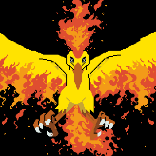
  </p>
  <p>
    This thesis is <em>just</em> a bachelors thesis, so it's far from being comprehensive. But as far as I know, it's still the only study of Amiga ASCII art. I have included some comments here and there from my 2023 perspective where I thought it needed them. 
  </p>
  <p>
    If you have any comments, corrections or other thoughs, let me know (hlotvonen@gmail.com) and I'll include them at the end of this page! 
  </p>
  <p>
    If you just want to see the end result, skip to <a href="https://blog.glyphdrawing.club/amiga-ascii-art/#322-making-the-colly">Making the colly</a>
  </p>
  <p>
    Enjoy :-)
  </p>
  <p>
    <em>EDIT: Thanks to <a href="https://mw.rat.bz/">Michael Walden</a> and <a href="https://www.goto80.com/">goto80</a> for some edits and corrections!</em>
  </p>
</div>
<hr />
<h2>Table of Contents</h2>
<p><a href="https://blog.glyphdrawing.club/amiga-ascii-art/#introduction">Introduction</a></p>
<p><a href="https://blog.glyphdrawing.club/amiga-ascii-art/#research-section">Research section</a><br />
… 2.1. <a href="https://blog.glyphdrawing.club/amiga-ascii-art/#21-source-materials-and-research-data">Source materials and research data</a><br />
… 2.2. <a href="https://blog.glyphdrawing.club/amiga-ascii-art/#22-about-text-art">About text art</a><br />
… … 2.2.1. <a href="https://blog.glyphdrawing.club/amiga-ascii-art/#221-definition-of-text-art">Definition of text art</a><br />
… … 2.2.2. <a href="https://blog.glyphdrawing.club/amiga-ascii-art/#222-history-of-text-art">History of text art</a><br />
… 2.3. <a href="https://blog.glyphdrawing.club/amiga-ascii-art/#23-the-age-of-ascii-art">The age of ASCII art</a><br />
… … 2.3.1. <a href="https://blog.glyphdrawing.club/amiga-ascii-art/#222-history-of-text-art">History of home computers</a><br />
… … 2.3.2. <a href="https://blog.glyphdrawing.club/amiga-ascii-art/#232-what-is-ascii-art">What is ASCII art?</a><br />
… … 2.3.3. <a href="https://blog.glyphdrawing.club/amiga-ascii-art/#233-what-is-amiga-ascii-art">What is Amiga ASCII art?</a><br />
… … 2.3.4. <a href="https://blog.glyphdrawing.club/amiga-ascii-art/#234-the-golden-age-of-amiga-ascii">The golden age of Amiga ASCII</a><br />
… … 2.3.5. <a href="https://blog.glyphdrawing.club/amiga-ascii-art/#235-ascii-art-to-decorate-bbs-boards">ASCII art to decorate BBS boards</a><br />
… … 2.3.6. <a href="https://blog.glyphdrawing.club/amiga-ascii-art/#236-what-is-a-colly">What is a colly?</a></p>
<p><a href="https://blog.glyphdrawing.club/amiga-ascii-art/#production-part">Production part</a><br />
… 3.1. <a href="https://blog.glyphdrawing.club/amiga-ascii-art/#31-my-starting-point-for-creating-ascii-art">My starting point for creating ASCII art</a><br />
… … 3.1.1. <a href="https://blog.glyphdrawing.club/amiga-ascii-art/#311-finding-the-right-method">Finding the right method</a><br />
… 3.2. <a href="https://blog.glyphdrawing.club/amiga-ascii-art/#32-production-process">Production process</a><br />
… … 3.2.1. <a href="https://blog.glyphdrawing.club/amiga-ascii-art/#321-description-of-creating-amiga-ascii-images">Description of creating Amiga ASCII images</a><br />
… … 3.2.2. <a href="https://blog.glyphdrawing.club/amiga-ascii-art/#322-making-the-colly">Making the colly</a><br />
… … 3.2.3. <a href="https://blog.glyphdrawing.club/amiga-ascii-art/#323-physical-final-product">Physical final product</a></p>
<p><a href="https://blog.glyphdrawing.club/amiga-ascii-art/#concluding-remarks">Concluding remarks</a></p>
<p><a href="https://blog.glyphdrawing.club/amiga-ascii-art/#sources">Sources</a><br />
… 5.1. <a href="https://blog.glyphdrawing.club/amiga-ascii-art/#51-printed-sources">Printed sources</a><br />
… 5.2. <a href="https://blog.glyphdrawing.club/amiga-ascii-art/#52-unprinted-sources">Unprinted sources</a><br />
… … 5.2.1 <a href="https://blog.glyphdrawing.club/amiga-ascii-art/#521-internet-sources">Internet sources</a><br />
… … 5.2.2. <a href="https://blog.glyphdrawing.club/amiga-ascii-art/#522-documentaries">Documentaries</a><br />
… … 5.2.3. <a href="https://blog.glyphdrawing.club/amiga-ascii-art/#523-interviews">Interviews</a><br />
… 5.3. <a href="https://blog.glyphdrawing.club/amiga-ascii-art/#53-image-sources">Image sources</a></p>
<hr />
<h1>INTRODUCTION</h1>
<p>Colon, hyphen, and parenthesis are typographic punctuation marks used in written language that serve as separators for various text structures. By combining these three symbols in sequence, you get :-). When you tilt this combination ninety degrees clockwise in your mind, it can be interpreted as a smiling face, an emoticon, with eyes, nose, and mouth. Originally, these symbols were created for the structures of written language, but in daily human communication, these symbols and their combinations have been given a new added meaning and purpose. Images created with letter characters enhance the expressiveness of text-based presentations, such as emails or text messages.</p>
<p>In text-based communication, the representation of images has not always been possible for technical reasons. To address this need, text art emerged, a technique of creating images where a picture or word is formed from drawn or printed symbols in a composition. An emoticon is a kind of simple image formed with letter characters. However, by combining various letter characters spread over several lines, it's possible to create much more nuanced images that can depict almost any subject. This image-making technique has been a part of the history of writing up to the present day. I will discuss this matter in more detail in section <a href="https://blog.glyphdrawing.club/amiga-ascii-art/#222-history-of-text-art">2.2.2.</a></p>
<p>Text art made on a computer is usually called ASCII art. The name derives from the character standard developed in the 1960s. ASCII art flourished in the 1980s and 1990s, before widespread public access to the internet, when text-based BBS systems operating on telephone networks served as the primary places for thought and information exchange, much like the internet. The making of ASCII art waned as the internet displaced BBS systems with the advent of fast broadband connections around the year 2000. However, ASCII art has surged in recent years due to nostalgia, social media, and the archiving of ASCII art.</p>
<p>In my thesis, I delve into this image-making technique and use it as a method to develop my visual expression. In the research sections, I define text art as one genre of visual art, encompassing ASCII art and its sub-genres, and briefly describe the history of text art and ASCII art and the associated subculture. I focus especially on the Amiga-style ASCII text art in my thesis and create a collection of my experiments using this image-making method. I elaborate on the aforementioned concepts in section <a href="https://blog.glyphdrawing.club/amiga-ascii-art/#23-the-era-of-ascii-art">2.3</a>.</p>
<hr />
<h1>RESEARCH SECTION</h1>
<h2>2.1. SOURCE MATERIALS AND RESEARCH DATA</h2>
<p>Historically, the typewriter as a medium of creative expression has largely been overlooked, perhaps because those who created typewriter art were primarily professional typists who demonstrated their skills mainly to peers in the same field. Many early typewriter artists were likely unaware of the historical background and significance of their art, leading to a lack of its widespread recognition and acceptance by critics. Those who were interested in the typewriter as a medium for text art were mainly intrigued by it from the perspective of concrete poetry, rather than viewing it from a visual art perspective. This has resulted in a lack of complete understanding of the entire field of text art. Only now, due to the archiving capabilities of the Internet and the exposure of text art, is a more comprehensive picture emerging.<sup class="footnote-ref"><a href="https://blog.glyphdrawing.club/amiga-ascii-art/#fn1" id="fnref1">[1]</a></sup></p>
<p>This same trend seems to be occurring with ASCII text art, leading to a perceived lack of quality source material on text art or ASCII art. Two anthologies have been written on typewriter art: Alan Riddell's <em>Typewriter Art</em> (1975) and Barrie Tullett's <em>Typewriter Art: A Modern Anthology</em> (2014). Only one significant retrospective has been held on typewriter art (London and Edinburgh 1973, 1974)<sup class="footnote-ref"><a href="https://blog.glyphdrawing.club/amiga-ascii-art/#fn2" id="fnref2">[2]</a></sup>. Not a single extensive publication or study has been written on ASCII art, and only one small exhibition was held in Cologne in 2013 as part of an electronic art festival. The subject has been briefly touched upon in a few studies dealing with computer enthusiast subcultures, such as the 2011 study <em>Like City Lights, Receding: ANSi Artwork and the Digital Underground, 1985-2000</em> by Canadian Michael Hargadon. Most studies focus on computer enthusiast subcultures and related phenomena mainly from a technical, sociological, or historical perspective.</p>
<p>For my research, I interviewed two individuals who are still actively involved in the Amiga ASCII scene. I interviewed Amiga ASCII pioneer, German Michael &quot;Skin&quot; Hischer, via email. Additionally, I interviewed Finnish Amiga ASCII artist Antti &quot;h7&quot; Kiuru. The interviews mainly focused on questions about the process of creating ASCII art, their style, sources of inspiration, and personal history. I also posed a few general questions in the Facebook group &quot;Ansi, Ascii artists worldwide!&quot; which includes a large portion of individuals involved in the subculture.</p>
<p>As written sources, I utilized several studies dealing with computer enthusiast subcultures and related phenomena, numerous internet sources, and Barrie Tullett's work on typewriter art, <em>Typewriter Art: A Modern Anthology</em>. From these pieces, I believe I was able to create a comprehensive yet source-critical understanding and description of the subject matter under investigation.</p>
<h2>2.2. ABOUT TEXT ART</h2>
<h3>2.2.1. DEFINITION OF TEXT ART</h3>
<p>While working on this thesis, there didn't seem to be a definition of text art available anywhere. This is probably due to the almost complete absence of both Finnish and English literature or research on text art. Just the fact that the English Wikipedia article for &quot;text art&quot;<sup class="footnote-ref"><a href="https://blog.glyphdrawing.club/amiga-ascii-art/#fn3" id="fnref3">[3]</a></sup> redirects to a vague and sparse article on ASCII art indicates the scarcity of research and that the history of text art has not been fully understood internationally. However, to address my research topic, I need to define text art in some way.</p>
<div class="note-from-the-future">
  <h4>Note from 2023:</h4>
  <p>
    Anders Carlsson goes over a critical overview of (some) genres of text art in his paper <a href="http://widerscreen.fi/numerot/2017-1-2/beyond-encoding-a-critical-look-at-the-terminology-of-text-graphics">Beyond Encoding: A Critical Look at the Terminology of Text Graphics</a> in WiderScreen (June 15, 2017).
  </p>
</div>
<p>When I started to develop a definition of text art, the difference in the use of a letter character in written language and in text art seemed to be a defining factor. What is the significance of a letter in text art? What's the difference between a letter character in written language and in text art?</p>
<p>Text is a semantic unit. In text, the form isn't as important as the meaning given by the forms<sup class="footnote-ref"><a href="https://blog.glyphdrawing.club/amiga-ascii-art/#fn4" id="fnref4">[4]</a></sup>. Written text consists of graphemes, i.e., written characters. Grapheme refers to letters, that is, characters used in a phonetic writing system, and other writable characters such as numbers and punctuation marks<sup class="footnote-ref"><a href="https://blog.glyphdrawing.club/amiga-ascii-art/#fn5" id="fnref5">[5]</a></sup>. In written language, text and letters contain meanings; they are a tool for communication.</p>
<p>In the context of text art, a character is considered solely through its form. In text art, a letter is not symbolic and does not have semantic meaning, but the composition of letter characters creates an image, which in itself can symbolize something. The semantic meaning of the image arises from the form given by the composition of the letter characters, that is, what the image resembles, unlike in written language where combinations of letter characters, words, and sentences mean something, carry meaning. Thus, one can think that the word &quot;ball&quot; immediately brings to mind an object made of some material, while in the context of text art, a ball can be symbolized by, for example, the letter O, in which case just the shape of the letter can bring to mind an object made of material.</p>
<p>Text art can therefore be defined as follows: <strong>text art is a form of art in which a composition of letter characters forms a two-dimensional representation, that is, an image</strong>.</p>
<div class="note-from-the-future">
  <h4>Note from 2023:</h4>
  <p>
    This definition is not satisfactory. 
  </p>
  <p>
    First of all, there are forms of text art where characters can be both: semantic (where the character is a part of a word) and non-semantic (where the same character is part of an typographical picture) meanings. This is quite common in shaped or visual poetry. 
  </p>
  <p>
    Secondly — where the attempt at a universal definition of text art gets really complicated — it's possible that the whole picture consists of no letters at all. An example is of course ANSI art, where the pictures usually consist of only block elements █, ▓, ▒, and ░. 
  </p>
  <p>
    A possible, more broad, but also more straightforward, definition of text art could be: <strong>pictorial images created from type elements</strong>. (I don't suggest that to be the definitive definition, because it doesn't quite capture the essence of more calligraphic forms of text art.)
  </p>
  <p>
    Broadly, text art can be divided into 3 categories: calligraphic, mechanical and digital.
  </p>
  <p>
    Calligraphic text is hand drawn, it includes but is not limited to these sub-genres: calligrammes, calligraphic pictures, zoomorphic calligraphy, various shaped or pattern poetry (carmina figurata, grid poem, imago poem, spatial line poem), micro-calligraphy (or microgrammy), some asemic writing and pictorial islamic calligraphy.
  </p>
  <p>
    Mechanical text art is usually done with either letterpress or typewriter. That includes subgenres such as: type pictures / typipictures (US), art-printing, letter-pictures, pictorial typography, ruled paintings / picture, imagotipo/imagotipia (Venezuela), Koppermandaag prenten (The Netherlands), Bildsatz, Ornamententypensatz, Typensatz (Germany), Stigmatypie (Austria), stigmatypy (US), typometry / typometrie, typotecture and typewriter art (including concerte poetry and other visual poetry).
  </p>
  <p>
    Digital text art includes various textmode art such as 7-bit and 8-bit ASCII art, PETSCII, ATASCII, PC-ASCII (filled ASCII), ANSI art, Amiga ASCII, Shift_JIS, Unicode art, Taiwanese ANSI and others. Non-textmode text art includes newer and more varied styles, but they are too numerous to include here. Check Carlsson's overview and Polyduck's <a href="https://polyducks.co.uk/pages/what-is-textmode/">What is Textmode?</a> for more.
  </p>
  <p>
    (I should write a more comprehensive overview especially of the mechanical ones at some point...)
  </p>
</div>
<h2>2.2.2. HISTORY OF TEXT ART</h2>
<p>Before the invention of typewriters and computers, calligram was the most common form of text art. A calligram is a poem, phrase, or word in which the text or words are arranged so that they collectively form a picture. The picture formed in the calligram is usually visually related to the words or word used in it and expresses the theme of the poem. One of the first calligrams is <em>Axe</em> by Simmias of Rhodes, made in 325 BC, where the text forms an image of an axe (Figure 2). A Jewish tradition of micro-calligraphy also resembles calligrams, where small written Hebrew letters form geometric and abstract images<sup class="footnote-ref"><a href="https://blog.glyphdrawing.club/amiga-ascii-art/#fn6" id="fnref6">[6]</a></sup>.</p>
<figure class="u-image-full-width">
    <img class="crisp" alt="A manuscript page of 3 poems shaped like an axe, wings and a vase" loading="lazy" decoding="async" src="https://blog.glyphdrawing.club/assets/XAbta85DYP-700.jpeg" width="700" height="396" />
    <figcaption>(Figure 2.) Axe of Simmias of Rhodes, 325 BCE</figcaption>
</figure>
<p>Arabic calligraphy can also be considered a form of text art. Drawing humans is seen in Islam as idol worship, so pictures were drawn using calligraphy, that is, text. In Islamic culture, calligraphy is considered the noblest form of visual art, as it translates the words of God as revealed in the Qur'an into a visible form. Qur'anic manuscripts have always been commissioned from the most skilled calligraphers to give the text an artistic appearance worthy of its value <sup class="footnote-ref"><a href="https://blog.glyphdrawing.club/amiga-ascii-art/#fn7" id="fnref7">[7]</a></sup>.</p>
<p>Movable type and printing press developed in the 1400s made duplicating knowledge fast and, above all, cheap. The printing technique made it possible to shape people's perceptions of themselves and the surrounding world. The great revolution of printing in Europe was the invention of movable type, which meant that the same type could be used over and over again to produce many different printed products. Movable types significantly accelerated page production compared to engraving each page separately on wood or metal plates, so movable types were also used to create typographic ornaments and pictures <sup class="footnote-ref"><a href="https://blog.glyphdrawing.club/amiga-ascii-art/#fn8" id="fnref8">[8]</a></sup>.</p>
<div class="note-from-the-future">
  <h4>Note from 2023:</h4>
  <p>
    This is my current focus of study and I hope to write more about the history of pictorial typography with movable type soon&trade;!
  </p>
</div>
<p>Just as the printing press once did, the typewriter revolutionized the world. By the end of the 1800s, it had established its position not only in the industrial and commercial sectors but also in the cultural and social fields. Typewriter created new professions and livelihoods and was also a crucial step towards women's emancipation. It also gave people the means to communicate freely without fear of censorship and enabled writers to write as quickly as they thought. The typewriter brought a modern way of directly presenting and disseminating thoughts<sup class="footnote-ref"><a href="https://blog.glyphdrawing.club/amiga-ascii-art/#fn9" id="fnref9">[9]</a></sup>. It also became a tool for making art.</p>
<figure class="u-image-full-width">
    <img class="crisp" alt="Typewritten drawing of a butterfly" loading="lazy" decoding="async" src="https://blog.glyphdrawing.club/assets/sQHzWW2fiz-600.jpeg" width="600" height="901" />
    <figcaption>(Figure 3.) Flora Stacey's butterfly (1898)</figcaption>
</figure>
<p>One of the first surviving images made with a typewriter is a picture of a butterfly made by Flora Stacey, who worked as a secretary, in 1898<sup class="footnote-ref"><a href="https://blog.glyphdrawing.club/amiga-ascii-art/#fn10" id="fnref10">[10]</a></sup> (Figure 3). By re-entering the same paper at different angles and stacking letters, almost any shape could be created, and Stacey's picture is more reminiscent of pencil drawing than typical mosaic-like text art. On the other hand, a few years earlier, the publication <em>Pitman’s Typewriter Manual</em> (1893) better utilized the limitations and possibilities set by the typewriter and is more reminiscent of modern ASCII art than Stacey's butterfly (Figure 4).</p>
<figure class="u-image-full-width">
    <img class="crisp" alt="Various patterns, letters and characters made with a typewriter" loading="lazy" decoding="async" src="https://blog.glyphdrawing.club/assets/xaTljLkg-F-590.jpeg" width="590" height="824" />
    <figcaption>(Figure 4.) Pitman’s Typewriter Manual (1893)</figcaption>
</figure>
<p>However, text art made with a typewriter can be seen to have flourished mainly in the 50s–70s. Around the same time in the 1950s, concrete poetry was born in different parts of the world, where the typewriter was used as a tool to create visual poems with the typographic layout of words being crucial to the impression. In concrete poetry, seeing and reading play an equally significant role<sup class="footnote-ref"><a href="https://blog.glyphdrawing.club/amiga-ascii-art/#fn11" id="fnref11">[11]</a></sup>. Artists and poets who used this method were interested in how printed words can be interpreted through their presentation and design. They sought ways to create new meanings and conceptual levels for the text by visually composing it<sup class="footnote-ref"><a href="https://blog.glyphdrawing.club/amiga-ascii-art/#fn12" id="fnref12">[12]</a></sup>.</p>
<p>At the same time, written messages were transmitted over radio links using teletype machines. Using a sound reminiscent of Morse code, the machine could remotely control another similar teletype machine, with messages printed on paper through a printer. What was written on paper at one end was automatically written on paper at the other end. To standardize the character graphics for teletypes, the 5-bit Baudot code was developed, which can be considered a precursor to the ASCII character system. Text art created with teletype machines was exchanged among other radio amateurs, and these works are very reminiscent of future ASCII art <sup class="footnote-ref"><a href="https://blog.glyphdrawing.club/amiga-ascii-art/#fn13" id="fnref13">[13]</a></sup> (Figure 5).</p>
<figure class="u-image-full-width">
    <img class="crisp" alt="The last supper rendered with text" loading="lazy" decoding="async" src="https://blog.glyphdrawing.club/assets/Nlo5l3x-sh-640.jpeg" width="640" height="479" />
    <figcaption>(Figure 5.) Teletype art.</figcaption>
</figure>
<p>The development of different forms of text art does not seem to be linear but appears to have occurred independently following each paradigm shift in information technology. They are fascinating examples of how technology has been used as a tool to create works far from what the technology developers could have imagined they would create. The pioneers of text art seem to have been primarily those who were not primarily artistically oriented but were interested in technology and its limitations.</p>
<p>The first step in the emergence of computer-made text art, called ASCII art, occurred with the change in Western consumption paradigm brought about by the microcomputer revolution in the late 1970s. How did this paradigm shift occur, and what followed? What steps led to the birth of ASCII art? I will discuss these issues in the next chapter.</p>
<h2>2.3. THE AGE OF ASCII ART</h2>
<h3>2.3.1. A HISTORY OF HOME COMPUTERS</h3>
<p>At its core, computers are intricate calculators, adept at computing mathematical functions swiftly and processing vast amounts of data. Until the late '70s, these calculations and data processing were performed on large mainframes – the first-generation computers situated in glass-walled computer rooms. These were primarily used as instruments of centralized power within hierarchical organizations to manage large and complex commercial-administrative systems. This gave birth to an industry where IBM played a dominant role. These mainframes were only accessible to entities with significant capital, such as the defense industry, large corporations, and universities. Their operation required expertise in both hardware and software<sup class="footnote-ref"><a href="https://blog.glyphdrawing.club/amiga-ascii-art/#fn14" id="fnref14">[14]</a></sup>.</p>
<p>By the late '70s, foundational computer components, transistors, and microprocessors, had been miniaturized enough to allow for the creation of reasonably sized second-generation microcomputers. In essence, microcomputers did not differ from mainframes except in size, price, availability, and complexity<sup class="footnote-ref"><a href="https://blog.glyphdrawing.club/amiga-ascii-art/#fn15" id="fnref15">[15]</a></sup>.</p>
<p>However, the technology revolution didn't stem merely from technological achievements, but from the evolution of factories that produced components. As these components were miniaturized, their production costs reduced, and manufacturing energy efficiency and volumes increased. This allowed for mass production of computers. Yet, by the mid-'70s, a typical microcomputer user needed skills like soldering components, constructing keyboards, interfacing devices, and programming both the system and applications. Computers transitioned from computer rooms to design offices and labs, inadvertently giving rise to the hacker culture. A new wave of enterprises emerged in the IT sector, leading innovations and developing consumer-friendly applications and devices<sup class="footnote-ref"><a href="https://blog.glyphdrawing.club/amiga-ascii-art/#fn16" id="fnref16">[16]</a></sup>.</p>
<p>By the late '70s, new companies emerged that sold pre-assembled computers. Apple was one of these, with its Apple II in 1977 being the first massively successful mass-produced microcomputer. In a May 1977 article for <em>Byte</em> magazine, Apple's Steve Wozniak wrote,</p>
<blockquote>
<p>“I think a personal computer should be small, reliable, convenient to use, and inexpensive”<sup class="footnote-ref"><a href="https://blog.glyphdrawing.club/amiga-ascii-art/#fn17" id="fnref17">[17]</a></sup>.</p>
</blockquote>
<p>No longer did computer users need to be IT experts or hobbyists, but could simply be the &quot;ordinary consumer&quot;.</p>
<p>The third generation, or personal computers, in the 1980s, transitioned IT from the hands of engineers to a broader user base who began applying it for tasks like word processing and spreadsheet calculations. By the '80s, the market had been flooded by several small, medium, and large companies offering various solutions. By 1983, however, the market was predominantly dominated by systems from three computer manufacturers: Apple Computer's <em>Apple II</em>, Commodore International's <em>Commodore 64</em> (and later <em>Amiga</em>), and IBM's <em>PC</em>. Each catered to slightly different consumer bases based on price and technical features. Apple computers were mostly sold to users wanting a mix of games and utility programs, Commodore dominated the gaming market because of its affordability and superior graphics and sound capabilities, and IBM rapidly secured a monopoly in the corporate IT world.</p>
<p>In the 1980s competition, IBM established the dominant standard for personal computers (IBM PC-compatible computers), but lost its exclusive rights to manufacture machines following its standard. By the end of the '80s, 80% of all sold microcomputers were either IBM-made or at least used its system. However, by the early '90s, the mantle had shifted to the Intel-Microsoft duo, whose actions reshaped the entire industry. Intel was responsible for processors, and Microsoft took care of the operating system<sup class="footnote-ref"><a href="https://blog.glyphdrawing.club/amiga-ascii-art/#fn18" id="fnref18">[18]</a></sup>.</p>
<p>Still, Amigas were popular in the early '90s and became significant among computer enthusiasts. They were more prevalent in Europe than in America, which influenced the strong Amiga culture in Europe. For instance, according to a reader survey conducted by <em>MikroBitti</em> magazine, 49% of its Finnish readers owned an Amiga, while 27% owned a PC, at the turn of 1991–1992<sup class="footnote-ref"><a href="https://blog.glyphdrawing.club/amiga-ascii-art/#fn19" id="fnref19">[19]</a></sup>.</p>
<p>However, Amiga's share of the home computer market declined sharply in subsequent years as PCs overtook them in terms of price-to-quality ratio. Commodore couldn't counteract IBM PC's and its clones' rise with their Amiga. Though initially ahead in terms of value, by 1992, it became challenging to produce cost-competitive technology against the ballooning PC industry<sup class="footnote-ref"><a href="https://blog.glyphdrawing.club/amiga-ascii-art/#fn20" id="fnref20">[20]</a></sup>.</p>
<p>In May 1994, Commodore filed for voluntary bankruptcy. However, the unwavering loyalty of some Amiga users ensured that the Amiga hobby and scene continued, even if new devices were no longer sold. By the mid-'90s, PCs had become the standard home computer in Europe, with no serious challengers in sight.<sup class="footnote-ref"><a href="https://blog.glyphdrawing.club/amiga-ascii-art/#fn21" id="fnref21">[21]</a></sup> Gradually, computers became a household item in Western countries.</p>
<p>Brushes and parchment, the printing press, teletype, and typewriters each enriched text-based communication in their time. Similarly, the most crucial factor of the computer revolution was the democratization of information as the computer became a consumer product<sup class="footnote-ref"><a href="https://blog.glyphdrawing.club/amiga-ascii-art/#fn22" id="fnref22">[22]</a></sup>. In the following subsections, I will discuss the evolution of computer writing systems and the emergence of different forms of ASCII art with these devices and systems.</p>
<h3>2.3.2. WHAT IS ASCII ART?</h3>
<p>In the 1960s, to facilitate the transfer of text-form information across various systems and devices, the ASCII character set standard was developed (an acronym for <em>American Standard Code for Information Interchange</em>)<sup class="footnote-ref"><a href="https://blog.glyphdrawing.club/amiga-ascii-art/#fn23" id="fnref23">[23]</a></sup>. In information technology, a character set is an agreement defining how binary numbers represented as bit combinations should be interpreted as characters belonging to a writing system. A computer can correctly process only those characters included in its known character set. ASCII is a 7-bit character set, covering 128 (2⁷) character positions, and primarily encompasses the letters, numbers, punctuation, and special characters, as well as certain control codes, required for American English<sup class="footnote-ref"><a href="https://blog.glyphdrawing.club/amiga-ascii-art/#fn24" id="fnref24">[24]</a></sup>.</p>
<figure class="u-image-full-width">
    <img class="crisp invert-color" alt="A list of characters in ASCII" loading="lazy" decoding="async" src="https://blog.glyphdrawing.club/assets/06J-fhZapl-1092.png" width="1092" height="270" />
    <figcaption>(Figure 6.) Printable letters and symbols from the ASCII character set.</figcaption>
</figure>
<p>Since computers typically use 8-bit bytes and ASCII is 7-bit, many computer manufacturers developed broader character sets where the spare bit was utilized. This doubled the number of characters from 128 to 256 (2⁸). In these character sets, the first 128 characters typically matched ASCII, but the remaining positions could be devoted, for example, to letters of other languages or characters reserved for table graphics. As a result, the extended character sets of different computer manufacturers could vary considerably<sup class="footnote-ref"><a href="https://blog.glyphdrawing.club/amiga-ascii-art/#fn25" id="fnref25">[25]</a></sup>.</p>
<div class="note-from-the-future">
  <h4>Note from 2023:</h4>
  <p>
    Check VileR's <a href="https://int10h.org/oldschool-pc-fonts/readme/">The Ultimate Oldschool PC Font Pack</a> for a very thorough collection of classic system fonts.
  </p>
</div>
<p>ASCII remained the most commonly used character set on the Internet until 2007 when it was overtaken by the UTF-8, based on the Unicode standard, comprising over 110,000 characters<sup class="footnote-ref"><a href="https://blog.glyphdrawing.club/amiga-ascii-art/#fn26" id="fnref26">[26]</a></sup>.</p>
<p>Artwork created with the ASCII character set is referred to as ASCII art. However, the term &quot;ASCII art&quot; has become an umbrella term for all types of images formed from computer-assisted characters. This is somewhat misleading, as ASCII refers to the original 7-bit, 128-character position character set. Most ASCII art, however, is crafted using extended 8-bit or higher character sets. The most renowned forms of ASCII art are 7-bit ASCII art, ANSI art, Amiga ASCII, ATASCII, PETSCII, Shift_JIS, teletext, and Unicode art. Each employs a distinct character set and often a specific font to craft the images<sup class="footnote-ref"><a href="https://blog.glyphdrawing.club/amiga-ascii-art/#fn27" id="fnref27">[27]</a></sup>.</p>
<p>Most ASCII art is crafted using a computer's text-based system (known as &quot;textmode&quot;), which consists of a grid built from identically sized cells. Each cell can contain one character. Characters employ a monospaced font, with each character occupying equal space, thus each row can contain an equal number of characters. The number of characters per row depends on the system and application in use. For instance, IBM PCs employed an 80x25 grid for displaying text, with a maximum of 25 rows, each having 80 cells. Current text processing predominantly supports variable-width fonts, which weren't viable in textmode. ASCII art made in textmode can thus be described as a kind of mosaic, where typographical symbols are precisely arranged on a grid to form an image<sup class="footnote-ref"><a href="https://blog.glyphdrawing.club/amiga-ascii-art/#fn28" id="fnref28">[28]</a></sup>.</p>
<p>One of the earliest images reminiscent of ASCII art was created by Kenneth Knowlton and Leon Harmon, both of whom worked at Bell Labs. The image was a mosaic of a nude, comprised of symbols used in electronic circuit diagrams<sup class="footnote-ref"><a href="https://blog.glyphdrawing.club/amiga-ascii-art/#fn29" id="fnref29">[29]</a></sup>: (Figure 7).</p>
<figure class="u-image-full-width">
    <img class="crisp" alt="A black and white image of reclaining nude body, comprised of symbols used in electronic circuit diagrams" loading="lazy" decoding="async" src="https://blog.glyphdrawing.club/assets/hgult1_0qR-2000.jpeg" width="2000" height="853" />
    <figcaption>(Figure 7.) Harmon-Knowlton nude.</figcaption>
</figure>
<blockquote>
<p>&quot;The nonscientific, some say artistic, aspects of computer graphics arose for me via a sophomoric prank. Ed David, two levels up, was away for while and the mice, one might say, played ever more freely. Leon Harmon stopped by to ask me for help with a brilliant idea: when Ed returns, one entire wall of his office will be covered with a huge picture made of small electronic symbols for transistors, resistors and such. But overall, they will form a somewhat-hard-to-see picture of, guess what, a nude! And so the renowned Harmon-Knowlton nude was conceived, coaxed into being, and duly hung on Ed's wall.&quot;<sup class="footnote-ref"><a href="https://blog.glyphdrawing.club/amiga-ascii-art/#fn30" id="fnref30">[30]</a></sup>.</p>
</blockquote>
<p>Even though this image was swiftly removed from the office wall and rapidly dismissed by Bell Labs' PR department, it leaked to the public, ending up on the pages of The New York Times and even on display at the Museum of Modern Art in New York in an exhibition titled <em>The Machine as Seen at the End of the Mechanical Age</em>. This prank turned into a sensation in a short time, and the creation of this symbol-based mosaic was a crucial step in the evolution of computer graphics and ASCII art<sup class="footnote-ref"><a href="https://blog.glyphdrawing.club/amiga-ascii-art/#fn31" id="fnref31">[31]</a></sup>.</p>
<h3>2.3.3. WHAT IS AMIGA ASCII ART?</h3>
<p>ASCII art made with the Amiga computer's font and column settings is called Amiga ASCII.</p>
<p>The Amiga has its own 8-bit character set. The first 128 characters follow the ASCII standard, and the remaining 128 characters follow a supplemental Latin character set ISO/IEC 8859-1. It isn't particularly suited for drawing pictures and graphics, as it doesn't contain characters meant for drawing tables and graphics, unlike character sets of some other contemporary machines. Amiga's extended character set mainly contains some mathematical symbols and some characters of European languages, such as the letters ä, ö, and å used in Finnish.</p>
<div class="note-from-the-future">
  <h4>Note from 2023:</h4>
  <p>
    <a href="https://mw.rat.bz/ascii/#AmigaOS">As noted by Michael Walden</a>, the Amiga character set is equal to "ISO/IEC 8859-1" and "ECMA-94 Latin Alphabet No. 1" except for one character at code point hex 7F. It's a strange glyph: a rectangle filled with diagonal black and white stripes. Normally the code point at 7F is <a href="https://graphemica.com/007F">DELETE</a>. This character is rarely used in Amiga ASCII art, but can be used for some interesting effects. See recent <a href="https://16colo.rs/pack/impure80/h7-impure.txt">example by h7</a> where this character is used for the beard and line under the logo.
  </p>
</div>
<figure class="u-image-full-width">
    <img class="crisp invert-color" alt="A list of characters in Amiga" loading="lazy" decoding="async" src="https://blog.glyphdrawing.club/assets/WClLk5xu82-583.png" width="583" height="309" />
    <figcaption>(Figure 6.) Printable letters and symbols from the Amiga character set.</figcaption>
</figure>
<p>What makes the Amiga particularly suitable for creating text art, however, is its default monospaced font &quot;Topaz&quot;. Its letterforms and column settings allow for the creation of cohesive patterns. In Amiga, the line spacing and character spacing are very narrow, so certain characters &quot;merge&quot; if arranged correctly. For example, by typing an underscore followed immediately by a slash, it looks as if these two characters were one cohesive pattern and not two separate characters.</p>
<p>By combining these characters, it's possible to create pictures resembling sketches or outline drawings. This is a special feature of Amiga ASCII, distinguishing it from all other forms of ASCII art. Amiga ASCII is also called line-ASCII to differentiate it from filled-ASCII made on PCs.</p>
<p>Slashes and underscores are perhaps the most commonly used characters in Amiga ASCII art. These characters form the basis of many Amiga ASCII pictures. Two slashes placed one below the other form a cohesive slanting line, and two underscores in a row form a straight horizontal line. These characters can form an endless variety of shapes, which almost seamlessly connect to each other. Due to the cohesive line formed by the slash, many Amiga ASCII logos look italic or slanted.<sup class="footnote-ref"><a href="https://blog.glyphdrawing.club/amiga-ascii-art/#fn32" id="fnref32">[32]</a></sup></p>
<figure class="u-image-full-width">
    <img class="crisp invert-color" alt="The word foundation rendered in Amiga ASCII style" loading="lazy" decoding="async" src="https://blog.glyphdrawing.club/assets/O8X5M6sFju-397.png" width="397" height="115" />
    <figcaption>(Figure 9.) Foundation - this word is formed using the Topaz font characters / \ and _ with Amiga's original column settings.</figcaption>
</figure>
<p>Michael Hischer, whom I interviewed, describes his technique as:</p>
<blockquote>
<p>&quot;[The limited number of characters] has always been an opportunity and challenge for me to create something that others don't do or can't do. I never use more than ten characters when creating ASCII. An excessive number of characters would be a distraction and divert from the essentials.&quot; <sup class="footnote-ref"><a href="https://blog.glyphdrawing.club/amiga-ascii-art/#fn33" id="fnref33">[33]</a></sup> (Figure 10)</p>
</blockquote>
<figure class="u-image-full-width">
    <img class="crisp invert-color" alt="Various typographical symbols from the Amiga character set" loading="lazy" decoding="async" src="https://blog.glyphdrawing.club/assets/-84UvNu9jk-485.png" width="485" height="34" />
    <figcaption>(Figure 10.) Characters mainly used in the art of Michael "Skin" Hischer, a pioneer of Amiga ASCII art.</figcaption>
</figure>
<p>Amiga ASCII is part of a broader phenomenon called the demoscene. The demoscene is a computer hobbyist subculture centered around its cultural artifacts, demos. Demos are real-time audiovisual presentations executed on a computer, made especially within the demo culture, or demoscene, that emerged around the mid-1980s.<sup class="footnote-ref"><a href="https://blog.glyphdrawing.club/amiga-ascii-art/#fn34" id="fnref34">[34]</a></sup> The Amiga scene, on the other hand, is a subculture of the demoscene, centered on logos and other visual materials made for BBS usage and the competitive skill of text artists.<sup class="footnote-ref"><a href="https://blog.glyphdrawing.club/amiga-ascii-art/#fn35" id="fnref35">[35]</a></sup></p>
<div class="note-from-the-future">
  <h4></h4>
  <p>
    In 2018 I wrote an essay <a href="https://blog.glyphdrawing.club/ascii-art-from-a-commodity-into-an-obscurity/">ASCII art: From a Commodity Into an Obscurity</a> that talks more about the subculture and the question "Why does ASCII art exist?"
  </p>
</div>
<p>Amiga ASCII art can be seen as a continuation of PETSCII art made on Commodore's earlier Commodore 64 computer. PETSCII refers to the character set of the Commodore 64, which was well-suited for text art. The technologically advanced Amiga, however, replaced the Commodore 64, and many PETSCII artists began to create text art on Amiga computers. However, the popularity of Amiga ASCII art is mainly based on the culture and social communities formed around BBS<sup class="footnote-ref"><a href="https://blog.glyphdrawing.club/amiga-ascii-art/#fn36" id="fnref36">[36]</a></sup>. For this reason, I will mainly focus on discussing Amiga ASCII during the BBS era, leaving out the similarities of PETSCII art to Amiga ASCII.</p>
<p>Nowdaays Amiga ASCII is mostly created on PC, Mac or Linux computers. The only defining factor for Amiga ASCII art today seems to be the method of creating the image using the Amiga font.</p>
<h3>2.3.4. THE GOLDEN AGE OF AMIGA ASCII</h3>
<p>A BBS (<em>Bulletin Board System</em>) refers to a computer connected to the landline network through a modem, to which its users, or BBS enthusiasts, connected with their own computer. The main focus of BBSs was primarily on various discussion areas and file sharing. Many BBSs formed tight-knit user communities and served as meeting places for various groups. BBSs can be thought of as precursors to many features familiar from today's Internet, such as social communities.<sup class="footnote-ref"><a href="https://blog.glyphdrawing.club/amiga-ascii-art/#fn37" id="fnref37">[37]</a></sup></p>
<p>The origin of BBSs began when Ward Christensen and Randy Suess (US) developed the MODEM program in 1978 mainly for data exchange within their computer club. With it, two computers could communicate and exchange files. Later that year, Christensen and Suess developed the system known as the world's first BBS called CBBS (<em>Computer Bulletin Board System</em>)<sup class="footnote-ref"><a href="https://blog.glyphdrawing.club/amiga-ascii-art/#fn38" id="fnref38">[38]</a></sup>.</p>
<figure class="u-image-full-width">
    <img class="crisp " alt="Amiga computer connected to a CRT showing a colorful BBS menu screen" loading="lazy" decoding="async" src="https://blog.glyphdrawing.club/assets/-NVaxnysH8-640.jpeg" width="640" height="480" />
    <figcaption>(Figure 11.) BBS rig on an Amiga 1200 computer.</figcaption>
</figure>
<p>Connections to the BBS were made using a modem connected to the landline network, using a character-based terminal program. Connecting cost the same as making a regular phone call. International connections were thus possible, though expensive. After calling the BBS, the user had to log into the system first. Most often, real names and sometimes also pseudonyms or handles were used in BBSs. In addition, during registration, users were often asked for name and address information and sometimes also for certain data communication settings.<sup class="footnote-ref"><a href="https://blog.glyphdrawing.club/amiga-ascii-art/#fn39" id="fnref39">[39]</a></sup></p>
<p>BBSs were navigated using keyboard commands in various menus. There were several different menu levels, usually varying according to the software the BBS used. Typically, BBSs included discussion areas, file areas, private messages, bulletins, and in some systems, it was also possible to play text-based games or chat in real-time with other users and the BBS administrator. File exchange was a significant part of BBSs, as uploading files earned usage time in the BBS.<sup class="footnote-ref"><a href="https://blog.glyphdrawing.club/amiga-ascii-art/#fn40" id="fnref40">[40]</a></sup></p>
<p>BBS activities remained for a long time within a small group interested in data communication and microcomputers. Gradually, as modem speeds increased towards the end of the 1980s, it began to spread to the awareness of larger user groups. What started primarily to facilitate mutual information exchange began to form a subculture. The age and user structure began to change, and at the same time, the ways BBSs were used diversified significantly. In the 90s, the subculture was mainly composed of young men aged 15-20. They shared an interest in computers and the possibilities they created<sup class="footnote-ref"><a href="https://blog.glyphdrawing.club/amiga-ascii-art/#fn41" id="fnref41">[41]</a></sup>. BBSs were significant communal forums for social activity. They served as meeting places for friend groups as well as hobbyist and subcultural groups<sup class="footnote-ref"><a href="https://blog.glyphdrawing.club/amiga-ascii-art/#fn42" id="fnref42">[42]</a></sup>.</p>
<p>Due to the home computers on the market that were incompatible with each other, hobbyists were loosely divided into different user groups specific to each computer. It was possible to log into BBSs with any computer, but due to the different character set standards, they might not necessarily display or function correctly. As a result, Amiga and MS-DOS-based PCs developed slightly different user cultures, even if their basic vibe was the same<sup class="footnote-ref"><a href="https://blog.glyphdrawing.club/amiga-ascii-art/#fn43" id="fnref43">[43]</a></sup>.</p>
<h3>2.3.5. ASCII ART TO DECORATE BBS BOARDS</h3>
<p>Data transfer via modem was very slow and therefore consisted mainly of text files. Terminal programs used to connect to the BBSs also operated under text-based operating systems. Due to their text-based nature, the BBS user interfaces were quite austere. There arose a need to embellish these interfaces and create images.</p>
<p>Amiga and PC-based BBSs started to be decorated with ASCII graphics. Most of the BBSs operated on PCs, which were not compatible with Amiga (Figure 12). Graphics on the PC were created using the extended character set and font of the original IBM PC, known as ANSI art.</p>
<figure class="u-image-full-width">
    <img class="crisp invert-color" alt="The word GRMMXI in PC and Amiga ASCII styles. The PC style word looks like it's outline is made of dashed lines while the Amiga has a more seamless outline." loading="lazy" decoding="async" src="https://blog.glyphdrawing.club/assets/qzXH73V-55-749.png" width="749" height="144" />
    <figcaption>(Figure 12.) The same logo in IBM PC's (left) and Amiga's (right) fonts.</figcaption>
</figure>
<p>ANSI art is a form of ASCII art. However, it significantly differs from other forms of ASCII art, as ANSI art mainly consists of rectangular raster bars and looks more like pixel graphics than actual text art. PC computers' ROM (<em>read only memory</em>) contained the character set and font specified on <em>&quot;code page 437&quot;</em>. This character set includes the 128 characters of the ASCII standard and additionally a set of graphical elements specifically for drawing tables and graphics. However, ANSI images are primarily composed of five characters, whose different strength raster surfaces enable the creation of color fields and shading on an 80x25 grid. Using color was also possible through terminal control codes included in the ANSI X3.64 terminal control standard. The ANSI color palette consists of 16 colors and 8 background colors, which was later expanded to 16 colors and 16 background colors by reusing some bits for more colors. This allowed for significantly more imposing images than traditional ASCII graphics.<sup class="footnote-ref"><a href="https://blog.glyphdrawing.club/amiga-ascii-art/#fn44" id="fnref44">[44]</a></sup></p>
<div class="note-from-the-future">
  <h4>Note from 2023:</h4>
  <p>
    Because the tools for creating ANSI and Amiga ASCII are mostly the same, many contemporary Amiga ASCII pieces also use ANSI colours. However, if the Amiga ASCII is using <a href="https://forum.16colo.rs/t/ice-colors-or-blinking-text/27">iCE colors</a>, the file wouldn't display correctly in many Amiga ASCII viewers and editors. For example the escape sequence "Esc[1m" turns on bold text on Amiga, but the same escape code turns the foreground text a bright light blue color using iCE colors.</p>
  <p>
    On the other hand, AmigaOS has a wide range of supported colors and different ANSI escape sequences, which would theoretically allow one to display more colors than the PC ANSIs. Some escape sequence commands can be also used for all kinds of funny trickery, like moving the cursor and erasing parts of lines. This made it possible to create pixel art with text files, and has lead to a lot of <a href="https://eab.abime.net/showthread.php?t=39795">confusion among the ASCII art community</a>.
  </p> 
  <figure class="u-image-full-width">
      <img class="crisp" alt="AmigaOS shell, showing a pixel logo of abime.net" loading="lazy" decoding="async" src="https://blog.glyphdrawing.club/assets/RVFZs4vu2K-1408.png" width="1408" height="1078" />
      <figcaption>This logo is actually a text file. When this text file is opened in AmigaShell, it renders a logo that look very much like pixel art, but it's made with some clever escape sequence trickery.</figcaption>
  </figure>
  <p>
    Even though Amiga ASCII could potentially be more colorful and diverse in form than the PC ANSI, for some reason most Amiga ASCII art in the archives is just plain text in monochrome.
  </p>
  <p>  
    <em>Thanks to <a href="https://www.goto80.com/">goto80</a> and by proxy sir garbagetruck for pointing this out.</em>
  </p>
</div>
<p>ANSI graphics were originally used in <em>crack intros</em><sup class="footnote-ref"><a href="https://blog.glyphdrawing.club/amiga-ascii-art/#fn45" id="fnref45">[45]</a></sup> for illegal software copies and in the logos of BBS login pages. Before long, ANSI artists formed groups and began publishing monthly packages containing ANSI art. Activities were typically organized, and intergroup competition became an essential factor in maintaining the intensity of the hobby.</p>
<p>A few comprehensive studies and other literature have been written on ANSI art and its related culture, so I will omit its in-depth discussion from this thesis.</p>
<p>Amiga ASCII was largely created for applications related to BBS boards. BBS administrators needed beautiful login pages and ASCII art to embellish various sections of the BBS to improve the user interface.</p>
<p>In the early 1990s, Amiga ASCII art groups and individuals began to release their materials as <em>collies</em> or logo collections. This convention can be seen as having come from the ANSI art side, where groups published their works in art packs. However, Amiga ASCII collies were individual text files containing all the material, while ANSI art packs were collections of separate files.</p>
<p>Today, BBS boards have no practical significance and exist mostly for nostalgic purposes. They can also be a status symbol for groups and a way to pass the time. However, various websites on the Internet have replaced the BBSs as the publication channel for collies<sup class="footnote-ref"><a href="https://blog.glyphdrawing.club/amiga-ascii-art/#fn46" id="fnref46">[46]</a></sup>.</p>
<h3>2.3.6. WHAT IS A COLLY?</h3>
<p>Colly, or collection, is a text file containing a collection of Amiga ASCII artworks created by one or more artists. The primary purpose of collies is to showcase the latest works of an ASCII artist in one place.</p>
<p>The term &quot;colly&quot; originated from the Amiga ASCII group <em>ART</em>'s 1992 released logo collection called <em>Collection volume 1</em> <sup class="footnote-ref"><a href="https://blog.glyphdrawing.club/amiga-ascii-art/#fn47" id="fnref47">[47]</a></sup>, after which it became a common practice within the subculture. Collies were the primary publishing format for Amiga ASCII art and have remained so to this day.</p>
<p>Rarely was Amiga ASCII used for traditional, representational art. However, representational images might be used in collies as illustrations. The main content of collies was typographic logos. They were usually made to a maximum size of 80x25, as the terminal programs used to connect to BBS were this size. Logos were typically 7-12 letters long, depending on the width of the logo font. The letters of a logo were often adjusted according to the length of the word and its intended use. The same logo style could be applied to words of different lengths. Even four-letter logos could be stretched to 80 cells to suit its use in BBS. Often, ornaments or texturing were made around the logo to frame the logo itself<sup class="footnote-ref"><a href="https://blog.glyphdrawing.club/amiga-ascii-art/#fn48" id="fnref48">[48]</a></sup>.</p>
<p>Some collies were collections of miscellaneous logos, advertisements, and other materials used in BBS made by the artist. However, many collies showcased the artist's newly developed typographic style to make logos. Collies could also be made in collaboration with another artist. Then both artists would create their own version of a particular word, and the person who commissioned the word could choose which one to use<sup class="footnote-ref"><a href="https://blog.glyphdrawing.club/amiga-ascii-art/#fn49" id="fnref49">[49]</a></sup>. Collies were often thousands of lines long.</p>
<p>Artists releasing collies competed with other artists for the best colly. An individual or group that made a beautiful colly gained respect and status among members of the subculture. Makers of high-quality ASCII art could also ascend within the group's internal hierarchy or receive invitations to generally more esteemed groups. As in other computer enthusiast subcultures, competition among groups and their members was a key factor in motivating groups to publish and maintain the quality of collections.</p>
<p>A colly traditionally consists of the following elements:</p>
<p>A. Advertisement for the group's own BBS<br />
B. Title of the colly, creator's logo, and group logo<br />
C. Table of contents (<em>index</em>)<br />
D. Introduction / creator comments<br />
E. The actual content of the collection, i.e., ASCII logos, BBS advertisements, and file_id.diz files<br />
F. Credits<br />
G. Greetings (<em>greets</em>)<br />
H. Acknowledgements (<em>respects</em>)</p>
<h4><strong>A. Advertisement for the group's own BBS</strong></h4>
<p>Collies usually begin with either an advertisement for their own BBS or a title. The BBS advertisement promotes the group's own headquarters (<em>HQ</em>) BBS. The headquarters serve as the group's primary publication channel for new collies, the place where the group's productions arrive the fastest<sup class="footnote-ref"><a href="https://blog.glyphdrawing.club/amiga-ascii-art/#fn50" id="fnref50">[50]</a></sup>.</p>
<figure class="u-image-full-width">
    <img class="crisp invert-color" alt="Logo and various advertising text in black and white Amiga ASCII style" loading="lazy" decoding="async" src="https://blog.glyphdrawing.club/assets/7uulPp4D8q-640.png" width="640" height="338" />
    <figcaption>(Figure 13.) BBS can advertisement from the colly "zeitgeist|moving|on" by the Finnish Amiga ASCII artist operating under the pseudonym Zeus.</figcaption>
</figure>
<p>In the ad, the name of the BBS is made as an ASCII image, and details about the BBS are listed around it. This information usually includes which groups it serves as the headquarters for, the names of the BBS administrators, technical details, software, and addresses used for connection. Only those with a functional BBS use a BBS advertisement. (Figure 13).</p>
<p>BBS advertisements were also made for BBSs other than the group's own. These ads could be spread on discussion areas reserved for ads in other BBSs. The more impressive the ad and the more famous the artist who made it, the more people it attracted to visit the advertised BBS<sup class="footnote-ref"><a href="https://blog.glyphdrawing.club/amiga-ascii-art/#fn51" id="fnref51">[51]</a></sup>.</p>
<h4><strong>B. Title of the colly, creator's logo, and group logo</strong></h4>
<p>At the beginning of collies, there is usually a title. The title may include the name of the colly creator, the name of the group the creator belongs to, and the name of the collection. The title is important because it reflects the theme and style of the collection and gives a taste of what's to come. It serves as an introduction to the following sections. (Figure 15).</p>
<figure class="u-image-full-width">
    <img class="crisp invert-color" alt="Various logos, text and patterns in black and white Amiga ASCII style" loading="lazy" decoding="async" src="https://blog.glyphdrawing.club/assets/q0sKBwdl_E-640.png" width="640" height="1474" />
    <figcaption>(Figure 15.) Title from the "Jungle Fever" colly by Finnish Amiga ASCII artist Antti "h7" Kiuru.</figcaption>
</figure>
<h4><strong>C. Table of contents (index)</strong></h4>
<p>The table of contents lists the ASCII images contained in the collection in numerical order. In the list, names are usually written in plain text. Tables of contents are used especially in long collies, which may contain hundreds of logos and other ASCII images made for various parties.</p>
<h4><strong>D. Introduction / creator comments</strong></h4>
<p>Collies often also contain a brief introduction, where the creator writes about the origin or theme of the collection, their own life, news, or other matters related to the subculture. This allows the creator to explain the background of their colly, express their thoughts related to drawing, or reinforce their position as an Amiga ASCII creator. (Figure 14).</p>
<figure class="u-image-full-width">
    <img class="crisp invert-color" alt="Logo and epilogue text in black and white Amiga ASCII style" loading="lazy" decoding="async" src="https://blog.glyphdrawing.club/assets/eesZDISCjl-640.png" width="640" height="514" />
    <figcaption>(Figure 14.) Introduction to the "Jungle Fever" colly by Finnish Amiga ASCII artist Antti "h7" Kiuru.</figcaption>
</figure>
<h4><strong>E. The actual content of the collection, i.e., ASCII logos, BBS advertisements, and FILE_ID.DIZ files</strong></h4>
<p>The main content of collies consists of ASCII logos made for others, BBS advertisements, and file_id.diz text files. These usually come as requests from other members of the subculture. For example, a BBS administrator might ask an Amiga ASCII artist to create a login page logo for their BBS. Then the creator of the colly can use their newly developed style to create a logo for the BBS administrator to use. So, ASCII logos were often put to some use. ASCII logos could be requested by anyone, individuals, or groups.</p>
<p>FILE_ID.DIZ is an ASCII text file that contains a short description of the content of the archive file. Many BBSs allowed users to upload their own files for others to download. BBS administrators might require the person uploading a file to also provide a description of the content they are uploading. To standardize descriptions, archive files were supplemented with a FILE_ID.DIZ file to provide a clear description of the content to be downloaded. The text file was required to contain at least the program name, version number, and a description of the file to be downloaded. Traditionally, FILE_ID.DIZ was allowed to be 10 lines long, with each line containing a maximum of 45 characters<sup class="footnote-ref"><a href="https://blog.glyphdrawing.club/amiga-ascii-art/#fn52" id="fnref52">[52]</a></sup>.</p>
<figure class="u-image-full-width">
    <img class="crisp invert-color" alt="Logo in black and white Amiga ASCII style" loading="lazy" decoding="async" src="https://blog.glyphdrawing.club/assets/3C-ZTpt4aK-640.png" width="640" height="306" />
    <figcaption>(Figure 16.) FILE_ID.DIZ file for nuancE from the colly "zeitgeist|moving|on". The top bar serves as a separator and provides the logo number, plain-language name, and purpose (FILE_ID.DIZ), as well as the collection name. The numbers and spacing symbols around the logo are not part of the logo itself but indicate row and character count. In this FILE_ID.DIZ logo, the requester's name is stylized. Placeholder text is left below it for layout testing when there is no actual content yet. The bottom corner contains the artist's pseudonym abbreviation zS! i.e., Zeus.</figcaption>
</figure>
<p>However, Amiga ASCII artists began to use this file for their own needs, often as an icon for the colly. In this case, FILE_ID.DIZ contains the name of the colly, the creator, and some release information. The purpose of the icon is to be as impressive as possible to attract the attention of others, as it serves as a preview for the actual colly.</p>
<p>Different logos are separated by a separator. The separator also structures the content and helps with navigation. The separator usually lists the logo number, which matches the table of contents, the name of the colly, the name of the logo, and/or the name of the person requesting the logo. Because logos are often difficult to read, the text of the logo in the separator is often written in plain text.</p>
<p>Amiga ASCII logos always have the artist's own abbreviation attached, indicating the creator and copyright. The worst violation is to steal someone else's style or logo and claim it as one's own. If caught, the punishment could be exclusion from the subculture<sup class="footnote-ref"><a href="https://blog.glyphdrawing.club/amiga-ascii-art/#fn53" id="fnref53">[53]</a></sup>.</p>
<h4><strong>F. Credits</strong></h4>
<p>Credits provide the closing details for the colly. It lists the creator's name (or names) and possible guest appearances, i.e., if another Amiga ASCII artist participated in the creation of the colly. The credits often state the release date, file size, file name, font used, text editor or other technical details. Often the credits also mention what music the creator listened to while creating the colly.</p>
<h4><strong>G. Greetings</strong></h4>
<p>Greetings, or <em>greets</em>, list the creator's personal acquaintances.</p>
<h4><strong>H. Acknowledgments (respects)</strong></h4>
<p>In acknowledgments, or <em>respects</em>, Amiga ASCII artists who are admired and respected by the creator are listed, even if they are not personally known.</p>
<p>Greetings and acknowledgments were once important for increasing visibility. In listings called ASCII charts, Amiga ASCII artists were ranked by popularity using various metrics. Amiga ASCII artists could be publicly voted on, or the greetings and acknowledgments included in collies were counted together, measuring the artist's popularity. Those who received the most greetings and acknowledgments from other artists topped the list, in turn increasing their popularity and visibility of their collies. Rankings also took into account for whom other artists had made logos. This partly motivated designing logos for other ASCII artists<sup class="footnote-ref"><a href="https://blog.glyphdrawing.club/amiga-ascii-art/#fn54" id="fnref54">[54]</a></sup>.</p>
<p>The largest archive site for Amiga ASCII collies, <em><a href="http://asciiarena.com/">asciiarena.com</a></em><sup class="footnote-ref"><a href="https://blog.glyphdrawing.club/amiga-ascii-art/#fn55" id="fnref55">[55]</a></sup>, lists about 4,000 collies from 780 different artists spanning the years 1992-2015. Most of them were released before the year 2000. While Amiga ASCII might be considered a niche subculture, the number of artworks and artists indicates a significant phenomenon.</p>

<div class="note-from-the-future">
  <h4>Note from 2023:</h4>
  <p>
    Asciiarena.com is nowadays <a href="https://asciiarena.se/">asciiarena.se</a>, but unfortunately it seems to be down every once in a while. Archives containing all the released collys from 1992–2015 can be found on <a href="https://github.com/textmodes/archive-amiga">github</a>
  </p>
</div>
<hr />
<h1>PRODUCTION PART</h1>
<h2>3.1. MY STARTING POINT FOR CREATING ASCII ART</h2>
<p>I didn't get to witness the golden days of BBSs and ASCII art or belong to the ASCII art-related subculture because the subculture had already waned by the time I started my computer hobbies in the early 2000s. However, I remember what the Internet was like in the late 90s and early 2000s. It was a magical and mysterious place for me, where every now and then, I'd encounter these strange images made up of mere characters. These could be seen in text-based info files of downloaded files, comments on discussion boards, or hidden in a website's source code. These images intrigued me, and at about ten years old, I too wanted to master this art of image-making: slowly, one letter at a time, I typed an image of a DJ playing records. The technique was challenging and time-consuming enough that I tried it only once.</p>
<p>In January 2014, I found a web-based hobby magazine on the internet, <em>OrDeR Of ThE ShAdOw Wolf</em>, a cyberzine, made by the Dutch electronic music-producing artist Danny &quot;Legowelt&quot; Wolfers. For a moment, the internet felt magical and mysterious again, as I read text laid out in green monospaced font on a black background, with titles and images made in ASCII.</p>
<p>Legowelt starts the cyberzine with these words:</p>
<blockquote>
<p>&quot;Welcome to the first issue of ORDER OF THE SHADOW WOLF, a cyberpunk e-zine in true original text format. This is how e-zines looked before the dawn of the internet in the 1980s and early 1990s. They were distributed via BBS's [...]. People would download these e-zines on their 300 baud modems and read them on their monochrome green screens late at night. Difficult to imagine now but doing this felt like the most exciting thing in the world, surrounded by a mystique of hacker romanticism and being a cyberpunk pioneer. It was a time when your mum and retarded jock cousin weren't on the internet, even more hardcore...you were probably the only person in your whole town or area logged into cyberspace!&quot; <sup class="footnote-ref"><a href="https://blog.glyphdrawing.club/amiga-ascii-art/#fn56" id="fnref56">[56]</a></sup></p>
</blockquote>
<p>I wanted to delve into this obscure subculture and the way of making images. It felt fascinating. I also don't believe I'm very skilled in illustrating, designing logos, or producing visual material in general. I wanted to enhance my creative expression. After trying to draw my first ASCII image, I found that making logos and images with the constraints set by ASCII is quite liberating. The limitation of the ASCII character set forces creativity and uses it as a strength for making images. The primitive nature of this medium felt like the right method to develop my expression.</p>
<p>I set the following goals for myself before embarking on the project:</p>
<blockquote>
<p>&quot;I intend to try various styles and techniques to draw logos with ASCII. Initially, at least, I will use the word &quot;GRMMXI&quot; as the text for my logos, which represents my friends/classmates/artistic community for whom, and to whom, I'm creating these logos. This will keep me motivated. Through experimentation, I aim to observe shapes, typography, logos, and textures in a new light, thereby evolving as a graphic designer. I also haven't done much logo design before, so I hope this approach brings new perspectives to logo design.&quot;</p>
</blockquote>
<h3>3.1.1. FINDING THE RIGHT METHOD</h3>
<p>I work as a web designer, so I started working on my first experiments with the text editing tool I know best: a code editor. However, I soon realized that with the default font of the code editor, I couldn't produce results that met my expectations: the characters didn't mesh well together. I wanted to know how ASCII art is really made.</p>
<figure class="u-image-full-width">
    <img class="crisp invert-color" alt="Logo in black and white Amiga ASCII style" loading="lazy" decoding="async" src="https://blog.glyphdrawing.club/assets/XvtWRhhzHJ-380.png" width="380" height="223" />
    <figcaption>(Figure 17.) FILE_ID.DIZ file from the collective publication of the Break group.</figcaption>
</figure>
<p>While getting acquainted with ASCII art, I wasn't yet aware of the existence of Amiga ASCII. From the site <em><a href="http://sixteen-colors.net/">sixteen-colors.net</a></em><sup class="footnote-ref"><a href="https://blog.glyphdrawing.club/amiga-ascii-art/#fn57" id="fnref57">[57]</a></sup>, which archives ASCII and ANSI art, I found the logo of the <em>Break</em> group (Figure 17). I had never seen ASCII graphics of this style before, where the lines connect almost seamlessly. I wanted to make my thesis using this technique and began to delve into the technical characteristics of this style.</p>
<p>In my search, I found the website <em><a href="http://asciiarena.com/">asciiarena.com</a></em>, which archives Amiga ASCII collies. It is the most comprehensive site archiving Amiga ASCII and now serves as the primary publishing channel for new Amiga ASCII works for many. The site is full of increasingly impressive Amiga ASCII collies, and browsing through the works of others served as a significant source of inspiration throughout the project. I decided that I wanted to publish my project on this site in its original colly format.</p>
<p>I found and installed the original Amiga fonts<sup class="footnote-ref"><a href="https://blog.glyphdrawing.club/amiga-ascii-art/#fn58" id="fnref58">[58]</a></sup> in TTF format on my computer. This allowed me to start creating Amiga ASCII images and delve deeper into the method of making ASCII images. I set my text editor's user settings to use the Amiga Topaz font, reduced the line height, and changed the colors to black and white. This allowed me to achieve the desired results.</p>
<figure class="u-image-full-width">
    <img class="crisp invert-color" alt="Logo in black and white filled ASCII style" loading="lazy" decoding="async" src="https://blog.glyphdrawing.club/assets/xFJQZQunWZ-822.png" width="822" height="406" />
    <figcaption>(Figure 18.) My first ASCII attempt. When looked at closely, the above appears as a heap of random letters and symbols. However, by squinting, one can discern that it reads GRMMXI. Each character has its texture, contrast, and shape, which, when placed side by side, are reduced to a larger cohesive form or surface. I later learned that this is called filled ASCII, which was a common method of creating ASCII on PC computers.</figcaption>
</figure>
<h2>3.2. PRODUCTION PROCESS</h2>
<h3>3.2.1. DESCRIPTION OF CREATING AMIGA ASCII IMAGES</h3>
<p>Typing each character by hand required absolute focus. However, using the cut-paste technique, experimenting with new shapes and ideas was easy and smooth. This process enabled constant evaluation of the work. From the same logo, several different variations could be made.</p>
<figure class="u-image-full-width">
    <img class="crisp invert-color" alt="Logo in black and white Amiga ASCII style" loading="lazy" decoding="async" src="https://blog.glyphdrawing.club/assets/fb6TwRtWHq-640.png" width="640" height="578" />
    <figcaption>(Figure 19.) Logo variations. My early logo exercises, experimenting with different variations of an easily readable logo.</figcaption>
</figure>
<p>However, creating logos began to feel challenging and rigid. Comparing my logos to those made by others, I felt that I was not succeeding in creating an original yet stylish logo type. I tried sketching ASCII logos in a drawing book, but that also felt frustrating since, for instance, curved shapes are tricky, if not impossible, to make with Amiga ASCII. It was better to draft directly in the text editor and let the restrictions set by the characters influence the formation of the shapes.</p>
<p>For this reason, I wanted to break free and create images and logos that deviated from Amiga ASCII conventions. I also realized that I didn't need to follow the footsteps of previous ASCII artists and therefore didn't set clear content guidelines. I only decided in advance that I would try different methods and see what felt right and most inspiring. Hence, the image themes don't follow a clear unified line; the result consists of different experiments.</p>
<p>I tried a more expressive form language by creating logos that consisted of sharp angles and straight lines combined with wiggly shapes using parenthesis. Using parentheses seemed promising since I hadn't seen many using them in their logos. I challenged myself and created a &quot;slimy&quot; logo that dripped downward using parentheses, which I found successful.</p>
<figure class="u-image-full-width">
    <img class="crisp invert-color" alt="Logo in black and white Amiga ASCII style" loading="lazy" decoding="async" src="https://blog.glyphdrawing.club/assets/68pGs-fmYD-432.png" width="432" height="369" />
    <figcaption>(Figure 21.) Baltic Circle. Slime logo.</figcaption>
</figure>
<p>In one logo experiment, I added eyes and a mouth, making the letters look like fun characters. This inspired me to try creating human figures. With the special characters of the Amiga ASCII character set, I was able to create faces in different perspectives. The easiest facial features were the eyes, which I made using &quot;hatted&quot; variatons of a-, o-, and u-letters. However, making the mouth was challenging since very few Amiga ASCII characters are diagonally inclined. Drawing hands and feet also proved extremely difficult because of their round shapes.</p>
<figure class="u-image-full-width">
    <img class="crisp invert-color" alt="Logo in black and white Amiga ASCII style" loading="lazy" decoding="async" src="https://blog.glyphdrawing.club/assets/oHBF8UmsLN-640.png" width="640" height="754" />
    <figcaption>(Figure 20.) Character sketches.</figcaption>
</figure>
<p>However, this image theme felt funniest and most inspiring to me. I felt most creative when making characters. According to Michael Hischer, whom I interviewed, representational images weren't highly valued in the past, but they are now viewed positively<sup class="footnote-ref"><a href="https://blog.glyphdrawing.club/amiga-ascii-art/#fn59" id="fnref59">[59]</a></sup>, which motivated me to continue drawing characters.</p>
<p>My enthusiasm for creating images experienced highs and lows. My initial goal was to draw at least one ASCII image per day, which I did in the early stages of the project. However, making logos felt challenging, and I became frustrated with my drawing. Satisfaction was hard to come by. Additionally, immersing myself in the topic and writing about it took a significant amount of energy. Writing the thesis was challenging from start to finish, as I realized early on that I had chosen a nearly unexplored topic. However, Amiga ASCII as a subject is extremely interesting, which helped me persevere in creating the thesis.</p>
<h3>3.2.2. MAKING THE COLLY</h3>
<p>In the end, I created over 50 different logo and character experiments. I thought the number was too small to produce a decent final product, but when making the colly, I realized it was still sufficient.</p>
<p>I refined the ASCII images I had made and constructed the colly using the PabloDraw program. PabloDraw<sup class="footnote-ref"><a href="https://blog.glyphdrawing.club/amiga-ascii-art/#fn60" id="fnref60">[60]</a></sup> is an ASCII/ANSI editor for modern operating systems. It is specifically designed for ASCII art creation and includes Amiga's original Topaz font and column settings. For the colly, I had no clear idea; instead, I brought my separate image experiments into the program and started building suitable combinations from them.</p>
<div class="note-from-the-future">
  <h4>Note from 2023:</h4>
  <p>
    Nowadays I would recommend using <a href="https://blocktronics.github.io/moebius/">Moebius</a> instead of PabloDraw.
  </p>
</div>
<p>The pieces fell into place on their own. At the beginning of the colly, I created a dreamscape that continues in a comic-like manner with a person pondering the creation of a thesis, adding a meta-level to the colly. From within the dreamlike landscape, the title of the colly, &quot;innocence,&quot; is revealed, which I chose as a name to describe, firstly, the childishly innocent starting point of my authorship as a new ASCII artist, but also proclaiming my innocence in creating an unconventional colly stemming from my background.</p>
<p>After this, the colly continues with various styles and experiments that vaguely intertwine. My original ASCII images laid the foundation for the colly, but I still had to do a lot of work adding backgrounds, decorations, and details.</p>
<p>I find the final result interesting, and I am satisfied with it. The colly turned out to be significantly illustrative, which deviates from the traditions of Amiga ASCII collies. However, I believe this is a positive aspect since the colly as a whole remains cohesive and intriguing.</p>
<!-- Content with class 'amiga' removed for RSS compatibility -->
<details>
  <summary>Click here to view the colly as image</summary>
  <figure class="u-image-full-width">
      <img class="crisp invert-color" alt="Dot matrix printer printing the colly" loading="lazy" decoding="async" src="https://blog.glyphdrawing.club/assets/ML1Cbn8JO6-624.png" width="624" height="19026" />
      <figcaption>(Figure 22.) The final colly!</figcaption>
  </figure>
</details>
<h3>3.2.3. PHYSICAL FINAL PRODUCT</h3>
<p>Collies are usually viewed on a computer screen, but I wanted to materialize my product into a physical form. This seemed like a challenging task, as collies are typically continuous, spanning several pages in length, making them difficult to sensibly present, for example, on the pages of a book.</p>
<p>I came up with the idea to print my Amiga ASCII images using a dot-matrix printer. It can print on continuous form paper, which modern printers cannot do. Continuous form paper is a continuous strip of paper perforated at regular intervals. Dot-matrix printers were common in the 80s and 90s before the advent of proper inkjet and laser printers. In a dot-matrix printer, graphics are printed as dots by striking pins against a black ribbon onto the paper. This was perfect for my purpose, as my images are black and white and would cover several vertical A4 pages in total. As the device was popular around the same time Amiga ASCII was most commonly produced, it also served as a fitting historical reference.</p>
<p>However, I don't own such a device, and according to a Facebook poll, none of my acquaintances did either. The device seemed to be outdated technology that no one had. But I didn't give up; I searched for &quot;dot matrix printer&quot; in the Fonecta search service. The search yielded only one result: the printer-manufacturing company, <em>OKI Finland</em>. I emailed them, asking if they knew where I could borrow a dot-matrix printer. Fortunately, and to my surprise, they had one to lend, which I borrowed for a month.</p>
<figure class="u-image-full-width">
    <img class="crisp" alt="Dot matrix printer printing the colly" loading="lazy" decoding="async" src="https://blog.glyphdrawing.club/assets/EwqKIXHCbw-1064.png" width="1064" height="802" />
    <figcaption>(Figure 22.) Printing the colly with a matrix printer.</figcaption>
</figure>
<p>However, my luck changed when, upon testing the printer's features, I found out that it was not possible to print a completely continuous image. The printout of my production turned out to be over 5 meters long, and the printer left a margin of about a centimeter every 30 centimeters or so. This is due to the printer's drivers, which were not designed for long print runs, even if it would be theoretically possible. Nevertheless, I didn't let this discourage me, as the idea of the production still comes through despite this.</p>
<div class="note-from-the-future">
  <h4>Note from 2023:</h4>
  <p>
    I did manage to print it as a "continuous" image by printing one section at a time and then carefully positioning the paper again.
  </p>
</div>
<hr />
<h1>CONCLUDING REMARKS</h1>
<p>The aim of the project was to explore Amiga ASCII culture, learn to observe forms, typography, and textures in a new way, enhance my creative expression, and gather insights for graphic design.</p>
<p>Amiga ASCII significantly resembles graphic design. It is used to embellish user interfaces, create logos for clients, and typographic design lies at its core. However, I don't feel that I've gained any practical benefit as a graphic designer from this project. The method of Amiga ASCII is unique, and it has no practical link to today's world. It's hard to instrumentalize. It operates under its own rules, in the margin, outside the mainstream. It is anti-capitalist, even anarchistic, because it is difficult to commercialize or display in art galleries. It can be described as digital folk art or tradition. It pales in expressive power compared to many other art methods. Yet, it's alluring, charming, and delightful because of its peculiar nature.</p>
<p>I don’t see that I have developed as a designer, but I feel I have gained immensely from the project. I am pleased to have been introduced to such an interesting topic. In my view, I have provided a comprehensive description of the subject. I feel proud to have learned a skill that many people I know had never even heard of, and in that respect, my goal was met: I developed my creative expression. However, I only scratched the surface and see a lot of potential in the method. I definitely intend to continue creating Amiga ASCII art. It would also be great if my project helped me become part of the Amiga ASCII community.</p>
<p>As Matt “mattmatthew” Yee states in a <em>Blocktronics</em> interview:</p>
<blockquote>
<p>&quot;The works done by new and old artists these days are probably the best the scene has ever seen, with a few exceptions. My peers have developed this method further than it has ever been developed before. This is an exciting time to draw.&quot; <sup class="footnote-ref"><a href="https://blog.glyphdrawing.club/amiga-ascii-art/#fn61" id="fnref61">[61]</a></sup></p>
</blockquote>
<p>I look forward to following the development of Amiga ASCII art.</p>
<div class="note-from-the-future">
  <h4>Note from 2023:</h4>
  <p>
    8 years later, I must say doing this thesis was a real turning point for me! It's difficult to put into words how and how much it benefitted me as a graphic designer or as a person, but as text art is still at the core of my practice, I would say <em>a lot</em>. The "practical" use of Amiga ASCII has mainly come from learning and understanding the <em>modular process</em> of image making, which has enabled me to develop various modular design tools that I've used in my profession as a graphic designer. Even so much that I rarely use any Adobe software anymore.
  </p>
  <p>
    I did join the Amiga ASCII community shortly after releasing my thesis, by joining the "Impure!ASCII 1940" group. In 2021 I collaborated with them by making an <a href="https://www.youtube.com/watch?v=X9wodTL9XVA">8 minute long train ride animation</a> that even won the PC Demo compo at Flashparty 2021. I'm really happy how it turned out!
  </p>
  <p>
    Even though it's been 8 years, I still feel like I've only scratched the surface of the potential in the method. I don't see myself stopping anytime soon.
  </p>
</div>
<hr />
<h1>SOURCES</h1>
<h2>5.1. PRINTED SOURCES</h2>
<ul>
<li>Bann, Stephen (1967): <em>Concrete poetry. An international anthology</em>, Lontoo: London Magazine editions.</li>
<li>Coulmas, Florian (1999): <em>The Blackwell Encyclopedia of Writing Systems</em>. John Wiley &amp; Sons Ltd.</li>
<li>Halliday, M.A.K ja Hasan. R (1976): <em>Cohesion in English</em>. Longman.</li>
<li>Jäntti, Yrjö (1940): <em>Kirjapainotaidon historia</em>. WSOY.</li>
<li><em>MikroBitti</em>-magazine 6–7/1992</li>
<li>Tullett, Barrie (2014): <em>Typewriter art: a modern anthology</em>. Lontoo: Laurence King Publishing.</li>
</ul>
<h2>5.2. UNPRINTED SOURCES</h2>
<h3>5.2.1 INTERNET-SOURCES</h3>
<ul>
<li>Amiga History Guide (2003): <em>The Twists and Turns of the Amiga Saga</em>. WWW-page. &lt; <a href="http://www.amigahistory.co.uk/ahistory.html">http://www.amigahistory.co.uk/ahistory.html</a> &gt;</li>
<li>ASA (1963): <em>American Standard Code for Information Interchange. ASA X3.4–1963</em> &lt; <a href="http://www.worldpowersystems.com/projects/codes/X3.4-1963/index.html">http://www.worldpowersystems.com/projects/codes/X3.4-1963/index.html</a> &gt; 10.4.2015.</li>
<li><em>BYTE</em>-magazine (5/1977): <em>System description, The Apple-II</em>. &lt; <a href="https://archive.org/stream/byte-magazine-1977-05/1977_05_BYTE_02-05_Interfacing#page/n35/mode/2up">https://archive.org/stream/byte-magazine-1977-05/1977_05_BYTE_02-05_Interfacing#page/n35/mode/2up</a> &gt; 10.4.2015.</li>
<li>Carlsson, Anders &amp; Miller, Bill (2012): <em>Future Potentials for ASCII art</em>. Goto80 WWW-page. &lt; <a href="http://goto80.com/chipflip/06/">http://goto80.com/chipflip/06/</a> &gt; 10.4.2015.</li>
<li>Dubost, Karl (2008): <em>UTF-8 Growth On The Web. W3C Blog. World Wide Web Consortium</em>. &lt; <a href="http://www.w3.org/blog/2008/05/utf8-web-growth/">http://www.w3.org/blog/2008/05/utf8-web-growth/</a> &gt; 10.4.2015.</li>
<li>Elmansy, Rafiq (2014): <em>Taking A Closer Look At Arabic Calligraphy</em>. Smashing Magazine WWW-page. &lt; <a href="http://www.smashingmagazine.com/2014/03/20/taking-a-closer-look-at-arabic-calligraphy/">http://www.smashingmagazine.com/2014/03/20/taking-a-closer-look-at-arabic-calligraphy/</a> &gt;</li>
<li>Hargadon, Michael (2011): <em>Like City Lights, Receding: ANSi Artwork and the Digital Underground 1985-2000</em>. Masters thesis, Concordia University. &lt; <a href="http://spectrum.library.concordia.ca/7341/1/Hargadon_MA_S2011.pdf">http://spectrum.library.concordia.ca/7341/1/Hargadon_MA_S2011.pdf</a> &gt;. 10.4.2015.</li>
<li>Hertzen, Gustav von (2007): <em>Demokratian haaste</em>. Gummerus. &lt; <a href="https://gustavhertzen.files.wordpress.com/2011/01/demokratian-haaste-kirja.pdf">https://gustavhertzen.files.wordpress.com/2011/01/demokratian-haaste-kirja.pdf</a> &gt; 10.4.2015.</li>
<li>Hirvonen, Mikko (2010): <em>BBS-harrastajat 1990-luvun tietoverkkokulttuurin murrosvaiheessa – näkökulmia Internetin kulttuuriseen omaksumiseen</em>. Turku: Turun yliopisto. &lt; <a href="http://users.utu.fi/petsaari/tutkimukset/gradu%2012.04.2010.pdf">http://users.utu.fi/petsaari/tutkimukset/gradu 12.04.2010.pdf</a> &gt; 10.4.2015.</li>
<li>Holler, Richard (1994): <em>FILEID.TXT v1.9.</em> Textfiles WWW-page. &lt; <a href="http://www.textfiles.com/computers/fileid.txt">http://www.textfiles.com/computers/fileid.txt</a> &gt; 10.4.2015.</li>
<li>Karaiste, Mikko (2008): <em>Amigaskene, alakulttuuri tietokoneen puitteissa: kuvauksia alakulttuurin ja teknologioiden yhteenkietoutumisesta</em>. Jyväskylä: Jyväskylän yliopisto. &lt; <a href="https://jyx.jyu.fi/dspace/handle/123456789/38191">https://jyx.jyu.fi/dspace/handle/123456789/38191</a> &gt; 10.4.2015.</li>
<li>Knowlton, Ken (2005): <em>Mosaic Portraits: New Methods and Strategies</em>. YLEM Journal, Jan/Feb 2005 25 No. 2 &lt; <a href="http://computer-arts-society.com/uploads/page59.pdf">http://computer-arts-society.com/uploads/page59.pdf</a> &gt; 10.4.2015.</li>
<li>Korpela Jukka (2001): <em>A tutorial on character code issues. IT and communication</em>. WWW-page. &lt; <a href="http://www.cs.tut.fi/~jkorpela/chars.html#more">http://www.cs.tut.fi/~jkorpela/chars.html#more</a> &gt; 10.4.2015.</li>
<li>Popova, Maria (2014): <em>A Visual History of Typewriter Art from 1893 to Today</em>. WWW-page. &lt; <a href="http://www.brainpickings.org/2014/05/23/typewriter-art-laurence-king">http://www.brainpickings.org/2014/05/23/typewriter-art-laurence-king</a> &gt; 10.4.2015.</li>
<li>Reunanen, Markku (2010): <em>Computer Demos – What Makes Them Tick?</em> Helsinki: Aalto University School of Science and Technology. &lt; <a href="http://www.kameli.net/demoresearch2/reunanen-licthesis.pdf">http://www.kameli.net/demoresearch2/reunanen-licthesis.pdf</a> &gt; 10.4.2015.</li>
<li>Reunanen, Markku (2013): <em>Neljän kilotavun taide</em>. WiderScreen 2–3/2013. WWW-page. &lt; <a href="http://widerscreen.fi/numerot/2013-2-3/neljan-kilotavun-taide/">http://widerscreen.fi/numerot/2013-2-3/neljan-kilotavun-taide/</a> &gt; 10.4.2015.</li>
<li>Victoria and Albert Museum: <em>A History of Computer Art</em>. WWW-page. &lt; <a href="http://www.vam.ac.uk/content/articles/a/computer-art-history/">http://www.vam.ac.uk/content/articles/a/computer-art-history/</a> &gt; 10.4.2015.</li>
<li>Wikipedia: <em>ASCII</em> &lt; <a href="http://en.wikipedia.org/wiki/ASCII">http://en.wikipedia.org/wiki/ASCII</a> &gt; 10.4.2015.</li>
<li>Wolfers, Danny (2014): <em>ORDER OF THE SHADOW WOLF. E-ZiNe Issue #1 1/2014</em> &lt; <a href="http://www.legowelt.org/shadowwolfissue1.html">http://www.legowelt.org/shadowwolfissue1.html</a> &gt; 10.4.2015.</li>
<li>Yee, Matt (2015): <em>Interview with mattmatthew</em>. Blocktronics blog. &lt; <a href="http://blocktronics.tumblr.com/post/112450171273/anyone-already-familiar-with-blocktronics">http://blocktronics.tumblr.com/post/112450171273/anyone-already-familiar-with-blocktronics</a> &gt; 10.4.2015.</li>
</ul>
<h3>5.2.2. DOCUMENTARIES</h3>
<ul>
<li>Scott, Jason (2005): <em>BBS The.Documentary Part 1 - Baud</em>. 9:00. &lt; <a href="https://www.youtube.com/watch?v=JnSz-Hb9LQY">https://www.youtube.com/watch?v=JnSz-Hb9LQY</a> &gt; 10.4.2015.</li>
<li>Scott, Jason (2005): <em>BBS Documentary Interview Collection: John Sheetz</em>. &lt; <a href="https://archive.org/details/20030322-bbs-sheetz">https://archive.org/details/20030322-bbs-sheetz</a> &gt; 10.4.2015.</li>
</ul>
<h3>5.2.3. INTERVIEWS</h3>
<ul>
<li>Kiuru, Antti (2015): Interviewed in person. Helsinki. 5.4.2015.</li>
<li>Hischer, Michael (2015): Interviewed through email. 18.3.2015.</li>
</ul>
<h2>5.3. IMAGE SOURCES</h2>
<ul>
<li>Figure 1. Lotvonen, Heikki (2015).</li>
<li>Figure 2. Macpuerto (2013): <em>Caligramas</em>. Image from the WWW-page. &lt; <a href="http://macpuerto.com/wp-content/uploads/2013/12/03_simmias_rodas.jpg">http://macpuerto.com/wp-content/uploads/2013/12/03_simmias_rodas.jpg</a> &gt; 10.4.2015.</li>
<li>Figure 3. Tullett, Barrie (2014): <em>Typewriter art: a modern anthology</em>. London: Laurence King Publishing. Scanned 10.4.2015.</li>
<li>Figure 4. Tullett, Barrie (2014): <em>Typewriter art: a modern anthology</em>. London: Laurence King Publishing. Scanned 10.4.2015.</li>
<li>Figure 5. Scott, Jason (2005): Images from John Sheetz interview. Image from the WWW-page. &lt; <a href="http://www.bbsdocumentary.com/photos/099sheetz/M/p1010032.jpg">http://www.bbsdocumentary.com/photos/099sheetz/M/p1010032.jpg</a> &gt; 10.4.2015.</li>

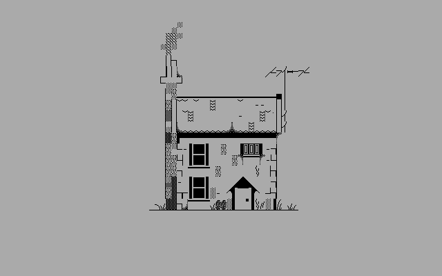
<li>Figure 6. Lotvonen, Heikki (2015).</li>
<li>Figure 7. Knowlton, Ken (1966): <em>Ken Knowlton Mosaics</em>. Image from the WWW-page. &lt; <a href="http://www.knowltonmosaics.com/pages/HKnewd.htm">http://www.knowltonmosaics.com/pages/HKnewd.htm</a> &gt; 10.4.2015.</li>
<li>Figure 8. Lotvonen, Heikki (2015).</li>
<li>Figure 9. Lotvonen, Heikki (2015).</li>
<li>Figure 10. Lotvonen, Heikki (2015).</li>
<li>Figure 11. cwilson5603 (2008): <em>Last Callers Screen</em>. Image from Flickr. &lt; <a href="https://www.flickr.com/photos/22767465@N05/2732637059/">https://www.flickr.com/photos/22767465@N05/2732637059/</a> &gt; 10.4.2015.</li>
<li>Figure 12. Lotvonen, Heikki (2015).</li>
<li>Figure 13. Zeus (2014): <em>zeitgeist|moving|on</em>. Image from the WWW-page. &lt; <a href="http://amiga.textmod.es/colly/se-zeit/">http://amiga.textmod.es/colly/se-zeit/</a> &gt; 10.4.2015.</li>
<li>Figure 14. Kiuru, Antti (2015): <em>Jungle Fever</em>. Image from the WWW-page. &lt; <a href="http://amiga.textmod.es/colly/ds%21-jufv/">http://amiga.textmod.es/colly/ds!-jufv/</a> &gt; 10.4.2015.</li>
<li>Figure 15. Kiuru, Antti (2015): <em>Jungle Fever</em>. Image from the WWW-page. &lt; <a href="http://amiga.textmod.es/colly/ds%21-jufv/">http://amiga.textmod.es/colly/ds!-jufv/</a> &gt; 10.4.2015.</li>
<li>Figure 16. Zeus (2014): <em>zeitgeist|moving|on</em>. Image from the WWW-page.&lt; <a href="http://amiga.textmod.es/colly/se-zeit/">http://amiga.textmod.es/colly/se-zeit/</a> &gt; 10.4.2015.</li>
<li>Figure 17. Break_06 (2014): <em>FILE_ID.DIZ</em>. Image from the WWW-page. &lt; <a href="http://sixteencolors.net/pack/break_06/FILE_ID.DIZ">http://sixteencolors.net/pack/break_06/FILE_ID.DIZ</a> &gt; 10.4.2015.</li>
<li>Figure 18. Lotvonen, Heikki (2015).</li>
<li>Figure 19. Lotvonen, Heikki (2015).</li>
<li>Figure 20. Lotvonen, Heikki (2015).</li>
<li>Figure 21. Lotvonen, Heikki (2015).</li>
<li>Figure 22. Lotvonen, Heikki (2015).</li>
</ul>
<h3>FONT USED IN PRODUCTION</h3>
<p>“ttf version of TopazPlus” by dMG/t!s^dS! is licensed under CC BY-NC-SA 3.0.0 &lt; <a href="http://www.trueschool.se/html/t!s-af10.readme.html">http://www.trueschool.se/html/t!s-af10.readme.html</a> &gt; 10.4.2015.</p>
<hr /><h2>Footnotes</h2>
<section class="footnotes">
<ol class="footnotes-list">
<li id="fn1" class="footnote-item"><p>Tullett 2014, p. 20 <a href="https://blog.glyphdrawing.club/amiga-ascii-art/#fnref1" class="footnote-backref">↩︎</a></p>
</li>
<li id="fn2" class="footnote-item"><p>Tullett 2014, p. 47 <a href="https://blog.glyphdrawing.club/amiga-ascii-art/#fnref2" class="footnote-backref">↩︎</a></p>
</li>
<li id="fn3" class="footnote-item"><p><a href="http://en.wikipedia.org/wiki/Text_art">Wikipedia</a> <a href="https://blog.glyphdrawing.club/amiga-ascii-art/#fnref3" class="footnote-backref">↩︎</a></p>
</li>
<li id="fn4" class="footnote-item"><p>Halliday &amp; Hasan 1976, 1–2 <a href="https://blog.glyphdrawing.club/amiga-ascii-art/#fnref4" class="footnote-backref">↩︎</a></p>
</li>
<li id="fn5" class="footnote-item"><p>Coulmas 1999, 12 <a href="https://blog.glyphdrawing.club/amiga-ascii-art/#fnref5" class="footnote-backref">↩︎</a></p>
</li>
<li id="fn6" class="footnote-item"><p>Carlsson &amp; Miller 2012, online source <a href="https://blog.glyphdrawing.club/amiga-ascii-art/#fnref6" class="footnote-backref">↩︎</a></p>
</li>
<li id="fn7" class="footnote-item"><p>Elmansy 2014, online source <a href="https://blog.glyphdrawing.club/amiga-ascii-art/#fnref7" class="footnote-backref">↩︎</a></p>
</li>
<li id="fn8" class="footnote-item"><p>Jäntti 1940, 35 <a href="https://blog.glyphdrawing.club/amiga-ascii-art/#fnref8" class="footnote-backref">↩︎</a></p>
</li>
<li id="fn9" class="footnote-item"><p>Tullett 2014, 9 <a href="https://blog.glyphdrawing.club/amiga-ascii-art/#fnref9" class="footnote-backref">↩︎</a></p>
</li>
<li id="fn10" class="footnote-item"><p>Popova 2014, online source <a href="https://blog.glyphdrawing.club/amiga-ascii-art/#fnref10" class="footnote-backref">↩︎</a></p>
</li>
<li id="fn11" class="footnote-item"><p>Bann 1967, 20. <a href="https://blog.glyphdrawing.club/amiga-ascii-art/#fnref11" class="footnote-backref">↩︎</a></p>
</li>
<li id="fn12" class="footnote-item"><p>Carlsson &amp; Miller 2012, online source <a href="https://blog.glyphdrawing.club/amiga-ascii-art/#fnref12" class="footnote-backref">↩︎</a></p>
</li>
<li id="fn13" class="footnote-item"><p>Scott 2005, documentary <a href="https://blog.glyphdrawing.club/amiga-ascii-art/#fnref13" class="footnote-backref">↩︎</a></p>
</li>
<li id="fn14" class="footnote-item"><p>Hargadon 2011, 35–38 <a href="https://blog.glyphdrawing.club/amiga-ascii-art/#fnref14" class="footnote-backref">↩︎</a></p>
</li>
<li id="fn15" class="footnote-item"><p>Hargadon 2011, 44 <a href="https://blog.glyphdrawing.club/amiga-ascii-art/#fnref15" class="footnote-backref">↩︎</a></p>
</li>
<li id="fn16" class="footnote-item"><p>Hargadon 2011, 45 <a href="https://blog.glyphdrawing.club/amiga-ascii-art/#fnref16" class="footnote-backref">↩︎</a></p>
</li>
<li id="fn17" class="footnote-item"><p>BYTE magazine 5/1977, 34 <a href="https://blog.glyphdrawing.club/amiga-ascii-art/#fnref17" class="footnote-backref">↩︎</a></p>
</li>
<li id="fn18" class="footnote-item"><p>Hargadon 2011, 47-48 <a href="https://blog.glyphdrawing.club/amiga-ascii-art/#fnref18" class="footnote-backref">↩︎</a></p>
</li>
<li id="fn19" class="footnote-item"><p>MikroBitti 6–7/1992, 7 <a href="https://blog.glyphdrawing.club/amiga-ascii-art/#fnref19" class="footnote-backref">↩︎</a></p>
</li>
<li id="fn20" class="footnote-item"><p>Amiga History Guide, online source <a href="https://blog.glyphdrawing.club/amiga-ascii-art/#fnref20" class="footnote-backref">↩︎</a></p>
</li>
<li id="fn21" class="footnote-item"><p>Amiga History Guide, online source <a href="https://blog.glyphdrawing.club/amiga-ascii-art/#fnref21" class="footnote-backref">↩︎</a></p>
</li>
<li id="fn22" class="footnote-item"><p>Hertzen 2007, 263 <a href="https://blog.glyphdrawing.club/amiga-ascii-art/#fnref22" class="footnote-backref">↩︎</a></p>
</li>
<li id="fn23" class="footnote-item"><p>ASA 1963, online source <a href="https://blog.glyphdrawing.club/amiga-ascii-art/#fnref23" class="footnote-backref">↩︎</a></p>
</li>
<li id="fn24" class="footnote-item"><p>ASCII, Wikipedia <a href="http://en.wikipedia.org/wiki/ASCII">http://en.wikipedia.org/wiki/ASCII</a> <a href="https://blog.glyphdrawing.club/amiga-ascii-art/#fnref24" class="footnote-backref">↩︎</a></p>
</li>
<li id="fn25" class="footnote-item"><p>Korpela 2001, online source <a href="https://blog.glyphdrawing.club/amiga-ascii-art/#fnref25" class="footnote-backref">↩︎</a></p>
</li>
<li id="fn26" class="footnote-item"><p>Dubost 2008, online source <a href="https://blog.glyphdrawing.club/amiga-ascii-art/#fnref26" class="footnote-backref">↩︎</a></p>
</li>
<li id="fn27" class="footnote-item"><p>Carlsson &amp; Miller 2012, online source <a href="https://blog.glyphdrawing.club/amiga-ascii-art/#fnref27" class="footnote-backref">↩︎</a></p>
</li>
<li id="fn28" class="footnote-item"><p>Carlsson &amp; Miller 2012, online source <a href="https://blog.glyphdrawing.club/amiga-ascii-art/#fnref28" class="footnote-backref">↩︎</a></p>
</li>
<li id="fn29" class="footnote-item"><p>Victoria and Albert Museum, online source <a href="https://blog.glyphdrawing.club/amiga-ascii-art/#fnref29" class="footnote-backref">↩︎</a></p>
</li>
<li id="fn30" class="footnote-item"><p>Knowlton 2005, online source <a href="https://blog.glyphdrawing.club/amiga-ascii-art/#fnref30" class="footnote-backref">↩︎</a></p>
</li>
<li id="fn31" class="footnote-item"><p>Victoria and Albert Museum, online source <a href="https://blog.glyphdrawing.club/amiga-ascii-art/#fnref31" class="footnote-backref">↩︎</a></p>
</li>
<li id="fn32" class="footnote-item"><p>Carlsson &amp; Miller, online source <a href="https://blog.glyphdrawing.club/amiga-ascii-art/#fnref32" class="footnote-backref">↩︎</a></p>
</li>
<li id="fn33" class="footnote-item"><p>Hischer 2015, interview <a href="https://blog.glyphdrawing.club/amiga-ascii-art/#fnref33" class="footnote-backref">↩︎</a></p>
</li>
<li id="fn34" class="footnote-item"><p>Reunanen 2013, online source <a href="https://blog.glyphdrawing.club/amiga-ascii-art/#fnref34" class="footnote-backref">↩︎</a></p>
</li>
<li id="fn35" class="footnote-item"><p>Karaiste 2008, 34 <a href="https://blog.glyphdrawing.club/amiga-ascii-art/#fnref35" class="footnote-backref">↩︎</a></p>
</li>
<li id="fn36" class="footnote-item"><p>Kiuru 2015, interview <a href="https://blog.glyphdrawing.club/amiga-ascii-art/#fnref36" class="footnote-backref">↩︎</a></p>
</li>
<li id="fn37" class="footnote-item"><p>Hirvonen 2010, 11 <a href="https://blog.glyphdrawing.club/amiga-ascii-art/#fnref37" class="footnote-backref">↩︎</a></p>
</li>
<li id="fn38" class="footnote-item"><p>Scott 2005, documentary <a href="https://blog.glyphdrawing.club/amiga-ascii-art/#fnref38" class="footnote-backref">↩︎</a></p>
</li>
<li id="fn39" class="footnote-item"><p>Hirvonen 2010, 22 <a href="https://blog.glyphdrawing.club/amiga-ascii-art/#fnref39" class="footnote-backref">↩︎</a></p>
</li>
<li id="fn40" class="footnote-item"><p>Hirvonen 2010, 31 <a href="https://blog.glyphdrawing.club/amiga-ascii-art/#fnref40" class="footnote-backref">↩︎</a></p>
</li>
<li id="fn41" class="footnote-item"><p>Karaiste 2008, 41 <a href="https://blog.glyphdrawing.club/amiga-ascii-art/#fnref41" class="footnote-backref">↩︎</a></p>
</li>
<li id="fn42" class="footnote-item"><p>Hirvonen 2010, 112 <a href="https://blog.glyphdrawing.club/amiga-ascii-art/#fnref42" class="footnote-backref">↩︎</a></p>
</li>
<li id="fn43" class="footnote-item"><p>Reunanen 2010, 77 <a href="https://blog.glyphdrawing.club/amiga-ascii-art/#fnref43" class="footnote-backref">↩︎</a></p>
</li>
<li id="fn44" class="footnote-item"><p>Hargadon 2011, 100 <a href="https://blog.glyphdrawing.club/amiga-ascii-art/#fnref44" class="footnote-backref">↩︎</a></p>
</li>
<li id="fn45" class="footnote-item"><p>A crack intro is the welcome view of a cracked computer program that contains messages to other hacker groups. <a href="https://blog.glyphdrawing.club/amiga-ascii-art/#fnref45" class="footnote-backref">↩︎</a></p>
</li>
<li id="fn46" class="footnote-item"><p>Kiuru 2015, interview <a href="https://blog.glyphdrawing.club/amiga-ascii-art/#fnref46" class="footnote-backref">↩︎</a></p>
</li>
<li id="fn47" class="footnote-item"><p><a href="http://www.asciiarena.com/info_release.php?filename=YXJ0MDEudHh0">asciiarena.com</a> <a href="https://blog.glyphdrawing.club/amiga-ascii-art/#fnref47" class="footnote-backref">↩︎</a></p>
</li>
<li id="fn48" class="footnote-item"><p>Kiuru 2015, interview <a href="https://blog.glyphdrawing.club/amiga-ascii-art/#fnref48" class="footnote-backref">↩︎</a></p>
</li>
<li id="fn49" class="footnote-item"><p>Kiuru 2015, interview <a href="https://blog.glyphdrawing.club/amiga-ascii-art/#fnref49" class="footnote-backref">↩︎</a></p>
</li>
<li id="fn50" class="footnote-item"><p>Kiuru 2015, interview <a href="https://blog.glyphdrawing.club/amiga-ascii-art/#fnref50" class="footnote-backref">↩︎</a></p>
</li>
<li id="fn51" class="footnote-item"><p>Hirvonen 2010, p. 23 <a href="https://blog.glyphdrawing.club/amiga-ascii-art/#fnref51" class="footnote-backref">↩︎</a></p>
</li>
<li id="fn52" class="footnote-item"><p>Holler 1994, online source <a href="https://blog.glyphdrawing.club/amiga-ascii-art/#fnref52" class="footnote-backref">↩︎</a></p>
</li>
<li id="fn53" class="footnote-item"><p>Hargadon 2011, p. 163 <a href="https://blog.glyphdrawing.club/amiga-ascii-art/#fnref53" class="footnote-backref">↩︎</a></p>
</li>
<li id="fn54" class="footnote-item"><p>Kiuru 2015, interview <a href="https://blog.glyphdrawing.club/amiga-ascii-art/#fnref54" class="footnote-backref">↩︎</a></p>
</li>
<li id="fn55" class="footnote-item"><p><a href="http://www.asciiarena.com/">http://www.asciiarena.com/</a> <a href="https://blog.glyphdrawing.club/amiga-ascii-art/#fnref55" class="footnote-backref">↩︎</a></p>
</li>
<li id="fn56" class="footnote-item"><p>Wolfers 2014, online source <a href="https://blog.glyphdrawing.club/amiga-ascii-art/#fnref56" class="footnote-backref">↩︎</a></p>
</li>
<li id="fn57" class="footnote-item"><p>Link: <a href="http://sixteencolors.net/">Sixteencolors.net</a> <a href="http://sixteencolors.net/">http://sixteencolors.net/</a> <a href="https://blog.glyphdrawing.club/amiga-ascii-art/#fnref57" class="footnote-backref">↩︎</a></p>
</li>
<li id="fn58" class="footnote-item"><p>Link: <a href="http://trueschool.se/">Trueschool.se</a> <a href="http://trueschool.se/">http://trueschool.se/</a> <a href="https://blog.glyphdrawing.club/amiga-ascii-art/#fnref58" class="footnote-backref">↩︎</a></p>
</li>
<li id="fn59" class="footnote-item"><p>Hischer 2015, interview <a href="https://blog.glyphdrawing.club/amiga-ascii-art/#fnref59" class="footnote-backref">↩︎</a></p>
</li>
<li id="fn60" class="footnote-item"><p>Link: PabloDraw <a href="http://picoe.ca/products/pablodraw/">http://picoe.ca/products/pablodraw/</a> <a href="https://blog.glyphdrawing.club/amiga-ascii-art/#fnref60" class="footnote-backref">↩︎</a></p>
</li>
<li id="fn61" class="footnote-item"><p>Yee 2015, online source. <a href="https://blog.glyphdrawing.club/amiga-ascii-art/#fnref61" class="footnote-backref">↩︎</a></p>
</li>
</ol>
</section>

            ]]></content>
        </entry></feed>