Typographic Portrait of Jean Sibelius Composed Entirely of Brass Rule
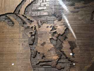
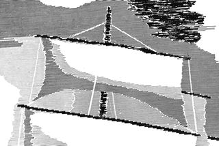
In the dimly lit “printing cellar” of Media Museum and Archives Merkki is a remarkable and curious object. It’s a mosaic of tightly arranged brass rule and spacing material, made by a Finnish typographer Valto Malmiola in 1937. Note, it’s not a single piece of metal, and it’s neither engraved nor etched… it’s thousands of individual metal bits, pieced together by hand, and locked tightly into a frame for printing.
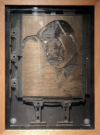
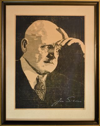
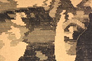
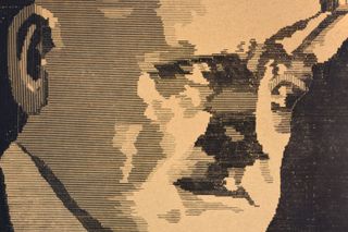
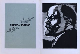
When inked and pressed onto paper, it creates an image of the famous Finnish composer Jean Sibelius.
But, to me at least, the resulting image itself is not what’s interesting here. After all, it’s a fairly conventional portrait of Sibelius. What’s interesting and what makes the whole thing remarkable is how it’s made and how it came to be. It’s essentially a form of proto-ASCII art: intentionally (mis)using techniques and materials originally intended for printing text to create a complex image. What led to its creation? What is it anyway? Where did Malmiola get the idea to use letterpress in such an unconventional way?
The Use of Rules
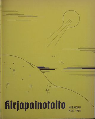
Malmiola writes about the inspiration for the picture in the Finnish printing arts periodical Kirjapainotaito:
“When our renowned master composer Jean Sibelius turned 70 in 1935, [...] I was struck with a strange dream of trying to replicate his image using impractical typographic methods. I had previously seen pictures "set" with Monotype fonts and decorations in foreign graphic design trade journals, particularly "The Inland Printer", so I decided to try, but not with type and ornament, but with rule.[1]
To give a bit of context, in letterpress printing, rules are strips of metal, often brass or type-cast metal, used for printing lines. They’ve been an integral part of printing since the early 1500’s.

Rules are typically used for decoration, as a border around the edges of pages, or for creating simple designs on book covers or brochures. A variety of tones from light grey to solid black can be made by combining rules of different widths. Rules also have a functional use as dividers for adding structure and visual hierarchy in tables, catalogues, and other layouts.
Instead of using brass rules conventionally, Malmiola used them like building blocks. By carefully arranging rules of varying thicknesses in horizontal and vertical lines, he managed to make complex images.
For those unfamiliar with letterpress techniques, or those who have never attempted to do a complex arrangement, the sheer insanity of Malmiola’s task might not be obvious.
Each element is carefully chosen or cut neatly into precise lengths and arranged in a way that leaves no air-gaps. Even the smallest unfilled space could lead to an unstable structure and make the whole thing unprintable. The level of precision, patience and skill needed to do what Malmiola did should should not be understated. How was it made?
The Construction of the Print
To plan the construction, Malmiola experimented with several approaches. He writes that the first attempt was a pitiful failure. The second attempt fared better. He came up with a “coding” system to classify different types of lines and spaces according to tonal values, by measuring the lights and shadows of the reference image, and marked each line with the resulting string of code. But he found the process too laborious and abandoned the idea. He also experimented with a “square system”, but doesn’t elaborate what he meant by that. [2] My guess is that he tried using grid paper to map tonal values.
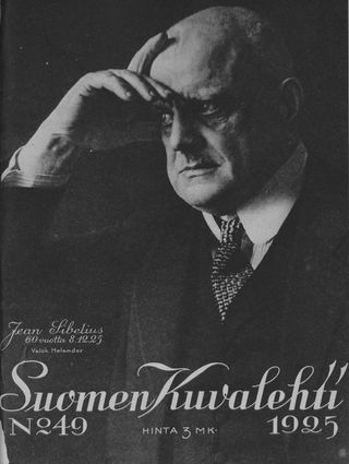
Unfortunately Malmiola doesn’t reveal his final method, but Paavo Haavi, who worked with Malmiola at K. K. Printing, says he used a one-to-one photographic enlargement of the reference image to help in the typesetting process[3]. The reference Malmiola likely used is a photo of Jean Sibelius that appeared on the cover of Suomen Kuvalehti -magazine in 1925.
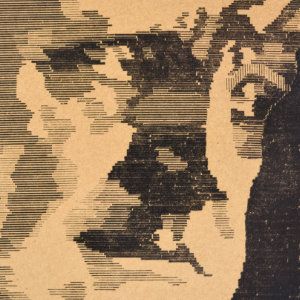
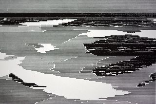
What’s clear, just by observing the image, is that Malmiola used what’s essentially a manual half-toning process by plotting the reference image into tonal values, which he then painstakingly constructed with brass rule, piece by piece. This kind of half-toning process is typically done by a photographic screen or some automated system, but Malmiola had to do it by hand. Where the reference image required a black area, Malmiola used a thick rule stacked tightly next to each other, and where a gray tone was required, he alternated between fine rules and spacers, creating illusions of various gray tones.
The final print measures just 28 × 37,5 cm (~11" × 14.7" in.) but is crafted using a staggering 30 000 ciceros of brass rule [4] (which equals to around 135 meters or ~442 feet) in addition to some spacers and quadrants for the white space.
Haavi also recounts that Malmiola presented the print to Sibelius in person, who reportedly exclaimed, “Tehän se vasta taiteilija olette!”[5], translating roughly to “Whose the true artist here!” Whether this was sincere or said tongue-in-cheek is not clear, but Sibelius signed the picture anyway and gave permission to include it in the prints, suggesting at least some level of validation and recognition for Malmiola.
Malmiola announced the finished piece in Kirjapainotaito and sold the prints for 10 mk (equivalent to about 4 € today, adjusted for inflation). Given the relatively small size of the Finnish typography scene at the time, there weren’t many who would actually appreciate such a print. The potential for profit was likely quite limited, so as an incentive, Malmiola sold the prints “for the benefit of war orphans”[6]. But despite his efforts, Malmiola had difficulties in selling his prints. As Haavi notes, he had to resort to selling them on the streets of Helsinki and through newspaper ads for years after the print was made.
After Malmiola’s death, the original letterpress forme of the Sibelius-print was donated to the hand typesetters guild, and later on to the printing industry workers’ trade division, the Helsinki Print Workers’ Association (HKY). HKY sold prints of it, and used the profits to “enhance the professional skills of young people working in printing”. In 2015, HKY loaned the Sibelius forme to the Media museum and archive Merkki’s printing cellar, where it remains on public display.
Malmiola’s Other Prints
In addition to the Sibelius-print, Malmiola made at least four others.
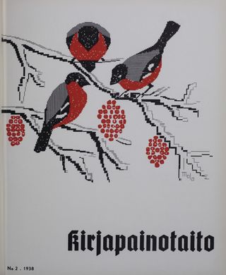
1. Bullfinches pecking at rowan tree berries, print on the cover of Kirjapainotaito in 1938
In 1938, Malmiola created a print featuring bullfinches pecking at rowan tree berries for the 30th anniversary cover of the Kirjapainotaito magazine. Malmiola explained that the tree represents “the tree of professional knowledge”, while the birds symbolize the friends and readers associated with the Kirjapainotaito magazine. [7]
He writes about the making of it as follows:
“In this context, we dare to say a few words about the construction of this issue’s cover. Firstly, such a practice should not be pursued by anyone, but since people in the world have so many hobbies… The rowan berries are monotype ornaments the size of cicero em, turned upside down and vaguely shaped with a file to intentionally create a ragged feel. In nature, the birds’ backs are blue-gray, but by using semi-bold lines, the illusion of a third color is evident. […] The slightly incorrect alignment of colors is intentional and enhances the image’s ‘atmospheric content,’ and poor printing, if one generally knows how to print poorly, gives the picture a piquant effect. It remains for the reader to make the final judgment on the validity of the moods elicited by the ‘image’. [8]
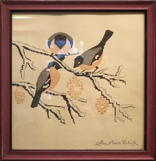
While the Sibelius print is quite dull in its precise imitation of the reference image, this artwork manages to take advantage of the unique properties of the technique. The inherent limitations in the material qualities of letterpress and brass rule, which result in sharp and square angles, gives the print almost a digital, or pixelated, look. What was, at the time, probably thought of as clumsy and naive, seems almost strikingly contemporary now. There is a nice balance between the rigid mechanical precision of typographic forms and the organic natural forms of the tree and birds, giving it a certain charm that’s missing in the Sibelius-print.
According to Haavi, the forme for this print was disassembled after printing to release the material back into use.[9]
2. Lighthouse, print on the cover of Kirjapainotaito in 1939
In 1939, Malmiola’s pictorial typography had become well known among the readers of Kirjapainotaito.
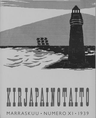
This print is a lot simpler than the previous ones he made, because Malmiola used a Monotype machine to make it, instead of composing the image with pre-made brass rules, like he had done earlier with the Sibelius-print. The Monotype machine also forced him to use only horizontal rules. The magazine includes a short description of the cover:
“The composer of the structure explains that the image was derived from the theme ‘the waves of time strike harshly.’ The line material used is from monotype casting, which explains why the image surface could be modified by even breaking the material, something that, of course, would not be acceptable or even permissible with ordinary lines. [10]
He programmed the machine to cast custom-sized rules from type metal (= an alloy comprising lead, antimony, and tin). Unlike brass, type metal was bulk material and reusable. This meant that any errors could be corrected by melting the metal down for reuse, which made it a more cost-effective option than the expensive brass. The process, however, still demanded a lof of manual effort in hand-setting type and trimming the rules to the exact lengths needed to construct the image.
3. Carradale-print, 1942
In 1942 Malmiola finished another piece to commemorate the 300th anniversary of Finnish printing art.
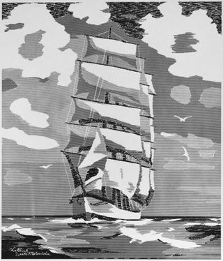
As far as I know, this is Malmiola’s largest print, measuring 45 × 53 cm (~18" × 21" in.) and uses an astonishing 72 000 ciceros of rule (around 325 meters or ~1 065 feet). Even though it was also made with a Monotype machine, and uses only horizontal rule, it took Malmiola 140 hours to complete.[11]
Even though Monotype machines make it possible to reuse the material, Malmiola’s wanted to preserve the layout, rather than melting it down. The type metal needed for the construction of the print was provided by the Valtioneuvoston kirjapaino (Government Printing Office), and not by Malmiola’s own employer, K. K. Printing, who probably lacked the required material (or the will to give it). Yet, according to Haavi, the forme was melted anyhow, after an apprentice dropped it on the floor.[12]
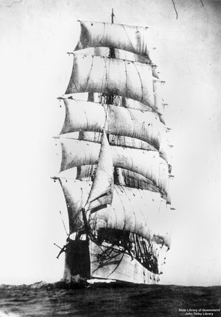
The print is based on a photo by Allan C. Green of a four-masted steel barque named Carradale (which Malmiola incorrectly called a frigate), built in 1889. In 1914 the ship was sold to Finnish shipowner J. Tengström, and the photo appeared in various magazines at that time (see for example 1922 Nuori Voima № 48). [13]
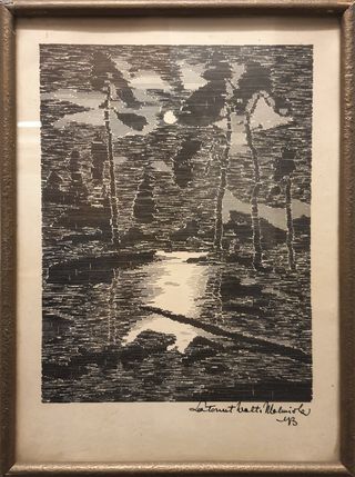
4. Forest-print, 1943
I don’t know much about the creation of this print, but I saw it for the first time when I visited the offices of Helsingin Kirjatyöntekijäin Yhdistys ry in Helsinki. This print also uses only horizontal rules, but the construction is much less precise than any of the others, resulting in some charming raggedness, which works well with the gloomy moon-lit forest scene.
Malmiola’s Inspiration for the Technique
Many Finnish typographers followed and read foreign typographic journals, which inspired new ideas and techniques. In the late 1920’s, pictorial typography had emerged as a new trend in Germany. This method of producing images became a trendy topic in typographic trade journals. For example, Arthur Grams’ article “Das Buchdrucker als Architekt” (“The Printer as an Architect”) in Typographische Mitteilungen in July 1929 writes about pictorial typography in a way that explains its potential in typesetting:
“Most colleagues are simply unaware of the wealth of forms, particularly elementary forms, concealed within the typesetting case. Yet, it is in these elementary forms that the full and grand allure of picture composition truly emerges; the elementary forms render it an expressive medium for the new demands of the era. They may occasionally appear somewhat grotesque; however, this should not discourage one from exploring their subtleties. We must endeavor to continuously uncover new facets in picture composition, because the elements it comprises are our elements: type! Type belongs to the printer! That is the essence and purpose of picture composition; it is from this perspective that one must consider the matter.[14]
This new style spread from Germany, and inspired typographers like Valto Malmiola. Malmiola experimented with this style as early as 1933, and advocated for its use in an article titled “Yritys ‘kujeilla’ asiallisesti” (“An Attempt to do ‘Trickery’ Earnestly”) in Kirjapainotaito for December 1933[15]. He agreed with the idea that typographic elements are not just laying out text, but could be used for artistic expression. This early experiment probably inspired Malmiola to attempt a more ambitious project later on, leading to the creation of the Sibelius-print.
In 1937, when Malmiola wrote about the creation of the Sibelius-print in Kirjapainotaito, he mentioned having seen pictures typeset with Monotype fonts and decorations in The Inland Printer.[16] There are not many pictures set with Monotype in The Inland Printer that would match the year 1934 or 1935, but I found this portrait of Franklin D. Roosevelt, composed of 17 000 monotype characters in the May 1935 edition:
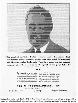
This image is not created with brass rule, but with dots and colons. The gray tones are not achieved by purely half-toning optical illusion, but by having a tinted background (originally green) in the shape of the head[17].
While this image matches Malmiola’s description, I suspect his actual inspiration might have been something else. In January 1936, Graafikko, another Finnish trade journal, featured work by a Viennese printer, Carl Fasol. Fasol had developed a method of printing which he called “Stigmatype” already as early as 1860. Some of the stigmatype prints resemble the style and method of construction of Malmiola’s prints. Fasol introduced his invention to the public in 1867 with typeset picture of flowers and a picture of Gutenberg. Both images were reveled and he gained recognition especially among typographers.[18] Fasol turned this into a series of Album for Printing Art, and traveled around Europe selling them, including Finland.[19].
As a side note: the article also mentions some of Fasol’s prints were donated to Suomen Kirjapainomuseo (Finnish Printing Press Museum), which never actually existed, but the material is currently in the archives of Tekniikan Museo (The Museum of Technology). I went to look for the prints, but sadly couldn’t find them.
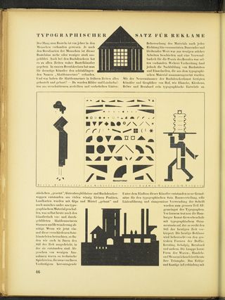
Beyond Fasol, there are many other typographers who used rules and other type elements to create pictorial typography in various delightful ways. Just to name a few, there’s Georg Wolffger in 1670, Monpied and Moulinet in ~1840’s and a whole trend of bending and twisting rules into all kinds of shapes in the 1870 – 1890’s. A comprehensive exploration of this phenomena would be required to put Malmiola’s work into proper context, but falls outside the scope of this post.
What’s interesting, is that these early practitioners of pictorial typography had recognized the potential of using small, modular, pixel-like elements to construct images. It laid the groundwork for how we understand and manipulate images today by showing how complex images can be made from simple, repeating parts. These early techniques were the building blocks for modern digital imaging, influencing everything from 4-color offset printing to bitmap graphics.
But... Why?
Pictorial typesetting was not always met with enthusiasm. It was often dismissed as a gimmick or childish dabbling, not just by traditionalists, but also by the rising avantgarde of typography. Jan Tschichold’s hugely influential book The New Typography, published in 1928, strictly forbade the use of any decorative elements or pictorial compositions made with type elements.
“The New Typography has absolutely nothing to do with ‘pictorial’ typesetting (Bildsatz) which has become fashionable recently. In almost all its examples it is the opposite of what we are aiming for.
— Jan Tschichold in The New Typography [20]
Traditionalists, on the other hand, wanted typography to follow the established norms and styles of classical printing. In Finland, V. A. Vuorinen, a member of the Kirjapainotaito editorial team wrote an article in April 1934 titled “Latomisvälinen kuvittamisesta” (“Illustrating with typesetting tools”). In it, he stated that since typesetters usually lack formal artistic training, they should stick to what they know: simple typographic layouts.
“Finally, it should be mentioned that, in my opinion, a cobbler should stick to his last. Illustration is such a demanding task that not everyone is capable of it. At least I have come to the conviction that if a typesetter uses all his means and strength to produce good, proper typography, the value and artistry of the work becomes many times better than just dreaming of images. […] Let pictorial typesetting be seen as a pastime that can be indulged in between more important tasks, but when it’s necessary to produce something quickly, let’s work with letters and proper arrangements if there are no ready-made picture plates available, and most often leave the doomed-to-fail typesetting with illustrative means to the side. [21]
Both the avantgarde and traditionalists viewed typographic experimentation, like what Malmiola was doing, as ridiculous and detracting from the primary purpose of typography: clear communication.
Vuorio’s article might have been written as an indirect response to Malmiola’s “Yritys ‘kujeilla‘ asiallisesti” (“An Attempt to do ‘Trickery‘ Earnestly”) in Kirjapainotaito for December 1933[22]. In it, Malmiola suggests that the method of creating pictorial typography should be taken seriously. But even then, Malmiola often downplayed his art, referring to his practice as merely a “hobby”. Did he do so to shield himself, and his work, from being too harshly judged as unprofessional by his colleagues?
Malmiola wrote that this kind of work “ought to be executed using straightforward methods; the design should be presented with just a few outlines, and importantly, there needs to be a hint of humor, as too serious an attempt might end up being inadvertently comical.” These thoughts seem somewhat unexpected, especially when contrasted with Malmiola’s solemn portrayal of Sibelius. Maybe Malmiola wanted to prove that his method had real potential for serious and respectful artistic expression by choosing Sibelius as his subject. Maybe he wished that by making a portrait of the renowned composer Jean Sibelius on his 70th birthday would make the technique seem more professional than how it was percieved by others.
Whatever the case may be, Malmiola’s dedication appears to have been driven more by passion, curiosity, and enjoyment rather than by financial or other superficial motives. As noted by Haavi, at that time, many typesetters, including Malmiola, took great pride in their profession and were interested in the discourse happening on an international level[23]. Malmiola was a frequent contributor to Kirjapainotaito, writing short articles and essays, especially about pictorial typesetting. In April 1933 Malmiola wrote an article titled “Mielikuvitus latojan apuna” (“Imagination as an Aid to a Typesetter’s Skills”) where he argued that typesetting, while not a traditional art, requires imagination and creativity to produce exceptional work, and most importantly, to find joy in the work[24]. This seems to have been the case for Malmiola, as he worked on his “hobby” during his free time and quieter work periods.
However, I get a sense that he wanted to share his art with a wider audience to show that letterpress was capable of producing actual art, and to contribute to the field he was passionate about. The Sibelius-print was showcased at the 1938 International Handicraft Exhibition in Berlin [25], and was featured in the Printing Art Quarterly -magazine [26], alongside the works of A. M. Cassandre, J. C. Leyendecker and László Moholy-Nagy.
Malmiola’s art would not have come to be without the support of his foreman Atte Syvänne, the technical director of the K. K. Printing, and member of Kirjapainotaito editorial staff. Under his leadership, the K. K. Printing had evolved into a well known general printing house in Finland. Syvänne was known for encouraging his employees, and it’s apparent, that in his role as Malmiola’s supervisor (or as the overseer of Malmiola’s own supervisors), he actively supported Malmiola’s interest in pictorial typesetting.[27]
It’s also worth noting that not many foremen in the printing industry would have allowed the use of valuable resources, such as 30 000 ciceros worth of brass rule, for personal “hobby” projects. But Syvänne shared a passion for the art of printing with Malmiola, and permitted him to use resources for his experiments.
Syvänne also dabbled in pictorial typography himself, and one of his experiments appear on the cover of Kirjapainotaito in June 1936, a year before Malmiola’s Sibelius-print. This might have influenced and inspired Malmiola in his own typographic experiments.
Valto Malmiola’s Short Biography
As a morbid contrast to the playfulness of his work, I found out that he was a supporter for Nazi ideology after reading his article “Työn aateluus”. This, of course, casts a shadow on his legacy and I debated for a long time if I should even write about him. But, because I already sunk a lot of time into this research, and because his art is unique in the context of (Finnish) typography, and because his work is part of a bigger typographic phenomena, I decided to go ahead anyway. While his work is fascinating, it’s important to view his person with a critical understanding of this context. That said, fuck nazis and fuck Malmiola, may he rot in hell.
Valto Malmiola (1893–1950) was a Finnish typographer and made a long career at K.K. printing house.
1893: Born in Hämeenlinna 25. 10. 1893. Originally known as Johan Waldemar Malmberg.
1914–1917: Moved to Helsinki in his youth, learned typesetting at K. F. Puromiehen’s printing house.
1917-1918: Briefly worked at Huvudstadsbladets nya tryckeri.
1918: Sentenced to four years in a penal colony for “aiding in treason.”
1930: Participated in a study trip and acted as secretary with the Taideteollisuuskoulu’s (School of Art and Design) graphic evening course.
1931: Won both first and second places in a typesetting competition hosted by Kirjapainotaito magazine.
1933: Published multiple articles in Kirjapainotaito,“Mielikuvitus latojan työtaidon apuna”, “Ne latojattarien ohjelmat”, ‘Eräs puoli “ohjelma” -kysymyksestä’, ‘Yritys “kujeilla” asiallisesti’
1933: Involved in establishing a café-restaurant for graphic artists, featuring international magazines and books.
1935: Legally changed his name to Valto Malmiola.
1937: Created the Sibelius portrait.
1938: Displayed the Sibelius portrait at the International Handicraft Exhibition in Berlin.
1938–1943: Produced various prints including the Bird print (1938), Lighthouse print (1939), Carradale print (1942), and Forest print (1943).
1950: Passed away in Helsinki on October 11, 1950, after a long illness.
His son Orla Valdemar Malmiola (1919 -1995) worked as a printing house foreman.
Acknowledgements
I want to thank Markku Kuusela, a researcher at the Media Museum and Archives Merkki, and typesetter Juhani “Jussi” Lahtinen for their invaluable assistance in my research. Thanks also to Grafia ry for giving me a grant that made this research possible. Additionally, I am thankful to Emilia Västi, the Collection Manager at The Museum of Technology, for her help in searching for the elusive Carl Fasol print in their archives. Lastly, special thanks to Gladys Camilo for proofreading the article.
Image sources
- Figure 1. Malmiola, Valto. Sibelius. 1937. Letterpress forme of brass rule and spacing material. Photograph by Heikki Lotvonen, January 2023.
- Figure 2. Malmiola, Valto. Sibelius. 1937. Letterpress print, 28 × 37,5 cm. Photograph by Heikki Lotvonen, December 2023.
- Figure 3. Typo: A Monthly Newspaper and Literary Review, Volume 2, Issue 22 (27 October 1888), Design in typography. — Rules | NZETC. (n.d.). https://nzetc.victoria.ac.nz/tm/scholarly/tei-Har02Typo-t1-g1-t10-body-d1.html
- Figure 4. Typo: A Monthly Newspaper and Literary Review, Volume 2, Issue 22 (27 October 1888), Design in typography. — Rules | NZETC. (n.d.). https://nzetc.victoria.ac.nz/tm/scholarly/tei-Har02Typo-t1-g1-t10-body-d1.html
- Figure 5a. Malmiola, Valto. Sibelius. 1937. Letterpress forme of brass rule and spacing material. Photograph by Heikki Lotvonen, January 2023.
- Figure 5b. Malmiola, Valto. Sibelius. 1937. Letterpress print, 28 × 37,5 cm. Photograph by Heikki Lotvonen, December 2023.
- Figure 6. Malmiola, Valto. Sibelius. 1937. Letterpress print, 28 × 37,5 cm. Photograph by Heikki Lotvonen, December 2023.
- Figure 7. Helander, Ivar Rafael. Portrait of Jean Sibelius on his 60th birthday. Cover of Suomen Kuvalehti, 05.12.1925, nro 49, Kansalliskirjaston digitaaliset aineistot
- Figure 8. Malmiola, Valto. Bullfinches. 1938. Cover of Kirjapainotaito : graafillinen aikakauslehti, 01.02.1938, nro 2,Kansalliskirjaston digitaaliset aineistot
- Figure 9. Malmiola, Valto. Bullfinches. 1938. Letterpress print. Photograph by Heikki Lotvonen, December 2023.
- Figure 10. Malmiola, Valto. Lighthouse. 1939. Cover of Kirjapainotaito : graafillinen aikakauslehti, 01.11.1939, nro 11, Kansalliskirjaston digitaaliset aineistot
- Figure 11. Malmiola, Valto. Carradale. 1942. Letterpress print, 45 × 53 cm. Photograph by Heikki Lotvonen, December 2023.
- Figure 12. Carradale (ship). (n.d.). John Oxley Library, State Library of Queensland.
- Figure 13. Malmiola, Valto. Carradale. 1942. Letterpress print, 45 × 53 cm. Photograph by Heikki Lotvonen, December 2023.
- Figure 14. Malmiola, Valto. Carradale. 1942. Letterpress print, 45 × 53 cm. Photograph by Heikki Lotvonen, December 2023.
- Figure 15. Malmiola, Valto. Untitled. 1943. Letterpress print. Photograph by Heikki Lotvonen, December 2023.
- Figure 16. Malmiola, Valto. Yritys "kujeilla" asiallisesti.. Illustrations in Kirjapainotaito : graafillinen aikakauslehti, 01.11.1933, nro 11, s. 18, Kansalliskirjaston digitaaliset aineistot
- Figure 16. Dresden, S. (n.d.). Typographische Mitteilungen, 20.1923, p. 90, https://digital.slub-dresden.de/werkansicht/dlf/308006/90#
- Figure 18. Inland Printer/American Lithographer. 1935-05: Volume 95, Issue 2.
- Figure 19. Fasol, Karl. Das Gutenberg-Haus in Mainz. In Diesem Hause Errichtete Johann Gutenberg Mit Fust Im Jahre 1450 Eine Gemeinschaftliche Druckerei, Welche Später von Gutenberg Allein Betrieben Wurde 1860, https://data.onb.ac.at/rep/BAG_10375637.
- Figure 20. Otto Ellandi Отто Элланди. Ellandi, Otto. 1985. Small book. Photograph by Heikki Lotvonen, December 2023.
- Figure 21. Syvänne, Atte. 1936. Cover of Kirjapainotaito : graafillinen aikakauslehti, 01.06.1936, nro 6, s. 1, https://digi.kansalliskirjasto.fi/aikakausi/binding/927036?page=1, Kansalliskirjaston digitaaliset aineistot
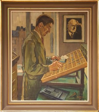
- Figure 22. Valkonen, Topi. Malmiola työn äärellä. 1948. Oil on canvas. HKY offices, Helsinki. Photograph by Heikki Lotvonen, December 2023.
Footnotes
Kirjapainotaito : graafillinen aikakauslehti, 01.11.1937, nro 11, s. 38 Kansalliskirjaston digitaaliset aineistot ↩︎
Kirjapainotaito : graafillinen aikakauslehti, 01.11.1937, nro 11, s. 38 Kansalliskirjaston digitaaliset aineistot ↩︎
Haavi, Paavo. Interview by Jussi Lahtinen. Notes provided by Markku Kuusela and communicated via email to Heikki Lotvonen. March 28, 2022. ↩︎
Haavi, Paavo. Interview by Jussi Lahtinen. Notes provided by Markku Kuusela and communicated via email to Heikki Lotvonen. March 28, 2022. ↩︎
Haavi, Paavo. Interview by Jussi Lahtinen. Notes provided by Markku Kuusela and communicated via email to Heikki Lotvonen. March 28, 2022. ↩︎
Grafiskt blad, Walto Malmiola, Jean Sibelius, tryckt signatur, 37x27,5. Ej signerad - 1342 9028 - Metropol Auktioner. (n.d.). ↩︎
Kirjapainotaito : graafillinen aikakauslehti, 01.02.1938, nro 2, s. 15 Kansalliskirjaston digitaaliset aineistot ↩︎
Kirjapainotaito : graafillinen aikakauslehti, 01.02.1938, nro 2, s. 16, Kansalliskirjaston digitaaliset aineistot ↩︎
Haavi, Paavo. Interview by Jussi Lahtinen. Notes provided by Markku Kuusela and communicated via email to Heikki Lotvonen. March 28, 2022. ↩︎
Kirjapainotaito : graafillinen aikakauslehti, 01.11.1939, nro 11, s. 27, Kansalliskirjaston digitaaliset aineistot ↩︎
Lahtinen, Juhani. Käsinlatoja: Kadonnut Ammattikunta : Muistoja Ja Muistelmia Helsingissä., 2006. ↩︎
Haavi, Paavo. Interview by Jussi Lahtinen. Notes provided by Markku Kuusela and communicated via email to Heikki Lotvonen. March 28, 2022. ↩︎
Dresden, S. (n.d.-b). Typographische Mitteilungen. July 1929. ↩︎
Kirjapainotaito : graafillinen aikakauslehti, 01.11.1933, nro 11, s. 12, Kansalliskirjaston digitaaliset aineistot ↩︎
Kirjapainotaito : graafillinen aikakauslehti, 01.11.1937, nro 11, s. 38 Kansalliskirjaston digitaaliset aineistot ↩︎
Inland Printer/American Lithographer. 1935-05: Volume 95, Issue 2. ↩︎
Österreichische Buchdrucker-Zeitung : Wochenblatt für sämmtliche graphische Zweige ; Organ des Graphischen Club in Wien, F. Jasper, 1873, http://data.onb.ac.at/ABO/%2BZ228853704. ↩︎
Graafikko, 01.01.1936, nro 1, s. 16, Kansalliskirjaston digitaaliset aineistot ↩︎
The new typography : a handbook for modern designers : Tschichold, Jan, p. 70, Internet Archive ↩︎
Kirjapainotaito : graafillinen aikakauslehti, 01.04.1934, nro 4, s. 16 Kansalliskirjaston digitaaliset aineistot ↩︎
Kirjapainotaito : graafillinen aikakauslehti, 01.11.1933, nro 11, s. 12, Kansalliskirjaston digitaaliset aineistot ↩︎
Haavi, Paavo. Interview by Jussi Lahtinen. Notes provided by Markku Kuusela and communicated via email to Heikki Lotvonen. March 28, 2022. ↩︎
Kirjapainotaito : graafillinen aikakauslehti, 01.04.1933, nro 4, s. 13, Kansalliskirjaston digitaaliset aineistot ↩︎
Helsingin Sanomat, 15.03.1938, nro 72, s. 9, Kansalliskirjaston digitaaliset aineistot ↩︎
PRINTING ART QUARTERLY. Chicago: Dartnell, 1938 [Volume 67, Number 3], modernism101.com ↩︎
Haavi, Paavo. Interview by Jussi Lahtinen. Notes provided by Markku Kuusela and communicated via email to Heikki Lotvonen. March 28, 2022. ↩︎