An obscure text justification method
I thrifted a book Type Matters! by Jim Williams. It's not a great book, but it had one interesting tidbit in it, describing an obscure text justification setting. It says:
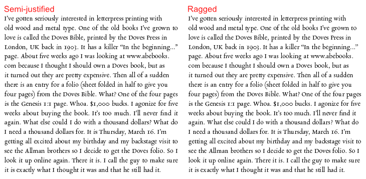
Range left, range right, centered or justified: there is also a fifth way of setting type within a given measure, called cogent. In the 1980s [...] an advertising agency called Cogent Elliott would send out type mark-ups requesting the type to be set as 'semi-justified', whereby the setting was range left but lines that were close to the measure were pulled out to the full width, to give a more defined edge to the right-hand side.
I had never heard of "cogent" or "semi-justified" text alignment, and searching for it online brings up almost no relevant results.
I found this idea interesting, so I had to try it out. Here's an interactive demo. Adjust the line width slider to see the effect:
It's a bit jarring at first — probably because this style of justification is so uncommon — but it's surprisingly readable after getting used to it.
Here it is implemented it in my (WIP) stroke font editor:
How does it work?
Type Matters describes semi-justification as ragged, where lines that are almost to the full width are justified. But then the question is: what does it mean "almost"? How do we decide which lines should be justified?
The basic justification algorithm (called greedy) puts words on a line with normal spaces between them, until the next word doesn't fit in the element's boundaries, and then distributes the remaining space evenly between the inter-word gaps of that line. The left-over word starts a new line, and the process is repeated.
The problem is that if the remaining space is large, it can produce horrible gaps in-between words. This happens usually if the line width is short, or if the text has long words (which languages like Finnish or German have plenty), rendering the text nigh unreadable. This is what we have on the web, and it sucks.
As I was trying to figure out the semi-justification logic, I realized that the problem is actually about word-spaces: what we really want to avoid is holes.
We can do that with bounding word-spaces. By bounding word-spaces, we don't need to decide which lines should be justified, because lines automatically self-select: if a line can reach the target width within acceptable spacing bounds, it gets justified, and if not, it stays ragged. This is achieved by restricting how much word-spaces are allowed to expand during space distribution. In addition, we can also allow the word-spaces to shrink for more flexibility. Here's how it works:
- Puts words on a line one at a time, but with word-spaces shrunk by a minimum word-space value. When a word would exceed the target line width, move it to the next line.
- Distribute the remaining space evenly among the word-spaces to reach the target line width. But, if the word-spaces would exceed maximum word-space value to fill the line, leave the line ragged (using normal word-spacing).
- Repeat for each line, including the last.
That's it.
With moderate min and max word-space values (e.g. -25% and 25% of the normal space), most of the lines get justified, while some lines get ragged. In the "worst case" scenario, if the textbox is narrow, most lines just get ragged, whereas basic greedy justification would produce holes. But, if the textbox is wide enough, the result is a well justified paragraph, with occasional ragged lines. It never produces unacceptable results, but has the potential of producing great results.
Here's a (non-optimised) implementation in JavaScript:
class SemiJustify {
  // measureText should return the pixel width of a text string
  #measure
  constructor(measureText) {
    this.#measure = measureText;
  }

  justify(text, { maxWidth, minSpace, maxSpace, normalSpace }) {
    const words = text.trim().split(/\s+/);
    const lines = this.#breakLines(words, maxWidth, minSpace);

    return lines.map((words, i) => {
      const canJustify = words.length > 1 &&
        this.#totalWidth(words) + (words.length - 1) * maxSpace >= maxWidth;

      return {
        words,
        spacing: canJustify
          ? this.#calcSpacing(words, maxWidth, minSpace, maxSpace)
          : normalSpace
      };
    });
  }

  #breakLines(words, maxWidth, minSpace) {
    const lines = [];
    let line = [];

    for (const word of words) {
      if (line.length && !this.#fits(line, word, maxWidth, minSpace)) {
        lines.push(line);
        line = [];
      }
      line.push(word);
    }

    if (line.length) lines.push(line);
    return lines;
  }

  #fits(line, word, maxWidth, minSpace) {
    return this.#totalWidth(line) + this.#measure(word) + line.length * minSpace <= maxWidth;
  }

  #calcSpacing(words, maxWidth, minSpace, maxSpace) {
    const gaps = words.length - 1;
    if (!gaps) return minSpace;

    const spacing = (maxWidth - this.#totalWidth(words)) / gaps;
    return Math.min(Math.max(spacing, minSpace), maxSpace);
  }

  #totalWidth(words) {
    return words.reduce((sum, word) => sum + this.#measure(word), 0);
  }
}
and here's a crude example use for canvas:
const canvas = document.getElementById('canvas');
const ctx = canvas.getContext('2d');
ctx.font = '9px Arial';

const measureText = (text) => ctx.measureText(text).width;
const justifier = new SemiJustify(measureText);

const text = "Justifying text usually means that all lines except (usually) the last are set to equal measure. Text justification is very common in books and other printed matter, and is regarded by many as an essential property of high quality typography. On the web, it's the opposite.";

const normalSpaceWidth = ctx.measureText(' ').width;
const result = justifier.justify(text, {
    maxWidth: 150,
    minSpace: normalSpaceWidth * 0.75,
    maxSpace: normalSpaceWidth * 1.5,
    normalSpace: normalSpaceWidth
});

// Render each line
let y = 9; // Starting Y position
const lineHeight = 12;
result.forEach(line => {
    let x = 0; // Starting X position
    line.words.forEach((word, i) => {
        ctx.fillText(word, x, y); // Draw the word
        x += ctx.measureText(word).width;
        // Add spacing (except after the last word)
        if (i < line.words.length - 1) {
            x += line.spacing;
        }
    });
    y += lineHeight;
});
The algorithm could be further improved with hyphenation, and even further with bounded glyph scaling and letter spacing adjustments. The SVG web component included above can be found here. I also tested mixing this with hyphenation in this codepen demo.
Fix justification for the web
The best justification systems are based on the Knuth–Plass line-breaking algorithm. It's what professional typesetting programs use. But it's also really complex, and requires a lot of tricky optimisations to be fast and reliable. That, and the fact that Knuth-Plass requires knowing the contents of the text upfront to make its calculations, is the reason the web (for example) only implements a simple greedy algorithm for text justification.
But anyone who has ever set type with text-align:justify; knows that the greedy justification can produce horrible holes if the line width is short or if the text has long words, rendering the text unreadable. As a consequence, the one rule for web typography has been to not justify text under any circumstances.
We can't have Knuth-Plass on the web — sad, but understandable. The proposed text-wrap:pretty; might bring it, or something like it, to web at some point, but the current implementations found in Safari and Chrome don't fix the issues with justification.
So, text-align:left; (or right) remains the only viable text alignment option for the web.
In my opinion, the semi-justified system could offer a real alternative. As I see it, it has no downsides:
-
It has essentially the same computational cost as regular greedy justification since it's still, in essence, a greedy algorithm.
-
It's simple to implement.
-
It's a progressive enhancement. My proposed syntax would be to use the already existing word-spacing property to accept a clamp function:
p { text-align: justify; word-spacing: clamp(-25%, 0%, 25%); } -
It's inherently responsive. The most common use case is clear: as the containing box resizes, the text inside gets automatically justified on desktop (wide screen), and ragged on mobile (narrow screen).
Related examples
In a briarpress discussion the same method is called "half justification":
I have a design book somewhere I believed mentioned a technique for justifying type that was called something like half justification. [...] The idea was that if the length of the text was within some predetermined distance of the maximum possible width the line would be justified. If it fell short of that it would remain ragged right.
Johannes Lang pointed out that Fraser Muggeridge gave a talk recently about this exact method: Justified and unjustified setting (at the same time)! The talk includes many examples, it's worth a watch.
kst pointed me to Johannes Ammon's talk/article Better Justification for the Web, in which he gives a great overview and history of the problem, and suggests using variable fonts for additional parameters for better justification (he calls his method "soft justification", here's a demo). The "further reading" section also has some great resources, like Bram Stein's TeX line breaking algorithm in JavaScript and Simon Cozens' line breaking algo for variable fonts for which there's also a demo.
End note
If you found this idea interesting and want to discuss it, or if you know of any examples of this method used, please contact me at hlotvonen@gmail.com or post a comment on mastodon.