In 2017 Shick Toikka asked me and my friends at GRMMXI to design a chapter showcasing one of their typefaces (Saol Text) in their upcoming type specimen book.
We decided amongst us that each would design one spread for the book.

A typeface can potentially have up to 144,697 characters covering a wide variety of scripts, languages and symbols, all defined in the Unicode standard. But for 99% of basic everyday use in any (latin) language you only need around ~200 different glyphs. If a typeface has more glyphs than that, it's very rare that they get used, and I feel it's a fairly thankless job for the type designer to spend so much time designing all these characters which might never see the light of day. In my spread I wanted to use these more uncommon and obscure typographic symbols to show at least a bit of appreciation.
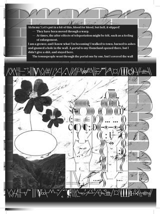
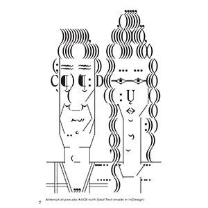
To utilise the full range of characters in Saol Text, 482 characters in total, I figured I'd make ASCII art with it. In ASCII art type loses its sound-meaning and characters become building blocks for illustrations, which meant that I could use any character from Saol Text purely based on its form.
Turns out, it's not really worth it trying to emulate ASCII with a non-ASCII font in InDesign (or any other Adobe software). In order to use a glyph that you can't type with a keyboard, you need to either copy-paste it from somewhere or click the glyph from the "glyphs" tab to insert it. This process just takes too much time and is too cumbersome to do that it kills any creativity.
In the end I ended up copy-pasting an old Amiga ASCII picture I had made and changing the font to Saol Text to achieve my goals, but it wasn't what I had wanted to do. I wanted to make ASCII art with non-ASCII fonts.
I wanted a tool that would have the following features:
- Full range of glyphs in the font easily accessible.
- Place selected glyph with a press of a key.
- Uniform grid of cells into which glyphs can be placed.
- Works with any font.
Such program didn't exist which meant that if I really wanted it, I'd have to make it myself. I had no idea how though, as I had only ever made simple websites thus had no knowledge of software or application development. At the time I was studying in a graphic design MA and decided to make it my final project to figure it out.
I told the idea to my friend Ian Tuomi. He got excited about it and really helped me get started. With him we figured out that an ASCII picture is basically a spreadsheet table where each cell holds the data required to display the individual glyphs and its various transformations. He also suggested to make it a web application with React and MobX which makes modifying the "spreadsheet" and displaying the changes really easy. I can’t thank him enough for his help.
We developed the editor during the spring of 2018 and released it to the public as part of my graduation exhibition from graphic design MA at Sandberg Instituut in Amsterdam.
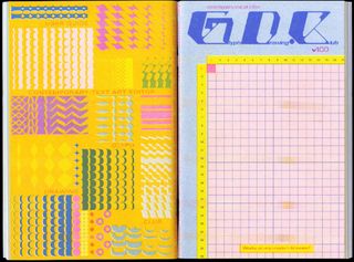
For the exhibition I had also invited people to submit illustrations and experiments made with the editor for a collaborative 100-page, Risograph-printed zine that ended up being filled with amazing work from 27 artists worldwide (Glyph Drawing Club User Guide v.1.0.0.).

Since then, I’ve released many new features and updates to the site, and GlyphDrawing.Club has grown from a simple editor into a very capable modular design tool. Most notable features since the User Guide 1.0.0. and launch have been the addition of vector export, layers and coloring tools along with many smaller features that enhance the workflow.
With all the features that are now in place I feel like I finally have what I initially wanted; an ASCII art tool I can use with any font!
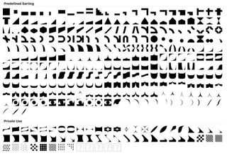
For the default font used in the editor I designed a modular typeface Tesserae. It started out as a vectorised version of the classic Commodore 64 PETSCII font, a square monospace font including geometric shapes.
The magic of square is that it can be rotated by 90 degrees and it still occupies the same space. If a square tile is then split diagonally into two triangles – one side black the other white – and these squares are placed next to each in various rotations of 90 degrees, you can get some visually hypnotising patterns. This is the idea behind Truchet tile system.

Tesserae works in the same way, but instead of a single square pattern, there's now over 900 different patterns. Combine that with rotating, 4 layers, inverted shapes, different colors, etc. and the possibilities for any kind of modular design work are almost literally endless. It’s very fun and satisfying to use, and because of Tesserae, the editor is used more for modular design than it is for emulating ASCII art.
I’ve seen people make amazing things with it from expressive custom type design to crazy elaborate illustrations, and I’ve also had the pleasure of teaching design with the editor in a few different schools and events. It’s been awe-inspiring to see people from all over the world make things with it that I would have never dreamt of.
This text is an edited version of a text that was originally published in the Glyph Drawing Club User Guide v.2.0.0. in 2019.
