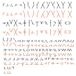
My favourite source of type design inspiration is to browse Amiga ASCII archives at asciiarena and 16colo.rs. In those archives there is just an endless amount of really wild but mostly well made lettering and logos, and the strangest thing is that they are mostly made by teenagers in the 90's!
One of the ideas behind Glyph Drawing Club was to be able to emulate the style of Amiga ASCII specifically, but with "smooth" vector lines instead of pixelated bitmap fonts, and the "Tesserae" font supplied with Glyph Drawing Club is kind of answer to that. But there's still something in the raw interfaces of ascii art editors and in the extremely limited selection of shapes in Amiga ASCII that can't really be replicated.
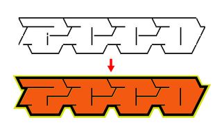
I wanted to keep the type design process in the old school ascii art editors and only afterwards transform the logo into something more contemporary. Thus, I modified the original Amiga ASCII font Topaz (ttf version by https://www.trueschool.se/) into a "contemporary" version with straight interconnecting lines and ligatures.
Now I can do ASCII type in an ascii art editor, copy paste the ASCII into Illustrator, and then change the font into the new modified version of Topaz and get a filled, more contemporary look.
If you want to do the same or test the font, follow the small technical tutorial below!
-
Download & install Moebius ASCII art editor.
-
In Moebius change the font to Topaz 2+ from
View -> Change Font -> Amiga -> Amiga Topaz 2+and draw some type with ASCII!Helpful tips to draw ASCII:
- configure the top key mappings to include at least
/ \ |and any other symbol that is hard to type fast. If you use Mac, make sure yourF1,F2keys work as function keys (System Preferences -> Keyboard). - You can select an area by dragging your mouse across the drawing. You can move this selection by pressing
mand "stamp" it withs. You can also presstto make the selection "transparent" anduto paste it under.
- configure the top key mappings to include at least
- After you are done with the ASCII version, select it and copy it to your clipboard (
cmd/ctrl+c). - Open Illustrator, create a new text box and paste the ASCII into it.
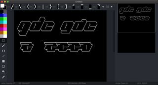
- Download & install TesseraeTopaz8x16 font from here.
- Change the font into TesseraeTopaz8x16. Make sure in your paragraph styles the line height is the same as font size and there's no kerning values or other offsets / shifts.
- Select the text box, and go to
Type -> Create Outlines. If you get weird subpixel shifts when outlining, just scale the font super big, then outline, then scale back to desired size. - Select everything & merge the paths from Pathfinder. If you want a "filled" version, and not outlined version, just ungroup the vectors, select the outer path and delete it. Now you should have a smooth vectorized version of your ASCII drawing!
Note:
I've added several ligatures and made some "text art" modifications to the TesseraeTopaz8x16 font. For example letters h, y, k, t, Y, X, v, V, i, l, z, Z are heavily modified to allow continuous shapes. Ligatures such as ._ and _. makes underscore 150% times it's width so it lines up with the | symbol below it, et cetera. Test how the font behaves by switching between the original Topaz to TesseraeTopaz! Check some of the font's features below: