Note from 2023:
This article was originally published in Versus #8 diskmagazine in 2018, and you need an Amiga or an emulator to read it.
I did some light formatting and added links and images to this text. I've also appended a 2023 update to the end of the article.
Finding ASCII art
I'm one of the very few people (or possibly the only one?) that have entered the Amiga ASCII scene in recent years. That's why Browallia asked me to write a short article of how I, a total outsider who has never even touched an Amiga, found my way into researching and making Amiga ASCII art.
I was born in 1989; too late to be old enough to experience the heyday of ASCII art. My teenage years on the Internet were spent on the early social media sites and elaborate ASCII imagery was never a big part of that. Nonetheless, I vividly remember admiring the ASCII artwork decorating NFO files that came with torrents, and I always wondered who had made them and especially how they were made. But without having any knowledge or contact with people who would know, I never really tried to find out.
Fast forward to spring 2015. I was studying graphic design at Aalto University and trying to figure the topic for my bachelor's thesis. Initially I was going to do it about utopian university, but ironically found the subject too difficult and depressing. I was desperately looking for a new subject that would be interesting and fun, while having something to do with graphic design.
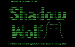
Then one day I stumbled upon the website of Legowelt, an electronic music producer from the Hague (where I had also been as an exchange student a year earlier). He had made an e-zine called Order of the Shadow Wolf plain text e-zine that immediately mesmerized me with its wonderful glowing green ASCII illustrations in between short articles about obscure subjects against a black background and his description of the era before the Internet:
"Difficult to imagine now but doing this felt like the most exciting thing in the world, surrounded by a mystique of hacker romanticism and being a cyberpunk pioneer."
Graphic design of E-Zines
I was interested in this romantic, nostalgic feeling of some "forgotten" period of digital culture that I didn't even know existed. I found graphic design where I least expected it: that e-zine was practically a digital magazine with typography, illustrations, headlines and all kinds of nice small details but done in a way I had never considered before as "design". I had a subject for my thesis: What kind of design decisions had to be made when you couldn't use anything but plain text and the character set of ASCII? No formatting, bullets, underlining, bolding, italics or other typographic elements that graphic designers normally work with. How do you design a zine when everything is done by typing and the space bar?
After some research the answer to that was rather disappointing. Most e-zines I found (primarily on textfiles.com) were just long plain text files often without any typographic contrasts and no exciting "design" elements. I realized that it wouldn't be interesting enough for a thesis subject. What I found more interesting were the various ASCII images, BBS ads and logos scattered in the text files, so my subject changed once again: ASCII art.
Finding Amiga ASCII art
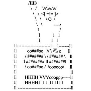
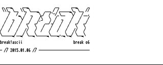
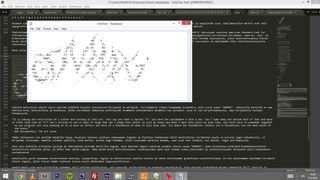
The first ASCII images I made with Sublime Text code editor using the basic coding font, painstakingly trying to recreate something similar (filled ASCII) I had seen on the torrent NFO files. However I wasn't a big fan of the clumsy aesthetics of 7-bit ASCII art and ANSI resembled too much of pixel graphics. It wasn't until I found an image of the FILE_ID.DIZ of a Break!Ascii logo (download the pack here) that I discovered what Amiga ASCII is.
I liked the way the lines connected to each other without leaving a gap and the extended character set of Topaz had nice details and symbols. Researching further, I found asciiarena.net (note from 2023: currently hosted at asciiarena.se altough it's frequently down. I've added a note at the end on how to view the Amiga ASCII archives nowadays ) and felt like I had found a hidden gem. It was such a cool website with thousands of Amiga ASCII collys with elaborate logos and illustrations (I miss that place. Can someone bring it back?).
I was fascinated with how much they were focused on type and logo design and how many different lettering styles were possible with just a handful of different typographic symbols. The logos were also more similar to graffiti, where the goal of typesetting wasn't to make the text legible, rather to make the characters as abstract as possible while still somewhat resembling the letters they were supposed to depict.
As a graphic designer, that was profoundly inspiring. The logos were all custom made, often with wonderful little details, ligatures, effects and styles; a quality that is often lacking in typical commercial logo and type design. The method of producing Amiga ASCII reminded me of modular type design, where each character were constructed with a set of smaller shapes to create a larger complete shape, but the character set of Amiga ASCII allowed for a more sophisticated result. As far as I know, such an ornate "modular design" system had never been extensively used in professional graphic design (or rather, there are no tools for that) (note again from 2023: elaborate modular design systems have existed in letterpress, but ASCII art has some unique characteristics and a huge volume of artworks done that surpass anything made previously), and that was hugely motivational for me when I decided to write my bachelor's thesis on Amiga ASCII art.
The graduation project consisted of two parts: thesis and production.
Writing my BA thesis
The thesis was a research into text art in general and then more specifically into Amiga ASCII art.
I tried to first define what text art is and then with that definition place Amiga ASCII into a continuum of text art history, roughly beginning in 300 BC with calligrams, and then re-emerging in different ways parallel with the various cultural and technological paradigms; the development of all the different printing and communication systems throughout the centuries, such as the invention of printing press, typewriter, RTTY and—of course—computers and digital technology.
With that information as background context, and some explanation of the general development of home computing and bulletin board systems, I examined how Amiga ASCII art came to be as a way to set different BBS boards apart visually and to enhance their graphic interfaces. Finally I looked at how Amiga ASCII developed into a mature artform, a subculture within a subculture, and what the community's cultural practices were; especially how the artworks were usually showcased in the form of "collys". My main conclusion is that Amiga ASCII can really be seen as a type of digital folk art or digital outsider art, as it only had significance to the members of the demoscene and Amiga ASCII art communities and cultures.
Writing the thesis was a difficult challenge, as there are few written research about Amiga ASCII, particularly from an artistic point of view. The most helpful existing visual and cultural research was Michael Hargadon's incredible thesis "Like City Lights, Receding: ANSi Artwork and the Digital Underground 1985-2000". Even though it only briefly mentioned Amiga ASCII art and concentrated on ANSI art, many parallels could still be drawn as the two different ASCII artforms have a lot in common especially in the way their respective communities operate. But mostly I had to gather bits of information from many different sources and combine them together. To make sense of it all I interviewed Michael Hischer (sk!n) and more extensively Antti Kiuru (h7), and got a lot of great first hand knowledge about everything relating to Amiga ASCII — how they personally approach drawing but also about the history of Amiga and the scene.
Making my first colly
For the production part I of course had to make Amiga ASCII art myself. It was an incredibly fun process. My main goal was to try many different ways to use the Topaz character set and experiment with different ideas and imagery. I created several different and small individual pieces, that I would later on combine into a sort of narrative colly. Creating logos and type was the hardest part for me (and still is), because there is already so many great typefaces that it was hard to create anything original. Instead, I tried to come up with shapes and ideas that I hadn't seen before when browsing the Amiga ASCII colly archives. I especially enjoyed making more illustrative figures, patterns and decorations as that didn't seem to be so common.
After I published my thesis and colly, I posted them on the "Ansi, Ascii Artists Worldwide!" Facebook group. This seemed to create some buzz in the community and Eric (hellbeard) invited me to the impure!ASCII 1940 art group, with whom I've been making new Amiga ASCII art ever since. My idea with Amiga ASCII has always been to create something outside of the Amiga ASCII "mainstream", to try to figure out ways Topaz hasn't been used before, to push the artform into some new directions. As I am a newcomer to the artform and culture, I do not have any sentimental nostalgia value for the medium. For me it's a curiosity, a hobby that I can't totally call my own, but also a source of inspiration for my academic and artistic practice.
Final note
Even though my thesis was only a simple and short bachelor's thesis and isn't sufficient as a real comprehensive paper, it's still the only one (that I know of) written on the subject. As such, I hope it will inspire some future researchers or current practitioners of Amiga ASCII; as it has inspired me to continue my own research into the tools and method of making text art and what the future possibilities of such an approach may be. I am now about to graduate from my master's studies in graphic design, on a topic that started from my interest in Amiga ASCII art and text art in general. I must admit that I wasn't as interested in the aesthetics of ASCII, but rather the tools and the method of producing it. As soon as I discovered Pablodraw back in 2015, I fantasized about a similar tool that could be used with any font. Therefore, I had to make one myself and that's what I am graduating with: a contemporary online grid based text art tool that works with any font and any glyph. Technically, it can also be used for making (or emulating) Amiga ASCII art, but the beauty of the tool shines when used with non typical ASCII art fonts, such as Viznut's extensive "Unscii" font. (note from 2023: GlyphDrawing.Club is the tool!)
Update from 2023
I figured I should leave a warning for anyone who might be reading this and is thinking of getting into ASCII art as a hobby or practice: I can wholeheartedly recommend ASCII art to anyone, but I don't recommend engaging with the "ANSI / ASCII scene".
You can largely avoid the scene if you:
- don't join the facebook group "Ansi, Ascii Artists, and BBS Sysops Worldwide!"
- don't publish or post anything at 16colo.rs
- don't join any of the "scene" related IRC or Discord channels and
- don't participate in any ASCII or ANSI competitions at demoparties
Unfortunately, many of the vocal and active members of the scene are making the whole community feel very unwelcoming and hostile. They don't want any newcomers, or change in general, and if you challenge that in any way, they will bully you until you quit. There is a lot of homo- and transphoba, sexism, misogynia, racism etc. Since 2015 I've seen plenty of people join the scene, and then leave soon after, because it's just not worth their time.
I persisted for some years, but also stopped participating because I don't want to deal with these people anymore. It takes a lot of energy and I rather spend my time in positive communities rather than in ones that end up being negative. It is very unfortunate as I met many amazing people and had great times collaborating with the members of Impure. I hope the scene can get its shit together at some point. Until then, I will continue making ASCII and ASCII-related projects, but outside of the "scene".